3 examples of landing page case studies that inspire trust
A case study should inspire trust that you're the right provider for a specific job. These 3 landing page examples do just that...


Oliver Meakings
A case study is a key part of any B2B sales process, which is why I've put together a list of landing pages for you to draw inspiration from.
These landing pages demonstrate useful techniques that can take your conversion rate to the next level.
Case studies aren't the same as "normal" landing pages, but they have a similar purpose: to convince website visitors that you are the right person/company for the job. And there's nothing more convincing in marketing than somebody finding success with your product.
A good case study takes the reader through a journey; from painful realization of a big problem that lies ahead all the way to overcoming the hurdle.
In the midst of all of that "chaos" is where your product or service comes in, so here are a few ways to help you tell the right stories.
A Few Ways To Write Your Case Study
Case studies don't necessarily have to live on a landing page to be effective, they can also be distributed via PDF files, videos, or even live webinars to capture a specific audience.
When it comes to highlighting a story on a landing page though, the most important thing is to start with the benefits provided and work your way through the challenges.
Remember that you're speaking to a business audience so all they care about is what's in it for them. You have to provide this answer immediately at the top of your case study.

Although this is the first thing the prospect will see, it's not the first one you'll write. The process of getting your case study down is much more treacherous than that. First, you have to ask yourself why...
» Why did the customer go through such lengths to use your product?
The problem is always the biggest factor in a customer's success story. If the product was able to solve it, then the process of getting there was worth it and the money was well-spent.
In most cases, customers will never get there.
Sometimes because the product or service wasn't good enough, other times because they didn't really know what they wanted.

But when they do get on the other side of the fence, that's when a case study is crucial for you to get the most out of the business relationship, and I have some examples to show you.
The 3 Case Study Page Examples I've Picked
For each of the 3 examples you'll see in a moment, there are different ways to convey a similar message—that of success.
That's what a case study is all about, it's where customers are celebrated for being the "hero" in the story and your product being the means to an end. The elements of a good case study landing page are:
- A banner image at the top that recaps the entire story in a quick summary for the reader to understand whether they'd like to go through with the entire article
- Quick benefits below the main banner with information on what the customer was able to achieve after going through the "trouble" of implementing the solution
- Some high-level information on the type of business the customer runs like the industry they operate in and the size of their company compared to target market
- The complete story of how a customer first realized they had a problem and then identified your product or service as a potential solution leading to success
All these elements must be included for a case study that inspires trust. Fancy design isn't as important here as sending the message of success across using a real-life example.
Example of Case Study #1: Miro's Thoughtful Formatting
There's no denying that Miro has one of the most beautifully-intricate visual identities I've come across, so it's good to see that they're passing that effort onto their case studies as well.

Miro is a collaborative software most known for its digital whiteboard, where customers can conduct brainstorming sessions and store some of their most important Eureka moments.
Essentially, it's a place where team members go to "throw it all out on the table" and then start putting the pieces together.
It's a wonderful tool that has a unique angle on collaboration.
Upwork saw an opportunity to use the tool in a way that would help them fully-embrace design thinking as part of their culture and thus requiring a complete organizational restructuring across multiple departments.
Miro beautifully illustrates the complexity of the situation by pairing it with a sleek profile of the company and the type of business they run.

Addressing the problem is only one part of the equation though; they go as far as to highlight what design thinking is with beautiful cards right below the fold not only guiding you through the journey of Upwork but also educating you on the topic itself which coincidentally is exactly what Miro is strong at: helping teams foster innovation via collaborative effort.

In just two visual steps, Miro has given us a lot of information to work with, and now I'm left wondering: "Was Upwork ultimately able to deploy their design thinking approach?"
That's when Miro fills in the context from within Upwork's culture, making it clear that this was a big shift for them and that if they wanted to do it, they'd have to be aligned in full.

The reason why I'm putting this landing page first is that it screams trust; from the thoughtfully-placed quotes to the authoritative sources, Miro knows exactly what they're trying to achieve with this case study and they execute it almost with surgical precision.
What's even better is that, being a software tool, Miro can embed their own solution within the case study itself, making the experience that much more compelling.

Of course, not everybody will be able to afford creating a software suite as complex as Miro's just to make their case study stand out, but I just think it's absolutely brilliant. The problem with case studies is that they are often boring, uninspired chunks of text that don't say anything other than:
"We did this for customer A so you should buy our product."
Miro flips that coin by focusing on Upwork's problem first and only getting to what Miro did as a solution towards the bottom of the article, cementing their commitment to customer success.

Overall, Miro checks all the boxes here:
- An immediate understanding of the problem
- Tackling the story from an educational standpoint
- Removing themselves only to enter when relevant
- Focusing on the customer success and not theirs
If you had to copy one landing page for your next case study, this is it. One of the most elegant ways to compliment a customer that's found success with your product or service.
Example of Case Study #2: Ghost's Unorthodox Approach
Ghost is a Content Management System that claims to be the best way for news publishers to claim back their independence through a variety of monetization features.

Just like Miro's landing page, the best case studies are the ones that embed your product or service within the content itself, essentially showing the benefit rather than talking about it.
That's where Ghost's approach truly shines.
They created a "showcase" of websites built on Ghost.
From this seemingly-endless pool of gorgeous designs, you can draw a lot of inspiration, with many of them having their own dedicated mini-spotlights to celebrate the customer.

Although not a case study landing page in the "traditional" sense since this is more of a gallery of customers who built their publications using Ghost, it's still impressive how they were able to pass that feeling of trust and empowerment by simply taking screenshots of their client's sites.
The cool thing is that Ghost has dozens of the examples to show, making it an effective marketing tool due to its compelling visuals and variety of choices.

As unusual as it might seem, Ghost's approach is extremely effective at producing exactly the effect they are looking for:
» building trust in the blink of an eye
As soon as you open up the showcase page, you're greeted with a world of Ghost creations that look amazing. The next in line is obviously you then.
Example of Case Study #3: Kiflo's Simple Yet Effective Page

To close this deep dive into some of the most powerful case study landing page designs available on the internet, I'm now picking something more in tune with a "typical" success story.
Similar to HubSpot's case study design, Kiflo (a Partner Relationship Management software suite) highlights the main benefits provided by their product at the top of the page.
In the hero section, they include details about the representative who's given a short interview for the case study, and later they'll link that information with quotes from them.

Quotes with real faces and names reinforce the message of the case study
With its simple approach, Kiflo's case study landing page is half-article, half feature page. Below the fold, you get a clear understanding of the company they've interviewed, the challenge that they were facing, and how they came to find and ultimately choose Kiflo as a solution.
The page does a great job at separating each section so that the reader can follow along with PerceptionPredict's point of view which is that of the hero going through incredible challenges to find the superpower which would lend him the tools to succeed in his quest.

By then connecting the features of the product back to the original problem, Kiflo is effectively affirming itself as the solution to creating a partner program from scratch with practically no experience nor advanced knowledge on how to operate one day-to-day.
In their "Strategy" section, Kiflo describes how each feature helped the customer tackle a part of the overall puzzle, up until finally solving the problem at scale.
The results shown are convincing and they really show the effort that the team at Kiflo made to help PerceptionPredict succeed.
The landing page world isn't just made of eye-popping colors and quirky animations; it's meant to deliver value to the reader in a way that helps them move forward and down your funnel.

If you're looking to create a case study page but don't really know where to start, try and bring a first version of it live rather than aiming for perfection. Then see what sticks.
I've reviewed 100s of landing pages over the years and I can tell you that what I care about seeing the most is upfront value.
If you don't tell me what you do NOW, I'm gone.
A similar thing can be said about case studies; if I can't find anything that tells me I should trust you above the fold, I won't go on to read the rest.
So put those benefits up there :)
(And convince me you're the only solution to my problem!)
Originally published 27 Apr 2021
Sign up for more like this.

How to write the perfect web design case study to win more clients
An immersive digital portfolio is the key to landing new clients. Learn how to show off your skills with a winning web design case study.

Design and build a custom portfolio website, visually, within 21 days.

A design portfolio without case studies is like a movie with no dialogue — visually present but lacking the substance needed to convey its full meaning.
Dialogue and case studies both communicate meaning. Without dialogue, audiences struggle to understand a film’s plot, characters, and themes, similar to how clients will struggle to understand the problem you solved, your design process, and the impact of your work without a thorough case study.
When you’re competing against other designers for a project or role, a well-written web design case study sets your portfolio apart , showing potential clients what you’ve done and what you’re capable of.
What is a case study?
A case study is an in-depth investigation into a person or group of people, a situation, event, or a product. A web design case study is a visual and textual analysis of a successful web platform, landing page , website design, or other web-based product. These types of case studies can be physical documents, but they’re often digital: PDFs, infographics, blog posts, or videos. Screenshots are an essential component, as are wireframes and mockups. But a robust web design case study also features detailed written explanations.
These visual and written elements work together to create a comprehensive assessment of the design process from start to finish, including the challenges faced, the solutions implemented, and the results achieved.
5 benefits of web design case studies
Now that we’ve touched on how case studies sell prospective clients on your work, here are a few other benefits of adding web design case studies to your portfolio website:
1. Demonstrate expertise
Case studies are a powerful marketing tool for designers to demonstrate their capabilities to potential clients or employers. A good web design case study showcases your skills and expertise in solving complex design problems.
2. Build credibility
In case studies, designers often include the name of the business, client, or project they’ve worked on, building credibility by providing real-world examples of their past work. You can even add testimonials and reviews to highlight positive feedback directly from those you’ve worked with.
3. Inspire future projects
Examining and analyzing your own work can inspire your next website build — maybe you’ll try one of the layouts that was nixed for this project or center the next design around an element you ended up loving. It also provides guidance and best practices for design projects, setting the bar for innovative design.
4. Encourage personal growth
Writing an investigation of your own design portfolio pieces after completing a project provides an excellent avenue for self-reflection. Reflecting on past projects, the struggles you’ve faced working on them, and what you’ve learned from the process will help you identify your strengths as a designer and areas of improvement to work on.
5. Improve communication
Presentations of your own work don’t just communicate the design process, decisions, and outcomes to clients. They also speak to stakeholders, including clients, team members, and management. A well-written case study illustrates a designer’s ability to effectively communicate complex design ideas and concepts, and writing it will improve your communication skills and offer insight into how effectively you work and collaborate with others.
What makes an effective web design case study?
A web design case study describes the process you took to solve a challenge with a particular web design project. A successful case study features a notable client project, a well-written narrative structure, and an engaging visual design.
Think of it as a story with an identifiable beginning, middle, and end. Throughout the story, show clients your approach to successful web design — the problem, the research you did to prepare for the project, the steps and iterations you completed throughout the process, and the final results you delivered. This narrative structure helps clients understand the project’s evolution and details your design process, making it key to an effective case study.
Case study curation and criteria
We’ve covered the basics of what a good case study looks like. But how do you determine which projects to include? If a project meets all the following criteria, it’s a good candidate for a detailed case study.
Is it relevant to the future projects you hope to explore?
If there’s a type of project you’ve completed in the past that you’d like to avoid in the future, that particular portfolio piece might not be a great option for a case study. You’re not just trying to sell yourself to clients — you’re trying to land jobs you actually want to do.
Does it have a defined initial problem?
Web design projects often arise as a result of a problem. These projects are perfect for case studies because the product design goes beyond appearance and functionality. Here are some of the issues your designs might solve:
- Poor user experience: To create a smooth, enjoyable experience for users, user experience (UX) design focuses on identifying and solving issues that cause frustration, confusion, or difficulty while using an app or a website, such as confusing navigation, misleading icons, or slow load times. Addressing these challenges lets you showcase your understanding of your target audience’s needs and demonstrates your ability to apply your creative and technical skills to solve them.
- Low search engine ranking: Redesigning a website with search engine optimization (SEO) in mind will improve its ranking in the search engine results pages, and you’ll have metrics to include in your case study to quantify the claims you’re making.
- Inconsistent branding: Brand design is a massive part of a company’s identity. A lack of alignment between the logo, colors , and other visual elements of a brand’s identity and its digital assets reflects negatively on the company, leaving customers with more questions than answers about who’s behind the brand. Good web design can bring a sense of cohesion to the company’s digital products, an achievement you can speak to in your case studies.
Does the outcome deliver measurable success?
Good design is subjective, but the best projects for case studies have data to show how successful they are. Search engine ranking is one example. You might also highlight impressive metrics for user engagement (bounce rate, time spent on the site), conversion rate (the percentage of visitors who make a purchase or fill out a form), or web traffic (the number of visitors to the website).
Is the project visually suitable for presentation?
When preparing a web design case study, consider the various formats it can be presented in, such as a video, static webpages, or interactive web content.
Selecting projects that fit your chosen presentation format is essential to showcasing your web design skills. As a web designer, it’s a given that whatever you’re presenting to potential clients needs to use thoughtful, aesthetically pleasing designs.
Design for display
There’s no single right way to present a case study. What’s most important is that your case study tells the story of the journey from an initial problem or idea to a finished product that meets the client’s needs.
A minimalist design will help you achieve this goal. But don’t confuse minimalist with boring. You can (and should) get clever with the presentation. Instead of using basic screenshots, for example, consider exhibiting your work in modern frames with immersive features. Or display screenshots of the product in its natural habitat. Webflow designer Karen Huang uses a digital screen in this user experience case study to feature a screenshot of the user interface (UI) on a smartphone screen just as users would experience it:

Build completely custom, production-ready websites — or ultra-high-fidelity prototypes — without writing a line of code. Only with Webflow.
How do you structure a case study?
The contents of every web design case study will vary, but they should all follow this basic structure:
1. A challenge

Start your case study with an introduction to your client and the problem your design solved. Include details about the project’s context, goals, and constraints. This section sets the stage for the rest of the case study and ensures the readers clearly understand what the project — and your solution — is all about.
2. A solution

Detail your approach to solving the challenge introduced in the previous section. Include information about your research, its methodology, and the data you gathered to develop your solution. Focus on your skills, not diagnostics — this is the place to showcase your intelligent approach, reasoning, and innovative ideas that ultimately resolve the challenge.
For this section, it’s helpful to break each key resolution into separate paragraphs and introduce images in chronological order to detail your design process. Screenshots of wireframes and strategy phases will paint a vivid picture of the project’s journey.
If you face any challenges or roadblocks while designing your solution, discussing them provides insight into your problem-solving skills and shows potential clients how you overcome difficulties. End this section with multiple pictures of the final product, and be sure to include a direct link to the project for potential clients and employers to peruse.
3. The impact

This section is where you’ll highlight metrics and data that back up the project’s success. Leverage metrics, user feedback, or whatever data is available to illustrate how your solution solved your client’s challenges and achieved the project’s goals. You can also include information about the potential longitudinal impact of your work and future opportunities for the project.
4. Key quotes

A case study is a perfect place to share client testimonials and add quotes from team members to help readers learn what the experts behind the project think about the build. Get creative but use quotes sparingly, sprinkling them throughout the case study to support the image or project stage the quote relates to.
Let your work do the talking
At Webflow , we offer the tools to make websites and the tutorials you need to perfect them. Learn how to start a web design business , make an online portfolio , or enhance your skills with a web design certificate with guidance from our blog and educational platform, Webflow University . Draw inspiration from our collection of templates and websites and start building your best site yet with Webflow.
Subscribe to Webflow Inspo
Get the best, coolest, and latest in design and no-code delivered to your inbox each week.
Related articles

Presenting your web design portfolio: The complete guide for winning new clients
When presenting your portfolio to a potential web design client, focus on sharing your goals, ideas, and thought processes as you worked through the projects.

4 steps to creating an impressive UX design portfolio
Your UX design portfolio helps you impress future employers and attract clients. Here are four crucial steps to creating an outstanding portfolio.

13 tips to make you a better web designer
Helpful advice to help you level up your web design skills

5 SaaS web design trends in 2017
Check out 5 of the most fascinating web design trends from ChartMogul's 2017 study of SaaS landing pages.
.jpeg)
How to get web design clients fast: 5 key steps
Not sure how to get web design clients fast? Follow these 5 essential steps to get started.

The modern web design process: setting goals
The first step to building a successful website is ... defining success.
Get started for free
Try Webflow for as long as you like with our free Starter plan. Purchase a paid Site plan to publish, host, and unlock additional features.
Transforming the design process at
- Interactions
- Localization
- Figma to Webflow Labs
- DevLink Labs
- Feature index
- Accessibility
- Webflow vs WordPress
- Webflow vs Squarespace
- Webflow vs Shopify
- Webflow vs Contentful
- Webflow vs Sitecore
- Careers We're Hiring
- Webflow Shop
- Accessibility statement
- Terms of Service
- Privacy policy
- Cookie policy
- Cookie preferences
- Freelancers
- Global alliances
- Marketplace
- Libraries Beta
- Hire an Expert
- Made in Webflow
- Become an Expert
- Become a Template Designer
- Become an Affiliate
Learn / Guides / LP optimization
Back to guides
6 real-life landing page optimization examples in action
High-converting landing pages don’t just decrease customer acquisition costs and ensure you’re driving the most value possible from your campaigns. They also help you create a better experience for the people who matter the most—your users.
But to create a high-converting page with an excellent user experience (UX), you need to look at successful landing page optimization (LPO) examples and learn how to implement their strategies.
Last updated
Reading time.

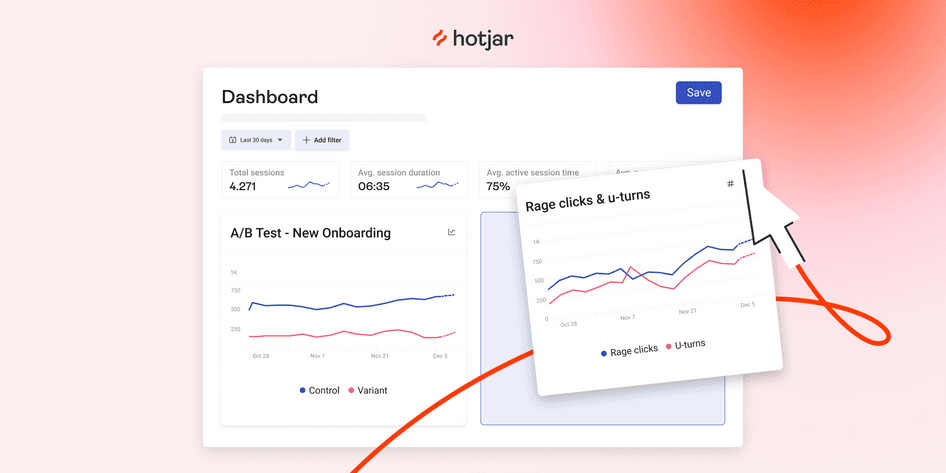
In this chapter of the LPO guide , we examine some of the most effective landing page optimization examples. With some help from Hotjar (hi there! 👋), each of these companies created pages that delight visitors with a user experience so great, they continue to come back for more .
These real-world case studies help you understand exactly why you need to optimize your landing pages, which LPO techniques work best, and how they look in action, so you can set up your own pages for success.
Use Hotjar to supercharge your landing pages
Use Hotjar’s digital experience tools to understand why users behave the way they do—and find solutions that increase conversions.
6 highly effective landing page optimization examples to learn from
Your landing page’s main objective is to deliver a laser-focused user experience that helps your visitors achieve their jobs to be done and helps you achieve your conversion goals.
As you review these practical LPO examples—and see how companies used Hotjar’s tools to up their landing page game— take note of which strategies and tactics you can implement on your landing pages to replicate their results.
1. How ClickMechanic used heatmaps for cost-effective redesigns
When UK-based marketplace ClickMechanic decided to redesign their landing pages, Hotjar’s digital experience insights tools turned out to be exactly what they needed to keep the process cost-effective.
After receiving some enlightening feedback about their sign-up process using surveys , the team realized their landing pages could also use some optimizing, so they turned to heatmaps.
Heatmap data showed that the vast majority of their landing page visitors never even scrolled beyond the hero (the main image on the homepage). As a result, the ClickMechanic team focused on redesigning the content above the fold, instead of giving the entire page a revamp.
This approach helped the company save money on design and engineering and deliver a 15% increase in conversions .
Why this LPO strategy works
Visual user insights—like those that come from analyzing heatmaps or recordings —help you spot simple ways to improve your user’s experience and deliver small incremental changes that have a big impact.
Heatmaps visually represent where visitors click, move, and scroll, helping you understand how they really engage with your site , so you know which landing page elements to optimize to improve their experience.
💡 Pro tip: use concept testing alongside heatmaps to bring fast and effective user insights into your redesign process.
A landing page redesign takes a lot of time—it pays to ensure you get it right. Hotjar’s concept testing feature helps you test your new landing page design, lead generation form fields, calls to action (CTAs), landing page copy, testimonials, or other online marketing assets with users before you launch.
This effectively diminishes risk, brings user insights into your design process, and even collects ideas to help refine your landing page optimizations. Plus, it’s way cheaper than running an entire A/B test .
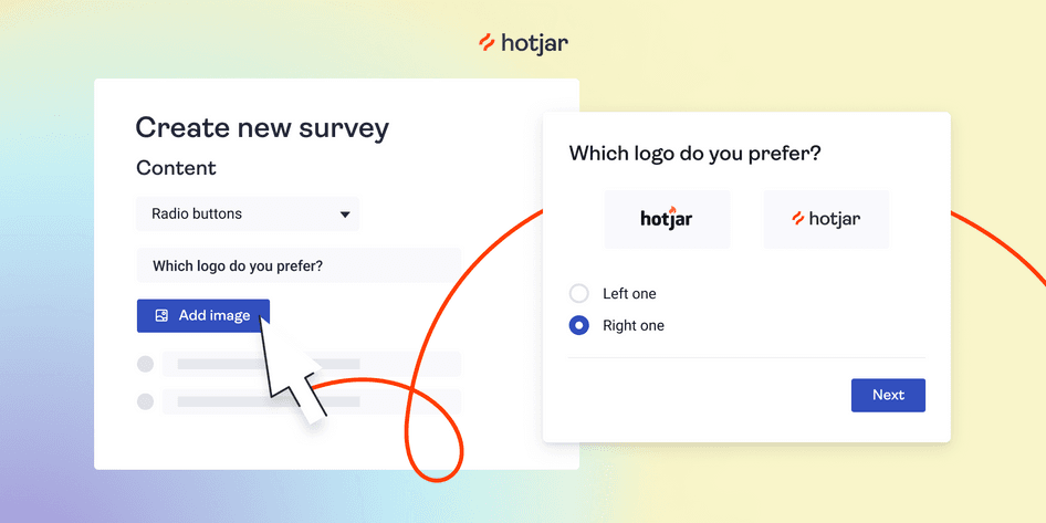
Use Hotjar to set up a concept testing survey and quickly find out which version of your design users like better
2. How CCV Shop used behavior analytics to identify issues
Landing pages are crucial to CCV Shop —they use them to generate leads for their online storefront business, which helps over 17,000 entrepreneurs run their ecommerce stores.
When it comes to optimizing these landing pages, CCV Shop leverages Hotjar’s suite of behavior analytics tools to observe and analyze user actions, understand their prospective customers, and increase conversions. Here’s how:
The result? A 38% increase in their conversion rate , which got them really close to reaching their 2% conversion goal.
With user behavior at the center of your landing page optimization strategy, your creations are guaranteed to resonate.
Platforms like Hotjar give you a front-row seat to how your audience interacts with your top-performing campaigns . They help inform your next optimizations with insight into users' habits, behaviors, frustrations, and needs, so you know exactly what to prioritize.
As you see the landing page experience through your users' eyes, you get an unbiased view of your work—what hits the mark and, more importantly, what doesn’t. This type of compelling data helps you validate your LPO strategy, make changes to streamline the user journey, and reduce guesswork in these important decisions.
💡 Pro tip : use Hotjar Funnels to make sense of drop-offs on your landing pages.
Drop-offs are the bane of every landing page’s existence. Traditional web page analytics, with its big-picture traffic data, will only get you so far. What you need is to understand why users are dropping off, so you can do something about it.
Hotjar Funnels helps you visualize your landing page conversion flows, and shows you the relevant recordings at each step, making it easier than ever to connect your numbers to real user behavior.
This full overview of your funnel lets you quickly spot where most users drop off of your landing page—and the real reason behind it, so you can identify issues and pain points that make people leave, and confidently optimize for impact.
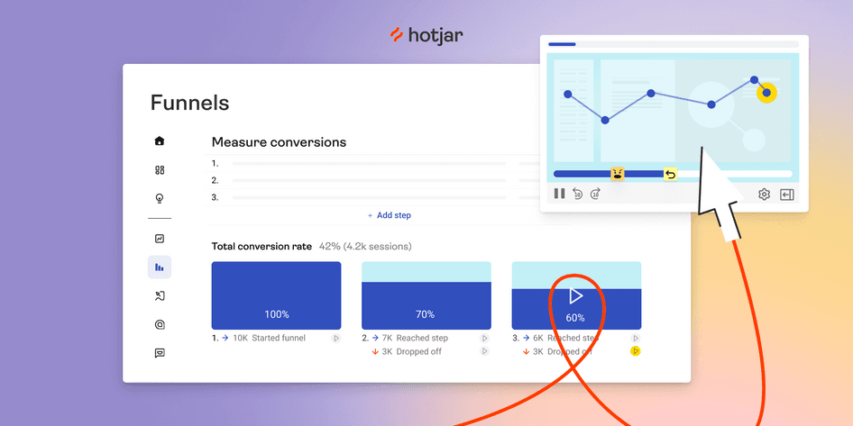
Visualize your conversion flows—and the real user behavior behind it—at every step with Funnels
3. How Unbounce solved UI/UX issues to improve user sign-ups
Unbounce’s experience with landing page optimization shows that sometimes, it takes a bird’s eye view to realize that the user’s experience doesn’t meet expectations.
The idea of improving UX on their landing page’s sign-up form seemed pretty straightforward at first: integrate with an auto-completion API to save time and simplify the whole process for the user and increase conversions. They even ran usability tests to ensure everyone loved and was on board with the new feature.
But they were in for a surprise. Once the team actually rolled out the changes—and enabled Hotjar Recordings to monitor their performance— they realized that auto-complete was the number one spot people got stuck :
Watching real people fail to use our brand-new ‘improved’ UX was cringe-inducing and painful to see when all we wanted to do was help them. I can't think of any other tool that would give such valuable insights.
Implementing your assumptions without seeking the truth in your user’s experience is one of the challenges of designing seamless user interfaces (UIs).
In this landing page optimization case study, Unbounce used Hotjar to debunk assumptions in the design of their processes and interface:
Watching Hotjar Recordings was both a humbling and exciting experience because we knew exactly what we needed to change and identified some serious bugs which would have cost us a lot in losses of sign-ups.
By analyzing real visitor actions, the UI team was able to make informed decisions in rolling out fixes , which significantly improved their sign-up process and even prevented them from losing a customer who was signing up for an annual plan of $2,000+.
💡 Pro tip: supplement recordings data with insights from voice-of-the-customer (VOC) tools , like surveys, to determine what users expect from specific pages.
For example, asking questions with surveys and polls helps you dive deeper into user actions on your landing page. Recordings show you which landing page elements they use first and how they use them, and surveys help you understand why .
Some of the responses may validate work you’ve already done, while others may be surprising. Either way, with the context for these actions in hand, optimizing your landing page becomes an easier task.
Use surveys and polls to collect feedback from people who are visiting your landing pages
4. How Creatopy engaged in continuous discovery to improve conversions
Back when they were known as Bannersnack , online banner-maker and design tool Creatopy relied on web analytic tools to track and measure traffic on their landing pages. However, they were in the dark when it came to understanding what people were actually doing there, and why.
To speed up their optimization work, the product, design, and marketing teams turned to Hotjar.
In a cycle of continuous discovery, Creatopy used heatmaps on landing pages they needed to optimize, regularly gathering evidence of how people interacted with them, and then leveraged these insights to produce an alternative design and A/B test the old and new versions against one another.
By applying this LPO strategy, the team increased sign-ups by 25%.
A structured and sustainable approach to continuous discovery helps you infuse your landing page optimization decisions with customer insights . Continuously gathering information on user needs helps you refine your ideas, which leads to happier customers, better prioritization, and improved targeting for your pay-per-click (PPC) campaigns.
For example, consistently analyzing heatmaps of your landing pages gives you quick visual cues about their current results, performance, and scope for improvements—like areas of intensity that reflect where most customers hover their mouse, or cold spots that need a boost.
You can integrate heatmaps into your business’s workflow and make them part of ongoing analytics, updating them on a regular basis to reflect your growth and efforts.
With the right mindset and tools, continuous discovery helps you deeply empathize with your visitors and feel confident your landing pages meet their evolving needs.

💡 Pro tip: unlock the secrets to high-converting pages with Hotjar Trends.
As you optimize your landing pages for conversions, use Hotjar Trends to see if sign-ups increase over time, and then view the corresponding heatmaps and recordings to understand why.
Traditional analytics only show you the numbers, but Trends lets you see the full picture by visualizing your metrics, so you can spot user behavior patterns and uncover the ‘why’ behind the data.
This lets you connect the dots between user behavior and numbers in a single tool, by linking product metrics to qualitative user insights.
Hotjar Trends lets you create custom conversion metrics and KPIs, and visualize them as charts to spot trends over time
5. How TomTom leveraged user feedback to create copy that converts
The team behind independent navigation software TomTom doesn't have to wonder whether their website and landing page optimizations actually improve the user experience. Using Hotjar alongside other analytic tools , they get all the quantitative and qualitative data they need to make meaningful improvements to the customer journey .
For example, one of their favorite Hotjar tools is Surveys , which allows them to ask satisfied customers why they signed up or made a purchase—information they can then turn into compelling copy for landing pages and email campaigns. The results speak for themselves:
Using the information gathered from Surveys helped us make substantial changes that resulted in a +491% increase in email CTR and a +49% conversion rate increase for our landing pages.
Improving the user experience means answering questions about why users behave the way they do. To leverage LPO and increase conversions, marketing and UX teams need to go beyond the raw numbers they get from traditional tools like Google Analytics to really understand user behavior .
Tools like surveys or feedback widgets bring VOC insights to your decision-making, allowing you to:
Prioritize what to optimize with real user feedback
Validate every idea with reliable user insights
💡 Pro tip : connect with customers 1:1 to gather even more valuable insights for your landing pages.
By enabling you to seamlessly conduct user interviews, Hotjar Engage brings you closer to your customers than ever before, so you can understand their needs better and create landing page experiences that truly help them achieve their goals .
Focus on how customers talk about your brand while Engage seamlessly hosts, records, and transcribes your calls. You can even get your team involved, compare notes, and turn these insights into action.
Tap into Hotjar's pool of 175,000+ users to automate recruiting people for interviews
6. How re:member revived affiliate traffic
When the digital marketing team at Scandinavian credit card company re:member noticed affiliate users—a significant traffic source—were bouncing from their landing page form more than usual, they knew traditional analytics wouldn’t be enough to tell why.
Sure, the team could try to dissect these numbers in search of a motive, but they wanted to visually see what went wrong. To pinpoint the issue—and find a solution for it—they turned to Hotjar:
If a user decided to leave the website, with Hotjar, we’re able to see if maybe the location of important information was out of the screen using Heatmaps. With click maps, we can see if users click on objects that aren’t meant to be clicked. But most importantly, Recordings allow us to see specific users anonymously, what went wrong, and when they had a hiccup.
Pairing recordings with heatmaps, re:member noticed that these affiliate users were experiencing technical difficulties—like attempting to click on unclickable elements—and were also looking for more information that wasn’t available on the landing page—by searching for and analyzing benefits before making a decision.
Seeing the credit card application form experience through their users’ eyes helped re:member understand why their affiliate visitors were leaving, so they could build a solution that increased conversions by 43% .

Without Hotjar, the re:member team may have never discovered what caused affiliate traffic to leave. But because they used the right tools, they had no problem spotting the issue and crafting a simple solution to reduce their bounce rate.
By studying users engaging with your page, you develop a deeper understanding of their needs with qualitative and quantitative data — less guesswork and more features guaranteed to help your visitors convert or complete a desired action. This helps you avoid costly mistakes and fix issues that can have a long-term impact on your bottom line.
💡 Pro tip : use the Hotjar Dashboard to quickly find out why visitors don’t convert.
With all the user metrics that matter in one place, the Hotjar Dashboard brings together the insights you need to improve your users’ landing page experience.
This tool paints the big picture by showing you quantitative data about your landing page at a glance. As you identify trends on the Dashboard, you can zoom in on the qualitative insights—by viewing related heatmaps and recordings—to validate your assumptions.
With no extra time and external integrations needed, the Dashboard showcases high-level user behavior to help you spot problems before they have a negative impact on your audience —perfect for fast-paced teams who don’t have the time to sift through data.
Track your important metrics in one place with custom dashboards
Next steps to landing page optimization
Even with the best of intentions, a poorly optimized landing page leaves potential customers confused and hesitant, ultimately leading to a user experience that just doesn’t do it for them.
These landing page examples show the impact that LPO has on a variety of different businesses, but they all revolve around one common principle: improving performance starts and ends with users.
Keep your landing pages user centric with actionable insights that uncover exactly why your visitors convert, and why not, to build exceptional digital experiences and confidently optimize your UX and revenue stream.
FAQs about landing page optimization examples
Why is it important to optimize landing pages.
A well-optimized landing page helps your business increase the effectiveness of your marketing campaign by improving the user experience, increasing traffic, and converting more visitors into leads or customers.
By testing and improving the key aspects of a landing page, you’re also ensuring that your work continues to resonate with your target audience as your business grows and evolves over time.
What’s the difference between conversion rate optimization and landing page optimization?
Landing page optimization (LPO) is a subset of conversion rate optimization (CRO) that only deals with improving the performance of landing pages, instead of the entire conversion process on a website.
LPO is also mostly aligned with a one-touch customer point and usually offers value in the landing page itself—like downloading a lead magnet, making a payment, or subscribing to a newsletter.
CRO, on the other hand, involves an investment from customers in terms of time and process funnels that extend beyond landing pages to increase the chance of better targeting and conversion.
What is the best way to optimize a landing page?
Use Hotjar’s suite of digital experience tools to spot simple ways to improve your users’ experience and deliver small incremental changes that have a big impact. This helps you:
Discover issues and pain points that make visitors drop off your site
Get a front-row seat to how your audience interacts with your top-performing campaigns
Get inspired with new ideas to improve your landing pages and grow your revenue
Previous chapter
LPO mistakes
Next chapter

End of 2018 Sale

Lander Blog
Online Marketing Ideas for Small Businesses
- Conversion Optimization
- SEO & SEM
- Content Marketing
- Social Media
- A/B Testing
- Online Marketing
- Landing Pages
- Lander Academy

- Posted on Content Marketing June 21, 2018
- 6 MINUTES READ
5 Great Case Study Landing Page Examples To Inspire You
Case Study Landing Page Examples: With the ever-growing digital marketing competitions, you need to find effective ways to design your web page.
This will not only help you get traffic to your page, but it will also help retain people who visit the page and even make it easy for them to undertake actions as you direct.
Landing pages have various elements which must be properly incorporated to fit a particular business venture. Necessary adjustments should also be made when the need arises to meet the market demand which changes daily.
This article will highlight some case study landing page examples to inspire you and help you get it right with the landing pages.
Below are the examples of the case studies:
Case Study Landing Page Example #1: Betting Expert
This is a site for online sports betting. They tested various elements of a landing page to know which element combinations gave them higher conversion rates.
Their control form page had the generic ‘’sign up’’ and they did not provide any offer in the form to entice their customers as shown in the image below:

They have customized their entry form with a simple and lead oriented call to action, making it easy for customers to recognize the value to be achieved rather than the generic simple call to action. The result was a 31.54% increase in customer conversion.

Reasons for the increase in conversion rate
• The treatment focused on communicating the benefit ‘’FREE betting tips’’ as early as possible, arousing curiosity. Who doesn’t love free things?
• They customized call to action ‘’sign up & get the best daily tips,’’ is not only enticing but it is also manipulative in a way. The words are coined so well to include both the CTA and value.
Case Study Landing Page Example #2: Vendio
Vendio was worried about the low conversion rates and the main contributor to this was their entry form. Their initial Signup form appeared as shown below:

They had to devise ways to increase the conversion rates. They removed the less eye-catching entry form. The result was:
• A room for larger and eye-catching images.
• Space for a larger USP.
• Strategically placed call to action button.
• A 60% rise in customer conversion.
Important Suggestion
• Placing the sign-up form on the right side instead of the left side could result in more lead generations. This is because many people view forms from top left, right and finally down to the left. This would entice more customers to sign up.
These are the changes Vendio made on their entry form:

Case Study Landing Page Example #3: WikiJob
WikiJob was enjoying a large number of customers subscribing to their free tools. But the number greatly reduced in the case of their paid tools. To deal with this, they resorted to including testimonials from their previous customers.
This helped them achieve the following results:
• They gave their visitors evidence that their values and offers were genuine and legitimate.
• Their potential customers were able to see the success of subscribed users, giving them the urge to also try.
• They boosted trust and credibility and in return got a 34% increase in visitor conversion rates.
Before adding customer testimonials:

After adding customer testimonials:

Case Study Landing Page Example #4: Bag Servant
This is an eCommerce bag servant site committed to displaying both small name and big-name bag brands. They recently won an impressive sector award and they used the award to generate more leads entry form.
Below is the form they used before the impressive sector award:

Their landing page form after the award:

Including the award in the entry form has a great effect on their business success, mainly for the lesser known bag brands. Just like testimonials, the award:
• Make the business more recognizable.
• Gives the new visitors evidence that their values and offers were genuine and legitimate.
• Potential customers are able to gauge quality based on the award, giving them the urge to also try.
• Boosts trust and credibility and in return, they got a 72.05% increase in visitor conversion rates.
Case Study Landing Page Example #5: Underwater Headphones
The waterproof headphones developer recently experienced a lack of increase in their lead generation rate. They devised ways to deal with this by making a few formatting changes and the result was a 35.6% increase in their customer conversion rate.
Initially, Underwater headphones designed their landing page focusing on Call to action. Testimonials from previous customers came after the call to action. This was not so enticing since it is the nature of human beings to read from left to right, top to bottom.

The initial web page also had their product covered with texts, limiting visibility, hence discouraging people to take the required call to action.

Need more inspiration? Check out our template library
Tips to increase conversion rates
Every business is unique and therefore requires a unique approach. Below are general tips you can use to improve your landing page.
1. General Design
Page design is the essential aspect of landing page elements. Have a clean design that does not confuse your visitors. For the best design,
• Limit the calls to action in your design and make it clear and simple to undertake
• Make the form appear as professional and credible as possible by including awards and testimonials from customers.
• Start with testimonials and awards on the left before including the CTA button on the right.
• Use simple images that tell people what lies behind the landing page.
2. Remove the Main Navigation Menu
You do not want your visitors to abandon the page before converting, do you? Remove the main navigation from the page to avoid distracting them and keep them longer on your page to perform the intended tasks hence high conversion rates on your landing page.
3. Make your Page as Simple as Possible
Use simple words which are clear and easy to understand. Do not clutter your page with unnecessary words to eliminate distraction, confusion or overwhelming your visitors.
However, you should take note of the value of your offer and get the right balance. Just include what is related to your offer and what will entice customers to subscribe to the offers.
4. Customize the Sign-Up Button
Avoid using the term ‘’submit’’ on your form button as much as you can so as not to make people shy away from performing the required tasks.
You can instead opt for statements that relate to values to be achieved in return. “Sign up and get FREE betting tips’’ is an example of the statements you can opt for instead of the generic ‘’submit.’’ Ensure that the button you are giving is big, bold and colorful.
5. Give Proof Elements
People tend to resist giving out their personal details due to spam related issues. To counter this, add security features to your landing page to eliminate visitors’ anxiety.
These features include:
• A private message that indicates visitors’ email address will not be shared.
• Security seals, a BBB rating or certifications for sensitive information.
• Testimonials or customer logos to leverage social proof and reinforce credibility.
From the landing page case study and the various landing page elements we have looked at, you can choose which elements work best for you. Lander is a leader in creating landing pages; seek our input today and enjoy lead generation on your page.
Post Author

Krishna Shastry
Krishna is a conversion specialist and a digital marketing guru. His focus is to help customers maximize their conversion optimization metrics. Reach out if you need help with your conversion rates!
Related Posts

7 benefits of using Kanban for your SEO business
July 16, 2021

Using Kanban Boards to Improve Your Marketing

What is B2B Content Marketing? Definition, Best Practices with Examples
April 8, 2021
Popular Posts

‘Tis The Season of Lander Promotional Offers
December 5, 2018
How to Increase Conversion Rate with Influencer Marketing
March 26, 2018
![[Infographic] Optimizing Site Retention Rate With Landing Pages](https://landerapp.com/blog/wp-content/uploads/2014/11/Main-75x75.png "landing page design case study")
[Infographic] Optimizing Site Retention Rate With Landing Pages
October 30, 2017
👋🏽 We wrote a book! Order Wireframing for Everyone today →
- What are wireframes and why are they used?
- Accelerate Your B2B Software Spec and Wireframing Process
- Use Wireframes to Develop Your Designer’s Eye
Common Website Mistakes and How to Fix Them
- Wireframing Tips Every Design Agency Should Know
- Should PMs Wireframe? - The Ultimate Guide
How to Help People Avoid and Recover From Errors in Your UI Design
- How to Wireframe Your Website Copy. A Step-by-Step Guide
- Wireframing Website Copy for Product People
How to Design a Sign-Up Flow: Balsamiq Cloud Case Study
- How to Use Wireframes for Content Modeling
- How to Use Wireframes to Create a Service Blueprint
- Designing Effective Data Tables
- Ten Principles of Effective Wireframes
- Usability Testing Wireframes with Your Users
- Evaluating Wireframes with Usability Inspection Methods
- SaaS Website Design: Lessons From Real Users
- How and When to Get Feedback on Your Designs
- Wireframing User Flow with Wireflows
- Best Practices for Designing E-commerce Sites
- Four Simple Rules for Effective Website Forms
- Bridging the Gap Between Content and Design With Wireframes
- How to Use Visual Hierarchy and Alignment to Improve UI Design
- Designing for Action: Best Practices for Effective Buttons
- Five Steps to Creating Great Wireframes
- How to Start a Wireframe Project
- Creating Mobile App Wireframes: A Step-by-Step Guide
- Practical Tips for Creating Better Wireframes
- Copying an Existing UI to Learn How It Was Designed
- Tips for Presenting Your Wireframes
- How Product Managers Build Healthy Relationships with Designers
- Perfect Landing Page Wireframes
- Wireframing Mobile Applications
- Soft Skills for UX Designers
- How Wireframes Can Improve Communication With Freelance Developers
- Wireframing for Responsive Design
- Content-First Design: Let the Content Determine the Design
- Wireframing for Site-Builder Applications
- The Two Phases of Wireframing: Ideation and Validation
- Using Wireframes with Agile User Stories
How to Design a Landing Page: Balsamiq Cloud Case Study
- How to Use Wireframes with Design Systems
- How to Turn User Research Into Wireframes
- Why Wireframes Are Still Relevant
- Creating Polished Wireframes
- Wireframing Key Screens to Kickstart the Design Process
- When to Use Buttons and Links
- How to Use Text in Wireframes
- Wireframing Tips for Getting "Unstuck"
- What Are Wireframe Annotations and Why Use Them?
- Three Techniques for Creating Better Wireframes
- UI Design Basics
In this tutorial we show you how we designed a landing page and followed a website project process, from the first notes to the final visual design.
A landing page is any type of web page that a visitor lands on, typically from a link on another page, an email, or an ad. In marketing, landing pages are thought of as single pages that may be able to stand alone to describe a product or service and provide a call to action for the visitor, usually to sign up for or buy it.
In this article we'll go through the landing page for Balsamiq Cloud , covering the process for a typical website project from start to finish .
How we design
The steps I take in the design process vary only slightly from project to project. One thing that I consistently do is work in the lowest fidelity possible at first . I then work towards higher fidelity as we explore , test and validate ideas.
Here’s how it usually shakes out.
- Words - Gather information and summarize the project in text.
- Sketches - Start out the design with thumbnail sketches — abstracted mini sketches of pages that look like blocks and squiggles. This can be traditionally done with pen and paper , but I use the Quick Draw feature in Balsamiq .
- Wireframes - Flesh out the ideas from our sketches using zone diagrams to identify elements. Start to wireframe by adding more detail and explore the hierarchy of elements on the screen and describe function and behavior.
- Visual Design - Begin the design comp by blocking out layout in grayscale elements. Add detailed information, specify position, weight and size of elements. Begin to add color and refine the elements on the screen iteratively. I leave plenty of time for frequent review and iteration in wireframe and visual design stages.
Let’s take a closer look.
Words first
Start with a textual description.
The lowest fidelity and least expensive tools are the ones that let you dispose of ideas easily so you can throw out the ideas that aren't working, explore new ones, narrow them down and choose a direction to pursue. Words are perfect for this stage.
Clarify your user stories
I usually begin by gathering descriptions of what we're designing. The user story is clarified by meeting with team members to discuss what we're designing. I'll then start a description of the project on a wiki page. (See our article on Using Wireframes with Agile User Stories .)
Think of this as "project brief light." It's a words-only description of the project used to facilitate discussion, organization and planning before sketching. I can't emphasize enough how important it is to get on the same page at this point. Iterations on the foundational ideas for the project now will save you a lot of time and money later.
Take inventory
The next steps might be to take inventory of the elements that need to go onto the page.
This is the work of figuring out the Information Architecture of the screen. It might take the form of a user flow diagram with boxes and arrows to illustrate what leads where. It might take the form of an outline. Some people write up Page Description Diagrams.
For our landing page I created an outline, based on a walk-through of the features of the product and we reviewed and refined this outline. From this baseline of understanding I start working visually.
Review and validate
The main takeaway is that text is the cheapest deliverable to iterate , so have plenty of discussion and review at this stage.
Thumbnail sketches
Now I begin exploring some visual representations of the elements. Before Balsamiq, I did thumbnail sketches . You can think of this as pre-wireframe idea generation.
Think of this as sitting around a coffee table with your team sketching ideas on the back of a napkin. It's rougher and more abstract, with far less detail than a wireframe.
Identify elements
These are quickly sketched boxes to identify elements of the screen and begin to explore how to arrange them hierarchically.
Balsamiq's Quick Draw feature allows me to use that same type of pen/paper thumbnail sketching technique. I draw Rectangles and might label the elements of the screen.

This gives me a bird's eye view of the page. Seeing the entire page as little blocks helps me figure out the hierarchy of elements from the outline. It'll also turn out to be helpful as I'm figuring out how elements re-flow for responsive breakpoints.
Once I have the high-level organization of the screen in the thumbnail sketches, I can start wireframing to flesh out more of the page elements. I start working from the outside in to organize zones of content or features and then switch gears to working from the inside out on adding details to each zone.
Work outside-in: Organize zones
I start by turning those sloppy blocks into a zone diagram based on the ideas we sketched. Zone diagrams let you figure out the blocks or modules of content that go into the screen further adding hierarchy to the elements , based on the priorities of the story the page should be telling.
After zone diagrams, I can continue to create smaller blocks within the zones for the content elements. I continue to use Quick Draw Boxes and Text to visualize the content abstractly. It's a bit like a technique I used when painting — get your basic shapes down , step back and blur the eyes to look at the composition.

To take the painting analogy further, once the broad, sketchy strokes start to define the architecture of the screen, I then keep working inward to find the inner structure. I'll flesh out the details, by putting in copy. I may use placeholder copy at first, but prefer to use something closer to the actual copy to get a sense of where text will break.
Work inside-out: Add detail
This is where the sketch evolves into a wireframe as more information is added and flow is demonstrated.
The illustration below shows how that bird's eye view gets more focused as we zoom in to show actual content. What I did in this case was use the Transform Control (CTRL+T or CMD+T) function to transform those Rectangles into components from the library and make the scribbly Line of Text objects into real text.

When we're ready to review at this level of fidelity, we'll do a walkthrough with the team.
We like to do a lot of review and iteration at this stage before moving on to visual design.
Visual design
If your team is satisfied with the direction the product design is headed, you may start thinking about visual design.
Iterate copy
In our project, Peldi had some great ideas to simplify the login flow as we were wireframing and we had a direction for the visual design. We did some initial copywriting and I set out to turn the wireframed elements into a visual design.
Start exploring visual concepts
Sketch , the excellent illustration application for the Mac, is my tool of choice for visual design. With Sketch I began some grayscale exploration of the screen , creating and moving boxes around and adding the headings.
I defined the zones of the screen and annotated some initial ideas, like having a simple hero with full viewport video, where to place the calls to action, what features to describe and how to message the value proposition. I started designing the typographic elements, adding all of the inner content inside the boxes, explored a few concepts for the layout and noted interactive behaviors.
Design review
I put the first comp into a Balsamiq Cloud project so we can review the early stage concepts. We do a walkthrough and begin to review as a team.
Here's a screenshot of the comp in Balsamiq Cloud. We used the Comment features in Cloud to ask questions and point out issues, and I iterated from that discussion.

From the design review I get clarification on things we want to improve and we do a bit more copywriting.
At some point we have enough agreement on the concept and agree that we're ready to start building it in code . We know that some iterations will also continue in development, so we expect to evolve the real thing as we build.
This illustration showed the stopping point where we had enough validation of the visual design to start to develop.

As you can see from the actual Cloud landing page , we continued to iterate on the real thing. You can even watch a Live Wireframing video showing how we worked on adding our pricing information to the page.
Optimize around low fidelity and find the right design
I hope this gives you an idea of how we work iteratively using wireframes behind the scenes.
Don't move too fast past the lowest fidelity and least expensive tools. Because we're a small, distributed team, we're always thinking about optimizing our time on solving the right problems. Using low fidelity is a great way to avoid losing time in more expensive decision making by the time we're working on code.
We hope this might inspire you to think about how you use Balsamiq for even lower fidelity wireframing and see how it provides the glue between initial idea exploration and the more complete concept imagined in visual design.
For more guidance on designing landing pages, read our article on Perfect Landing Page Wireframes .

Related Articles

Learn how to improve your website’s user experience! For each mistake you’ll learn what usually happens and why, what it looks like, and what to do about it.

- Tips & Tricks
5 min. read

Error management: help people avoid errors in the first place, see the error, and understand what's happened — and add instructions on how to recover from it.

3 min. read

Designing a Sign-Up flow for a web app is much harder than you’d think. It requires a balance between usability and security, with a sprinkle of marketing on top.

9 min. read
Other Topics You Might Be Interested In
- Intro to Wireframing
- For Product Managers
- For Developers
- Mobile Design
Get the Inside Scoop!
Want to get exclusive early updates on our Products , Wireframing Academy , and our Company ?

Subscribe to our monthly newsletter and be part of our Inner Circle !


- Illustration
- Processes and Tools
Animation Branding Case Study UI/UX
Case Study: Good.Co. UI Design for Landing Page
The case study from tubik studio on ui/ux design of landing page. analysis of the page fuctions and practical case featuring different stages of the process..
Creating a website or an application, people usually have different and sometimes numerous goals. Some of them in case of conversion give real or virtual money, some provide signups and others persuade your target customer to decide on a free trial. In all cases, nobody starts the venture without any thoughts what they want to get: money, popularity, pitch for self-expression, power and so on and so forth. Therefore, in all cases, the producers and advertisers of any web and mobile product sell something, although the payment can go far beyond users’ money, concentrating on some other feedback and respond. That is why, actually, analyzing the efficiency of a website or mobile app we talk about conversions rather than purchases.
Taking into account the fresh trends of the online sphere of communication and trade, it is easy to say that landing pages are growing their popularity fast and steadily. The reason is simple. Potential users of your product are surrounded with a huge deal of informational sources, so that’s really easy to get lost in them. That’s why so many efforts are made to create a strong web presence for any product having a good reputation. Among those efforts, you will find not only each and every step of improving the product itself but also plenty of work to create brand awareness and efficient marketing. And, considering stats and research in this sphere, a landing page can also become a good way to strengthen the product.
The essence of a landing page
Landing page in its basic wide meaning is the term that is used for analytics to describe any page where the user started his or her journey around your site. However, today the other, the more specific meaning is used much more often to define a landing page. Behind this term, people understand the special web page created for presentation of the specific product, service, features or options so that the visitor could get necessary information quickly and easily not being distracted by other options. That is why the analysts say landing page is in most cases much more efficient than a home page. Home page can have too many options and getting through all of them to find the particular product the user can be distracted from making the decision, lose interest or even get annoyed.
Well, it is easy to imagine with a little metaphor. Imagine, you are going to visit, let’s say, New York, to walk around Manhattan. That is the dream of your life. And finally, you find the service which offers to take you to New York City fast and cheap. Great, isn’t it? You pack your bag, you charge your camera, you get up full of admiration as the dream of your life is going to get real. And then you are taken by these amazing people who offered you the realization of your dream to the very starting point of New York City. And they leave you there to find Manhattan or any other place you want by yourself. How do you like it now? Who knows, perhaps you will be not so happy after an exhausting journey around the huge city looking for the place you want. Wouldn’t it feel great to be taken right to the destination, fresh and ready to admire and absorb positive emotions? Wouldn’t you as a customer be happier to reach your goal faster and easier? Sure, yes.
And that is what landing page does. When a person obtains the information from the outer source about the specific product, feature, information or service and clicks through the link to its provider, sure, he or she doesn’t dream to spend a lot of time looking for desired product or page among all the links and information provided on your homepage. The user wants to “land” at that very place which will make possible for him or her to get what they want as fast as possible and getting enough (but not too much) information to support their decision-making process. So, as practice proves, creating a well-thought-out landing page is a really vital thing to strengthen your marketing and increase conversion rates.
As this topic is quite actual today, we have decided to create a new piece for our case study set. This time it will be about the process of creating a landing page by one of Tubik Studio designers Ludmila Shevchenko.

Tubik designer Ludmila Shevchenko
Redesign of a landing page for a self-discovery platform Good.co.
Adobe Photoshop, Adobe Illustrator, Adobe After Effects.
Good.co is actually the company which, using psychometric and psychological analysis and having broad experience in the sphere of employment and HR, helps people to identify their professional style so that they could fit with their existing and potential employers or teams as effectively as possible.
When the designer was assigned to the project, the company had already had the mobile application available both for iOS and Android. Moreover, it had had the landing page as well, but the customers decided to renovate it in order to make it more attractive and appealing to potential users.
There were some preconditions from the customer to keep in mind: the customer wanted a landing page to include specific slogan and specific mascots representing personal archetypes. These mascot images were originally created for the site much before and were promoted by the existing application so they shouldn’t have been anyhow changed. It is easy to think that when a designer is given such a supportive material like ready-made mascots it makes the process simpler and faster; however, these preconditions can sometimes make the job even more complicated and demanding as in this case the designer is limited in stylistic options has to create a general concept of the page corresponding to the given elements.
As usual, the designer started work with sketching, keeping in mind that the landing page needed to have three main parts: 1) A general idea of the application with a call-to-action element. Call to action was to encourage people to download the application from the AppStore or GooglePlay. 2) Testimonials 3) Description of the main features

The process of sketching the landing page
As you can see, the designer and the customer agreed upon the efficient scheme of a landing page. The first part mentioned had to capture user’s attention, convey the general idea of the application, create positive feelings about the products and show the possibilities for the potential action, as this part features the buttons clicking through which the user can instantly download the application. Therefore, the first part of the page in the area seen before scrolling down the page had to be quite informative, but not too much, catchy and focused on the conversion goal.
The second part of the page was also very important to include. Testimonials are widely known and highly efficient way of conveying social acceptance and approval of the product, so the landing page is the perfect place for them. The essential thing to do in this part was to make them distinctive from the other content, again catchy and easy to read.
The third part of the page included extended information for those users who got interested in the features of the product before they click through to downloading option. This part included more detailed information about the product and its benefits.
One of the important traits of an efficient landing page is that all the copy needs to look harmonic, clear and readable. So one more thing to analyze for the designer was fonts and typefaces.
So, after sketching the variants and discussing them with the customer, the designer brought out the first version of the pre-scrolled part of the page designed in general flat stylistic with relatively neutral color scheme including some bright details. The testimonials were offered to slide onto the screen one after the other.

The first version of the pre-scroll area with a neutral color palette
The customer liked the general concept and layout of the first part of the page but wanted some alterations with the color scheme to make it brighter and catchier. Working out this wish, the designer developed the other version.

The second version uses a brighter color scheme
So the designer worked out the versions of the full page, which featured all the changes the customer wanted to see. Finally, after close collaboration with the customer and providing constant updates in the process, she created two variants of the landing page. Comparing them, it is easy to see that the variants have the same general concept and color palette, but they are different in the layout, especially in the parts of testimonials and the product description. The first variant presented a more funny and joyful version, while the second one was a bit more formal and business-like.
So, let’s look at the first variant.

The first version of the full landing page
The first version, shown above, had big lettering for slogan working as a headline of the page and the subheading revealing the main benefit of the product. It also included a logo, links to social networks, links to the pages describing some features of the product in detail and the image reinforcing the whole stylistic decision. The image included original archetypes used in the application and featured the screen of a mobile device so that to immediately convey the understanding that the product is a mobile application. Also, this part of the page included call-to-action elements which were brightly-colored buttons enabling a user to download the application from the source convenient for them. The second part included testimonials looking like speech bubbles with the light background that was made them easy to read on the general colorful background of the whole part. The third part of this version featured the mobile device with the other screen in the center and the descriptions of the benefits were placed around it being strengthened with the icons. All the parts had colorful backgrounds.
Now let’s see what is different in the second variant of the landing page.

The second version of the full landing page
The second version was also following flat stylistics. The headline letters were made smaller, although not losing their readability. The image of a mobile device with a profile screen was also featured, but the archetypes were taken out of the strict limits and grouped around the device, providing rather big and distinctive images. Call-to-action buttons this time were not colored in the other color and featured only shapes of the buttons to make them look more business-like. The part with testimonials was made simpler, with no specific details and provided colorful blocks with the copy and the avatar of the person or company providing the testimonial. The third part also had a different layout as the image of a mobile device was moved to the left side of the page, and the rest of the page provided the blocks of descriptions copy. This part had a light background and was reinforced with the colorful icons originally created by the designer so that they could support the message.
The second variant was accepted by the customer as the final one. It was more business-like and provided a high attention ratio. Then the designer also added some more catchy elements to the first pre-scrolled area. This part was provided with interface animation of the archetype images animated while hoovered.
This work showed the importance of each and every detail while designing a landing page. This job goes far beyond the limits of pure art because it includes deep analysis so that all the elements were meaningful, informative and guiding users to the achievement of their goals.
Welcome to check a set of profitable strategies for landing page design
- February 2024
- January 2024
- December 2023
- November 2023
- October 2023
- September 2023
- August 2023
- February 2023
- January 2023
- December 2022
- November 2022
- October 2022
- September 2022
- August 2022
- February 2022
- January 2022
- December 2021
- November 2021
- October 2021
- September 2021
- August 2021
- February 2021
- January 2021
- December 2020
- November 2020
- October 2020
- September 2020
- August 2020
- February 2020
- January 2020
- December 2019
- November 2019
- October 2019
- September 2019
- August 2019
- February 2019
- January 2019
- December 2018
- November 2018
- October 2018
- September 2018
- August 2018
- February 2018
- January 2018
- December 2017
- November 2017
- October 2017
- September 2017
- August 2017
- February 2017
- January 2017
- December 2016
- November 2016
- October 2016
- September 2016
- August 2016
- February 2016
- January 2016
- December 2015
- November 2015
- October 2015
- September 2015
- August 2015

Welcome to check designs by Tubik on Dribbble and Behance ; explore the gallery of 2D and 3D art by Tubik Arts on Dribbble
Don't want to miss anything?
Get weekly updates on the newest design stories, case studies and tips right in your mailbox.

Single-Page Website: Best Design Practices
The article covers the benefits and pitfalls of single-page websites: check when and how to use them and learn effective UI design practices for this type of interfaces.

Small Stars of Big Design: Interactive UI Elements
The article covers a variety of small but powerful elements of UI design: read about buttons, icons, tags, filters, tabs and the like checking them in UI examples.

Case Study: Health Care App. UI for Doctors
Fresh practical case study on UI/UX design presenting the creative process for HealthCare App: the path of the interface concept from wireframes to animation.

Time-Management Tips for Creative People
The article presenting the brief review of time-management in the creative process as well as tips which designers could use to manage their time effectively.
More articles by themes
Let’s collaborate
Want to work on the project together? Contact us and let’s discuss it.
Elevating Landing Pages for Higher Ed & SaaS Platforms
Discover how llama lead gen helped clients achieve their goals with landing pages and improve their online presence..

Landing pages play a crucial role in driving conversions and capturing leads for businesses. In this case study, Llama Lead Gen takes pride in showcasing the successful redesign of landing pages for three distinct SaaS platforms. By leveraging our UI/UX design expertise, we aimed to create engaging and persuasive landing pages for Parchment.com, a Higher Education SaaS Platform, and CreatorIQ.com and TribeDynamics.com, two Influencer Management SaaS Platforms.
#landingpagedesign
#websitedev
Client Background
Parchment serves as a vital bridge between learners and academic institutions, simplifying the exchange of academic credentials. Our objective was to create landing pages that streamlined the user journey, improved the information architecture, and incorporated clear calls-to-action, resulting in a seamless and efficient credential exchange process.

CreatorIQ empowers brands to connect with influencers and execute successful influencer marketing campaigns. Llama Lead Gen aimed to design landing pages highlighting the platform's features, offering intuitive navigation, and delivering persuasive content to drive brand-influencer collaborations.

Tribe Dynamics provides influencer marketing analytics and insights, enabling brands to optimize their influencer strategies. Our goal was to craft a landing page that effectively showcased the platform's monthly insights and resources in an easy-to-use way to attract clients seeking comprehensive influencer marketing information.

Research and Analysis
To ensure the success of the landing page redesigns, we conducted in-depth user research for each industry. We gained valuable insights into the target audiences' behavior, preferences, and expectations through surveys, interviews, and analytics analysis. Additionally, we conducted thorough competitor analysis, studying the landing pages of industry leaders and identifying best practices that could be adapted for our clients' platforms.

Design and Development
Collaborating closely with each client, we established clear project objectives and identified the target audience's needs and pain points. Wireframing and prototyping stages were tailored to each platform's unique requirements, ensuring optimal user experiences. Through iterative design and feedback cycles, we refined the layouts, visual elements, and content to align with the client's branding and messaging strategies, fostering an impactful first impression.
Our design focused on simplifying the user interface, ensuring the key actions were prominently displayed. We employed a clean and modern typography style, utilized a consistent color scheme, and improved the visual hierarchy to guide users effortlessly through the credential exchange process.

Recognizing the importance of user engagement, we strategically highlighted the platform's features and benefits throughout the landing page. A visually appealing and intuitive design enabled users to navigate seamlessly, encouraging them to explore the advantages of influencer collaborations.

Tribe Dynamics
Leveraging a captivating storytelling approach, we combined compelling copy and immersive visuals to convey the platform's value proposition. We worked with their data sets to help showcase the platform's best insights and reports, establishing credibility and trust with potential clients.

Implementation and Testing
The designs were brought to life through meticulous front-end development, ensuring responsiveness across devices and browsers. We conducted thorough testing to ensure the landing pages functioned flawlessly, with a focus on cross-browser compatibility and performance optimization. Usability testing provided valuable insights, enabling us to refine and improve the overall user experience.
We also used the clients' existing CMS tools to implement and develop the landing page designs, which makes it super easy to integrate into the tools and systems they already know and use.

Results and Impact
Since launching the new websites, all three clients have seen increased website traffic, overall engagement, and downloads of their content pieces. Visitors of their respective pages have spent more time on the page, along with visiting other pages of their website.
Llama Lead Gen is proud to have helped Parchment, CreatorIQ, and Tribe Dynamics achieve their landing page goals and improve their online presence. By conducting thorough research, developing effective strategies, and creating visually appealing and user-friendly designs, we delivered landing pages that exceeded our client's expectations and provided them with tangible results. We look forward to continuing to work with these clients and helping other businesses achieve their online goals.

Average Time On Page for Key Lead Magnet

Form Conversion for Content Downloads

Booked Demo Clicks on Core Product Page

Views Per User on Add On Service Page
Through our collaboration with Parchment, CreatorIQ, and Tribe Dynamics, Llama Lead Gen successfully transformed their landing pages, driving tangible results and enhancing their online presence. This case study exemplifies the importance of tailored design solutions aligned with target audience needs and industry best practices. The knowledge gained from these projects provides valuable lessons and insights for future landing page design endeavors.

LLG is able to develop landing pages for us very quickly. The llamas are efficient, hardworking, and on top of the ball!

nicole barbuto
Director of Demand Generation @ CreatorIQ
Choosing the right landing page design partner for your business
Discover the power of captivating landing pages that drive conversions and elevate your online presence with Llama Lead Gen. Our expert designers specialize in creating stunning and user-centric landing pages for diverse industries and SaaS platforms. With a deep understanding of user behavior and industry best practices, we craft visually appealing designs that engage your target audience and effectively communicate your brand's value proposition.
At Llama Lead Gen, we believe every element of a landing page should work together seamlessly to capture attention, guide users through a compelling user journey, and inspire action. From typography choices to color schemes, and navigation flow to persuasive content, we meticulously craft each element to optimize the user experience and drive conversions.
Our approach is rooted in collaboration, as we work closely with our clients to understand their unique objectives, target audience, and branding guidelines. Through extensive research and iterative design processes, we tailor landing pages to resonate effectively with your customers, ensuring maximum impact on your business goals.
Whether you're in the education sector, influencer marketing, or any other industry, our landing page design services are tailored to your specific needs. We leverage the latest web technologies to create responsive designs that seamlessly adapt to various devices, ensuring a consistent and engaging experience for users.
Don't let your landing pages go unnoticed. Unlock the potential of your online presence and generate tangible results with Llama Lead Gen's exceptional landing page design capabilities. Contact us today to discuss your project, and let us help you create landing pages that captivate, convert, and elevate your business to new heights.
Ready to take your landing page design efforts to the next level?
Struggling to effectively and efficiently budget for your landing pages? Save time, money, and resources by hiring Llama Lead Gen as your landing page experts.
Explore our other case studies

Site Visitors for Largest Digital Marketing Campaigns in History
See Case Study

Applicants Attracted Elite MBA Scholars in US to Study in China

Qualified Leads Generated for a B2B SaaS Company

Qualified Leads for Digital Transformation Company
- Case Studies
Landing Page Redesign Case Study

Problem statement
The Harvard Business Review shared a whitepaper from Microsoft where simple design changes represented millions of dollars in revenue.
You might be wondering, "what simple design changes could increase my bottom line?"
There is no one size fits all website design. Design can change depending on your branding or your user's needs. What is effective for one brand might not work at all for your brand. In this case study, we were tasked with finding the optimal design for a business with hundreds of local landing pages.
Solution summary
After extensive A/B testing and design iterations, we arrived at an optimal design that, once implemented, improved sitewide conversion rates, including all blog pages and location pages, from 5.03%> to 10.73%> to 14.24%.
Due to my team's SEO initiatives, user sessions increased by 122%, from 90,000 to 207,000 .
The effect of both was a mind-boggling increase in sales.
By the project's end, my team's changes resulted in an estimated $1,255,512 million from 12,650 additional phone calls.
We performed numerous tests over six months on multiple platforms. Making only minor tweaks to the design.
We tested several design changes, such as:
- Mobile menu
- User reviews
- Changed the CTA wording
- Added breadcrumbs
- Shortened the title length
- Added a footer bar on mobile
- Added a mobile responsive design
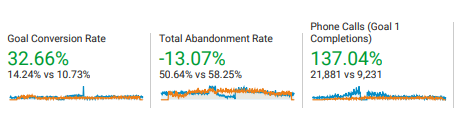
My team's efforts translated into 137% additional phone calls over 12 months .
Changing the headline in Google Optimize doubled the conversion rate
One of marketing professionals' most effective conversion rate and most commonly explored techniques is experimenting with the headline.
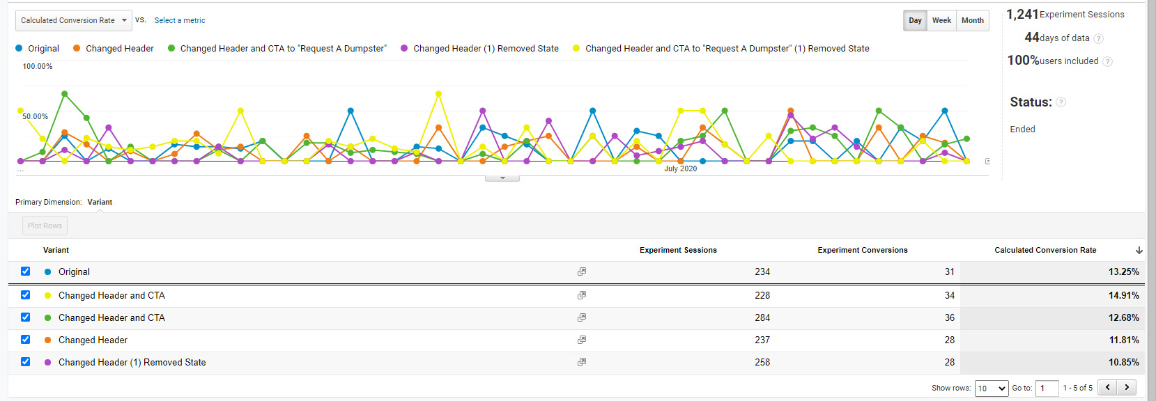
Imagine if I walked up to you and told you that I could double your phone calls simply by removing two words on your landing page.
That is what happened with our initial tests on the Las Vegas location page; those results were confirmed with the Kansas City location page tests.
- Simply removing "Roll off" from "Roll off Dumpster Rental" on the Las Vegas landing page doubled the conversion rate from 5.03% to 11.19%.
- Changing the Kansas City landing page's title increased the conversion rate to 11.01%, confirming the results.
- Google Optimize was 95% confident that the version with the shorter headline worked better than the version with the longer headline.
- Experimenting further, changing the CTAs increased the conversion rate to as high as 14.91%.
Another way to phrase it is if this test were performed 100 times, 95 out of 100 times, the shorter headline would work better.
Testing the buttons also helped

We found that changing the text on the buttons improved the conversion rate.
Call to actions (CTAs) are another commonly explored conversion rate optimization. The colors and placement of the CTAs are simple and effective optimizations.
One problem we addressed in this redesign was that the "request a call" buttons would lead a user to a page with a contact form where they could enter their email address, where a salesperson would follow up with their request.
- 'Callback' leads closed 10% of the time, whereas direct phone call leads closed 25% of the time.
- Therefore, simply making it easier to call in any way increased sales.
Instead of directing some users to a contact page, we ensured all the buttons had a "click to call" CTA.
This change increased both calls and revenue because instead of asking users to "request a call," we made it evident that they would be calling us instead.
A/B testing in Unbounce produced promising results
Unbounce is a cloud A/B testing tool. It allows you to conduct multivariate testing in the cloud. It's an excellent tool for PPC traffic because you can control which users visit your cloud pages and get a clear answer on the optimal design for your audience.
It's also great for complete design overhauls. Your client will often be thoroughly attached to their current site, so it helps to return to the team with a fully redesigned mockup with various testing controls and sound data.
This may be no surprise, but while testing designs in Unbounce, we found that users were likelier to make a phone call on a mobile-optimized site.
The above screenshot is from one of many tests we conducted. We reached an average 21.88% average PPC conversion rate while testing pages within Unbounce.
- Button colors: In Unbounce, we tested different button colors to see how they affected conversion rates. The most influential colors were blue and green, outperforming orange significantly. That was interesting because of the infamy of the Amazon orange.
- Trust elements: Trust elements can do a lot for conversion rates. In Google's groundbreaking whitepaper " How people decide what to buy lies in the ‘messy middle' of the purchase journey ," the researchers identify six consistencies in every buyer's journey. In the whitepaper, reviews, specifically star reviews, were the most influential factor they tested.
- Content length: Note how long the content is; interestingly, with the Unbounce tests, we discovered that totaL length did not matter. Instead, what mattered more was the button design, mobile friendliness, and the inclusion of trust elements in the above-the-fold content .
- Heuristics: A category heuristic might be like megapixels in a camera; in the case of dumpster rentals, it was dimensional and weight capacities. These elements are essential for comparison shoppers. Users like to see categorical information because it helps users make quicker purchasing decisions.
See the final Unbounce landing page design below. Note the differences in the above-the-fold content.

- Different logo
- Large buttons
- Different CTA
- Categorical heuristics
- Star reviews
Call quality also increased during the same timeframe because we negated irrelevant keywords .
The original PPC landing pages had an average conversion rate of 3.41%, whereas one Unbounce page had a conversion rate of 21.88%. That is a dramatic difference. Note that one Unbounce page still performed well without a mobile version! Suggesting that the changes worked.
We made the site mobile responsive
This seems like a no-brainer. And most of the time, mobile responsiveness is a priority. Yet, I've been at corporations without a mobile-optimized site in 2022!
Discount Dumpster had a mobile responsive site; it just needed work. What a user sees in that first moment on your site matters a lot. We ensured every viewport had some call to action. In addition, the website design was optimized for various viewports.
From the Unbounce tests, we determined that the most significant change we could make was to include a mobile-optimized version of the site. The mobile-optimized site performed at 21.88% versus the 11.92% conversion rate of the desktop-only Unbounce landing page. This made perfect sense because our conversion type was phone calls.
You can see a before and after of the mobile design changes.
- The original mobile menu took up more than a third of the viewport
- The original design had the "Request pricing" wording
- The title's font size was large in relation to the viewport
- Breadcrumbs were not visible
- The headline was much wordier
These minor changes influenced the probability that someone would make a phone call.
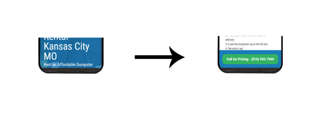
On mobile, we A/B tested a floating footer element to the bottom of the page with an easy-to-click button making it even easier for users to call us.
We re-did the whole site to meet Google's Core Web Vitals
After working on the mobile responsive design, the last change was optimizing the site's scripts to meet Google's UX Lighthouse scores .
I don't think many appreciate how difficult optimizing for speed can be. I've worked on many sites for many organizations and have seen countless roadblocks from internal and external stakeholders and doubts about the possible rewards of focusing on the user experience.
With today's audience increasingly online, shopping decisions are even more competitive. A bad user experience or a slow site could harm your business. The Core Web Vitals are here to stay; your company could suffer if it adapts too slowly.
- Mozilla saw 60 million more downloads each year by making its webpage 2.2 seconds faster.
- Amazon calculated that webpage load slowdown of just one second could price it $1.6 billion in revenue annually.
- Amazon observed a 1% increase in earnings for every 100 milliseconds (.1 seconds) of improved webpage speed.
- Walmart saw conversions increase by 2% for every 1-second decrease in load times.
- Bing discovered that a 2-second delay in page loading time led to a 1.8% drop-off in queries, a 3.75% reduction in clicks, a 4% reduction in satisfaction, and a 4.3% reduction in revenue per visitor.
- Shopzilla improved its site speed from 6 seconds to 1.2 seconds, which increased earnings by 12% and page views by 25%.
At one point, these scores were 100/100, and getting perfect Core Web Vitals took some creative problem-solving.
Generally, script optimization requires extensive knowledge and expertise. To top it all off, Google counts all scripts, even its own tracking scripts, against you.
Combining all we learned - before and after

The final design had a 26.06% nationwide average conversion rate when combined with Paid Ads
After implementing all the changes above on the live site, we followed Adwords optimizations that saved us 94% in PPC costs , such as keyword negatives and using single keyword adgroups.
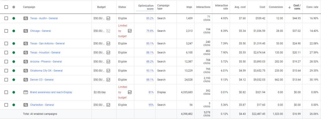
In Figure 7, you can see that the result was that we spent over $20,000 with an average 26.06% nationwide PPC conversion rate .
Note that we used a combination of hyper-targeted keywords with hyper-targeted landing pages.
With all that we've tested in this case study, to my surprise, in this case, the above-the-fold content mattered the most.
This makes sense, and many eCommerce pages are pretty dense in information but are organized in a way that doesn't look dense.
And that makes sense on a user level; some users will be ready to make a purchase and only need the essential elements to make an informed decision. But, at the same time, other users will need more detailed information to make an informed decision. An excellent landing page is catered to multiple buyer personas.
In this case study, I've walked you through the steps necessary to create a conversion rate-optimized website.
We increased the sitewide conversion rate with simple design changes and saw an average sitewide conversion rate of 14.24% from all traffic, paid, organic, and social.
We achieved an average 26% conversion rate when isolating for PPC traffic. Other metrics, such as a 137% increase in call volume, resulted from the combination of design changes, local SEO, and PPC spend.
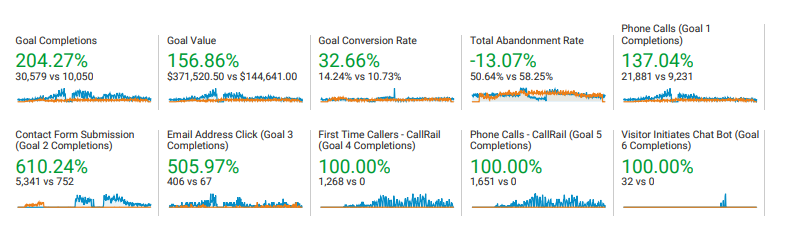
About the author
The results are surprising, Quality Score and Cost Per Click are more clearly correlated when you look at Exact Match keywords.
I love WordPress for its customizations. Styling code snippets enhances user perceptions. Copy and paste the code below to style your WordPress code blocks.
The code snippet plugin changed my life. I no longer edit the raw PHP files to add simple functions like titles to users' profiles.
By restructuring your account and using hyper-targeted ad text, CPA can be reduced.
YMYL stands for "Your Money or Your Life." Google uses YMYL to help understand if a web page's main content could impact people's safety, health, or financial well-being.
With slight modifications to Optinmonster's native A/B testing capabilities, it becomes an excellent CRO testing tool.
17 High-Converting Landing Page Examples to Inspire You in 2024

Table of contents

Enjoy reading this blog post written by our experts or partners.
If you want to see what Databox can do for you, click here .
Whether you’re running a Google Ad campaign or one on social media, the endgame is the same: redirecting prospects to your landing page. That puts immense pressure on the landing page’s design because it’s not only responsible for converting leads but also for shaping your marketing campaigns’ success.
But what does a high-converting landing page look like? And, more importantly, how can you create one for your company?
Google it, and you’ll drown in conflicting advice – keep it simple, pack in all the key information, and optimize landing page speed, but also add strong visuals.
To filter out the fluff, we’ll share 17 high-converting landing page examples and best practices sourced directly from 37 companies.
Here’s what we’ll be covering in this article:
How Landing Pages Impact Performance
What makes a landing page effective, 17 landing page examples from top companies for inspiration, track your landing page kpis with databox.
Landing pages are standalone web pages created with a specific purpose in mind. They are designed in a way to minimize distractions and give the right amount of information to prospects to convert – be that downloading an ebook or signing up for a free trial.
Hence, it’s no profound mystery that landing pages have a direct impact on the conversion rate .
With persuasive copy targeting user pain points, visual elements that give a sneak peek into your product, and strategically placed call-to-action buttons, you can witness a substantial surge in the conversion rate. In fact, many companies believe a good landing page conversion rate can lie anywhere between 21-50% .
Landing pages also influence how effective your ad campaigns are . They are mere extensions of your ad campaigns as they provide greater context to what is being advertised. Ads capture interest, while landing pages transform that initial attraction into engagement and, finally, conversions.
It goes without saying that a well-connected ad page and landing page is the key to success. A disconnected one will only result in a high landing page bounce rate .
Lastly, landing pages can impact more high-level business goals, like brand trust and credibility . A landing page that converts often includes strong social proof cues, like customer testimonials and trust badges.
With the number of companies providing similar offerings, the inclusion of social proof can be the difference between a prospect abandoning the incompleted buyer’s journey and sticking till the end for the final purchase.
The best-converting landing page is one that harmoniously blends different tactics.
This is not a baseless statement as most of the 37 companies we surveyed have implemented multiple strategies to create high-converting landing pages.
Now what are these effective strategies, you may ask?
- Optimized landing page speed
- Implemented clear and prominent CTAs
- Conducted A/B tests for different page elements
- Incorporated responsive design for mobile users
- Integrated customer testimonials or case studies
- Employed persuasive storytelling techniques in copywriting
- Utilized heatmaps or user behavior analytics

Now executing all of the above strategies on your landing pages might appear overwhelming. Particularly if you’re a smaller company with limited resources and expertise available.
Luckily, some strategies hold more weight than others. When asked about the most important factor that makes high-converting landing pages, our respondents chose:
- Clear calls to action – CTAs are designed to encourage action. A well-designed CTA that features clear instructions ends confusion and motivates leads to make the next move.
- Persuasive and informative copywriting – At the of the day, people are looking for solutions to their problems. The right copy conveys your value proposition, addresses pain points, and builds credibility.
- Engaging visuals or multimedia content – Strong visuals improve the user experience and enable prospects to view your product before having to purchase it.

Let’s move on to what you’re really here for – the best converting landing page examples that will inspire you to make your own.
We’ve sourced these landing page examples from the following companies. Each example also features an inside perspective as to why those pages have secured maximum conversions.
- Sylvane
- Serpple
- Evolo
- RecurPost
- Content Whale
- SEO PowerSuite
- Broadcast2World
- Candida Diet
- OSHA Outreach Courses
- The Expert Editor
- 2Stallions
- Groove Commerce
- MonsterInsights
- OptinMonster
PRO TIP: How to Analyze Your Landing Page Performance as a Whole
If you’re a digital marketer, you know the drill.
- Create and publish a compelling offer or a new website page.
- Build a campaign around it to get the word out.
- Analyze the data as it rolls in and make adjustments to improve performance.
If you’re like most marketing teams, you’re doing this multiple times on multiple pages and offers. So how can you assess your landing page engagement as a whole? By looking at Google Analytics 4 metrics and answering questions like:
- Which pages on my website generate the most pageviews?
- How long do visitors spend time on our website?
- How are our landing pages converting?
- What’s the overall bounce rate of our website?
You could certainly do this by digging through a variety of Google Analytics reports and dashboards, but wouldn’t it be nice to consolidate that information in one dashboard?
Now you can benefit from the experience of our Google Analytics 4 experts, who have put together a great Databox template showing all the most important KPIs for your landing page(s) performance.
It’s simple to implement and start using as a standalone dashboard or in marketing reports, and best of all, it’s free!
You can easily set it up in just a few clicks – no coding required.
To set up this dashboard, follow these 3 simple steps:
Step 1: Get the template
Step 2: Connect your Google Analytics 4 account with Databox.
Step 3: Watch your dashboard populate in seconds.
1. Sylvane

If you’re an eCommerce store offering an extensive array of products, this landing page example would be of interest to you. It has all the elements to convince the visitors to purchase.
Here’s what Meg Hellerstedt from Sylvane has to say about their high-converting landing page: “Our warehouse deals page is the most high-converting landing page on our e-commerce store. I attribute this success to three things:
- It starts with a compelling headline
- Has strong social proof
- Clear CTAs”
Hellerstedt further adds, “The headline ‘Save on open-box and returned items’ effectively entice customers to head to the landing page, then the testimonials and prominent CTA buttons help in sealing the deal. Emphasizing the markdown price is a great selling factor, too. Seeing the price slashed from $300 to $100 is always a trust sales tactic.”
Key takeaways from Sylvane’s landing page:
- Include (and reinforce) trust indicators. If you offer money-back guarantees or something similar, prominently feature it. Take inspiration from Sylvane as it highlights its money-back guarantee not only in the above-the-fold copy but also as an attractive badge.
- Add a touch of personalization. Writing copy like ‘Special Offers for You’ gives the impression of a personalized experience, which compels the visitor to engage and possibly, convert.
- Offer discounted prices. Showing before and after prices is a great way to engage your price-sensitive prospects. It’s also a great way to spread positive word-of-mouth.
2. Serpple

Who says you need to overdo the design to achieve remarkable landing page metrics ? A simple-designed web page with clear copy and a limited color palette can get the job done equally well.
But there’s another secret behind the high conversions that Serpple’s homepage brings.
Adam White from Serpple shares, “We do a ton of above-the-fold content AB testing on our homepage. The current iteration continues to beat out other more benefit-driven headlines. This actually was contrary to what we thought would happen but there is something about the message of ‘loving our rank tracking software’ that beats out the message of ‘getting more traffic and sales’ which we assumed would be a better-converting headline.”
Key takeaways from Serpple’s landing page:
- Test your landing page elements. Guessing games rarely work when looking to optimize your KPIs. What you think may work, might not, and vice versa, which is why you must test important elements, like headlines, calls to action, etc.
- Show your product straight away. Even if you offer a free trial or demo, you should include screenshots of your product as Serpple has done. Not only does this give a sneak peek into the functionality but enhances transparency.
- Include frequently asked questions. Most people have a dedicated page for their FAQs. But adding a few questions towards the page’s end (like Serpple has done) ends any ambiguity without having to consult the support team.
3. Evolo

Want to know how the above landing page gathered a conversion rate of 17.72% and an inverse bounce rate of 60%?
Kevin Larsen from Mediaveien , the website’s developer and ad campaign manager, spills the beans:
“What makes this landing page different from other landing pages on the same site, is product-market fit. It targets a specific user group that is very interested in this service, and the landing page’s quality is overall better than competitors’ landing pages.”
Key takeaways from Evolo’s landing page:
- Create different landing pages for different user groups. Gone are the days when your target audience was one homogenous group. Cater to different segments by addressing their pain points and giving them exclusive solutions.
- Give options to explore. Not everyone is ready to purchase – some like to do their due diligence before committing to a tool. Take inspiration from the above landing page example as it gives the option to book a demo and contact a customer service agent along with the ‘Try Now’ button.
- Keep the above-the-fold clutter-free. If the top section contains excessive copy and visual elements, the website visitor will struggle to decide where to look. Think of your core value proposition and make that the highlight of your landing page.

Belkins, a lead generation agency, has designed a great way to capture leads – a free and accessible ROI calculator. Not only is this a smart idea, but the landing page design and copy are aimed at showing value first and pushing a conversion later.
Michael Maximoff from the Belkins team shares, “Our ROI Calculator landing page is our highest-performing landing page, and 30% of our website conversions come from this page alone. The biggest factor and difference with this page compared to others is its interactive element — a fill-in ROI calculator tool created for different client personas with a clear CTA and follow-up system.”
Maximoff further adds, “We created this simple, data-driven tool for the sole purpose of driving conversions through our website landing page, which is ever-present on our site and promoted externally as well. Landing pages offering simple tools that help your leads get accustomed to your offer convert like crazy, and I’d highly suggest creating one if you have a cool idea and the resources to do so.”
Key takeaways from Belkins landing page:
- Add an interactive element. Games, carousels, and interactive infographics, among others, are great ways to encourage engagement and prolong the average time spent on page. The longer a person stays on your landing page, the greater the chances of them moving further on the buyer’s journey.
- Offer something of value. Providing a free valuable resource, like an ROI calculator, subject line checker, or PDF converter, helps to start the relationship on a positive note. And when your prospects are ready to purchase, your tool will be top of mind.
- Keep your landing pages short. Belikins’ landing page follows a no-BS approach and includes only essential information. Don’t cram everything on a single page – the last thing you want is to overwhelm the visitors.
5. RecurPost

Who says a blog post can’t be your top-converting landing page?
Debbie Moran from RecurPost shares the strategy behind using blogs as a medium to rake in conversions:
“This landing page effectively communicates steps for auto-tweeting on Twitter. It highlights how auto-tweeting can save time, streamline social media management, and enhance overall Twitter engagement. This page also features a user-friendly interface, providing step-by-step instructions and visuals on how to set up auto-tweeting, all of them helping the page rank on top on SERP.”
“Now Twitter being extremely popular and having a large user base, the landing page “How to Auto Tweet on Twitter” has specific messaging tailored to Twitter users, addressing their pain points and also demonstrating how RecurPost provides a unique solution compared to other social media scheduling tools. So this page becomes an all-in-one solution spot for all the user queries regarding Twitter automation, thus becoming the highest converting landing page on RecurPost.”
- Create product-led content. If you plan to use your blog as a conversion-driving force, remember to illustrate your product value throughout. Describe a problem, give a solution, and then present your company as the best solution provider.
- Keep the navigation bar limited. Landing pages are designed to minimize distractions, and RecurPost nails this by only adding pricing and features menu items. If you have to add menu items, make sure they help to aid the decision-making process.
- Strategically place calls to action throughout the landing page. Just because a piece of content is informative doesn’t mean you have to be skimpy with the CTAs. Use them to break large chunks of content – you never know when your visitor converts!
6. Content Whale

This landing page example from Content Whale proves how you can achieve a high conversion rate without having to add any visuals. What makes this landing page a success is that it includes all the essential information needed to make a confident decision.
Bhavik Sarkhedi from Content Whale shares more on this strategy, “They want to see samples; the page has it. They want to see FAQs for miscellaneous things; the page has it. They want a contact form; it has the same. Best storytelling copywriting; well, it does have that too.”
Key takeaways from Content Whale’s landing page:
- Discover user concerns and address them. Talk to your customers and note the bottlenecks that impact their decisions – is price a concern or, perhaps, security? Address these concerns to eliminate doubts in decision-making.
- Add a variety of call-to-action buttons. Don’t just link to your demo or pricing page, but instead, link to all complimentary pages. Content Whale links to their price calculator and sample pages, along with a contact form – all-important for converting leads.
7. SEO PowerSuite

In the tough SEO software industry, this landing page from SEO PowerSuite emerges as a standout example. The landing page showcases a clean design with a limited color palette, key features complemented with product screenshots, and attention-grabbing CTA buttons.
Aleh Barysevich from SEO PowerSuite attributes the success of their high-converting landing page to two factors.
“First and foremost, the page offers a free tool, which is a major draw. It’s not about just collecting contact details for a newsletter; it’s about providing real, useful SEO data at no cost. This aspect alone boosts our conversion rate significantly.”
“Then there’s the second factor – the sign-up form. This is where our experimentation really paid off. The version with the dark background is not just a design choice; it’s a strategic one. It catches the eye immediately, drawing users in as soon as they land on the page.”
Barysevich continues, “Adding the G2 rating icon to the form further improved our conversion rate. This small addition has a big impact, lending credibility and building trust. This combination of offering something valuable for free and a well-crafted sign-up form is what really makes this landing page effective.”
Key takeaways from SEO PowerSuite’s landing page:
- Add social proof in the above-the-fold section. Most people won’t scroll down the landing page if they’re not impressed with the initial view. Adding social proof in the above-the-fold section is a great way to add credibility instantly.
- Use colors strategically. Don’t use colors without a purpose. Like SEO PowerSuite, use the striking colors from your palette to highlight your calls to action.
- Make your headline short and clear. The headline should share your value proposition but write it in a digestible manner. It should state the value straight away (free in this case) and shouldn’t be unnecessarily long.
8. Broadcast2World

Probably the most well-designed landing page example from our list, Broadcast2World is a treat to the eyes. But the design isn’t the only reason this landing page has generated high conversions.
Sunny Arora from Broadcast2World shares the secret, “We introduced 2 step landing pages last year, where basically we take basic information from the user like work email and video objective on the first page with a compelling offer and clear CTA. And then, on the next page, step 2, we ask for more detailed information. This basic technique increased our conversion rate by 5X in a few months of implementation.”
Key takeaways from Broadcast2World’s landing page:
- Don’t push your leads away. You don’t ever want to ask for too much information that you scare your prospects away. Capture initial interest and then focus your efforts on converting it – even if it means breaking your landing page campaign into two parts.
- Focus on the overall visitor experience. This landing page example offers an immersive experience that is consistent from the top to the bottom. The design is consistent and cohesive and creates the impression of dealing with a legitimate firm. Points to note!
9. Candida Diet

This landing page brings in 70% of conversions for Candida Diet’s website. It might look like a simple blog article but Lisa Richards from their team shares why it’s such a success.
“This is the content our TA is searching for in order to understand their candida symptoms, and our long-form content piece, including what to eat and what to avoid, directly aligns with their search intent. We’ve included an insightful infographic to help them digest the information easier while making it memorable. We’ve also embedded simple sign-up forms within the content to make it easier for them to sign up for our free treatment plan.”
Key takeaways from Candida Diet’s landing page:
- Appeal to different types of prospects. There are two types of people; visual learners and readers. This landing page example appeals to both because it is a long-form article but also includes an infographic that acts as a summary.
- Create valuable and helpful content. The focus should be on providing value, be it through a step-by-step guide or a free backlink checker. It’s easier for visitors to trust websites that have their interests in mind.
- Encourage two-way communication. By opening the comment section, Candida Diet has enabled visitors to connect with them. This creates a positive impression for other visitors because it increases trust and humanizes your brand.
10. OSHA Outreach Courses

This landing page example from OSHA Outreach Courses is deceptively impactful. It’s a short, simply designed web page that has garnered an impressive conversion rate.
Farhan Siraj from their team shares why, “This landing page has a high conversion rate because it clearly mentions the discount we provide on multiple enrollments in our eLearning platform. Customers across industries actively seek discounts, and when a website dedicates a special page to it, search engines tend to rank that page higher. This results in increased traffic and improved conversion chances.”
Siraj further adds, “It’s also important to note that individuals searching for discounts are usually at the end of their buying journeys. They are highly likely to convert if they find what they are looking for. This page also enables customers to easily calculate the discounts they will receive in clear numbers, this sort of transparency and clarity is always effective.”
Key takeaways from OSHA Outreach Course’s landing page:
- Include trigger words. By using phrases like “discounted offers,” “most-in demand,” and “great discounted price,” OSHA Outreach Course has evoked impulsive reactions and as a result, immediate purchases. When used strategically, trigger words can do wonders for your conversion rate.
- Make the payment procedure simple. Wherever possible, reduce the steps it takes for a lead to purchase. In the above case, OSHA Outreach Course collects vital company details on the same landing page and then finishes the payment on another page.
11. The Expert Editor

Concise and precise – that’s how I’d describe this landing page example. It features limited copy, barely any visual elements, and a contact form with only two mandatory questions.
But Brendan Brown from The Expert Editor team credits the high conversions to another reason.
“I believe that the ‘Get Started’ page on The Expert Editor website stands out primarily due to its persuasive and informative copywriting. This approach has proven to be the most critical factor in its high conversion rate. The copy on this page is effectively crafted to not only inform potential clients about our services but also to persuade them of the value and benefits we offer.”
Key takeaways from The Expert Editor’s landing page:
- Follow a blended approach when writing copy. In Brendan’s words, keep the copywriting both informative and persuasive. Sharing information about your services combined with a few persuasive words here and there educates and motivates your leads.
- Highlight your privacy/confidentiality policy. When sharing confidential information, security is always a concern. It’s always better to highlight how this information will be stored and treated, instead of just hiding your policy in the landing page’s footer.
12. 2Stallions

If you’re looking to get more conversions for your gated content pieces, this high-converting case study landing page from 2Stallions is a good example to refer to.
What makes it so impactful is the clutter-free above-the-fold section that captures attention and then converts it to engagement in which the visitor signs up for the case study.
Geetha Boyani from 2Stallions Digital Marketing Agency shares why they’ve bagged a consistent conversion rate with this landing page:
“The landing page is designed to be concise and easy to navigate, ensuring users won’t be overwhelmed by excessive information. The form utilizes standard questions, making it simple and straightforward to complete. This landing page has consistently maintained a conversion rate of 3-5% for over a year, demonstrating its effectiveness in capturing leads.”
Key takeaways from 2Stallions landing page:
- Write an attention-grabbing headline and subheadline. The first step in increasing conversions is capturing interest. A bold headline with a well-crafted subheading (when executed well) does the job best.
- Highlight your achievements. Don’t shy away from bragging about your industry awards/achievements. They add instant credibility and position your brand as a market leader.
- Reinforce your calls to action. In a single-scroll landing page, 2Stallions included the Download CTA button three times. Repeating the CTAs helps to reinforce the action you want the prospect to take.

Solomon Thimothy from Clickx attributes the success of their high-converting landing page to several different factors. Let’s have a look at which factors worked in the company’s favor.
“This landing page is packed with testimonials. That’s the biggest differentiator, hands down. However, other elements like engaging and aesthetically pleasing visuals, persuasive copy, fast loading speed, and mobile friendliness are also very important. Without these other elements, people would not be able to see that precious social proof that we’ve collected over the years. So it’s always a combination of factors.”
Key takeaways from Clickx’s landing page:
- Highlight your founder/team members. When you add a picture of your team/founder front and center, it instantly humanizes your brand and helps to build that crucial trust.
- Include video testimonials. Surely trust budges and written reviews are important, but they can’t exceed the impact of video testimonials. When your clients express genuine enthusiasm about the positive impact your service has made, and wholeheartedly recommend you, you’ll undoubtedly attract a multitude of leads.
- Add a powerful claim. When you make a bold promise, it makes the prospect curious to the extent they explore more of your services and feel compelled to test that claim.
14. Groove Commerce

Getting conversions on gated content pieces is difficult for many, but not for Groove Commerce . Spencer Flaherty from their team shares the reason behind the landing page’s success:
“Famous advertising executive David Ogilvy once said that ‘Headlines Are Worth 90% of the Advertising Dollar.’ If your offer, such as a gated piece of content, isn’t converting then the first place to check is your headline. What makes this landing page particularly high-converting is that the information covered inside of the eBook is highly valuable to eCommerce retailers evaluating a platform switch.”
Key takeaways from Groove Commerce’s landing page:
- Strategize thoroughly before you create. eBooks are not the easiest and quickest to create. Hence, it is important that you carefully choose the topic before you put in that commitment. Which topics, you may ask? Any profound customer pain points that drive them to find solutions.
- Give an inside sneak peek. Gated pieces can be a hit-and-miss – you never know if they’ll be worth sharing your private details. To communicate the value, give a brief description of what to expect in the eBook, just like Groove Commerce has done.
- Show related content pieces. It’s always good practice to share related content. If your readers enjoyed the first piece, they’ll explore the ones being recommended to them. This translates to more time spent on the website, which boosts the probability of conversions.
15. PRM

If you have to explore one landing page example from our list, let it be this one.
Everything from this landing page screams premium and exclusivity. Its top section is a video that shows the latest collection while the remaining page displays the elaborate items grouped into similar categories.
Regarding the conversions this page generates, Kamil Bajołek from PRM says, “The landing page stands out for its clear focus on high-end brands and limited collections, which is a key differentiator from other landing pages. This focus is evident in the way the page is structured and the content it highlights.”
“One of the main features that make this page unique is its emphasis on exclusive offers and limited-time promotions, such as the prominent “BLACK FRIDAY UP TO -70%!” deal. This creates a sense of urgency and exclusivity, encouraging visitors to take advantage of these offers while they last.”
Bajołek continues, “Another notable aspect is the user-friendly design of the page. The layout is clean and easy to navigate, with clear categories like clothing, footwear, and accessories, making it simple for users to find what they’re looking for. The use of high-quality images and the option to view more details about each product further enriches the user experience.”
Key takeaways from PRM’s landing page:
- Include urgency-creating elements. When you create urgency, either through the design or the copy, you increase the chances of impulsive purchases. For a retail business, this is a sure-shot way of boosting conversions.
- Highlight your top perks. If you offer benefits like free delivery or 24-hour shipping like PRM does, make sure it’s not hidden away in a large passage of content. Instead, it should be made prominent, so it grabs the attention of interested buyers.
16. MonsterInsights

One look at this page and you’ll know for sure why it brings in high conversions. This landing page is focused on one thing only and that is to persuade users to upgrade.
Syed Balkhi from MonsterInsights shares their strategy for driving conversions from this landing page:
“This is an upgrade offer to the Pro plan landing page which aims at our existing users of the Plus version. The page includes a clear CTA that it is a one-time offer, which urges users to take action. Besides, it includes (1) the comparison of the original vs. discounted price, reminding users that it’s a huge and limited-time deal, and (2) a progress bar showing 90% completed, making it sound simple and easy to upgrade. All those factors combined make it an irresistible deal.”
Key takeaways from the MonsterInsights landing page:
- Add a progress bar. There is something about progress bars and not leaving them incomplete. Adding them is a strategic move that plays with human psychology and compels the user to convert in hopes of meeting that 100%.
- Feature all your trust badges. Trust indicators on pricing and upgrade landing pages are a must because they show that the website isn’t a scam and that the potential buyer can make the purchase without having any second thoughts.
17. OptinMonster

The last landing page example on our list is from the popular lead generation tool, OptinMonster .
Thomas Griffin from their team shares the reasons behind the high conversion rate of this landing page:
“We go beyond the basics of landing page design to craft compelling content that converts. Our landing pages guide prospects effortlessly toward the desired action, using clear page sections, visually highlighted benefits, and persuasive social proof. And of course, we don’t forget to place call-to-action buttons throughout the page to ensure no lead is left behind.”
Key takeaways from OptinMonster’s landing page:
- Focus on the visual layout. When you provide a tool with an elaborate list of features, mentioning them all can appear overwhelming. To make it more digestible, rely on the layout style of your landing page to break the content flow and give each section its deserving attention.
- Add a CTA to the sticky header. For longer landing pages, like the one above, add a sticky/fixed header that reinforces your value proposition and features a call to action. This is to ensure the visitor doesn’t get consumed on the page to the extent they forget what they were initially looking for.
I’m positive you now must have several strategies in your arsenal after going through the above high-converting landing page examples.
But the job isn’t complete after executing the strategies – you must also timely track the landing page conversion rate along with other metrics to ensure you’re on the path toward success.
Just like there’s a better way to design landing pages for high conversions, there’s a more efficient way to monitor key metrics.
While many marketers turn to Google Analytics for insights, this approach has its drawbacks. Applying different filters for performance comparisons can result in errors, and the manual process of extracting data into spreadsheets for reporting is a permanent headache.
Enter Databox – a better and stress-free way to monitor and report on landing page KPIs
Connect Google Analytics as a data source (along with 100+ integrations) and display important metrics in visual dashboards like this website engagement one . There are 200+ dashboard templates to choose from and you can use the drag-and-drop editor to customize the layout.
If you prefer a more hands-on approach, you can also create these dashboards from scratch and personalize them with your brand elements. Sharing these dashboards with the management is a piece of cake as well!
We’ve just touched the tip of the iceberg when it comes to exploring Databox’s features. Sign up for a free account to witness how you can use Databox to skyrocket the performance of your landing pages.
Do you want an All-in-One Analytics Platform?
Hey, we’re Databox. Our mission is to help businesses save time and grow faster. Click here to see our platform in action.
- Databox Benchmarks
- Future Value Calculator
- ROI Calculator
- Return On Ads Calculator
- Percentage Growth Rate Calculator
- Report Automation
- Client Reporting
- What is a KPI?
- Google Sheets KPIs
- Sales Analysis Report
- Shopify Reports
- Data Analysis Report
- Google Sheets Dashboard
- Best Dashboard Examples
- Analysing Data
- Marketing Agency KPIs
- Automate Agency Google Ads Report
- Marketing Research Report
- Social Media Dashboard Examples
- Ecom Dashboard Examples

Does Your Performance Stack Up?
Are you maximizing your business potential? Stop guessing and start comparing with companies like yours.

A Message From Our CEO
At Databox, we’re obsessed with helping companies more easily monitor, analyze, and report their results. Whether it’s the resources we put into building and maintaining integrations with 100+ popular marketing tools, enabling customizability of charts, dashboards, and reports, or building functionality to make analysis, benchmarking, and forecasting easier, we’re constantly trying to find ways to help our customers save time and deliver better results.
Masooma is a freelance writer for SaaS and a lover to-do lists. When she's not writing, she usually has her head buried in a business book or fantasy novel.
Get practical strategies that drive consistent growth
The Benefits of Hiring a Fractional Chief Marketing Officer (fCMO): Perspectives of Agencies, Buyers, and fCMOs

Google My Business SEO: 8 Tips to Optimize Your Business for Local Searches
The 23 best keyword tracking tools (according to 107 seos).

Build your first dashboard in 5 minutes or less
Latest from our blog
- New in Databox: Analyze the Performance of Any Metric or KPI with Metric Insights April 22, 2024
- The Benefits of Hiring a Fractional Chief Marketing Officer (fCMO): Perspectives of Agencies, Buyers, and fCMOs April 18, 2024
- Metrics & KPIs
- vs. Tableau
- vs. Looker Studio
- vs. Klipfolio
- vs. Power BI
- vs. Whatagraph
- vs. AgencyAnalytics
- Product & Engineering
- Inside Databox
- Terms of Service
- Privacy Policy
- Talent Resources
- We're Hiring!
- Help Center
- API Documentation
Case Study: Good.co. Landing Page Design

Creating a website or an application, people usually have different and sometimes numerous goals. Some of them in case of conversion give real or virtual money, some provide signups and others persuade your target customer to decide on a free trial. In all cases, nobody starts the venture without any thoughts about what they want to get: money, popularity, pitch for self-expression, power, and so on and so forth. Therefore, in all cases the producers and advertisers of any web and mobile product sell something, although the payment can go far beyond users’ money, concentrating on some other feedback and response. That is why, actually, analyzing the efficiency of a website or mobile app we talk about conversions rather than purchases.
Taking into account fresh trends of the online sphere of communication and trade, it is easy to say that landing pages are growing their popularity fast and steadily. The reason is simple. Potential users of your product are surrounded by a huge deal of informational sources, so that’s really easy to get lost in them. That’s why so many efforts are made to create a strong web presence for any product having a good reputation. Among those efforts, you will find not only each and every step of improving the product itself but also plenty of work to create brand awareness and efficient marketing. And, considering stats and research in this sphere, a landing page can also become a good way to strengthen the product.
The essence of a landing page
Landing page in its basic wide meaning is the term that is used for analytics to describe any page where the user started his or her journey around your site. However, today the other, more specific meaning is used much more often to define a landing page. Behind this term, people understand the special web page created for the presentation of the specific product, service, features, or options so that the visitor could get the necessary information quickly and easily not being distracted by other options. That is why the analysts say landing page is in most cases much more efficient than the home page . The home page can have too many options and getting through all of them to find a particular product the user can be distracted from making the decision, lose interest, or even get annoyed.
Well, it is easy to imagine with a little metaphor. Imagine, you are going to visit, let’s say, New York, to walk around Manhattan. That is the dream of your life. And finally, you find the service which offers to take you to New York City fast and cheap. Great, isn’t it? You pack your bag, you charge your camera, you get up full of admiration as the dream of your life is going to get real. And then you are taken by these amazing people who offered you the realization of your dream to the very starting point of New York City. And they leave you there to find Manhattan or any other place you want by yourself. How do you like it now? Who knows, perhaps you will be not so happy after an exhausting journey around the huge city looking for the place you want. Wouldn’t it feel great to be taken right to the destination, fresh and ready to admire and absorb positive emotions? Wouldn’t you as a customer be happier to reach your goal faster and easier? Sure, yes.
And that is what landing page does. When a person obtains the information from the outer source about the specific product, feature, information or service and clicks through the link to its provider, sure, he or she doesn’t dream to spend a lot of time looking for desired product or page among all the links and information provided on your homepage. The user wants to “land” at that very place which will make possible for him or her to get what they want as fast as possible and getting enough (but not too much) information to support their decision-making process. So, as practice proves, creating a well-thought-out landing page is a really vital thing to strengthen your marketing and increase conversion rates.
As this topic is quite actual today, we have decided to create a new piece for our case study set. This time it will be about the process of creating a landing page by one of Tubik Studio designers Ludmila Shevchenko.

UI/UX designer for Tubik Ludmila Shevchenko
Redesign of a landing page for a self-discovery platform Good.co.
Adobe Photoshop, Adobe Illustrator, Adobe After Effects.
Good.co is actually the company which, using psychometric and psychological analysis and having broad experience in the sphere of employment and HR, helps people to identify their professional style so that they could fit with their existing and potential employers or teams as effectively as possible.
When the designer was assigned to the project, the company had already had the mobile application available both for iOS and Android. Moreover, it had had the landing page aa well, but the customers decided to renovate it in order to make it more attractive and appealing to potential users.
There were some preconditions from the customer to keep in mind: the customer wanted a landing page to include a specific slogan and specific mascots representing personal archetypes. These mascot images were originally created for the site much before and were promoted by the existing application so they shouldn’t have been anyhow changed. It is easy to think that when a designer is given such a supportive material like ready-made mascots it makes the process simpler and faster; however, these preconditions can sometimes make the job even more complicated and demanding as in this case the designer is limited in stylistic options has to create the general concept of the page corresponding with the given elements.
As usual, the designer started work with sketching, keeping in mind that the landing page needed to have three main parts: 1) The general idea of the application with the call-to-action element . Call to action was to encourage people to download the application from the AppStore or GooglePlay. 2) Testimonials 3) Description of the main features

The process of sketching the landing page
As you can see, the designer and the customer agreed upon the efficient scheme of a landing page. The first part mentioned had to capture the user’s attention, convey the general idea of the application, create positive feelings about the products and show the possibilities for the potential action, as this part features the buttons clicking through which the user can instantly download the application. Therefore, the first part of the page in the area seen before scrolling down the page had to be quite informative, but not too much, catchy, and focused on the conversion goal.
The second part of the page was also very important to include. Testimonials are a widely known and highly efficient way of conveying social acceptance and approval of the product, so the landing page is the perfect place for them. The essential thing to do in this part was to make them distinctive from the other content, again catchy and easy to read.
The third part of the page included extended information for those users who got interested in the features of the product before they click through to downloading option. This part included more detailed information about the product and its benefits.
One of the important traits of an efficient landing page is that all the copy needs to look harmonic, clear, and readable. So one more thing to analyze for the designer was fonts and typefaces.
So, after sketching the variants and discussing them with the customer, the designer brought out the first version of the pre-scrolled part of the page designed in general flat stylistic with a relatively neutral color scheme including some bright details. The testimonials were offered to slide onto the screen one after the other.

The first version of the pre-scroll area with a neutral color palette
The customer liked the general concept and layout of the first part of the page but wanted some alterations with the color scheme to make it brighter and catchier. Working out this wish the designer developed the other version.

The second version using a brighter color scheme
So the designer worked out the versions of the full page, which featured all the changes the customer wanted to see. Finally, after close collaboration with the customer and providing constant updates in the process, she created two variants of the landing page. Comparing them, it is easy to see that the variants have the same general concept and color palette, but they are different in the layout, especially in the parts of testimonials and the product description. The first variant presented a more funny and joyful version while the second one was a bit more formal and business-like.
So, let’s look at the first variant.

The first version of the full landing page
The first version, shown above, had big lettering for slogan working as a headline of the page and the subheading revealing the main benefit of the product. It also included logo, links to social networks, links to the pages describing some features of the product in detail, and the image reinforcing the whole stylistic decision. The image included original archetypes used in the application and featured the screen of a mobile device so that to immediately convey the understanding that the product is a mobile application. Also, this part of the page included call-to-action elements which were brightly-colored buttons enabling a user to download the application from the source convenient for them. The second part included testimonials looking like speech bubbles with a light background that was made them easy-to-read on the general colorful background of the whole part. The third part in this version featured the mobile device with the other screen in the center and the descriptions of the benefits were placed around it being strengthened with the icons. All the parts had colorful backgrounds.
Now let’s see what is different in the second variant of the landing page.

The second version of the full landing page
The second version was also following flat stylistics. The headline letters were made smaller, although not losing their readability. The image of a mobile device with a profile screen was also featured, but the archetypes were taken out of the strict limits and grouped around the device providing rather big and distinctive images. Call-to-action buttons this time were not colored in the other color and featured only shapes of the buttons to make them look more business-like. The part with testimonials was made simpler, with no specific details and provided colorful blocks with the copy and the avatar of the person or company providing the testimonial. The third part also had a different layout as the image of a mobile device was moved to the left side of the page and the rest of the page provided the blocks of descriptions copy. This part had a light background and was reinforced with the colorful icons originally created by the designer so that they could support the message.
The second variant was accepted by the customer as the final one. It was more business-like and provided a high attention ratio. Then the designer also added some more catchy elements to the first pre-scrolled area. This part was provided with interface animation of the archetype images animated while hoovered.
This work showed the importance of each and every detail while designing a landing page. This job goes far beyond the limits of pure art because it includes deep analysis so that all the elements were meaningful, informative, and guiding users to the achievement of their goals.
More Design Case Studies
If you are interested to see more practical case studies with creative flows for UI/UX design, here is the set of them.
Watering Tracker. Mobile UI Design for Home Needs
Big City Guide. Landing Page Design
Vinny’s Bakery. UI Design for E-Commerce
Health Care App. UI for Doctors
Slumber. Mobile UI Design for Healthy Sleeping
Kubrick Life. Educational Biography Website
Designer AI. Dashboard and Graphics for Fashion Service
Pazi. UX and UI Design for Vehicle Safety Mobile App
CashMetrics. UX Design for Finance Management Service
Originally written for Tubik Blog
Want to get emails about new posts?
Check your inbox or spam folder to confirm your subscription.
IMAGES
VIDEO
COMMENTS
To close this deep dive into some of the most powerful case study landing page designs available on the internet, I'm now picking something more in tune with a "typical" success story. ... Similar to HubSpot's case study design, Kiflo (a Partner Relationship Management software suite) highlights the main benefits provided by their product at ...
A landing page is much more than just a digital business card; it's a tool that captures the essence of a professional's skills and their services. It is the first interaction that sets the tone and a carefully crafted entry point designed to engage, inform, and lead visitors to take action. This case study goes into the process of crafting ...
Landing Page Redesign. For my redesign, I wanted to draw attention to Coco Canary's practices that inspire inclusion, support social justice, and promote equality. I wanted the information and copy to be front and center to the user, supported by maximized use of white space and the use of amorphous shapes in calm, welcoming colors.
2. Build credibility. In case studies, designers often include the name of the business, client, or project they've worked on, building credibility by providing real-world examples of their past work. You can even add testimonials and reviews to highlight positive feedback directly from those you've worked with. 3.
Published in. UX Planet. ·. 9 min read. ·. Jun 14, 2021. 1. 📌In this case study, I'm going to articulate my process of redesigning a landing page of the BimaPe website. I will share my process, design decisions, and logic behind the decisions.
Extremely simple landing page. I'm not sure what the "85% of my hottest business hacks" is about, but the text under the CTA and the testimonial help clarify the page's purpose. 6. The Copy Cure. The Copy Cure's landing page. Again, a very simple landing page with a video that further describes the free training.
As you review these practical LPO examples—and see how companies used Hotjar's tools to up their landing page game— take note of which strategies and tactics you can implement on your landing pages to replicate their results. 1. How ClickMechanic used heatmaps for cost-effective redesigns. When UK-based marketplace ClickMechanic decided ...
Introduction. In this case study, we will delve into a landing page redesign project that I undertook as part of the highly competitive UI/UX design contest organized by Zuno. With a limited time of just 48 hours, this project challenged my abilities and pushed me to showcase my skills under pressure. Through this case study, we will explore ...
Most important elements of a successful landing page: 2. Explain how you value it (Subtitle) 3. Give a picture for them to see (Hero image) 4. Make them believe (Social proof) 5. Make the next ...
Here I'll talk about how I re-designed my own landing page. First, let's take a look at version 1.0 of SAAS and how I designed it, and what made me re-design it. Version 1.0. Reflections. Wireframing and visual design are two separate and equally essential parts of the process that can't be blended into one another. Do more and more ...
UI Design Case Study: Colony. Landing Page for Collaboration Platform. A sufficient landing page plays a vital role in a successful web marketing campaign. It presents a specific product or service so that the visitor could find the needed information quickly and without distractions. The effective landing page draws potential customers ...
5 Great Case Study Landing Page Examples To Inspire You. Case Study Landing Page Examples: With the ever-growing digital marketing competitions, you need to find effective ways to design your web page. This will not only help you get traffic to your page, but it will also help retain people who visit the page and even make it easy for them to undertake actions as you direct.
Take inventory. The next steps might be to take inventory of the elements that need to go onto the page. This is the work of figuring out the Information Architecture of the screen. It might take the form of a user flow diagram with boxes and arrows to illustrate what leads where. It might take the form of an outline.
It has to follow the points mentioned in the previous section (points in the most important elements of a successful landing page part). It has to use common landing page design elements such as the 3-feature-section and testimonials. It has to be in line with the latest design trends on Dribbble (e.g. bold typography, use of subtle shadows ...
Case Study: Good.Co. UI Design for Landing Page. The case study from Tubik Studio on UI/UX design of landing page. Analysis of the page fuctions and practical case featuring different stages of the process. Creating a website or an application, people usually have different and sometimes numerous goals. Some of them in case of conversion give ...
Since one of EverWeb's target audiences is the older generation, I conducted some research on the best practices in digital design for seniors. The key takeaways are as follows: Use clear navigation structure, larger UI design elements, a lot of whitespace, and choose distinctive colors. Focus on real-life application to get the audience ...
In this case study, Llama Lead Gen takes pride in showcasing the successful redesign of landing pages for three distinct SaaS platforms. By leveraging our UI/UX design expertise, we aimed to create engaging and persuasive landing pages for Parchment.com, a Higher Education SaaS Platform, and CreatorIQ.com and TribeDynamics.com, two Influencer ...
In this case study, we were tasked with finding the optimal design for a business with hundreds of local landing pages. Solution summary After extensive A/B testing and design iterations, we arrived at an optimal design that, once implemented, improved sitewide conversion rates, including all blog pages and location pages, from 5.03%> to 10.73% ...
Case Study — First peek into a japanese restaurant. The aim of this project is to create a landing page for a Japanese restaurant. This project was done as part of the 10kdesigners course. The main goal was to create a landing page for a Japanese restaurant called "Shirataki Noodle Company". The landing page should be able to give the ...
Nov 8, 2016. 1. Our task was to design a landing page for a web development company whose aim was to promote WooCommerce development services to ecommerce owners. The main goal of the landing page ...
17. OptinMonster. The last landing page example on our list is from the popular lead generation tool, OptinMonster . Thomas Griffin from their team shares the reasons behind the high conversion rate of this landing page: "We go beyond the basics of landing page design to craft compelling content that converts.
Case study: Designing a landing page for a yoga studio. Landing pages are created for a specific business purpose like to get more users, increase sales of your product. Landing pages are the best way to promote your product or service. I came up with a fictional company named Serenity.
👨🏻🎨 Design Language. To decide upon the design language for this project I thoroughly assessed Avani Rai's artwork so as to capture its essence and project the same through the landing page as well. I observed that a majority of her artwork involved black-and-white photography and the use of the concept of minimalism. I have used ...
More Design Case Studies. If you are interested to see more practical case studies with creative flows for UI/UX design, here is the set of them. Watering Tracker. Mobile UI Design for Home Needs. Big City Guide. Landing Page Design. Vinny's Bakery. UI Design for E-Commerce. Health Care App. UI for Doctors. Slumber. Mobile UI Design for ...