Learn More About:
- Customer Acquisition
- Optimization
- Customer Experience
- Data & Analytics


How (And When) To Use a Sticky Add to Cart Button For Improved User Experience
We've tried and tested how to use a sticky add to cart button for more conversions and a better user experience.

Brands want to make it as easy as possible for customers to shop on their mobile devices. Browsing through products on a tiny screen can be frustrating, not to mention it can be time-consuming to scroll all the way back to the top of a page just to add a product to the cart.
Enter the sticky add to cart button.
This fun-sounding feature provides a simple solution for ecommerce brands wanting to convert more sales on mobile. We’ve tried and tested it with a number of brands to bring you this comprehensive guide to the sticky add to cart button.
What is a sticky add to cart button?
The sticky add to cart button is a design element ecommerce brands use to keep the add to cart button visible on a mobile screen while customers are browsing. It can hover near the top or the bottom of the screen to give shoppers the chance to tap it wherever they are on the page.
While sticky add to cart buttons can increase conversions on desktop sites, we’re diving deep into the mobile version for the purpose of this piece. This is because sticky add to cart buttons are particularly useful on smaller screens where it’s easy to lose the add to cart button.

Hand sanitizer brand Touchland implements a sticky add to cart bar on its mobile site but not on the desktop version.

Sticky add to cart buttons can include:
- Simple, action-focused copy (i.e. “add to cart”)
- Branded colors
- The name of the product
- An image of the product
The importance of mobile conversion optimization for ecommerce brands
79% of smartphone users purchased a product through their mobile device in the last six months of 2021. An increasing number of shoppers are turning to their handheld devices to browse products on the go, but to turn window shoppers into real customers, store owners have to make it easy to purchase.
In the past, shoppers happily browsed products on their mobile devices but would turn to their desktops when they wanted to make a purchase. This is changing as an increasing number of ecommerce brands implement mobile-friendly features on their site. To stand out and enjoy the lion’s share of sales, brands need to optimize the mobile version of their sites and make it as easy as possible for customers to purchase mid-browse.
Sticky add to cart buttons provide an effective solution since they are a consistent reminder that shoppers can make a purchase directly from their mobile. This ultimately improves the customer experience to increase sales.
Should you use a sticky add to cart button?
You should always start your conversion optimization program with quantitative and qualitative research. This will lead you to data-backed testing ideas, rather than just assumptions and intuition.
A few things you can try before determining whether a sticky add to cart test would show a lift in conversions on your site.
- User testing: Ask users that fit your target customer profile to browse your mobile site and provide their feedback. Identify pain points and consider if a sticky add to cart button might solve them.
- Heat and scroll mapping: Use a heatmap tool to see where users are dropping off on your product page. If there’s a high drop-off, a sticky add to cart may help encourage users to scroll further.
- Analytics: Data is your friend when it comes to any kind of A/B testing. Maybe you already have a sticky add to cart button, but if lots of people are clicking, yet aren’t proceeding with the sale, you know there’s a different point of friction further through the checkout process that’s increasing cart abandonment.
One particular client of ours increased their conversions by over 4% simply by making their add to cart button sticky.
The plant-based food brand used product pages that featured robust content about their product benefits – giving users a lot of valuable information but requiring a lot of scrolling. This meant if users did engage with that product page content, they didn’t have an easy way to return to the top.
We implemented a sticky add to cart button on product pages to increase the visibility of purchasing actions and increase engagement on the page.

The test included a control and a variant. The control version didn’t include a sticky add to cart button, but the variant displayed a different sticky add to cart button depending on the action a shopper was taking:
- Scroll down: Showed sticky add to cart button in a contrasting color
- Scroll up: Showed sticky add to cart button and the menu
If a shopper hadn’t selected a size, the sticky add to cart button included the product name, star rating, and review count. If they had chosen a size, the button included all of the above plus the product price.
The variant produced a 4.09% lift over the control version. Based on the lift in per session value, we estimate that implementing the winning variation would produce noticeable revenue gains for the online store.
5 elements to consider when creating a sticky add to cart button
Sticky add to cart buttons have the potential to pump up your conversion rates – but, like any design element, there’s a knack to getting them right. Ultimately, what works for one brand might not work for another and vice versa, so we highly recommend performing user testing and also A/B testing your sticky add to cart buttons to find one that performs well.
Before you get stuck in one scenario, consider these important elements:
- The device: Will you be implementing a sticky add to cart on mobile, desktop, or both? The design of your button should vary depending on the device (we highly recommend a sticky add to cart for your mobile site)
- Customer intent: What do shoppers want to do on the product page? Is there content they might want to read rather than be greeted with a very obvious “buy now” button?
- Button text: What information do shoppers need to know before they add a product to their cart? Can you add it to the sticky button? We recommend including some persuasive elements like review count and star ratings, but don’t cram your button with information
- Where it’s shown: Does it activate on scroll up or scroll down? If you have a robust navigation, you’ll want to make sure it’s not taking up too much valuable screen real estate if you already have other sticky navigational elements. Additionally, what portion of the page should users see a sticky add to cart? We like to show it after they’ve already scrolled past a certain amount of content – for example past the buy box area.
- Other checkout elements: Sticky add to cart buttons can bolster other checkout elements – we added the shipping time near a sticky add to cart button for our client Wheelership which worked really well for them
There are a number of sticky cart Shopify apps in the Shopify store that let you create and customize a floating bar for your site or use one of the existing templates.
Enjoying this article?
Subscribe to our newsletter, Good Question, to get insights like this sent straight to your inbox every week.
How to test sticky add to cart buttons
Sticky add to cart buttons are very flexible. There are a ton of tools and apps you can use to quickly implement one on your site but, to ensure the most success, you should A/B test your buttons.
Start with a control version that doesn’t include a sticky add to cart button and create a variant or variants that include different elements. Here are some of the elements you can change and experiment with during the testing phase:
- Colors: Test different colors, including neutral colors and colors that contrast with your brand
- Copy: Play around with the text on your buttons
- Elements: Experiment with including persuasive content like star ratings, review count, price, and a product photo
- Incentives: Try adding an incentive, like free shipping, or entice shoppers with an upsell
You can also change the button to match the shopper’s intent. For example, with the client we mentioned above, we implemented a different colored button with different text when a shopper was scrolling up and down the page. We also changed the copy on the button to include the price if the customer had already selected a size.
Let’s take a look at a sample sticky add to cart A/B test with two different variants.
- Control: No sticky add to cart
- Variant #1: Sticky add to cart in the same color as the website header that includes the product name and price
- Variant #2: Sticky add to cart in the same color as the website header that doesn’t include the product name and price
If variant #1 outperforms variant #2, you can run another test with an additional set of variants:
- Variant #2: Sticky add to cart in a contrasting color that includes the product name and price
Again, if variant #1 outperforms variant #2 you can assume that shoppers prefer a branded add to cart button. However, you can continue to test the copy and what elements are included until you find a variant that outperforms all other variants.
8 examples of sticky add to cart button designs from mobile ecommerce sites
Ecommerce sites are quickly wising up to the conversion gains of sticky add to cart buttons. We’ve put together a list of some of the top brands that are implementing these features in their own unique way.
1. Gymshark
Gymshark changes the copy depending on where the shopper is located. For UK customers, the call to action says “add to bag” and for US shoppers it says “add to cart”.

Skims’ sticky add to cart button is more of a banner that runs the full length of the page. It’s branded to fit in seamlessly with the rest of the site.

3. Bailey Nelson
Eyewear brand Bailey Nelson features its checkout button at the top of the page. The copy includes the name of the product, the color, and the price.

4. Holland Cooper
Holland Cooper has a much larger sticky bar than most sites and it only appears when a customer has scrolled almost all the way to the bottom of the page. The banner encourages shoppers to “make a selection” and the copy includes the name of the product, the color, and the price.

5. Lazy Oaf
Lazy Oaf’s stick buy button blends in perfectly with the monochrome color scheme of the site. It’s strategically placed above another sticky button that asks shoppers if they want 10% off.

6. Ruggable
Ruggable’s quick buy button is a banner at the bottom of the page. It’s in a bright yellow color that’s in contrast to the site’s more neutral blue branding.

Caraway’s popup add to cart button allows shoppers to select the color of their chosen product from a dropdown menu wherever they are on the page.

8. Greetabl
Greetabl actually uses its sticky add to cart button to promote an upsell when a customer already has an item in their cart. Shoppers have the option to “add bonus” or “skip bonus”.

Increase conversions with a sticky add to cart button
Convenience is key for mobile shopping. Customers should be able to add items to their cart without having to scroll all the way back up the page. Sticky add to cart buttons make this possible, improving the user experience and providing ample opportunity for shoppers to convert. Start by testing different variants to find one that works best for your brand and continue to tweak and test until you’re experiencing the desired conversion rates.
If you haven’t already, test out a sticky add to cart on your mobile site. And, if you’d like a helping hand, consider a Conversion Growth Assessment™ for customized, actionable recommendations for your brand.
Interested in learning the laws of optimization?
Opting In To Optimization is a set of principles that will help digital leaders capitalize on unprecedented market demand and build sustainable, thriving businesses.
About the Author
Maggie paveza.
Maggie Paveza is a CRO Strategist at The Good. She has over five years of experience in UX research and Human-Computer Interaction, and acts as an expert on the team in the area of user research.
- Work With Us
- A/B Test Database
Sticky Add to Cart Button Example: Actual AB Test Results
In our work with dozens of ecommerce companies over the last 5 years, we’ve noticed that the design and UX of the add to cart section (buy buttons, options, quantity controls) is debated a lot.
- Should you make the add to cart button sticky?
- Should we make the entire section sticky?
- Should we hide some selections (size, color, flavor) or show all?
- Should we show all sizes as buttons or shove them in a dropdown?
- In what order should we present the different options?
This case study is about the first question.
In this article, we present results from a couple AB tests where we tested having the entire add to cart area be sticky versus not sticky on desktop devices for an ecommerce site in the supplement space.
The variation with the sticky add to cart button, which stayed fixed on the right side of the page as the user scrolls showed 7.9% more completed orders with 99% statistical significance. For ecommerce brands doing $10,000,000 and more in revenue from their desktop product page traffic, a 7.9% increase in orders would be worth $790,000 per year in extra revenue.
But, not all instances of making add to cart controls sticky have increased conversion rate, as we share below.
In our experience, sticky add to cart areas on desktop product pages are less common than on mobile, so this result suggests many ecommerce brands, marketing teams, and store owners may benefit from AB testing sticky add to cart buttons or entire add to cart areas being sticky on their product detail pages.
In general, this type of test is squarely in the “Usability” purpose of our Purpose Framework .

Usability tests are changes to UX, and typically what most people think of when they hear “AB testing”. But generally, they aren’t where you get consistent, long term increases in conversion rate, because most modern ecommerce websites already have good enough UX. Instead, we suggest: (1) tracking and plotting which purposes you’re testing more often and which are winning and (2) being more intentional about deciding which purposes are likely to move the needle for your customers and systematically focusing on them it.

We explain more in our Purpose Framework article linked to above for those that are curious. You can also see all ecommerce A/B tests we’ve ever done, organized by purpose, in our live database.
Note: If you’d like to run AB tests like this to help increase your ecommerce site’s conversion rate or improve user experience, you can learn about working with our ecommerce CRO agency here .
Building a Data Driven Culture: AB Tests Can Help Settle Endless Debates

The conference room: Where the sticky add to cart button is likely debated non-stop with little useful progress is made.
When you read about AB tests online, most articles have a nice predictable pattern: (a) We had a great hypothesis. (b) we tested it (c) it worked and got a conversion lift!
But when you do enough AB testing (we run hundreds of AB tests on ecommerce sites every year, which we transparently catalog here ), you come to learn that most tests don’t end up so neat and clean .
So instead, we urge you to think of an alternative, but also valuable use case of AB testing:
Run a test to learn about your customers even when you could make arguments for either variation being “better” and there isn’t consensus on which one is “obviously going to win” (a phrase we often hear clients use).
Let’s use this article’s example to learn why this “ab tests for learning” use case is so useful: For this sticky add to cart button example, in the traditional design process, people in the company would debate in a conference room (or by email, or in Slack), about having a sticky vs. non-sticky add to cart area on their product page.
They’d go in circles fighting with each other about which is better, which is more on brand, which competitors do something similar, and on and on.
Then, either the higher ranking person wins or an executive steps in and gives their official decision like Caesar at the Colosseum (even though 99% of the time the executive is not a UX expert).
But in reality, neither side knows which will do better. Both arguments are legitimate. And the one important contingent that does not have a seat at the table is the customer . An AB test lets your customers give their input.
And, finally, whichever variation “wins” is important but not as important as the learnings about how your customer thinks , what they prefer, and what is more persuasive to them, all of which you could learn by simply running a test.
So, with all this on our minds, we ran this test.
The Variations: Fixed vs. Sticky Add to Cart Buttons
The variations were simple. One of them (A), the buy box was not sticky and in the other (B) it was sticky. ( Aside: Read why we anonymize clients here . )

In this case, the client’s product page had a sticky buy box (variation B) to begin with, and it hadn’t yet been tested. The reason we decided to test this was because there was a content-focused culture around the brand, so we felt it was important to learn how much users want to be left alone to read content versus having a more in your face request to buy following them down the page.
One can make a theoretical argument for both variations:
- Argument for variation A (not sticky) : You don’t want the site to act like a pushy salesperson, hovering over your shoulder when you’re just trying to read about the product and its benefits. It will turn people off.
- Argument for variation B (sticky): People can read about the product just fine, and reminding them of the ability to add to cart will increase the percentage of people that do so.
This is why, by the way, we use The Question Mentality and base A/B tests on a series of questions instead of old fashioned hypotheses where someone pretends they know what the outcome will be “Sticky is better! Trust me!”.
In this test there are really just two main questions to answer:
- Does making the add to cart area sticky affect add to cart rates?
- Does it affect conversion rate too? In other words if people add to cart more, do they actually check out more?
Results: Sticky Add to Cart Button Gets More Orders by 8%
In this test, the sticky add to cart variation showed 7.9% more orders from the product pages with 99% significance. The sticky version also showed an 8.6% increase in add to carts with 99%+ significance. The test ran for 14 days and recorded approximately 2,000 conversions (orders) per variation.
Referencing the arguments for either side above, this test gave the marketing department and us valuable information about the customer (and saved a potentially conversion hurting future change of undoing the sticky add to cart area).
Despite this brand’s heavy focus on content, despite the customers’ needs to read a lot about product uses, benefits, ingredients, and more, having an ever-present add to cart area seemed to be okay with the customer. It did not annoy the customers, and in fact seems to increase the percentage of them that decided purchase. This is a useful learning, despite this test largely being in the usability category, not desirability .
(Note: This is true of this store, it may not be true of yours. Hence we always suggest at the end of case studies that you should “consider testing” this. We don’t say you should just “do” this.)
This learning can actually be extended beyond the product pages to content pages such as blog posts where we can test being more aggressive with product links and placements to see if similar results can be achieved there.
This is why we love using AB testing for learning .
Update: Sticky Add to Cart Button on Mobile Product Pages Also Increased Conversion Rate
Since first writing this case study, we tested multiple UX treatments for a sticky add to cart button on the mobile PDP of this exact same supplement ecommerce store. The smaller screen real estate on mobile devices, of course, means finding CTAs like the add to cart button can be more difficult, so making the add to cart button sticky could improve user experience.
We tested three variations: (A) No sticky add to cart button (B) Sticky add to cart button that simply scrolls the user to the add to cart area on the product page (C) Sticky add to cart button that causes the add to cart area to slide up from the bottom of the page like a hidden drawer.

We observed a 5.2% increase in orders for variation C where the add to cart area slides up like a drawer, with 98% statistical significance. This test ran for 14 days and had over 3,000 conversion events (orders) per variation (so over 9,000 conversion events total).
Add to cart clicks increased by a whopping 11.8% on variation C (>99% statistical significance) and by 6% on variation B. So actual use of the button was substantially increased by making the add to cart button sticky on the mobile PDP.
Variation B — where clicking on the sticky add to cart button simply scrolls users to the add to cart area on the PDP — on the other hand showed no statistically significant difference in conversion rate from the original. As per an insightful reader comment below, this discrepancy between variation C showing a clear lift and variation B showing no difference could be explained by:
- The slide up “drawer” of add to cart functionality (choosing a flavor, quantity, etc.)in variation C may have kept users focused on that step because it feels like you’re in a new “sub-page” of sorts instead of just scrolling to another part of the PDP.
- Also that means on the PDP itself there was no space taken up by add to cart functionality in variation C like choosing flavors so users got to see more persuasive “content” about the product on the PDP.
This suggests that similar conversion gains can be realized on mobile product pages, but the details of how to implement them and the UI/UX that will cause a conversion increase are important. Questions? Let’s discuss in the comments.
If you have questions about whether your store should test sticky add to cart functionality, how to execute it (e.g. Shopify plugins vs. manual coding), or about working with us, you can ask us in the comments, send us an email , or learn about working with us .
Or join our email newsletter to get our latest articles and AB tests.
Our Foundational Ecommerce CRO Articles
- Our Purpose Framework
- Our Question Mentality
- Our live database of all A/B tests we’ve ever done
- Our collection of ecommerce UX breakdown videos
Other Single A/B Test Case Studies
- Mobile users don’t like the hamburger menu, results from testing our Link Bar
- Case study of upsell and cross sell placement AB tests
- Does promoting free shipping increase conversion rate? AB test results.
Maxime Biais
Hello Devesh,
Thanks for this article, very useful. Really like the content of this website also. Regarding the test you ran on mobile, what was the performance of version B at the end? Did version C perform better than B? Would you have any advice regarding the behavior once you click on the sticky add to cart?
Thanks Maxime
Devesh Khanal
Great question. Both VB did not show a statistically significant lift over the original, only VC did. But the difference between VB and VC was more than just having a price next to the add to cart button in VC. In VB, clicking on the sticky add to cart button scrolled the user up to the add to cart area of the page. Whereas, in VC, clicking the add to cart button revealed add to cart details that slide up from the bottom of the mobile screen. We think this is the key to why VC won:
– The slide up “drawer” of add to cart functionality (choosing a flavor, quantity, etc.) may have kept users focused on that step because it feels like you’re in a new “sub-page” of sorts instead of just scrolling to another part of the PDP. – Also that means on the PDP itself there was no space taken up by add to cart functionality like choosing flavors so users got to see more “content” about the product on the PDP.
This is a great question and I’ve updated the post to reflect this discussion.
Really helpful Devesh, thanks a lot for your answer.
We actually want to test with format of version C (name, price and CTA). The question we are asking ourselves also is when the sticky should appear on the pdp. We have 2 options: – sticky shows up as soon as you land on the page => Does it make sense to present it before visitor sees color and size selection? Distracting or not for the visitor? – sticky shows up when you scroll down and pass the current call to action => less intrusive but might miss some add to cart…
Guess the only way to find out is to test ? If you have an advice, happy to hear it!
Thank you very much for this article. I am new on your site and getting familiarized with the work you do. As a suggestion, I would consider changing the colour scheme that you use for selecting the best performance Versions in your graphics. Using red to select your top performer Versions is confusing as it leads readers to think black is best, red is worst; whereas in reality, when reading your blog post and comments, it’s really the other way around! Maybe something to AB test 🙂
This is a good point. 🙂
Leave a Reply
Cancel Reply
Copyright 2024 GrowthRock

DEV Community
Posted on Jan 22
Implementing an E-Commerce "Add to Cart" Feature in React: A Step-by-Step Guide
Introduction The world of e-commerce has witnessed a tremendous surge in recent years, and building a seamless shopping experience is crucial for the success of any online store. One of the fundamental features in any e-commerce application is the "Add to Cart" functionality, allowing users to easily select and store items they wish to purchase. In this blog, we will explore how to implement the "Add to Cart" feature using React, a popular JavaScript library for building user interfaces.
Prerequisites Before diving into the implementation, make sure you have Node.js and npm (Node Package Manager) installed on your machine. You can create a new React application using Create React App:
Now, let's start implementing the "Add to Cart" functionality.
Step 1: Set Up the Project Structure Organize your project by creating a dedicated folder structure. For simplicity, let's create a 'components' folder to store our React components.
Step 2: Create Product and Cart Components In Basket.js, create a list of products that users can add to their shopping cart:
assume you have a list of basketData like
AddToBasketList.js
Basketcard.js, basketitem.js, totalprice.js, context file cartcontext.js.
That's it. Congratulations! You've successfully implemented the "Add to Cart" functionality in a React application.
Happy coding!🚀
Top comments (0)
Templates let you quickly answer FAQs or store snippets for re-use.
Are you sure you want to hide this comment? It will become hidden in your post, but will still be visible via the comment's permalink .
Hide child comments as well
For further actions, you may consider blocking this person and/or reporting abuse

Unlocking the Power of Python: Why It's Your Ultimate Programming Partner
Naveen Kumar Dongre - May 5

Mastering Git: Branching and Merging – Part 2
Dipak Ahirav - May 5

Good parts for good business
Udayan Maurya - May 5

ERR_LOADER_CHAIN_INCOMPLETE
wander-cardoso - May 5

We're a place where coders share, stay up-to-date and grow their careers.
Amazon Shopping App UX Case Study - An In-Depth Evaluation

Welcome to this UX case study of Amazon’s mobile app.
Amazon is undoubtedly the leading online retailer in the US. Its rise to being a top household e-commerce brand is largely attributed to its high-converting website. Throughout the years, Amazon’s website has gone through multiple changes, and in 2011, it introduced its first mobile app.
Yet, is it equally superior in terms of user experience (UX)? Should you replicate Amazon’s mobile layout for your e-commerce app?
We’re afraid the answer is no. Amazon. In its bid to optimize for conversion, Amazon has sacrificed some basic UX principles that once made it the role model for other e-commerce software development. For example, the cluttered home screen is overwhelming for new buyers.
Amazon is doing great because it is in a dominant position. Buyers are already accustomed to Amazon’s layout and navigational flow. But try replicating Amazon’s layout on a new e-commerce brand, and you wouldn’t get the same results.
Today, UX is a crucial factor in attracting and retaining visitors. An e-commerce interface with a good UX can increase the conversion rate by up to 400%. Therefore, you’ll want to ensure that the right UI/UX design services will be provided for your e-commerce app.
In this article, we’ll take you through a step-by-step UX review of the Amazon shopping app.
In any UX design case study, it’s important to establish the objectives of doing so. Setting the objectives provides a clear direction on how you ought to approach the UX review.
For Amazon, the objective is to determine if new, unregistered users will have a smooth experience when shopping for products on its app. As mentioned above, existing buyers shopping on Amazon for years may not be impacted by the changes as they are gradually introduced on the app.
However, a new user who’s shopping on Amazon for the first time may find the home page overly-cluttered with hundreds of product images and intersected with sponsored listings. There’s also a lack of uniformity in how the various category pages are designed.
For example, the Baby category showcases the top brands, followed by a list of top products and subcategory selection. However, the Computers category features visually appealing images that let you navigate into different devices.
Amazon’s take of UX design is unlikely to be helpful for new e-commerce apps. Here’s the key point. Amazon is already an established brand that’s selling to largely existing users. A new e-commerce business needs to capture new customers, and good UX is crucial.
In this UX case study, we’ll identify pain points on the Amazon shopping app and figure out how they can be improved to provide a better user experience.

Preparation
Before commencing a UX case study, you’ll need to be well prepared for it. In this case, it means surveying competing retailers and checking out the experience of using their mobile apps. By comparing between a few competitors, you could identify similarities and differences between the apps.
In this UX review on Amazon, we turn to competitors like eBay and Alibaba. eBay serves more than 180 million users worldwide, while Alibaba is the largest online retailer in Asia. Both are successful e-commerce giants, and we wanted to know how they compare to Amazon in terms of shopping experience.
So, we downloaded the separate apps and tried them out as any regular customer will do. We noted down the process of browsing through the products, adding them to the cart, and the check-out process. The experience serves as a useful relative comparison in the Amazon UX study.
User Research
A user experience analysis is about determining if a product fulfills the needs of the users. Likewise, an analysis of Amazon’s UX design requires an understanding of its users. It’s important to establish the demographics of users made up of Amazon’s customer base and analyze their experience using the app.
Therefore, you’ll need to set sights on user research and not the other fancy features in the app. If the users are not happy with the app, they are unlikely to buy regardless of the creative efforts in it.
During the user research, we wanted to gain clarity for these questions.
- Who made up most of Amazon app users.?
- How do most users interact with the Amazon app?
- What are the possible pain points faced by the users?
- What’s their experience using competitor’s apps?
- How do the users make their purchasing decision?
- What are the factors that influence the user’s decisions?
In order to answer these questions, we create proto personas as it is the quickest way to envision probably users that are using the Amazon app. If you’re not familiar with proto personas, it is the process of establishing target users of a product based on the researchers’ assumption.

Proto-personas are created based on what we think the users are like. They are not based on statistics or studies, although validation can be carried out later on. Proto-personas is commonly used in user experience analysis.
Here are some proto personas that we’ve created for this study.
- A professional executive who likes to shop spontaneously. This shopper has little time to browse through different products and would like to make quick decisions from the available information.
- A tech-savvy individual who’s no stranger to using an online shopping platform. This shopper takes the time to research a product thoroughly before purchasing. This shopper leverages features on the app and is attentive to details.
- An online marketer on the lookout for the best deals and prefers online shopping to physical stores. Ideally, this shopper prefers quality products and wants to shop in a secure environment.
- A young shopper who’s only using the app for essential goods. This shopper takes time to compare products and is particularly interested in eco-friendly products. This shopper is annoyed by ads during online shopping.
Besides proto personas, we’ve also created customer journey maps for this case study. A customer journey map illustrates every possible point of interaction between the user and the app. It helps provide clarity in the overall customer experience and pinpoint areas with room for improvement.
.jpeg)
Customer journey mapping helps you to identify how different personas interact with the app. It acts as a benchmark between real user experience and their expectations. You can also leverage the customer journey map to introduce personalized features in future products.
.jpeg)
Pain Points
The next part in this UX case study identifies pain points faced by the proto personas when using the Amazon shopping app. To do so, we use a methodology named Heuristic evaluation.
Heuristic Evaluation is a usability testing evaluation system introduced by Jakob Nielsen in 1990. It enables evaluators to determine a product’s usability based on 10 UX principles known as ‘heuristics’.
Usually, a group of 3-5 evaluators is tasked to evaluate a product against the heuristics. This is because it’s more probable for different evaluators to identify more problematic areas than a single evaluator.
The evaluation starts by determining the numbers of heuristics to be used. Depending on the product, you can use all 10 of the heuristics or a smaller number. UX designers have found this evaluation method helpful in identifying UX issues before product release. It is equally valuable when reviewing an existing product’s usability.
Here are the pain points that we’ve uncovered with Heuristic Evaluation.
1. Visibility of System Status
Positive findings.
- Home page.
- The app informs users of potential delays prior to ordering.
- Product page and shopping list.
- Interaction, which helps to understand that the product has added the cart (cart animation + vibration).
- Select Location.
- The application determines the geolocation based on the phone number.
- Cart page.
- User sees the total number of ordered goods, not the number of goods types.
- Includes all the necessary info about the product.
Need To Be Improved
- Search & Result page.
- The number of search results is unclear.
- There are no number of pages in the pagination - no indication of how many flippable pages.
- Several categories of the output of search results confuse users; the user does not understand whether it has displayed all results and on what principle it works.
- Not all the text from the filters fits in the line, it is not possible to see the full text.
- The delivery price is not specified.
- Filters do not display selected options, confusing options change (price).
- Product page & Shopping list.
- Users see the product’s size, but it’s hard to understand which one she/he needs.
- There is a price range for the product, but not the exact price the user has to pay for the product.
- Users will only realize a product is not available only after choosing the color and size.
- There is a check box in the basket with a gift proposal on the cart page, but it isn’t clear which item will be selected as the gift.
.png)
2. Match between system and the real world
Need to be improved.
- Expected more specific filters on a category, on the sizes for example, but it seems like the filter is quite generic.
- Product page & Shopping list.
- Some products’ sizes are shown in numbers, but users may expect them to be shown in more familiar alphabets presented in a table.
3. User control and freedom
- Search & results page.
- User can choose the option that suits him/her from those that the system offers.
- Location selection.
- A prominent message prompting you to change the location if it is not correct.
- Users can't choose the price range that they need (can’t choose a price less than $30).
- Category filter - the user doesn't understand what to choose here.
- "Sport & outdoor" - the name of the filter does not match what can be filtered here.
- Can't get out of filters without applying them and there’s no exit button.
- Unable to locate ‘filter by size’.

4. Consistency and standards
- Clicking the "back" button brings it back to the previous page without closing the open filter. It should close down the filter on the first click, and return to the previous on the second.
- Strange to see sorting inside filters. This is usually a separate feature for that.
- The "& Up" filter for reviews is inconsistent with the regular practice.
- Select location.
- Despite a predetermined location at the beginning, the states reverted to default when placing an order.
- Inconsistency of displaying informationDetails, descriptions, and characteristics of the product are already under the recommendations and related products.
- Non-typical usage of a drop-down for choosing the number of units.
- If you click on the "Details" button, a page opens with back navigation, although there is a top-level back button.
- Quantity selection is implemented differently than on the product page.
- The checkout button is above the items in the cart, which is inconsistent with the outside world. Usually, people read from top to bottom.
- The price for products is shown above them.
- Order page.
- Quantity selection is implemented differently than on the product page and basket.
- Strange order of fields (Country -> name -> street -> city).
.png)
5. Error Prevention
- Search & results page.
- The system returns the right option despite errors when typing the product name in the search bar.
- No prompt for automatic street selection when filling the address (for non-US territories).
- The ‘delete’ button is not highlighted, making it easy to be accidentally clicked on.
- Can’t quickly return a deleted item to the cart.
6. Recognition rather than recall
- The search history is saved.
- Return Possibility Message.
- If you exit the screen and return, the fields will remain filled.
- The system detects a Ukrainian user but shows an American code when entering the default phone number.
- Shows default American fields in address although it has detected a Ukrainian user.
- No dropdown list with autocomplete address field.
7. Flexibility and efficiency of use
- Search & results page
- Search with hints after entering a pair of characters.
- There is a checkbox to "make the address default".
- Very long scrolling of the product page. It is difficult to navigate and search for the necessary information - to navigate to the characteristics and reviews.
- Why is there no social log in.
8. Aesthetic and minimalist design
- Instead of indicating the items are not delivered to a specific country, the system should hide those non-deliverable items from the customer's view.
- Many different font styles (color, size, thickness).
- Small text, not ideal for people with poor eyesight.
- Elements look like a random mess (different contours, fillets, thickness, size)—little space.
9. Help users recognize, diagnose, and recover from errors
- Shows an informational message that allows users to change the address and with accompanying warnings.
- Search results.
User Testing For Pain Points
At this point, we’ve got a list of pain points by evaluating the Amazon shopping app against the selected heuristics. However, they are merely opinions from our team, who are testing the app based on created proto personas.
We need to validate that the problems that we’ve encountered are posing real problems for users. Therefore, it’s important to carry out user testing for those pain points.
User testing provides an opportunity to understand the app from a different point of view. It reduces the risk of us being blindsided in certain areas during the evaluation.
To carry out user testing, we’ve prepared tasks that are to be assigned to 5 users that we’ve selected. The participants are asked to accomplish the tasks using the Amazon shopping app and record problems that occur.
.jpeg)
Here are the results that validated our earlier findings.
- Confused with the search results.
- Can’t add to favorites on the search results page.
- Irrelevant recommendations.
- Confused with purchase screen - need to verify the info multiple times.
- The product page is hard to navigate, has too much info, and is not structured.
- Too many ads.
- Hard to compare items. It takes too long to return to the search screen.
Hypothesis To Test
We’ve identified what’s wrong with the current Amazon shopping app. To complete this UX case study, we’ll need to put together the solutions we perceive to lead to a better user experience.
To do so, we’ve created a list of improvements for all the pain points that we’ve identified and added our thoughts to them. We aim to create a redesign of the app interface and confirm that our hypothesis on the pain points and solutions is correct.
There are, of course, too many pain points to implement in the redesign, and some could be very tedious to do so. To narrow them down, we utilize the impact/effort matrix and selected impactful changes that are easy to implement.
With the choices of changes decided, we moved on to redesigning the Amazon shopping app in the form of a prototype. We’re sticking with Amazon’s original fonts and colors as they represent the online retail’s brand identity.
Based on our hypothesis, the new prototype should result in an improved user experience. We created two different versions to gather better insights in testing.
Check out our redesign here.
.png)
Everything we’ve done in this Amazon UX review will lead to nothing if we’re not testing the prototype with real users. We need to be sure that we’ve uncovered the pain points with the existing app and that our recommendations in solving the problems resonate with real users.
Therefore, we decided to turn to a proven method to validate our assumptions -- usability testing. Again, we invited a few users with different age groups and professions and got them to accomplish a single task on the prototype. They are asked to buy a soccer glove on the prototype with UX fixes.
As the users execute the task, they are asked to note any problems and thoughts with the prototype. When the app review is completed, we consolidate the results by asking questions like:
- How was the experience?
- What was easy/hard to understand/interact in this prototype?
- Is there anything difficult to understand at first glance?
- Which version of the prototype do you prefer?
It’s essential to hold the post-testing interview in a one-on-one session. The participants are more likely to be more open with their thoughts when they can talk in comfort. You’ll also have a better opportunity to understand their mindset and behavior when shopping for an item with the prototype.
Ideally, you’ll want to collect as much data as possible during the prototype testing. This is true whether you’re doing a user experience analysis for a 3rd party product or working on your own app.
The data becomes clear guidance to making UX improvements when revising the app. It removes guesswork and assumption from UX design. As a result, you’ll have a more precise strategy in creating UX that appeals to end-users.
.png)
Amazon could do with a few UX lift-ups in its app, that is, if it intends to appeal to new users. As shown in this UX review, it doesn’t hurt to correct some of the glaring issues with the existing app. Users can get to their desired items with less hassle, leading to increased conversion.
While Amazon could get away with some UX bad practices, budding e-commerce stores will fare differently with the same blunders. It is vital to carry out usability testing to ensure that users have a smooth experience with the app.
Tell us about your idea. We will reach you out.
Add to Cart Case Study
A Top 100 Furniture Retailer has recently implemented Shoptelligence’s Interactive Ensembles technology. The platform takes a retailer’s basic product data and transforms it into shoppable, cross-category room assortments allowing shoppers to discover more of the retailer’s catalog.
Visitors on the Top 100 Furniture Retailer’s website who engage with the Interactive Ensembles module:
- Spend 20+ minutes longer on the site
- Return to the site 269% more than non-engaged visitors
- Have ~7x more additions to the cart
Download Add to Cart Case Study

STyle Finder Case Study
A Top 100 Retailer recently expanded their partnership with Shoptelligence to implement the STyle Finder module on their website alongside Room STylist. STyle Finder is

Maximizing Furniture Sales: 5 Strategies to Tackle Excess Inventory in 2023
The furniture industry in the United States is currently experiencing an oversupply of inventory. Many retailers are struggling to move excess stock in 2023. Retailers

Coaster Supply Insights Case Study
Coaster, a leading North American importer and distributor of fine furniture, has recently added Shoptelligence’s Supply Insights module to its website to improve demand forecasting

10 Strategies to Beat Email Fatigue with Personalization
Email is an essential tool for businesses to communicate with customers in the modern digital world, but the average person receives over 100 emails per

How Furniture Retailers Can Leverage Analog and Digital Tools to Attract New Customers
In 2020, Covid changed the way Americans live and work in their homes. During the pandemic, 76% of people made some kind of improvement to

The Importance of the In-Store Visit
The US furniture industry is a significant contributor to the domestic retail economy, with an estimated 2021 value of $115.6 billion. The average order value

Shoptelligence is an AI-powered design discovery platform that helps retailers increase revenue through creating engaging shopping experiences backed by powerful analytics. Create a seamless shopping experience with Shoptelligence.
Contact info
330 E. Liberty St.
Ann Arbor, MI 48104
(212) 328-1440
© 2022 Shoptelligence. All rights reserved.
- < Previous
Home > DRS Conference Proceedings > DRS Conferences > DRS2020 > Papers > Swipe, Scroll, Add-To-Cart: a ca...
DRS2020 Research Papers
Swipe, Scroll, Add-To-Cart: a case study of e-commerce gallery designs for small screen devices
Nicholas Vanderschantz , University of Waikato, New Zealand Nicole Sijnja , University of Waikato, New Zealand
Author ORCID Identifier
Nicholas Vanderschantz: https://orcid.org/0000-0002-7729-7936
With significant increase in mobile online shopping the design of user experiences that promote purchaser decisions and increase sales is highly desirable to retailers and their marketing and digital production companies. Surprisingly little investigation into the usability of product galleries is available to guide the design of product listing pages for e-commerce websites, especially those websites viewed on small screen devices. Our research takes a synergistic view of the design and usability literature and provides a visually guided case study of e-commerce websites on mobile devices. We offer initial guidance to designers based on the insights from a heuristic analysis of current design trends of e-commerce websites viewed on a mobile device.
e-commerce, Mobile web, Product Display, Gallery Design
https://doi.org/10.21606/drs.2020.158
Vanderschantz, N., and Sijnja, N. (2020) Swipe, Scroll, Add-To-Cart: a case study of e-commerce gallery designs for small screen devices, in Boess, S., Cheung, M. and Cain, R. (eds.), Synergy - DRS International Conference 2020 , 11-14 August, Held online. https://doi.org/10.21606/drs.2020.158
Creative Commons License

Since September 18, 2020
To view the content in your browser, please download Adobe Reader or, alternately, you may Download the file to your hard drive.
NOTE: The latest versions of Adobe Reader do not support viewing PDF files within Firefox on Mac OS and if you are using a modern (Intel) Mac, there is no official plugin for viewing PDF files within the browser window.
Advanced Search
- Notify me via email or RSS
- Collections
- - DRS Conferences
- - Nordes Conferences
- - IASDR Conferences
- - Learn X Design
- - Pluriversal Design
- - Doctoral Education
- - DRS 1971-1980
- - DRS Archive
- DRS conferences peer review policy
- Notifications
- Join the DRS
Home | About | My Account | Accessibility Statement | Privacy | Copyright | Contact Us

Ecommerce UX Boost: The Sticky Add to Cart Solution

- April 20, 2023
- by Sarah Stafford
- User-Experience
As an ecommerce business owner, you know that making the purchase process as effortless as possible for shoppers is vital to increasing sales and growing your business. From UX overhauls to implementing subtle microinteractions on your site , modern features go a long way in making shopping hassle-free by guiding customers on their next steps after each interaction. One solution that can significantly impact your store’s user experience is the sticky add to cart feature. Read on to learn more about the features and benefits that make this a small but mighty UX enhancement.
What is a Sticky Add to Cart Feature?
The sticky add to cart feature is a simple yet powerful functionality that keeps the “Add to Cart” button or bar visible on the screen as customers scroll through a product or category page.
This feature enables customers to add products to their cart without having to scroll back up to the top of the page, making the checkout process faster and more convenient.
Benefits of a Sticky Add to Cart Feature
A sticky add to cart feature provides several benefits for both your customers and your business, including:
- Improved User Experience: The sticky feature keeps the add to cart button in front of shoppers regardless of where they are in your store. This eliminates the frustration of having to scroll up and down the page to add items to their cart, leading to a smoother and more convenient shopping experience.
- Enhanced Mobile Experience : A sticky feature comes in handy for mobile users navigating an ecommerce store on a smaller screen. Shoppers can easily add products to their cart without struggling to find the add to cart button or needing to zoom in and out.
- Increased Average Order Value: This powerful feature creates a sense of urgency that encourages customers to add more items as they browse your store, leading to higher average tickets per customer and boosting sales and revenue for your business.
- Reduce Cart Abandonment : With the average ecommerce cart abandonment rate upwards of 70% , store owners must find creative ways to encourage shoppers to complete their purchases. With a clear call to action visible at all times, customers have an extra reminder to complete their purchase.
Is there a Native Functionality for the Sticky Add to Cart Feature for BigCommerce?
BigCommerce does not offer a native sticky add to cart functionality, but that doesn’t mean you can’t enjoy its benefits. Our team specializes in custom development for BigCommerce and can create a sticky add to cart feature tailored to your store’s needs.
By opting for a custom-developed feature, you’ll have greater control over the feature’s look and feel. You can optimize the button or bar’s color, size, and position, ensuring it fits your store’s design seamlessly.
Our team of BigCommerce Designers and Developers can help you implement the optimal design attributes for your online store for the most effective user experience.
Get a Sticky Add to Cart Button for Your BigCommerce Store
At IntuitSolutions, we’ve seen firsthand how prioritizing UX improvements can have a massive return on investment for online stores.
A sticky add to cart feature is a must-have for any online store looking to improve the shopping experience for its customers. It offers a range of benefits, from increased convenience to improved conversion rates, and can be customized to fit seamlessly into your store’s design.
Send us a message or call us at 866-901-4650 if you want to learn more about the sticky add to cart functionality or other custom solutions to improve shopper engagement.
Our BigDev Certified developers can take any idea for custom features and functionality and deliver an efficient, optimized solution on BigCommerce to help your ecommerce business engage shoppers and grow more sales.
Sarah Stafford
Related post.

Google Core Web Vitals: Understanding the Latest INP Update
Taking Skygeek.com to New Heights with Custom BigCommerce Development and Optimization

10 Ecommerce UX Best Practices for Boosting BigCommerce Conversions

Licensed Toy & Collectible Merchant Gets Custom BigCommerce Solutions Enhancing Subscriptions, Pre-Orders, Checkout, and More

Case Study: Custom Product Variant Table Optimizing Wholesale UX on BigCommerce

- Consumer Resource Center
Our Approach
- Events & News

What Does Value Mean To Your Consumer?
Add to cart: retail excellence on every aisle.

A large national retailer wanted to streamline its private label portfolio and ensure its offerings exceeded customer expectations. After consolidating and optimizing product lines, the client hoped to leverage marketing and product placement to create brand-aligned shopping experiences. To center retail journeys around its brand narrative and products, the grocery line needed to understand consumers’ priorities and mindsets.
Our integrated research approach allowed us to fuel understanding and direction throughout each project stage.
Branding consolidation and quality control:
- Our team conducted 100 studies, thoroughly evaluating the retailer's product lines and consumer liking.
- We launched Home Use Tests (HUTs) to uncover consumer product interactions in their own environments.
- Additional studies were administered within our Consumer Centers.
Consumer experience and path to purchase
- Leveraging eye-tracking technology, we provided 30-minute shop-a-longs with consumers across the client's retail network.
- We mapped out consumers' navigation through stores to track their retail journeys and highlight key trends and patterns.
- Our team then conducted in-depth interviews with the same participants, illuminating critical insight into consumers' shopping mindsets.
Phase 1 Insights
Phase 1’s extensive research revealed a data-backed strategy informing consumer-aligned product line consolidation.
Phase 2 Insights
In Phase 2, we provided heatmap, statistical, and video assets illuminating the areas of the store which are best suited for visibility and identified the messaging most effective for capturing consumer attention and inspiring action.
Our multi-phased partnership empowered a new era of brand awareness and consumer connection for the client, demonstrating the power of insights when applied to each stage of clients’ research journeys.
Our insights not only drove product excellence brand alignment but also highlighted opportunities to invite consumers into this updated narrative.
More Case Studies
- See all Case Studies
Browse Case Studies by Industry:
- Food & Beverage
- Durable Goods
- Personal Care
- Quick Serve Restaurants
111 Deer Lake Road, Suite 120 Deerfield, IL 60015
- All Locations
- Privacy Policy
- Atlanta (Johns Creek)
- Atlanta (Sandy Springs)
- San Francisco
- 2024 Curion LLC. All rights reserved.

- API Testing
- Load & Performance Testing
- QA Outsourcing
- Usability Testing
- Accessibility Testing
- UI/UX Testing
- Web Application Testing
- Selenium Automation Testing
- Appium Automation Testing
- Mobile Automation Testing
- CRM Testing
- VR & AR App Testing
- Game Testing
- AI & ML App Testing
- Blockchain Testing
- Chatbot Testing
- IoT Testing
- E-Commerce Testing
- Functional Testing
- Automation Testing
- ERP Testing
- Mobile Application Testing
- Security Testing
- Next-Gen Testing Service
How to Test for Ensuring a Flawless Online Shopping Checkout Experience
Software testing, recent posts.

Mastering the Fundamentals: A Breakdown of Different Testing Types in Software Development

Automated Test Solutions: The Future of Efficient and Scalable Testing

Outsource Software Testing & QA: Top Benefits for Increased Efficiency and Reduced Costs

Why Test Cases For Trading Application is the Right Way
.jpg)
QA Automation Testing Services: Your Guide to Streamlining the Process
Table of content, share this article, is this blog hitting the mark.
Key Points:
- A flawless checkout experience is crucial for online stores to avoid cart abandonment and increase conversions.
- Essential testing strategies include testing payment processors, order placement, shipping options, mobile responsiveness, and shopping cart functionality.
- Detailed test cases are provided for both the "Add-to-Cart" functionality and the checkout page UI.
- Advanced techniques for checkout experience optimization include UX testing, multivariate testing, performance testing, and cross-browser/device testing.
- By ensuring a smooth checkout process, businesses can delight their customers and boost revenue.
You’ve just discovered the ultimate shopping product that you have been searching through the Internet for days. Owning the product is just a few clicks away. You add the item to your shopping cart and checkout for payment.
But, Hey! You found that the payment process is messy, glitchy, and confusing. You give up on purchasing the item and close the tab, feeling disappointed and frustrated.
We all have been in this situation at some point while shopping online. Right?Well, wouldn’t it be awesome if someone had properly tested the application to make sure that you had gone through that purchase process successfully? Makes sense, isn’t it?
The worst nightmare of an entrepreneur running the business is a customer abandoning the purchase of their product. You understand that a seamless and secure checkout experience is the magic ingredient that transforms casual shoppers into loyal customers.
The checkout process is the grand finale of your online store, and it demands your utmost creativity and skill. In this blog, we’ll guide you through a journey of testing and optimization, revealing how to craft a flawless online shopping checkout experience that wows your customers.
We’ll explore the process, exposing the hidden traps and treasures that can make or break your sales.
So, buckle up and get ready to embark on this exhilarating journey of testing and refining. Together, let's uncover the key elements that pave the way to a flawless online shopping checkout experience. The world of e-commerce awaits your mastery.
Table of Content
Important testing strategies for a seamless online shopping checkout, test cases for “add-to-cart” functionality, test cases for “checkout” page ui, advanced techniques for testing and optimizing online shopping checkout experience, avoid checkout glitches and delight your online customers with qable as your testing partner.
Ensuring a seamless checkout experience for an online business is one of the key aspects of a successful product or service. Implementing effective strategies to provide a smooth and flawless experience is the ultimate gateway to success.
Below are some of the essential testing strategies for a seamless checkout experience: •
Testing Payment Processors and Gateways :
This is a No-Brainer strategy for an online shopping platform and is of paramount importance as well. Verifying the integration between the client website and the payment gateway for smooth transactions is the first step to providing that seamless experience to end users.
Conducting tests to ensure secure and error-free transactions with special attention to details with a variety of payment methods and currencies enhances the product's or service's usability and effectiveness.
Testing for Order Placement and Confirmation Process :
Testing the workflow from order placement, order confirmation, and order tracking ensures a smooth checkout experience. Additionally, the assurance of proper order placement, and accurate and timely order tracking helps to build customer trust and loyalty towards the product or service.
Examining Shipping and Delivery Options :
Shipping and delivery options are the lifelines of your online store, connecting your products with your customers. That’s why you must test them thoroughly and ensure they work flawlessly.
Check that the shipping methods are displayed clearly and that the costs are added up correctly. Try different situations such as local and global shipping, multiple items in a cart, and any special delivery requests.
Ensuring Seamless Integration with Shopping Carts :
Ensuring that the shopping cart of an application or product functions correctly is also an important strategy for testing.
Functionalities such as adding or removing products, updating the cart, and so on are to be adequately tested. Potential issues while updating the cart must also be closely examined. Additionally, cross-browser responsiveness and cross-device testing are important elements of a quality product.
Optimizing Mobile Checkout Experience :
In today’s smartphone-centric world, your mobile checkout experience is your competitive edge. Test rigorously on mobile devices to make sure that the checkout process is fully tailored for smaller screens, touch interfaces, and changing network conditions. Check that all form fields, buttons, and validation messages are clearly visible and working.
Implementing these important testing strategies helps in defining the proper business goals, identifying and resolving bottlenecks, and at the core, allowing for a seamless and frustration-free user experience leading to a higher conversion rate and reducing the churn rate.
Read More: Reducing the Churn Rate Through Quality Engineering
While we are on the subject of making the online shopping checkout experience flawless, the Add-To-Cart functionality in an E-Commerce application is expected to be the most important one in the entire application.
Afterall, this is the button that marks the journey for an online purchase. Right?So, why not go through the most important procedures or test cases for the Add-To-Cart button and make sure it works as expected?Let’s get straight to it then.
1. Test for “Add-To-Cart” Button:
- Pressing the “Add-To-Cart” button should add the chosen item to the shopping cart
- Check and Validate that the item-specifics (name, price, quantity) are spot-on in the cart list
2. Test for Adding Multiple Items to the Shopping Cart:
- Make sure that the application lets you add multiple items
- Check and Validate that the total count of items/products in the cart is correct
3. Test for Item Availability:
- Try adding the items that are sold out and check for the proper error message that shows or pops up
- Check if the stock items amount is less once the item is added to the cart
4. Test by Adding Items to the shopping cart with different variations or configurations:
- For the items/products with variations (e.g. color, size)
5. Test that the Wish list, Save for Later, or Mark Favorite options working correctly:
- Check and Validate that the added items can be added as a gift, wish list item, favorite item, etc with the Add-To-Cart function.
6. Test for the cart updation after Adding items with Add-To-Cart:
- Check that the cart icon displays the correct number of items added to it
- Validate the updation of the cart by changing the cart content
7. Test for Add-To-Cart functionality from different pages of the website/application:
- Check and validate that the items can be added to the cart from various pages of the website such as from “search results”, category pages, product detail pages, and so on.
8. Test for Cross-Browser and Cross-Device compatibility:
- Check and Validate the cart functionality for the most popular browsers such as Chrome, Firefox, Safari, etc.
- Check and Validate the compatibility of the Add-To-Cart functionality across different devices (mobile, tablet, desktop)
- Test for compatibility with popular Operating systems like Android, iOS, MacOS, Windows, Linux Distro, etc
9. Test for the Add-To-Cart functionality for responsiveness:
- Check that the Add-To-Cart button and related elements fit well and respond well across different screen sizes and orientations like portrait, landscape, etc
- Check the responsiveness while resizing the browser window or rotating the device.
10. Test the cart functionality with related features:
- Check that cart items are in sync with other features such as the wish list , saved items list or save for later list.
11. Test how session and user login affect the Add-To-Cart function:
- Test cart items as a guest user and check that the items remain added to the cart during the session.
- Test cart items as a registered user. Check and Validate that they are linked to the respective user's account.
12. Test for the Error-Handling with Add-To-Cart functions and related functions:
- Test and validate scenarios where the Add-To-Cart function fails (e.g., network issues, server errors) and check that proper error messages appear to the user.
13. Test undo and clear cart options:
- Check that the user can remove items from the cart one by one or clear the whole cart.
- Test the "undo" option to bring back accidentally removed items.
14. Test how it deals with large quantities:
- Test the Add-To-Cart functionality with a large number of items and check that the application handles it smoothly without performance issues or UI glitches.
15. Test it works with discount codes and promotions:
- Check that the Add-To-Cart functionality correctly applies any discounts or promotions linked to the chosen items.
16. Test for the functionality for proper tax addition or reduction, delivery charges, etc:
- Check and Validate that the Add-To-Cart functionality properly updates the cart with the logic of tax calculation and other charges associated with the item/items.
17. Test how it performs under high load:
- Simulate high concurrent user traffic and test the Add-To-Cart function to make sure it can handle the load without slowdowns or errors.
Well, it's good that we have a comprehensive suite of tests for the Add-To-Cart button while shopping on an e-commerce application. But what about the “ checkout ” page for your application?
Well, let’s explore and find out the test cases for the “checkout” page and its UI that ultimately determines your shopping experience’s satisfaction level.
1. Test the UI of the order summary:
- Test that the checkout page shows a precise summary of the added items, including their names, prices, quantities, and total amounts.
- Ensure that the order summary’s UI is eye-catching and easy to grasp.
2. Test the visibility of key elements:
- Make sure that important elements like shipping address, payment options, order total, and place order button are noticeable and handy.
- Check and validate that all required fields are clearly labeled and marked.
3. Test the responsiveness of the checkout page:
- Test and validate that the checkout page fits well to different screen sizes and orientations.
- Test the UI elements' alignment when resizing the browser window or rotating the device.
4. Test the alignment and spacing of elements:
- Ensure that all elements on the checkout page, including labels, input fields, buttons, and text, are aligned properly and have the required spacing according to the UI design of the application.
- Look for any overlapping or tightly spaced elements that may affect the user experience.
5. Test the styling and formatting of text, i.e. the UI Typography:
- Test and validate that the text on the checkout page is easy to read, properly formatted, and has suitable font styles, sizes, and colors.
- Look for any text truncation or text wrapping issues.
6. Test error messages and validation:
- Enter wrong or incomplete information in the checkout form and see if proper error messages show up.
- See if the error messages clearly explain the issue and provide guidance on how to fix it.
7. Test the UI of shipping methods at the checkout page:
- Ensure that the available shipping methods are shown clearly and provide enough information, such as estimated delivery time and cost.
8. Test the UI of checkout page options:
- Check that the available payment options are displayed clearly
- Test the selection and UI of different payment methods, such as credit card, debit card, UPI, or other third-party integrations.
9. Test the order review and edit function on the checkout page:
- Test and validate that the user can review and edit the order details, such as quantities, shipping address, or payment information, before going on to place the order on the checkout page UI.
- Test the update function to make sure that the changes are reflected correctly in the UI.
10. Test the UI of order confirmation details:
- After placing an order, ensure that the checkout page displays a clear confirmation message with the order number and relevant details.
- Test the visibility and accessibility of order confirmation emails or notifications.
11. Confirm the progress indicator:
- If the checkout process involves multiple steps, check that a progress indicator clearly shows the current step and the remaining steps.
- Test the navigation between steps to make sure smooth transitions and proper tracking of progress.
12. Test the UI of trust symbols and security information:
- Test that the checkout page shows trust symbols (e.g., SSL certificates, security badges) to reassure users about the safety of their information.
- Test the UI of security-related information, such as privacy policies or terms and conditions.
13. Test the checkout page integration with third-party services:
- If the checkout page involves working with external services or packages (e.g., address validation, tax calculation), check the proper UI and function of these integrations.
14. Test the checkout UI in different languages or locales:
- Make sure that the checkout page UI elements are properly displayed and localized when using different languages or locales.
- Test for text alignments and formats when switching between different language options.
15. Test the overall look and vibe of the checkout page:
- Assess the overall appearance and feel of the checkout page, considering factors such as color theme, visual order, and ease of use.
- Test the user flow from adding cart items to finishing the checkout process to make sure a smooth and flawless experience.
These test cases cover various aspects of the checkout page UI, ensuring an intuitive and user-friendly interface for a perfect online shopping experience.
Using the latest and the most advanced techniques ensures that your product performs seamlessly. At the same time, the flawlessness in checkout operation in an online purchase reflects the quality of the e-commerce product.
Using the cutting-edge techniques for product validation can be the differentiating factor in a highly competitive market. Going beyond basics and using more sophisticated methods can uncover insights that can lead to product experience enhancement and make the user experience a breeze.
Below are some of the advanced testing techniques that could really help your product shine:
User Experience (UX) Testing:

UX testing involves seeing the checkout process through the eyes of the end user. Run usability tests with real users, watching their interactions and gathering feedback.
This approach helps find pain points, usability issues, and areas of confusion. By understanding the user’s perspective, you can make specific improvements to the checkout flow, resulting in a more natural and user-friendly experience.
Multivariate Testing :

With multivariate testing, we can see the results or impacts by combining multiple variables at the same time. Create variations of checkout elements, such as form fields, button placements, or progress indicators, and test them together to find out the best combination.
This approach helps discover the most powerful combination of elements that lead to higher conversions and a smoother checkout process.
Performance Testing under Stress :

A performant system is the need of the hour even under heavy loads. Slowdowns and system crashes are not an option. That's why it's mandatory for the system to remain performant even under heavy loads.
Simulating scenarios for testing where a large number of users are transacting online and trying to complete purchases can help identify potential bottlenecks and optimize performance.
Read More: What is Performance Testing?
Cross-Browser and Cross-Device Testing :

Different browsers and devices may affect how your checkout process works. To make sure it runs smoothly on any platform, test it thoroughly on various combinations of web and mobile options. Popular browsers like Chrome, Firefox, and Safari are the most tested browsers.
Additionally, different screen sizes with different operating systems and varied refresh rates can determine the product's compatibility and responsiveness. This way, you can ensure that your customers have a reliable and consistent checkout experience, no matter what device they use to shop.
Localization Testing :

It's not uncommon to see online shopping platforms making their services available globally. Validating the checkout details such as the localized currencies, language, local payment options, merchants, gateways, and shipping methods should be tested properly to provide a seamless and gap-free checkout experience.
Don't let glitches, errors, or confusion ruin your checkout process and drive away your customers. Hire QAble, the leading software quality assurance and testing company in India that specializes in testing your checkout process for a flawless online shopping experience.
QAble offers:
- Cross-Browser and Cross-Device Testing
- Localization Testing
- User-Experience Testing
- Multivariate Testing
- Performance Testing
QAble’s Team of experts and certified Testers identify and fix any issues that may affect your customers' satisfaction and conversion. QAble also provides you with detailed reports and recommendations on how to optimize your checkout process for maximum performance and boost your revenue.
With QAble, you can rest assured that your checkout process is smooth, secure, and reliable. Contact QAble today and get a free quote for testing and optimizing your online store.
Discover More About QA Services
Delve deeper into the world of quality assurance (QA) services tailored to your industry needs. Have questions? We're here to listen and provide expert insights

Written by Nishil Patel
CEO & Founder
Nishil is a successful serial entrepreneur. He has more than a decade of experience in the software industry. He advocates for a culture of excellence in every software product.

Why is testing important for the online shopping checkout experience?
Testing is essential to ensure a flawless checkout experience as it helps identify and address any issues or bottlenecks in the process. By thoroughly testing the checkout flow, payment systems, and user interactions, businesses can enhance usability, reduce cart abandonment, and build trust with customers.
What are some common issues to look out for during checkout testing?
Common issues to watch for during checkout testing include payment gateway errors, slow load times, confusing form fields, validation errors, and discrepancies in shipping or billing information. By actively testing for these issues, businesses can proactively resolve them and provide a seamless checkout experience.
How can A/B testing contribute to optimizing the checkout experience?
A/B testing involves comparing different versions of the checkout process to determine which elements or variations lead to higher conversion rates. By conducting A/B tests on aspects like form design, button placement, or step-by-step flows, businesses can make data-driven decisions to optimize the checkout experience and maximize conversions.
What role does mobile testing play in ensuring a flawless checkout experience?
Mobile testing is crucial since a significant portion of online shopping occurs on mobile devices. Testing the checkout process on various mobile devices and screen sizes helps ensure responsiveness, smooth navigation, and functional form fields. Mobile testing allows businesses to provide a seamless experience for customers regardless of the device they use.
How can user feedback be incorporated into checkout testing?
User feedback is invaluable for improving the checkout experience. Implementing feedback mechanisms such as surveys, customer reviews, or user testing sessions can provide insights into pain points, usability issues, and areas that require improvement. By listening to and acting upon user feedback, businesses can continuously refine and optimize the checkout process based on real customer experiences.

Latest Blogs


We are the ONLY Algorithmic Decisioning Platform offering a range of solutions aimed at business users across digital, marketing and merchandising.
Product Categories
- Customer Data and Audience Management
- Omnichannel Campaign and Journey Orchestration
- Active Content

Product Modules
- Audience Manager
- Social Proof Messaging
Products Modules

- Demand Forecasting
- Replenishment Optimization
- Supply Chain Collaboration
- Merchandise Intelligence
- Digital Marketing
- Merchandising
- Information Technology
- Supply Chain
By Vertical
- Fashion & Apparel
- Travel & Hospitality
- Food and Grocery
- Quick Service Restaurants
- Pharmacy/Healthcare
- Consumer Electronics
- Case Studies
- Whitepapers
- Partnership
- Brand Guide

Improve ‘Add To Cart’ Percentages Using Real-Time Social Proof Data
Applicable segment(s):.
Fashion & Lifestyle, Health & Beauty, Home Furnishings, Electronics, Luxury, Specialty, DIY, Toys, Office Supplies and D2C
Impacted Function(s):
Solution area:.
Social Proof
The Company
A leading fashion and lifestyle retailer in North America
The Challenge
Creating urgency and FOMO for newly launched products, trending products, and exclusives.
The Approach
The retailer used real-time stock availability metrics to showcase demand for their products and found that the message works best when it is prominently placed just above the ‘Add to bag’ button.
They deployed these on the PDP and cart pages. They also discovered that when used in tandem with flash sale, limited time free shipping offer messages, it was effective.
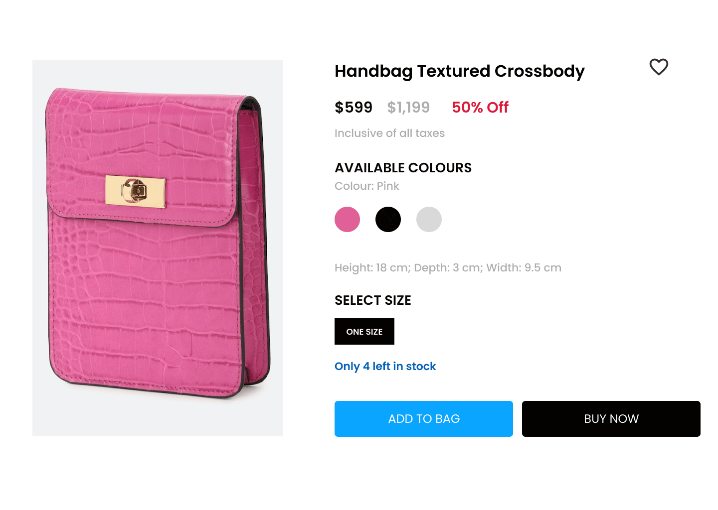
The retailer found that this yielded a 1.9 % increase in ‘Add to cart’ and was a great way to create a sense of urgency and ensure shoppers do not miss out on a trending item.
Found Use Cases Relevant to Your Business? Let's Talk.
More about social proof – just for you.
Explore our Social Proof resources — best practices, case studies, videos, and more — to stay ahead of the curve.

The Power of Social Influence in eCommerce
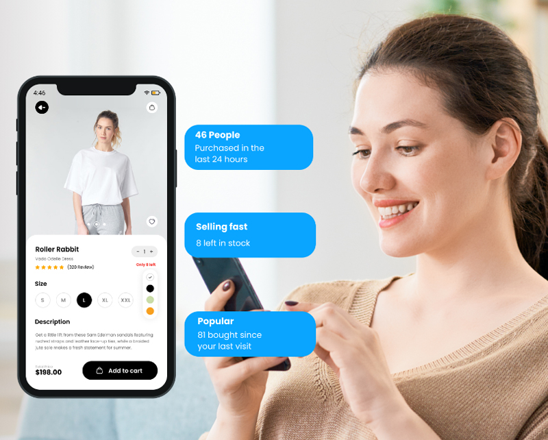
A leading North American fashion retailer realized a 4% lift in conversions in under 3 weeks
Social Proof Messaging Solution Sheet

Improve Add To Cart Percentages Using Social Proof

Privacy Overview
Easter Eggstravaganza: Cracking Open the Best Marketing Strategies for 2024 and Beyond

WhatsApp Broadcast
Send WhatsApp messages in bulk
WhatsApp Automation
Automate your WhatsApp marketing
Collaborate on a shared inbox

Multi-channel Widget
Multiple chat apps on one website widget

Shopify Integration
Drive sales to your Shopify Store

EasyStore Integration
Drive sales to your EasyStore site

Broadcast Campaigns
Broadcast messages in bulk

Multi-channel inbox
Connect your chat apps in a shared inbox
Drive sales to your Shopify store
For Marketing Campaigns
Send promotional messages to engage customers and drive sales
For Customer Support
Conduct multi-agent customer support easily with a shared inbox
For Abandoned Cart Recovery
Create automation to recover abandoned carts
For Order Confirmations
Send messages to customers to confirm their orders
Message Template Library
Best Shopify Apps
Help Center
Partner Program
NovoChat Community
Help Centre
- 12 September 2022
15 Ways To Improve Add-To-Cart Conversion Rate

Customer Success Executive
Reading time: 5 minutes
The primary goal of every e-commerce business is to improve sales and revenue . To achieve it, they will have to turn visitors into buyers.
The thing is, not every visitor who comes to your website will buy. They might have found your page through a random search, social media ads, or even word of mouth. Nonetheless, there’s a critical step to help you qualify them: and that’s an add-to-cart rate !
Add-to-cart rates are useful to identify potential customers and project your business revenue.
In this article, we will walk through the 15 proven tactics to increase your add-to-cart rate. Read on to find out!
What does add-to-cart rate mean?
As mentioned, there will be a visitor who takes action to add something to their cart when they explore your website. This will determine the add-to-cart rate.
It is the ratio or percentage of visitors adding at least one product or item to the cart during their session on your website. So, you can determine the rate by the total number of sessions where people add items to their cart divided by the total number of sessions and multiply by 100.
Add-to-cart rates are important because they help you determine if the shopper is qualified. When a shopper adds a product to the cart, they have an interest and an intention to buy .
This helps you evaluate product pages and marketing campaigns to improve usability and user experience.
Add-to-cart conversion rates by industry
Although e-commerce stores aim to have the highest possible add-to-cart conversion rates, the reality is varied depending on the industry. According to the latest data on the average add-to-cart rate, the food and beverage industry has the highest add-to-cart conversion rate at 11%.
The second highest add-to-cart rate goes to the beauty and personal care industry, with about 10%. This also marks a significant increase of 27% from the previous month.
Following that, the fashion, accessories, and apparel industry comes with 8%, and the multi-brand retail with 7%. Subsequently, the home and furniture as well as the luxury and jewelry industry has the lowest add-to-cart rate of less than 4%.

15 ways to increase add-to-cart rates
1. create an actionable and appealing cta.
Call-to-actions (CTA) should stand out and be eye-catching. Try to use specific colors that represent your brand and audience. A case study showed that creating CTAs that look like buttons increases click rates by 45% .
That said, you can adjust the color, shape, and size to make it highly visible and easy to find. Additionally, using straightforward verbs will provide even clearer action on what your customer should do.
It’s better to have one CTA button as the primary action to take when they visit your site or landing page. If you have multiple CTAs, be sure to organize them properly throughout your web page.
2. Add a product demo
Naturally, if someone doesn’t know how something works or looks like, this lowers the chances of thinking of purchasing it.
That said, if you sell a complex product, adding a product demo in the form of a video to show how your product works can increase your add-to-cart rates. This will help visitors get a clearer idea through a demonstration of your product.
Lots of consumers like video content as it is easy to understand and more engaging. A study showed that a product video increased add-to-cart conversion rates by 37% and the probability of visitors purchasing after watching a product demo is up to 85% .
So, add helpful product demo videos that convert!
3. Write engaging and compelling copies
Craft powerful words to persuade your customer to take action. Writing a copy might be a bit challenging and grueling as you need to pay attention to every single word — but it can certainly convert! Ensure that you choose words that are enticing, descriptive, and convincing enough.
Also be sure to add information about your products using FAB (feature, advantage, and benefit). Also, don’t forget to add value to your copies to lead your visitors to click on the CTA. 😉
Further, a microcopy will help to clear their doubt too. You can add some text below headlines and CTAs to further encourage visitors to buy.
4. Optimize page loading time & mobile friendliness
40% of visitors are more inclined to close a web page that loads for more than 3 seconds. Moreover, dragging loading times can drive your visitors away and lead to low conversions. Hence, optimizing a website’s performance is important to improve customer experience.
To add, more than 65% of consumers around the world make use of mobile devices to browse through products before buying them.
Try to compress some images on your site and use a lightweight theme as well as reliable hosting with at least a 99% uptime server. Most importantly, make sure that your site is accessible on mobile too by using user-friendly UI and UX design.
5. Offer free or discounted shipping
Shipping costs can be a decisive factor for your customers to add items to their cart and complete the payment. In fact, high extra costs are one of the main reasons why shoppers abandon their carts .
Therefore, to prevent this from happening, you can offer free shipping or a discount upon a minimum order value.
This perk is one of the most powerful ways to drive more sales. According to statistics, 73% of consumers will decide to buy products and services if they don’t have to pay the shipping cost.
Besides, the 2021 Consumer Trends Report showed that 80% of people want free shipping when ordering a product for a certain amount.
6. Upsell and cross-sell
Giving recommendations for a supplementary or higher value product is one of the proven tactics to increase your add-to-cart conversion rates. This is called upselling and cross-selling.
You can create an automated workflow to recommend shoppers when they decide to buy or choose a product. Try to offer another product to increase the value or a product with more benefits.
Amazon relied on this strategy using collaborative filtering and generated 35% of its sales from product recommendations. This method of selling will help increase your add-to-cart rate as long as it makes sense and is realistic.
7. Leverage an exit pop-up message
Statistics show that the average pop-up conversion rate is 11% . Hence, making use of an exit-intent pop-up is vital to track and analyze user behavior on your site. Then, you can trigger a pop-up message about discounted items or product recommendations.
Exit-intent pop-ups work with the help of predictive analytics and machine learning. Also, it has algorithms and data so that it knows when to pop up and tell customers what to do.
Try to use exit-intent pop-ups on your product or landing pages to make an offer. This can stop customers from leaving your site and hook them in with a special offer.
8. Include customer reviews
Reviews play a major role in the customer’s buying intent. The more reviews your product has, the easier the purchase decision. A study showed that nearly 88% of customers reassure themselves by reading reviews about the item they are going to buy.
Therefore, you can add product reviews, ratings, or testimonials as social proof and a testament to your products.
This will help increase add-to-cart rates and instill trust because people know about the quality of your product and services.
If there are no reviews yet about your store’s product, do not forget to ask your customers to leave a review. To encourage them to leave reviews, you can give them an incentive.
9. Optimize product pages
A research study stated that 87% of customers think that product content is very important in their purchasing decisions.
Furthermore, the same study showed that 50% of customers have returned the item they bought as it didn’t match the product description. This is why optimizing your product pages is a must .
There are several ways to do this, such as:
- Using high-resolution product images
- Writing on-point product titles and convincing descriptions
- Including product specifications
- Running a pricing strategy with coupons and discounts
That way, your product pages will have be more enticing and convince shoppers to add products to the cart.
10. Offer product bundles
Do you want to attract customers to complete the purchase and maintain their lifetime value? Product bundling is a great way to boost add-to-cart rates as well as your sales!
Besides, customers are more interested in buying a package while also saving their money. A case study from Doe Lashes and HVMN showed that the average order value (AOV) stepped up to 86% and 111% respectively when they started introducing product bundles.
This tactic sounds like a win-win solution for both store owners and customers, right? You can offer 2 products at a single price, mix and match bundles from high-priced and low-priced products, and offer Buy One Get One (BOGO) as well 😉
11. Create a FOMO trigger
The Fear of Missing Out (FOMO) can influence about 60% of people to make purchases within 24 hours. FOMO is another way to make customers take action and add items to their carts. This is how you can create a sense of scarcity and encourage shoppers to purchase so they don’t miss the special offer.
This strategy will help you encourage customers to act subconsciously by sending an update about discounted and limited stock products within a short timeframe.
As a result, people will feel a sense of urgency and add products to their carts and complete the purchase before they miss out on the product they want.
Tactics to create FOMO:
- Adding a countdown timer to the website or product pages
- Showing stock counts
- Offering a limited period deal or lifetime deal product
12. Display the add-to-cart cart icon on every page
The add-to-cart cart icon is quite vital to delivering a better user experience for your e-commerce website. Whether it’s a cart or shopping bag icon, make sure it remains accessible and visible on every single page. It should always appear even when customers scroll up and down your web pages.
Redirecting customers to the cart page every time they add a product can lead to a bad user experience, especially for mobile users. Therefore, the cart icon should stay on the page and update automatically when a shopper adds or removes items.
When the shopper is ready to check out, they can simply click the cart button and complete the transaction.
13. Add multiple payment options
Keep in mind that as an e-commerce business, you’re opening your doors to international shoppers as well. This means that you have to present more options for payment as not every shopper uses your common local payment methods.
Unfortunately, the lack of payment methods is one of the top reasons why shoppers choose to abandon their carts. Moreover, customers are 70% more likely to buy if there’s flexibility to pay using their preferred payment method . That means payment options also determine the purchase decision.
Hence, offering more payment methods is a great way to boost your add-to-cart conversion rates. Aside from credit card payments, offer options like PayPal, bank transfers, and even buy now pay later payments .
14. Provide chat assistance
Providing chat assistance is quite useful to build trust and increase conversion rates. That’s because shoppers sometimes do need more information or clear their doubts about a product before they are ready to buy.
According to research, 44% of online shoppers would prefer to have a live chat while purchasing something online.
That said, by offering real-time chat, whether it’s through a chat widget or live chat, shoppers can reach out to you and have their inquiries answered quickly. That way, customers will feel comfortable and convinced to purchase the product.
For example, using a chat marketing tool like NovoChat allows you to connect and communicate with shoppers on multiple platforms. You can install multiple apps like WhatsApp, Messenger, and Telegram to one chat widget so your customers can choose where and when to chat with you.

To add on, you can set up auto-replies and templated messages to make replying a breeze.
15. Send automated campaigns
According to research by Baymont Institute , mobile users have the highest cart abandonment rate of 86%. That’s a quite big percentage! 😮
But fret not! Not all hope is lost.
Automated message campaigns can definitely help increase add-to-cart rates and drive more conversions. You can automatically send SMSes and even WhatsApp messages to remind shoppers about cart abandonment . Moreover, you can include coupons or special offers to push them to complete the purchase.
Besides, there are a myriad of apps to help you send cart abandonment reminders, so you can set up automatic reminders and send bulk messages .
Conversion is the goal, and customer experience is the key
As you already learned the 15 tactics above, it’s time to implement them to grow your e-commerce business and compete in the e-commerce universe.
You can start by making small tweaks to your website and the flow of the purchasing process to create a better customer experience.
Analyzing add-to-cart rates is indeed critical to identifying prospective customers and trending products, as well as helping to improve conversions and revenue. However, delivering a pleasant experience that alleviates the predicaments during the checkout is one of the keys to increasing add-to-cart rates as well.
For more of such tips and advice, check out these resources! 👇👇👇
Try NovoChat for free! 🚀
An e-commerce chat marketing platform to grow your sales.

12 Valentine’s Day Chat Marketing Templates To Spread The Love

13 Best WhatsApp Welcome Messages You Should Be Using

21 Best WhatsApp Business Templates You Should Be Using

WooCommerce VS OpenCart: Which Is Better For Your E-commerce Business?

The Ultimate Guide To Facebook Messenger Marketing

NovoChat x EasyParcel: Online Booking Platform for Easy Delivery

8 Powerful Customer Testimonial Examples To Build Customer Trust

What Is Facebook Messenger Marketing? 10 Tips To Can Ace It

6 Tips For Selling on Facebook Marketplace
Related articles

How to Sell Online: 12 Tips To Get Your E-commerce Business Up and Running

14 Best E-commerce Strategies For Small Businesses To Boost Sales

19 Best Strategies To Turn Abandoned Carts Into Sales

Cart Abandonment VS Checkout Abandonment: What’s The Difference?

What Should I Do If I Have A Lot Of Add To Cart But No Sales?

What Is Abandoned Cart Recovery? 5 Ways To Recover Lost Sales
Multi-channel Inbox
Chat Button Builder
Customer Segments (coming soon!)
WHY NOVOCHAT?
NovoChat vs Sleekflow
NovoChat vs ManyChat
NovoChat vs WATI
NovoChat vs DelightChat
Product Roadmap
Guest Blogging Guidelines
Privacy Policy
Refund Policy
Are you really leaving all these resources behind? 🤔
100+ copy-and-paste message templates for multiple industries and use cases. All these can be yours in a single click.

Drive more sales with chat marketing.
Market your business on WhatsApp with NovoChat.
- React Tutorial
- React Exercise
- React Basic Concepts
- React Components
- React Props
- React Hooks
- React Advanced
- React Examples
- React Interview Questions
- React Projects
- Next.js Tutorial
- React Bootstrap
- React Material UI
- React Ant Design
- React Desktop
- React Rebass
- React Blueprint
- Web Technology
Implementing Add to Cart functionality using Redux toolkit in React
- Implementing Undo & Redo Functionality in React Apps
- Implementation of Dark Mode in React using Redux Toolkit
- Wishlist Functionality using Redux Toolkit in React
- Implementing Drag and Drop Functionality with useRef
- How to Implement Caching in React Redux applications ?
- How to implement pagination in React Redux Applications?
- How to connect the components using Connect() in React Redux
- Implementing React Router with Redux in React
- Implementing Authentication Flows with React Hooks and Auth0
- Create a Donut Chart using Recharts in ReactJS
- How to Create ToDo App using React Native ?
- How to implement BarChart in ReactJS ?
- How to implement useContext Hook in a Functional Component ?
- How to implement client-side routing in React?
- Create a Stacked Area Chart using Recharts in ReactJS
- How to handle more action using redux ?
- Redux Toolkit Better way to write Redux code in ReactJS
- How to create Tinder card swipe gesture using React and framer-motion ?
- How to create Doughnut chart in react using material UI and DevExpress ?
- Create a Brush Bar Chart using Recharts in ReactJS
- Presentational and Container Components in React Redux
- Create an Area chart using Recharts in React JS
- State Management in React – Hooks, Context API and Redux
- How to use handleChange() function in react component?
- Create a BiAxial Line Chart using Recharts in ReactJS
- How Redux Toolkit simplifies Redux code in React application ?
- How to create a Functional Component in React?
- What is the motivation for using React Redux?
- Common libraries/tools for data fetching in React Redux
Add To Cart functionality is one of the important components of the E-commerce platform. In this article, we are going to learn how to implement Add to Cart functionality using React JS and Redux Toolkit.
Preview of final output: Let us have a look at how the final output will look like.

Prerequisites
- React Redux
Approach to implement Add to Cart Functionality:
- Create five folders named Cart , Components , Pages , Reducer and Slices in src directory and create index.jsx and RenderCartItems.jsx in Cart , Product_card.jsx in Components , Home.jsx in Pages , index.jsx in Reducer and CartSlice.jsx in Slices respectively.
- Implement store inside index.js file as given in example.
- Implement cartReducer inside index.js file in reducer folder.
- Create CartSlice.jsx in Slices folder and implement functionality of add to cart and remove from cart in it.
- Create Home.jsx page in Pages folder and fetch product details.
- Inside Cart folder create index.js and RenderCartItems.jsx to create UI for cart.
- In last step we will call Home page and cart in App.js file.
Steps to Create and Configure React App with redux toolkit
Step 1: Create a react app using command “npx create-react-app app-name”.
Step 2: Install the required dependencies
Project Structure:

The updated dependencies in package.json file will look like :
Example: Create the folder structure and insert the following files accordingly.
Steps to Run the Application:
Step 1: Type following command in your terminal.
Step 2: Locate the given URL in your browser.
Please Login to comment...
Similar reads.
- Redux-Toolkit
- Web Technologies

Improve your Coding Skills with Practice
What kind of Experience do you want to share?

Case Study: How User-Generated Content Boosted Add-To-Cart Rates
August 18, 2023
Does the way you showcase content below the fold on a retailer site affect the Add-to-Cart rate? The short answer – it absolutely does!
We don’t believe in guesswork to maximise conversions and we don’t believe our clients should rely on it either. That’s why our Shopper Insights & Optimisation team are dedicated to finding the perfect solution for your e-commerce channels through testing. We believe A/B testing is the key to continuously optimising your product detail pages for an engaging and seamless shopping experience.
A typical A/B test compares two different variables, in our case usually on an e-commerce website or product detail page. This could take the form of placement of rich media, different utilisations of our innovative product suite, or even simple text and image options. Sounds straightforward, right?
It might shock you to know that only 44% of businesses A/B test regularly, meaning they are leaving money on the table every single day! Yet, particularly for conversion rate optimisation, A/B testing can have a huge impact. In fact, a survey of over 2,500 marketers by Venture Beat highlighted that conversion rate optimisation remains a must-do practice for any brand aspiring to success and growth.
It is because of this that we recently worked with one of the world’s largest toy manufacturers on a content syndication experiment. The test question? Does the way you showcase content below the fold on a retailer site affect the Add-to-Cart rate?
One of our most popular products is INpages. INpages are syndicated in-line product experiences packed with every content format imaginable, from images to 3D and Augmented Reality experiences. INpages help to create enhanced desktop and mobile shopper experiences, impressive cart conversion rates, and reduced returns thanks to better-informed purchases.
Alongside our client, we developed a number of INpages designs that combined a number of rich media elements, including high-quality images and videos as well as user-generated content (UGC) such as Instagram posts.
The first template (A) did not include any UGC and was used as a control design. The second (B) placed UGC content at the top of the INpage, whilst the third (C) template placed the same UGC content at the bottom of the page.

We tested each of these templates across 23 individual products on a sample of 5 retailers within the UK, Australia and New Zealand over the months of September and November in 2021.
The tests were conducted at an individual consumer impression level in an A/B/C format. This meant that we were able to test our default template (A) vs Template B, vs Template C.
From our extensive A/B/C test, we found that UGC placed at the top of the INpages boosted Add-to-Cart rates by 5.07% compared to INpage templates that do not feature any UGC.
We also found that the INpages template with UGC placed at the top performed 7.84%* better than templates that showcased UGC at the bottom of the template.

So what have we learnt?
In essence, the placement of rich media on your product detail pages (PDP) has a direct impact on Add-to-Cart rates and thus your revenue.
In many industries such as the competitive toys industry, small margins can make a big difference. From boosting Add-to-Cart rates to decreasing product return rates, it all matters!
Regularly testing and evaluating the performance of your e-commerce channels is essential to success in 2022 and beyond.
Flixmedia’s content syndication product suite allows you to syndicate your stunning brand content across your retail e-commerce channel with ease and helps you stand head and shoulders above your competition.
Furthermore, syndicating uniform content will amplify your brand voice across retailers. This ensures that your shoppers enjoy a consistent experience whenever they interact with your brand or product.
By providing rich content at the point of sale, they have all the information they need to confidently make a purchase, saving hours or even days of research. It’s also a win-win for you and your shoppers!
As proven by the above A/B/C test, with the right content served at the right time, turning browsers into buyers can be a piece of cake!
Toy brands that don't want to get left behind should create rich experiences in 2022.
Realise lost revenue and get started with your content syndication journey today, and make the most of our global retailer network!
*The methodology used here can be provided on request.

11 Winning Add To Cart Button Examples To Boost Your Conversions
25 Apr, 2024
Introduction
Add-to-cart button & its significance, 2. warby parker, 4. forever 21, 9. tap tap tap, 1. stand out with color & contrast, 2. make your button large & spacious, 3. use the style items to pop up your button, 4. provide automatic button changes for out-of-stock items, 5. clear the clutter to make it appealing, 6. switch to rounded corners, 7. provide a button hover effect, 8. periodically test the user-friendliness, 9. include ctas above the fold, 10. experiment with your add-to-cart button text, 11. add an extra shopping cart button at the bottom of product page, 12. regularly test for usability, how to create an add to cart button.
Did you know a fact about - Add to Cart button?
“The average Add to Cart conversion rate is whooping 10.9%.”
Motivating, isn't it?
Well, truth be told! You may have thousands of visitors coming to your website. But it's futile if they don't buy products, no matter the number of leads pouring in!
Your cart page is one of the most important pages on your website, and its design can have a big impact on your conversion rate. By following these key website design services tips, you can create a cart page that will turn more visitors into paying customers
Wondering how this is possible with just a simple Add to Cart Button? And how to create add to cart button? Our ecommerce website development services will help you in creating winning add-to-cart buttons.
Let's discuss how your product pages can drive your conversion rates using the online Shopping Cart Buttons.
The primary objective of any online business is to turn visitors into paying customers.
Isn't it? And a balanced SEO user experience is what motivates a visitor to spend quality time on the website and take the next desired action.
To move your visitors down the funnel, some dose of extra motivation is required, and a lucrative Add to Cart button or cart page design might make that happen.
“The Add to Cart button accelerates your customer reaction towards the product”
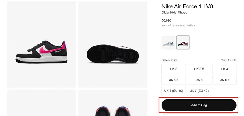
Imagine your customer just glanced at those stunning Nike shoes and has got the right feet, features, price, and all that he wished for. You have positioned the magic wand that says the “Add to Shopping Cart” button in the right place . Definitely, the customer will be motivated to add those stunning pairs of shoes to the cart . You win their half-battle!
Now you have to pamper them with some cool offers, and there you have a new customer added..sounds dreamy, right!
Having said that, if you are thinking about what would happen if the "Add to Cart" concept was non-existent.
Let's show you the world without it!
- Your Customers would repeatedly come and go from the products page to the payout page.
- The process might confuse your customers, and your customers may forget to add something important to their cart.
- The process will become time taking and cumbersome for customers.
- It will upset the balance of your online business with a higher bounce rate & poor navigation by the user will further degrade your business.
Found it a bit scary right?
Now you know why the “Add to Cart” feature is important to your customers. But it',s even more valuable for your website when considering web design for ecommerce. Wondering how! Let's take a look.
Keeping your customers happy and improving their purchasing experience is the key to success for any business.
Moreover, building a foundation for your own business and monitoring inconsistencies can help you identify various anomalies & growth sectors. After all, a happy customer is a profitable customer for the business.
Here’s how the ‘Add to Cart' feature assists your business bloom:
Till now, we’re talking from the customer's point of view. And when considering web design for ecommerce , adding an add-to-cart button below products adds charm to the user's shopping experience. Keeping buyers happy and improving their purchasing experience is the secrete to success for all online businesses. Thus when your users are happy and satisfied with your product or service, they’ll continue to come back to buy more products from you, leading to more sales and profit margins for your business.
Here are some more examples of how adding an add-to-cart button can boost your business
- It enhances and improves the SEO of the site and search rankings by more than 8% and supports the vendor by maintaining an appropriate record of all transactions that occur on the platform.
- It makes it look like the online store owner is a trustworthy, thoughtful online seller, making them approach their business more.
- This lowers the bounce rate and the number of empty baskets on the online store and increases average page views and dwell time by almost 20%.
- It enhances the general functionality of the online shop & allows the owner to build and maintain an organized portfolio of clients.
- The prompts for customers regarding special offers and discounts become handy at checkout. This tactic is said to increase the efficiency of purchases by almost 12% more.
- It helps present prices, taxes, and extra costs without ambiguity and efficiently integrates third-party shopping solutions.
At the end of the day, the ‘Add to Cart’ feature boosts sales and can be the best ecommerce design inspiration, which is the end goal of every enterprise.
Wondering what's next! Let’s boost your conversions with these 11 tempting Add to Cart button examples.
11 Exquisite Add to Cart Examples
Well, let's turn our heads to the most fantastic part of this topic.
Even the Add to Cart button is a minor part, but it can lift 3-folds of your brand’s weight easily.
In this part, we will tell you about the exquisite Add to Cart button examples, which have boosted their brand to the next level.
So, let's dive in!
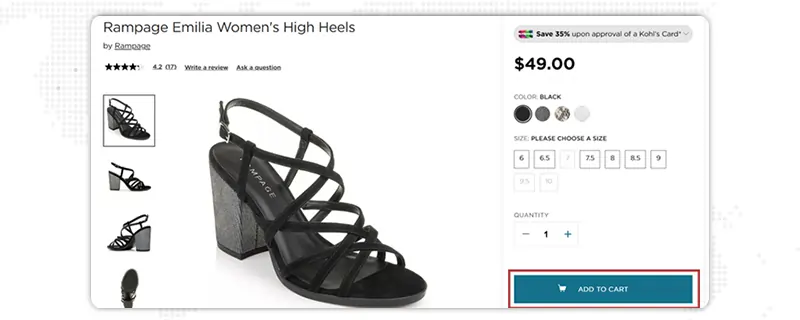
Why we liked it:
- Elegant & to the point ‘ Add to cart button design.’
- Seamless User Experience.
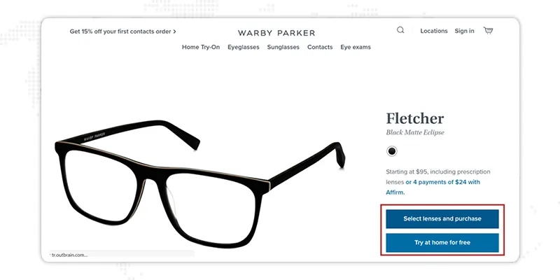
- Inspiring ‘Add to cart button design.’
- Products are arranged categorically.
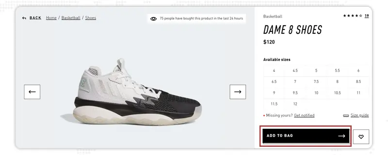
- Effortless and engaging ‘Add to cart button design.’
- Well displayed & concise texts.
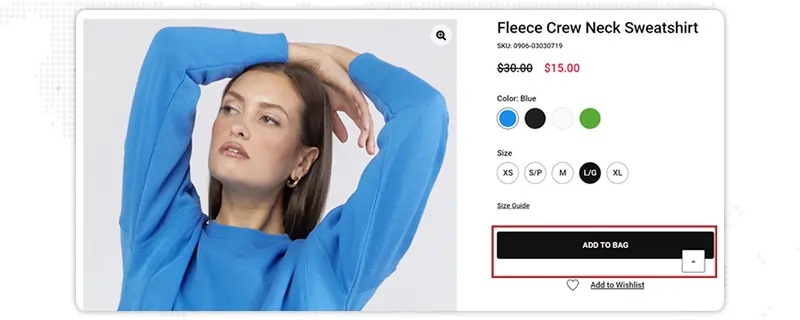
- Well-arranged & bold ‘Add to cart button design.’
- Engaging User Experience.
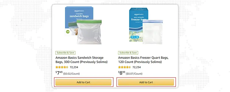
- Well informative ‘Add to cart button design.’
- The pricing is categorically displayed.
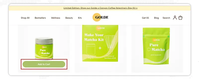
- Minimalistic ‘Add to cart button design.’
- Simple and easy to use.
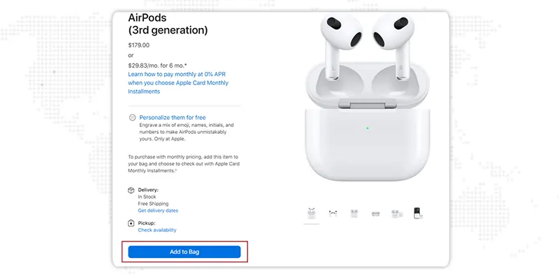
- Curvy-edged ‘Add to cart button design.’
- Well-placed text before and after the ‘Add to cart button.’
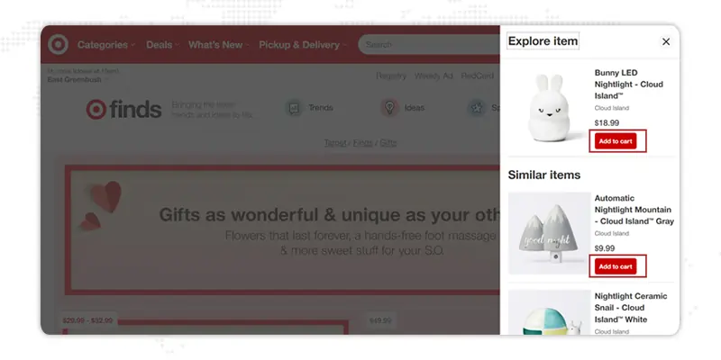
- Bold use of red color in the ‘Add to cart button.’
- Use of a mini cart to showcase items.
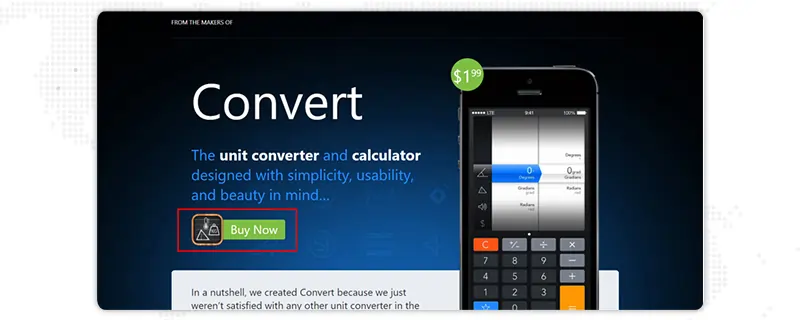
- Attractive use of the ‘Add to cart button.’
- The Use of square and oval shapes engages users.
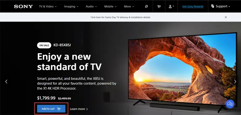
- Precise call to action before the ‘Add to cart button.’
- Bold use of add-to-button texts.
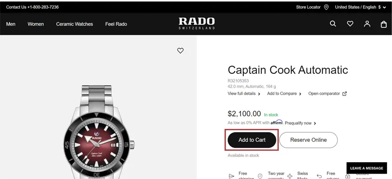
- Use the bigger font in the ‘Add to cart button.’
- An exquisite display of the brand with price makes the ‘Add to Cart button’ more engaging.
Well, with these brilliant online shopping cart examples and ecommerce design inspirations above, you can obtain excellent results and increase your conversion rate simply by executing the above details. But wait, there are more tips that can generate high traffic.
So, Let's dive in straight!
11+ Add-to-Cart Button Design Tips For More Conversions
While it may appear minor , your ‘Add to Cart buttons’ are essential to your success in making an emotional connection with your users. However, this connection is affected by your choice of shape, color, font, and button text. You can consider taking the help of website redesign services.
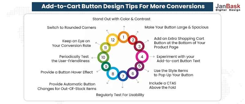
Then how to construct the best add to cart buttons that the world has ever seen?
Here are the best 11+ Add to Cart button design tips to add glamor to your brand:
The best Add to Cart button color can be your online store's standout feature with the right color and contrast.
The best add to cart button color should correspond to your brand's colors. Consider selecting the color of your button for visual contrast, as it will attract more organic traffic and lead to high click-through rates.
Usually, the color that converts the best is generally the one that stands out most from your website's background and color palette. For instance, the color that contrasts the most with blue is orange , which is another reason the orange button is widely used.
For further insight, understand more about the the importance of website visual effects .

A great Add to Cart button size can certainly make the button stunning, but it will look even more attractive if you design fonts & images keeping in mind what your website wants to convey.
Suppose, If your product pages use big fonts and images; your Add to Cart button design may need to be bigger than a site that uses smaller fonts. Generally speaking, the bigger a button, the more your users will notice and be forced to click.

After selecting the best add to cart button color and size, you can customize your Add to Cart button design more carefully with irresistible & bold design elements. You can take the help of eCommerce web design services.
You can make your Add to Cart button look more 3-D with a thin border and light shadow elements. You may also add an arrow after the text on the button. Using website redesign services , you can redesign CTA buttons. This will simplify the confusion of buyers once clicked. Then the customers will go ahead with the closeout process.
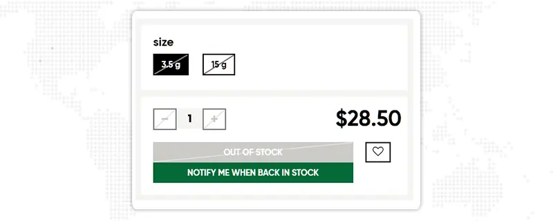
To improve the user experience on your webshop, consider automatically changing the text from your button to "Out-of-stock" or “Sold out,” as well as fade/change the color of your Add to Cart button.
If you don't do that, take the help of user experience design , otherwise, it will be an unpleasant experience for the user who has gone through the product details only to find it out of stock later. Although this customization will not impact your immediate conversion rate, it will prevent a bad shopping experience that prevents buyers from returning. Therefore conversion rate optimization is important.
An excellent Add to Cart button design can, indeed, bring some attention, but it will only be attractive if there is enough white space around it. It's only wise to give your Add to Cart button a little space to breathe, i.e., suppose if your page has too much text and remains unorganized, it will turn your visitors away. That's why to make it appealing, the Add to Cart button must be organized & should be clutter-free.

It has been proven that user interface (UI) components with rounded corners attract consumers more than sharp ones. Well, psychologically speaking, it's contours bias. This is essentially why we tend to avoid sharp edges.
The top e-commerce giants like Amazon & Walmart always have a slightly curved Add to Cart button design. That's because Selecting rounded corners to your Add to Cart button makes product or service pages more user-friendly.
Providing hover effects is one way to make the Add to Cart buttons more engaging. This turns them into responsive buttons, so if you hoover them around, they change their color slightly, i.e., red to blue.
This subtle change can make shoppers feel more engaged and take them to the next buying step. You can find many examples of button hover effects, including CSS and HTML code to inspire your web team, at sites such as CodePen.
Every time you make changes to your Add to Cart button, make sure to test it for its user-friendliness thoroughly. Even though you do not make any changes, keep an eye out for bugs & security details of your Add to Cart button .
Also, remember to get feedback from end-users about the Add to Cart button and how seamless it makes their checkout journey and also helps you to generate leads quickly .
If your customer needs help finding the right call-to-action buttons at the right time. The user will feel frustrated and leave the site. To avoid this scenario , you must search for different call-to-action examples and learn how to create a call to action button. Including CTAs at the top of the fold is advisable for user usability. This adds a better viewpoint for the customer, making your CTAs always visible.
If your customer needs help finding the right call-to-action buttons at the right time. The user will feel frustrated and leave the site. To avoid this scenario , you must search for different call-to-action examples and learn how to create a call to action button. Including CTAs at the top of the fold is advisable for user usability. This adds a better viewpoint for the customer, making your CTAs always visible.

Sometimes “Add to Cart '' works, and sometimes “Buy now” works. But it's important to experiment and get a deeper understanding with the help of analytics and finally implement the correct text.
You can significantly improve your e-commerce store value by providing an additional online shopping cart button at the bottom of the page.
This way , you will also stand apart from your competitors, making your page highly user-friendly and recommended for the business. Of Course, having said that, a professional eCommerce web design company can make your business successful.
Interesting, isn't it? So, we have updated you with the best insider tips that provide great Add to Cart buttons and can turn your visitors into buyers.
Whenever changes are made to your add-to-cart button, ensure to test it comprehensibly. Providing an easy checkout process that is intuitive for shoppers.
You can get feedback from your buyers regarding how seamlessly the add-to-cart button works.
However, if you're not making any changes, look for bugs in your add-to-cart buttons; otherwise, you might quickly lose a buyer because of the poor functionality.
This is how you can make high-conversion landing pages .
So, let's dive into our next precious detail on the Add to Cart button.
The "Add to Cart" option lets customers buy multiple items simultaneously. It literally operates as the physical shopping baskets that we see in retail stores.
So if you need clarification about how to create an Add to Cart Button for your website, don't worry! Let's simplify your headache with these simple steps below.
Step 1: Add an “Add to Cart” element
Visit any Add to Cart template-providing sites or value-providing e-commerce agency. Add an Add to Cart item to this collection list from the Add panel.
Step 2: Style and customize the different elements of “Add to Cart”
You can customize the appearance of items such as the "submit" button, the "out of stock" message, and the state "error" message.
Step 3: Paste the exclusively personalized “Add to Cart” on your product page
Now, Select the main Add to Cart wrapper and copy it, then add it to the product collection list. Then go to the product template page, connect to the “products” category, and paste your exclusive Add to Cart component.
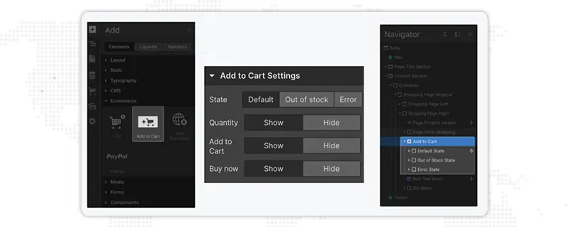
Exclusive Stats: Which Add to Cart Button Texts & Graphics Are Trending ?
Well, if you are still wondering! What kind of Add to Cart button text & graphics is impacting today's market? We have accumulated all the best add-to-cart service market data to provide the best options.
So let's have a look at them!
(Source: elasticpath)
What now! Well, these are some of the trendiest Add to Cart texts used nowadays. But what's better than to observe them utilized in exquisite ways by digital market players ?
Well! If you want to reduce cart abandonment and increase sales, this blog is for you! Your Add to Cart button is a crucial design element that should be action-driven. From embracing bold fonts to curved designs, experimenting with contrasting colors, and changing graphic texts, you can identify what increases your conversion rate.
The possibilities are unlimited!
After all, what does each customer need to do to purchase your products?
It's simply a click on your Add to Cart button linking them to smooth checkout.
There you have it! What are you waiting for now? Create larger, better, bolder & striking buttons that take your business to digital stardom.
Looking for high-converting Add to Cart Buttons for your home and product pages? Search nowhere! Share the specifics with our ecommerce web design services team at JanBask Digital Design, and they’ll guide you through them.
1. How to increase add to cart conversion rate?
Enhancing your add-to-cart conversion rate corresponds to more sales and helps you find high-performing products and barriers in your checkout process. Here are a few tactics to boost your add-to-cart conversion rate
- Make it easy for shoppers to buy
- Showcase your value props distinctly
- Add a CTA above the fold
- Add an extra add-to-cart button at the bottom of the product page
- Add live chat or a chatbot
- Create a seamless UX
- Create a sense of urgency
2. Does "add to cart " on the product page help the conversion rate?
Contrary to the “Buy” or “Buy Now” button, the “Add to Cart” button permits the shoppers to save the selected items to their online shopping cart so that they can continue shopping and, in the end, complete the checkout process, thus offering a smooth UX design . It also helps buyers to purchase several items simultaneously.
3. What is a good add-to-cart conversion rate for an e-commerce store?
A good add-to-cart conversion rate is evaluated based on your industry and several other factors. But having said that, data from eCommerce experts shows that an average add-to-cart conversion rate ranges between 3 to 4%, and a good conversion rate would be above this average rate. It is often considered between 8 to 10%
4. What is the best color for add-to-cart button s?
As often seen, red is the most common color in the websites that are reviewed, and Green, blue, and orange are also close to it, making it around 74% of the total.
5. What are the benefits of an add to cart button?
These buttons let buyers save items to their online shopping cart so that they can keep shopping and buy multiple products; then, they can complete the checkout process. Thus users are provided with a more satisfying experience.
6. Does add to cart mean buying?
It means you’ll be able to add the selected products to the list of items that you wish to buy from the specific website. And at the time of checkout, buyers will be shown everything that they’ve added to their online shopping cart.
7. How can one increase their cart value?
Here are some of the best ways to increase average order value
- Use an appealing design for your product pages
- Highlight trending products
- Offer social proof
- Customize user shopping experience
- Give a free shipping threshold
- Add product discounts
- Create special customer offers
- Give complementary products
8. What is the cart conversion rate?
The Cart Conversion Rate metric helps you calculate the no. of completed orders as compared to the total no. of shopping carts initiated by prospective customers.
9. What is the difference between add-to-cart and conversion rate?
Add to cart rate is the percentage of shoppers who add min. 1 item to their online shopping cart in a given session. To calculate your add-to-cart conversion rate, take the total number of sessions where someone added an item to the cart and divide it by the total number of sessions.
10. What is cart optimization?
It is an eCommerce critical process to optimize the online shopping cart for design and usability so as to avoid cart abandonment and maximize the shopping cart conversion rates.
Leave a Reply
Related Post

Apr 26, 2022
Top 15 Challenges Of eCommerce Business And How To Overcome Them

Aug 10, 2023
A Comprehensive PCI Compliance Guide For ECommerce Business
May 30, 2023
Whitepapers
Our whitepapers offer professional advice and helpful tips for web design and online marketing.
Talk to Expert
© 2024 JanBask Digital Design
- Case Studies

Free Web Design Code & Scripts
Home / Collections / 25+ Best JavaScript Shopping Cart Examples with Demo
25+ Best JavaScript Shopping Cart Examples with Demo

A shopping cart is the most important component of an eCommerce website. It stores all basic information related to products that customers added to their buying list. An ideal shopping cart comes with all basic features including adding, removing products, calculating price, and locally storing cart information for non-logged users. This hand-picked collection of JavaScript shopping cart projects helps you to quickly find out the best frontend “add to cart” functionality for your website.
Whether you are working on a shopping website template, creating a simple add to cart functionality, or making a simple online store, these projects might helpful for you to save your time and effort. Basically, these projects consist of only frontend “add to cart” functionalities to make an interactive shopping website. Therefore, you can functionalize the backend for these templates to make a fully working eCommerce website.
1. Single Page Shopping Cart Template
If you are looking for a single-page “add to cart” interaction with modern design, then the following JavaScript shopping project quite fits your needs. It comes with a multifunctional products card. Users can easily view, navigate products variants and images gallery inside the card.
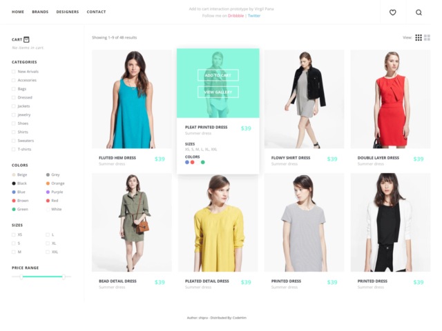
Code Features:
- Add products to cart and count total price.
- Basic webpage layout including navbar, sidebar, and widget area.
- Flip products card and show stats on mouseover.
- Image gallery carousel inside products card.
- Load next/previous Images.
Designer: Virgil Pana
2. Shopping Cart HTML CSS & JavaScript
The following shopping project provides a simplified “add to cart” functionality. It uses JavaScript and WebStorage API/Cookies to remember cart data converted to JSON format. Generally, it provides a complete cart page solution to calculate prices of added items at the front end and the collected data can be transferred to the server along with the checkout process.
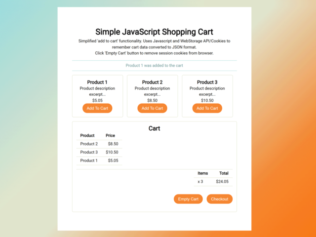
Code Features:
- Gets cart total price and products info from the session on load.
- Creates products object and converts product data to JSON for storage.
- Sends product data to session storage.
- Appends product JSON object to cart array.
- Creates session storage cart item.
- Gets existing cart data from storage and converts it back into an array.
- Overwrites cart data in session storage.
- Converts each JSON product in the array back into the object.
- Gets the property value of price, calculate and display the total price.
- Inserts and updates cart items on the HTML of the website.
- Sends feedback to users on successful added.
- Allows users to remove cart session storage objects & refresh cart totals.
Author: Jasmine Smalley
3. JavaScript Shopping Cart with Local Storage
The following shopping cart project uses local storage to save cart information. It is based on a simple idea, to minimize requests to the server and only send the final cart to the server for evaluation and payment. Basically, it uses foundation JS for the visual interface while the cart function has been written in Vanilla JavaScript. Anyhow, you can integrate this shopping cart project with your existing layout without using any other dependency.
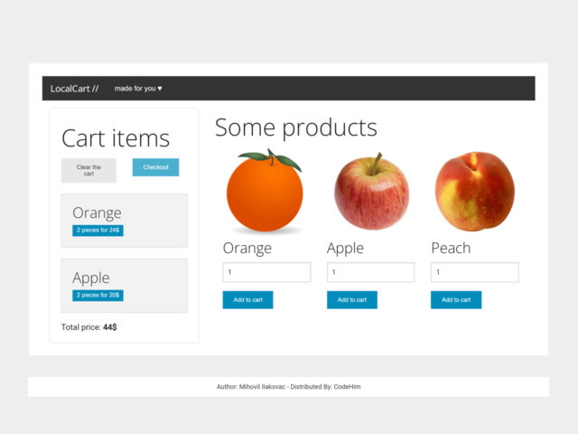
- Gets products name, price, and quantity.
- Stores products information in local storage.
- Displays items with quantity inside the cart.
- Checks local storage on page load and updates cart.
- Counts total price and show at the bottom of the cart.
Author: Mihovil Ilakovac
4. Add To Cart using HTML CSS JavaScript
This “add to cart” project comes with a grid products layout and categories filter functionality. Users can easily add products to the cart. It uses Bootstrap 3 CSS for responsive layout and jQuery . Generally, you can integrate this cart code snippet into your Bootstrap projects. It can be highly customized with additional CSS according to your needs.
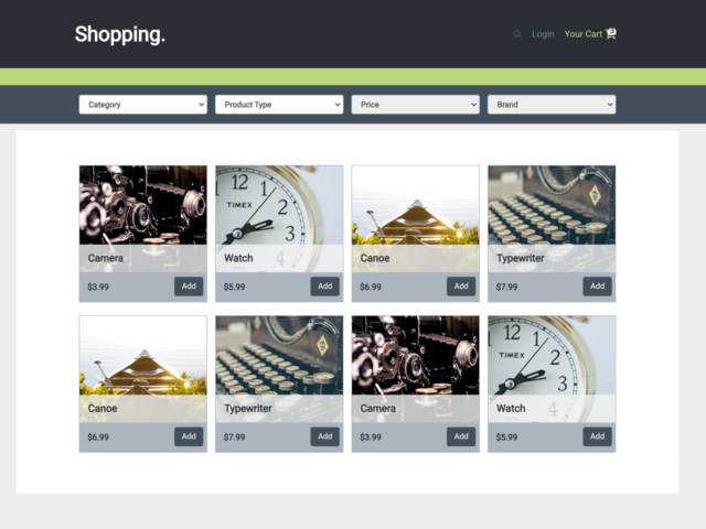
- Functionality to display filtering with dropdowns.
- Displays add to cart notification.
- Displays cart with slide-down animation.
- Function for manipulating a sibling input of type “number” from an event fired.
- Adjusts the number input value, trigger onChange.
- Runs onchange event to keep numbers between max/min values.
- Finds number controls and attaches click events.
- Attaches validation listeners.
Author: Filip Danisko
5. Simple Javascript Shopping Cart
The following shopping cart project comes with a minimal clean design with a floating cart button. It allows users to add products to the cart and store products info in local storage. Besides it allowing users to add/remove products, it also provides a modal popup sign-up form template for the checkout process.
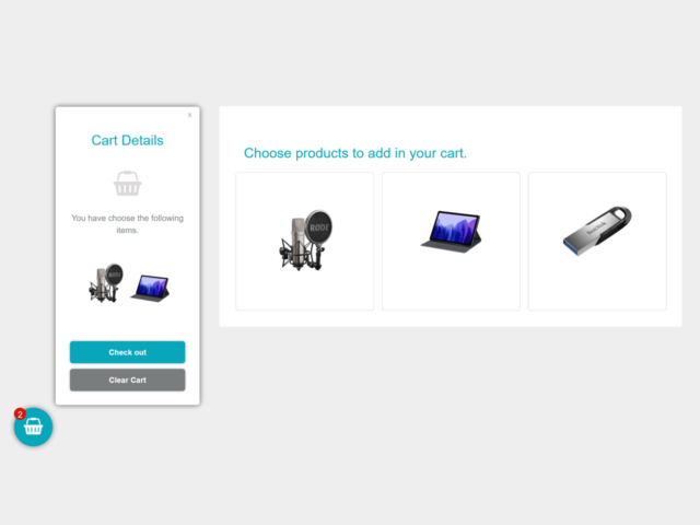
- Provides a simple way to add products to the cart.
- Displays a floating cart button to view, clear, and check out the cart.
- Provides a popup sign-up form template for the checkout process.
Author: djoba
6. Javascript Online Shopping Cart
If you are looking for a ready-to-use shopping project for your online store, then the following JavaScript shopping project helps you to save time and effort. This shopping cart project is purely built with HTML, CSS, and JavaScript without any dependency.
It comes with a basic webpage layout including navbar, products grid layout, and footer. Users can add products to the cart and view added products by clicking the cart icon located on the navbar. Similarly, added products can be removed one by one or clear the cart at once. Moreover, it supports local storage and call-back functions to boost the development process.
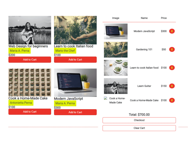
- Toggle shopping cart visibility.
- Get contents from local storage, if nothing is there, create an empty array.
- Save content inside local storage.
- Calculate the total price in the cart.
- Extract the price numbers from the cart items to calculate the total.
- Retrieve the td element in the cart where the product price is stored for each product in the cart.
- Iterate over each td node and extract the price.
- Display all products and total costs in the cart.
- Save selected products in local storage and display them in the cart together.
- To avoid users adding the same course twice, check the product is not in LS already before adding it
- Clear all products from the cart (and local storage).
- Checkout: just clear the cart after the user confirms the checkout process.
Author: Ksenia
7. Javascript Shopping Cart Source Code
The following JavaScript shopping cart source code helps you to create a simple cart page functionality. It allows users to add products and update quantity with plus/minus buttons. Similarly, users can remove products from the cart or clear the cart at once. It is purely built with HTML, CSS, and JavaScript. So, you can customize each part of this project according to your needs.
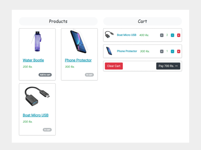
- Allows users to add/remove products.
- Allows users to increase/decrease products quantity.
- Updates products quantity and counts the total bill.
- Function to clear cart at once.
Author: Manish Gupta
8. Javascript Ajax Shopping Cart
Sometimes, we need to update cart data simultaneously on both the frontend and backend. In this case, we need an AJAX request to update data. So, the following JavaScript shopping project comes with an AJAX cart functionality. Basically, it provides an array for AJAX support to store/update cart information. You can integrate this code snippet into your project to calculate tax, shipping fee, subtotal, and total amount.
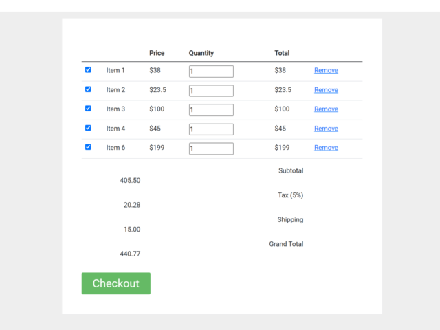
- Provides an array for AJAX support to store products/cart data.
- Counts products quantity.
- Calculates tax, shipping fee, subtotal, and total amount.
- Allows users to remove products from the cart.
9. JavaScript Drag and Drop Shopping Cart
The drag and drop shopping cart provides a realistic experience while adding products to the cart. The following shopping cart is built with drag and drop methods to add products by dragging them into the cart. Generally, it comes with a very basic style for the cart but you can further style it to make a realistic shopping trolley, pushcart, or basket. Thus, it will make a mind-blowing user experience while dragging products to the shopping trolley.
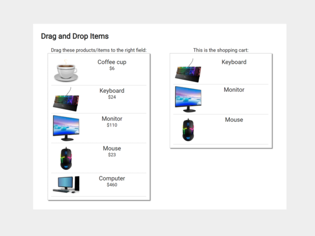
- An array of all shopping items using getElementsByClassName.
- The specific area to drop the items in (shopping cart).
- An area to display the shopping cart list after being dropped.
- Creates an eventListener to each item that will pull data of the specific item.
- Grabs the info (in this case, multiple values).
- Assigns the type of dataTransfer to copy.
- Appends the data to the dataTransfer.
- Pulls all the data you need into a JSON format from the current item.
- Specifies the dataTransfer and the data type to be copied.
- Creates an eventListener on e drop Zone (this is the process of moving data over to another area).
- Creates an eventListener for when the item is dropped.
- Prevents capturing/bubbling phases (not to be confused with preventDefault).
- Retrieves all data from JSON into their own variables.
- Function to append the item onto the shopping cart screen.
- Appends the dropped data into the shopping cart.
- Initiates the drag and drop when ALL content is loaded.
Author: serdeljac
10. JavaScript Vanilla Shopping Cart
If you need a dependency-free shopping cart, then the following Vanilla JavaScript project might be helpful for you. It comes with a simple page layout in which products have been arranged side by side. An add to cart button appears while hovering over a product. Users can add products to the cart and view collected products by clicking the cart button. The cart button will fire the side navigation menu containing products. Moreover, users can increase/decrease products quantity and remove products from that menu.
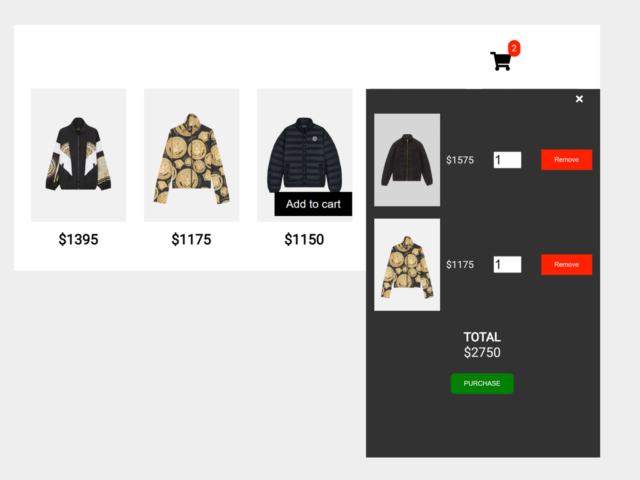
- Adds products to the cart.
- Creates side navigation for added products.
- Allows users to update the quantity of each product through number input.
- Counts and displays total price.
- Provides an event listener for the purchase button.
Author: ElieB77
11. Update Quantity in Shopping Cart Javascript
The following JavaScript shopping cart project is helpful to update products quantity and total bill on the cart page. Basically, it provides plus/minus buttons to update the quantity and displays the total price according to the items. Moreover, users can remove products from the cart list and go for the checkout process.
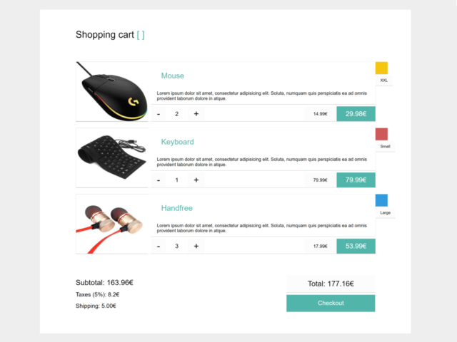
- Updates the total bill according to increasing/decreasing the product quantity.
- Provides callback for checkout process.
Author: Žiga Miklič
12. Shopping Cart Modal using Bootstrap
Showing the cart in the modal popup provides a good user experience before the checkout process. The following shopping cart project uses Bootstrap modal component to display cart list with quantity update feature, price count, and checkout button. Moreover, it allows users to remove added products with the delete confirmation modal.
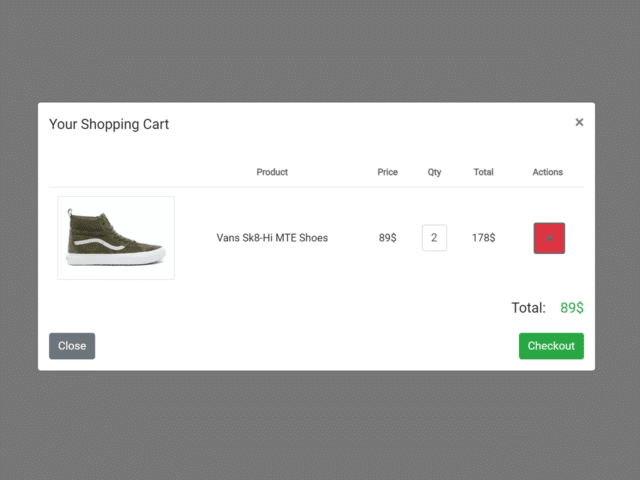
- Displays cart menu inside the Bootsrap native modal.
- Allows users to delete added products with a confirmation dialog box .
- Calculate and displays the total bill.
Author: cristina
13. Add To Cart HTML Code
The following “add to cart” project comes with a navbar, grid products layout , and cart functionality. Basically, this project comes with all basic cart functions including add, remove, empty cart, and update cart data with JSON. Moreover, you can integrate this shopping project with HTML5 templates to make it more beautiful.
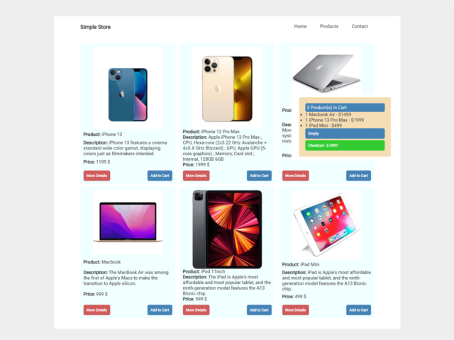
- Provides an array for JSON data to retrieve products from the server.
- Uses template strings to generate products cards.
- Generates Empty Cart and Checkout buttons based on the condition that checks if productsInCart array is empty.
- Settings up listeners for the click event on all products and the Empty Cart button as well.
- Adds new items or update existing ones in productsInCart array.
- Checks if the product is already in productsInCart array.
Author: Marco Roganovic
14. Shopping Cart Project in Javascript
The following JavaScript shopping cart project allows users to add products and displays cart lists inside a content lightbox. Generally, it comes with products cards arranged in the grid layout. The cart button has been placed inside the navbar that fires the modal dialog. Users can access their cart by opening the modal and there they can update products quantity or remove the products.
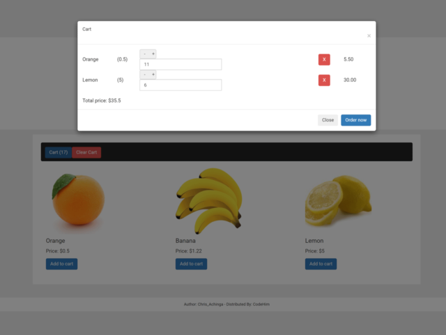
- Uses an array to store products in a cart.
- Allows users to add/remove products to/from the cart.
- Provides plus/minus buttons to increase/decrease products quantity.
- Uses local storage to save cart data.
- Provides functions to clear, save, and count cart items.
Author: Chris_Achinga
15. Feature-Rich Shopping Cart using jQuery
If you need a multifunctional shopping cart template, then the following project fits your needs. It comes with rich designed products cards that allow users to view products gallery with next/previous buttons and add products with the fly to cart animation. Similarly, users can view and remove products from the cart list. Moreover, this shopping project also provides a sign-up form template for the checkout process.
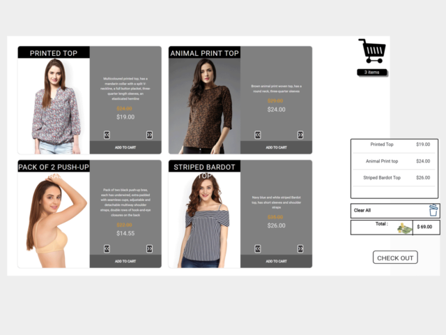
- It stores added products in an array.
- Disables multiple clicks for already added products.
- Adds an item to the cart with a fly-to-cart animation.
- Calculates the sum of all products and displays the total bill.
- Provides rich products card including images carousel inside them.
- Allows users to clear the cart.
- Provides signup form template for checkout process.
Author: Minh Quang
16. Multifunctional Modal Popup Shopping Cart
If you are working on a heavy content shopping website then you must go with the following multifunctional modal popup shopping cart. Basically, this project shows a rich cart list inside a modal allowing users to select products variants and quantities. Furthermore, users can add more products to their cart by picking from the additional products that are shown at bottom of the modal.
- Shows cart in a modal popup.
- Allows users to add and update products quantity.
- Counts and displays total bill.
- Provides products carousel at the bottom of the modal to add new products to the cart.
- Allows users to select products through the select box.
Author: shahjehan
Similar Code Snippets:
I code and create web elements for amazing people around the world. I like work with new people. New people new Experiences. I truly enjoy what I’m doing, which makes me more passionate about web development and coding. I am always ready to do challenging tasks whether it is about creating a custom CMS from scratch or customizing an existing system.
21 thoughts on “25+ Best JavaScript Shopping Cart Examples with Demo”
I need help in example no 6 I want to add more products but in a different section I try to copy and paste the code in the different section but the products in the new section are not adding to the cart
You can add as many products as you want. You just need to update id of add to cart button in each product card.
In the above product card, update the data-id="14" . For next card define 15 and so on.
It is working only one time
this is my code(index.html): https://github.com/Gtx1601/shopping-cart.git
I checked your code, everything looks fine. Check console errors if something went wrong with your project.
It is not showing any errors and it is not working as well please give me a solution for this (at line 148)
The grid class should be unique. You need to place all products in one grid class. Then you can use another way to define a separate section for those products.
ok thanks for the help
It is not redirecting products to cart page on other pages only that page you did
Hi Sipboy! First of all, you need to submit product’s details to server to generate a unique order, then you can show them anywhere on a website.
Please mention the code snippet that you’re talking about.
hello, thanks for sharing the code! I have a question, is it possible to sent the information of those products (in the shopping cart) to whatsapp?
Hi Jose! Basically, there is no built-in option to share cart info on Whatsapp. Anyhow, it’s possible to add an additional function to send shopping cart information to Whatsapp.
Can you show how to have the cart displayed on another page and also how to submit the order with an address input to my email
Hi Trey! Yes! we can submit the order detail to the server and then display it on any page. Similarly, we can forward cart info to email address.
Hi thanks. Can you show me the code to do those things?
Hi Trey! You can download the code snippet using the download button.
Hi I meant in response to this comment “Hi Trey! Yes! we can submit the order detail to the server and then display it on any page. Similarly, we can forward cart info to email address.” Also do you have a personal email?
Oh, I’m sorry, you want backend code. I’ll contact you with my personal email.
hello , how to add this code on my wp site plz guid ?
in which folder ?
hiii I need a add to cart code code for clothing site and i need to get selected size to cart also
thanks for codes, have a question when i add item in basket and change page all my items added in basket getting empty, can you help me to sort out that?
Leave a Comment Cancel reply
This site uses Akismet to reduce spam. Learn how your comment data is processed .
Free Web Design Code & Scripts - CodeHim is one of the BEST developer websites that provide web designers and developers with a simple way to preview and download a variety of free code & scripts. All codes published on CodeHim are open source, distributed under OSD-compliant license which grants all the rights to use, study, change and share the software in modified and unmodified form. Before publishing, we test and review each code snippet to avoid errors, but we cannot warrant the full correctness of all content. All trademarks, trade names, logos, and icons are the property of their respective owners... find out more...
Please Rel0ad/PressF5 this page if you can't click the download/preview link

Meaningful connections start with remarkable creative
Case studies, amelia island, the coffee bean & tea leaf, southern california toyota dealers, stella & chewy's, washington's lottery, case study by format, adcommerce™.
- Shop'spiration Cards
Proof it works
Cart injection with click2cart™, our objective.
PadSquad introduced the Cart Injection feature, powered by ClicktoCart™, to ad creatives in early 2020. Since that time we have run multiple campaigns with CPG clients measured by research studies to better understand the mindset of the customer when viewing these types of ads.
Cart Injection with Click 2 Cart®
The results.
Overall the addition of an ‘Add to Cart’ button, or Cart Injection, within mobile ad creatives for CPG advertisers has consistently rated higher on usefulness within survey research as compared to control creatives that did not include the feature.
of grocery shoppers surveyed said they are more likely to buy from an online ad that allowed add to cart vs going to the website to shop.
70% of grocery shoppers said they were more likely to buy from an online ad that allowed them to drop the product directly into the cart versus going to the website to shop. 75% of this group actually claimed this was their preferred way to shop.
In one study, grocery shoppers scored the ‘convenience factor’ of shopping from the ad versus shopping for the same product on a big box store website by 10 points higher than the control.
The addition of Cart injection within ad creatives across multiple CPG campaigns leave shoppers with a positive brand experience and give the impression of more convenience.
Are you ready to have remarkable creative?
Get in touch, let’s connect.

Add-to-Cart Rate
Identify friction points.
Pinpoint any conversion hurdles and use this data to optimize the purchase path.
A/B Testing
Experiment with different variables (e.g., CTAs, pricing strategies) to assess what resonates best.
Campaign Effectiveness
Understand whether eCommerce campaigns are persuading consumers to make purchases.
Conversion Rate Correlation
Monitor how often conversions happen after an item is added to cart and use this to inform upselling strategies.
Why Add-to-Cart Rate Is Important
Add-to-Cart Rate reveals the allure of products, in addition to the effectiveness of the online store's layout and product placement. It’s a crucial barometer of initial consumer interest and a predictive indicator of sales potential.
Tracking this rate over time helps recognize trends, forecast sales, and set inventory expectations. In isolation, Add-to-Cart Rate offers a snapshot of purchase intent, capturing when a shopper decides to consider a product seriously.
Stop Wasting Time on Reports. Get Marketing Insights Faster & Drive Results.
How Add-to-Cart Rate Relates To Other KPIs
Add-to-Cart Rate directly influences Conversion Rate, as it is an initial step in the purchasing funnel.
When more visitors add items to their cart, the likelihood of completing a purchase increases. Conversely, if the cart rate is high, but the Conversion Rate is low, it may indicate issues later in the shopping process (e.g., a slow checkout).
Add-to-Cart Rate also shares a reciprocal relationship with website traffic quality. High-quality traffic tends to yield a higher Add-to-Cart Rate, suggesting that engaged users are more likely to consider a purchase.
How To Calculate Add-to-Cart Rate
To calculate Add-to-Cart Rate, divide the total number of cart-related actions within a specific timeframe by the total number of visitors to the site. Then, multiply the result by 100 to get a percentage. Here’s a formula for quick reference:
What Is a Good Add-to-Cart Rate?
A good average Add-to-Cart Rate typically ranges between 8% to 10%. This indicates that the website effectively engages visitors, and products are well-aligned with purchase-driven consumers.
To sustain a high Add-to-Cart rate, maintain a user-friendly design, fast loading times, and mobile responsiveness.
What Is a Bad Add-to-Cart Rate?
A bad average Add-to-Cart Rate is generally considered to be below 3%. Such a low figure suggests issues with the site’s user experience, product appeal, or pricing strategies.
To improve a bad Add-to-Cart rate, focus on enhancing the user experience, provide compelling product information, and streamline the checkout process.
How To Set Goals and Benchmarks for Add-to-Cart Rate
To set effective benchmarks, begin by reviewing past Add-to-Cart Rates. To create realistic targets, consider the previous impact of website design updates, product lineup shifts, and strategy adjustments on these rates.
It’s also useful to break down this data by product categories, customer demographics, or marketing channels to identify patterns or trends. Based on this analysis, decide on realistic goals, considering historical performance and industry benchmarks.
Report Smarter, Not Harder.
Better, faster & easier client reports are just a few clicks away, why add-to-cart rate matters to clients.
Clients view Add-to-Cart Rate as a direct pulse on consumer interest and product market fit. A high rate means visitors are not just browsing–they’re taking the first steps toward a purchase.
This KPI helps clients understand which products are window-shopping and which ones are making it into the checkout line. A change in this rate may signal that it’s time to reassess product appeal or promotional strategies. This ensures that clients’ offerings stay aligned with customer desires.

Why Add-to-Cart Rate Matters to Agencies
For agencies, Add-to-Cart Rate is a diagnostic tool to dissect the shopping journey and optimize marketing efforts.
A robust rate validates an agency’s creative and strategic prowess, showcasing their ability to craft compelling product narratives. Conversely, a dip may prompt an analysis of user experience, campaign messaging, and funnel optimization. Agencies leverage this KPI to refine tactics, adjust targeting, and improve user engagement strategies.

Save Time and Money by Automating Your Client Reporting
Best Practices for Analyzing and Reporting on Add-to-Cart Rate
Analyzing Add-to-Cart rate is essential for sharpening campaign precision, boosting advertising efficiency, and driving revenue. Here are some reporting best practices to follow.
Consistent Tracking
Use a consistent method for tracking Add-to-Cart events, which ensures data reliability over time.
Segmentation
Break down Add-to-Cart rate by different variables such as traffic source, device type, product category, or customer segment to identify specific trends and behaviors.
Use Consistent Time Frames
Report on Add-to-Cart rate using consistent time periods (daily, weekly, monthly) to track trends and changes over time accurately.
Highlight Changes and Trends
Clearly point out any significant changes or trends in Add-to-Cart rate, such as seasonal variations or impacts from marketing campaigns.
Clear Visualization
Use charts and graphs to visually represent the Add-to-Cart rate trends, which makes data easier to understand and actionable.
Connect to Other Metrics
Report Add-to-Cart rate alongside related metrics such as Conversion Rate, Average Order Value, and Cart Abandonment Rate to give a complete picture of the shopping funnel.
Google Analytics 4 Dashboard Example
Related Integrations
How To Improve Add-to-Cart Rate
Improving Add-to-Cart rate often involves subtle yet effective adjustments to the shopping experience. Consider these straightforward strategies.
Streamline Navigation
Ensure a smooth, intuitive journey from product browsing to cart with minimal steps involved.
Enhance Imagery
Use high-resolution images and videos to showcase products effectively, prompting more Add-to-Cart actions.
Accelerate Load Times
Optimize website performance to facilitate quicker cart additions and an enhanced user experience.
Related Blog Posts
12 Ecommerce Goals That Drive Client Success
As digital marketers, metrics often rule our world. They are abundantly available, giving us insights into what’s working for our clients–and what we need to improve upon. That’s where tracking eCommerce goals comes in.

The Top 39 eCommerce KPIs That Drive Growth
Master eCommerce KPIs and learn how they tie into campaign and client performance with this practical, insightful guide. Drive growth, success, and client satisfaction.
The Ultimate Guide to Ecommerce Conversion Rate Optimization
In this guide, we’ll discuss how to use eCommerce conversion rate optimization to make the most out of the traffic that you’re getting.
Agency Growth Tips, Delivered to Your Inbox.
I have been in the industry for 10 years and used a lot of reporting tools. AgencyAnalytics is the best one I have used in terms of both the software itself and value for money. This tool is a must for any online marketing company.

Digital Debut
We’ve been using AgencyAnalytics for many years now, and it’s proven to be a dramatic time-saver and cost-saver for us. With the real-time interface, white label dashboards, and accurate rankings, we have all the tools we need to set us and our clients up for success.

B&S Media
Very happy with the overall tool, which gives you very accurate data. We chose AgencyAnalytics as its providing complete solutions for what we are after, giving us time to focus on performance-driven work.

Zib Digital
Creating, generating, and sharing reports has never been easier, and our clients love the fact they can follow our activity and their stats in real time. Everything is simplified, accessible, and beautifully presented.

Victory Digital
See More KPI Examples
Average order value (aov).
Average Order Value (AOV) measures the average amount spent on each transaction during a specific period.
Cost Per Acquisition (CPA)
Cost per Acquisition (CPA) calculates the average spend on advertising for acquiring one customer.
Click-Through Rate (CTR)
Click-through Rate, commonly abbreviated as CTR, measures the percentage of clicks received on online advertising or a link relative to the number of times it has been viewed.
Sales Qualified Lead (SQL)
A Sales Qualified Lead (SQL) is a prospect vetted through specific criteria, indicating a strong likelihood of converting into a paying customer.
Cart Abandonment Rate
Cart Abandonment Rate quantifies the percentage of online shoppers who add products to their cart but exit without completing the purchase.
Checkout Abandonment Rate
The Checkout Abandonment Rate indicates the percentage of online shoppers who leave a site during the checkout process without finalizing the purchase.
Get Started for Free


Sign Up Log In
CART: A Science Communication Tool for Restoration
What is CART?
Complex challenges in natural resources require collaboration and coordination across landscapes and jurisdictions. Yet, among (and even within) different organizations, it is often difficult to work together to tackle issues at the scale required to make a real difference. The Conservation and Adaptation Resources Toolbox (CART; previously known as CCAST) is a multi-organizational partnership directed by the U.S. Fish and Wildlife Service (USFWS) Science Applications Program and U.S. Bureau of Reclamation (Reclamation), and staffed by a growing network of coordinators and Case Study authors through the School of Natural Resources and the Environment (SNRE) at the University of Arizona, the USDA Southwest Climate Hub and Drought Learning Network, and Climate Adaptation Science Centers ( CASC ; Southwest and South Central ). CART, and the Communities of Practice (CoPs) it supports, is building partnerships to help address challenges for conservation, management, and restoration of natural resources at landscape and watershed scales across North America.
Collectively, the CART team is a diverse network of directors, staff, and students. The CART team cooperates with hundreds of individuals from dozens of organizations to increase and improve communication, develop tools to support landscape conservation and restoration, inform management decision-making, and develop actionable science.
CART Case Studies
CART, launched in 2017, provides an outlet for resource management professionals to highlight their work in a central location through its interactive Case Study Dashboard that users can also Explore by Tags . A Case Study is a write-up of work completed to manage, conserve, restore, or conduct actionable science on natural resources. CART Case Study narratives focus on methods and lessons learned that can inform future work or projects in other geographies, including project details often not published in peer-reviewed literature. Most importantly, Case Studies are catalysts for our Communities of Practice (see below).
As of May 2023, CART is home to 183 published Case Studies, with dozens more in progress. Case Studies include a range of topics from “Actionable Science” to “Collaboration and Community Engagement”. Within the interactive Dashboard feature, Case Studies are easily sortable by topic, stressors, management strategies, as well as geography. Here, users can navigate to Case Studies by filter (left side), a clickable chart (bottom right), or by tags found here .
Let us help communicate your restoration project or partnership through CART -- contact us if you are interested in contributing a Case Study (we do almost all the work!). The CART team handles all the information gathering and writing, and we require just a few hours of your time in providing background information, answering specific questions, and providing edits to preliminary drafts.
Student Interns and Emerging Professionals
Another important goal of CART is to support and provide mentorship to students and emerging professionals interested in a career in natural resources conservation, management, or restoration. Between 2019 and 2023, CART has supported over 45 student authors from 22 different organizations. Students come to CART with diverse backgrounds and college majors, and have developed 112 of CART’s 183 Case Studies as of May 2023. In turn, CART provides students and emerging professionals an opportunity to learn about on-the-ground conservation and restoration efforts, build their professional networks, and develop practical science communication skills.
Communities of Practice
A Community of Practice (CoP) is a group of individuals that regularly interacts to learn how to more effectively conduct their work and achieve common goals. CART supports CoPs for key natural resources challenges by providing the infrastructure to convene partnerships, improve communication, and develop useful tools to support decision-making. CART coordinates four CoPs comprised of natural resource managers, conservation and restoration practitioners and researchers, each with Case Studies and synthesis products. For example, a practitioner setting out to control a non-native aquatic species like American bullfrogs and restore native populations like Gila Topminnow may participate in a CoP to find examples of other projects that worked (and perhaps did not work) and learn lessons through Case Studies, explore treatment techniques through a synthesis review, and access a network of collaborators through the CoP listserv.
CoP: Non-Native Aquatic Species
Introduced non-native aquatic species can present obstacles to achieving management objectives, ranging from recovery of native aquatic species to maintenance of water delivery infrastructure. The Non-Native Aquatic Species CoP, officially launched in Spring 2020, is a central place to learn from non-native species control (and native species restoration) efforts and to prioritize research needs. The CoP develops Case Studies , hosts webinars on non-native aquatic species, and has created several decision support tools and a Non-Native Aquatic Species Toolkit. Here are a few non-native aquatic species focused Case Studies:
- Green Sunfish Eradication to Restore Native Aquatic Species in Ash Creek, Arizona
- Successful Bullfrog Eradication at a Landscape Scale in Yosemite National Park
- Restoration of a Native Fish Assemblage in the Blue River, Arizona
Contact Karlee Jewell for more information about CART’s Non-Native Aquatic Species work.
CoP: Drought Adaptation
Forecasts indicate that the Colorado River Basin will continue to experience drought conditions in the future, and that resource managers will need to continually adapt to ensure a sustainable water supply. As water demand for municipal and agricultural uses increases, ensuring the availability of water for other uses such as the environment, recreation, and hydropower becomes increasingly challenging. The Drought Adaptation CoP is a central place to discuss and learn from people preparing for, responding to, and recovering from drought. To support information-sharing on adaptation to drought, the CART team, in conjunction with the USDA Southwest Climate Hub and the Drought Learning Network, has developed a synthesis of methods and adaptive science tools to prepare for and respond to drought . Additionally, the CoP continues to develop relevant Case Studies focused on drought adaptation. Here are a few Case Studies currently online:
- Drought Mitigation through Land Management and Water Distribution for Wild Horses
- Heritage Genetics to Increase Cattle Resilience during Drought
- Co-Developing the Drought Severity Evaluation Tool for Use on the Navajo Nation
Contact Maude Dinan , Anna Weinberg , or Genevieve Johnson for more information about CART’s Drought Adaptation work.
CoP: Grasslands
Numerous groups have been restoring grasslands in the Southwest for decades. However, there remains a lack of understanding of the effectiveness and impacts of grassland restoration techniques that hinders our ability to scale grassland restoration. CART’s Grassland CoP supports the land managers, researchers, and restoration practitioners who need to simultaneously consider recovery of eroded soils, grazing and vegetation, fire, native and non-native species, monitoring and adaptive management. The Grassland CoP develops Case Studies on grassland restoration, hosts regular webinars and panel-discussions , facilitates workshops, and develops decision support tools. CART maintains an online Grasslands Toolkit that organizes all this information in one central location. Here are a few Case Studies currently online:
- Treatment of Non-Native Lovegrasses at Appleton-Whittell Research Ranch
- Reversing Erosion on Semi-Arid Grassland Ranches: A 10-Year Analysis
- Herbicide Treatment of Western Honey Mesquite in Texas Grasslands
Contact Ariel Léger for more information about CART’s Grassland CoP.
CoP: Aquatic Restoration
Billions of dollars have been spent on efforts across the United States to restore fish and wildlife habitat that depends on our nation’s aquatic resources. However, aquatic ecosystems are especially vulnerable to climate change due to previous alterations and the dependence on sufficient water. These dynamics are further complicated by drought, specifically the recent historical drought in the southwestern U.S. Restoring aquatic ecosystems may mitigate the impacts of climate change, but resource managers must find ways to incorporate climate information into restoration planning and decision making. The Aquatic Restoration CoP develops Case Studies, hosts webinars, and supports river basin-wide planning efforts in the Southwest. Here are a few Case Studies currently online:
- Floodplain Restoration for Salmonid Habitat in the Yakima Basin
- Using Woody Materials to Restore Crooked Creek
- Collaborating with Arizona Farmers to Conserve Flows in the Verde River
Contact Anna Weinberg for more information about CART’s Aquatic Restoration CoP.
CART Next Steps
CART continues to grow, both in terms of content and its team. The CART team is prioritizing its focus on each CoP and continues to work closely with interns to develop associated Case Studies to communicate lessons learned that support management practices and knowledge sharing among the CoPs. CART coordinators are focusing on CoP syntheses and tool development with input and guidance from CoP members. The CART team is excited to make these resources widely accessible and to further pursue this work with your input.
For more information on CART, to contribute a Case Study, or join a CoP please contact: Karlee Jewell or Genevieve Johnson .
Anna Weinberg and Ariel Léger are currently, and Alex Koeberle was previously, Research Specialists in the School of Natural Resources and the Environment at University of Arizona.
BILLY JOHNSON iHuman Case Study. Complete Solution/ Latest... - $10.45 Add to Cart
BILLY JOHNSON iHuman Case Study. Complete Solution/ Latest Update 2024
Preview 2 out of 14 pages

Generating Your Document
Purchase the document to get the full access instantly
- 3 Million+ Study Documents
- 100% Money Back Guarantee
- Immediate Download Access

Report Copyright Violation
Available in 1 Bundle

i-human BILLY JOHNSON Case; Latest 2023/2024 Complete Solution/ Latest Update
$25.45 0 X Sold 2 items
Bundle contains 2 documents
Case Details
Also available in bundle from $25.45
Add To Cart
Add To Wishlist
- Trusted by 800,000+ Students
- 24/7 Money Back Guarantee
- Download is directly available
Specifications
Institution Allen School Online
Study university
Course BILLY JOHNSON iHuman Case Study. Complete Solution
Document Details
Language English
Subject Health Care
Updated On May 05,2024
Number of Pages 14
Written 2023-2024
Seller Details

Tutorclinton
2.0K documents uploaded
24 documents sold
Member since 9 months
Reviews received
Recommended documents

BIlly Johnson iHuman

BILLY JOHNSON IHUMAN CASE

Billy Johnson iHuman Case...

Billy Johnson IHuman Case...
Billy johnson ihuman case..., what students are saying about us.
DocMerit is a great platform to get and share study resources, especially the resource contributed by past students.

Northwestern University Karen
I find DocMerit to be authentic, easy to use and a community with quality notes and study tips. Now is my chance to help others.

University Of Arizona Anna Maria
One of the most useful resource available is 24/7 access to study guides and notes. It helped me a lot to clear my final semester exams.

Devry University David Smith
DocMerit is super useful, because you study and make money at the same time! You even benefit from summaries made a couple of years ago.

Liberty University Mike T
- Follow us on
- Copyright © 2024 | All rights reserved
Register a free account


IMAGES
VIDEO
COMMENTS
Variant #1: Sticky add to cart in the same color as the website header that includes the product name and price. Variant #2: Sticky add to cart in a contrasting color that includes the product name and price. Again, if variant #1 outperforms variant #2 you can assume that shoppers prefer a branded add to cart button.
Since first writing this case study, we tested multiple UX treatments for a sticky add to cart button on the mobile PDP of this exact same supplement ecommerce store. The smaller screen real estate on mobile devices, of course, means finding CTAs like the add to cart button can be more difficult, so making the add to cart button sticky could ...
You can create a new React application using Create React App: npx create-react-app ecommerce-cart. cd ecommerce-cart. npm start. Now, let's start implementing the "Add to Cart" functionality. Step 1: Set Up the Project Structure. Organize your project by creating a dedicated folder structure. For simplicity, let's create a 'components' folder ...
The Challenge. The scope of this case study is to provide personalized experience to the users so that they can customize their shopping cart according to their needs. There are around 20million Amazon Prime customers in India alone. Majority of these subscriptions are on a shared basis i.e. there are more than one users linked to an account.
Idea 2: Long press the items from the cart to buy the items. In the cart, select the respective items by long pressing the items and see the buy now option hence the user can buy the products without any distress. Idea 3: Remove all the items from the cart.
The next part in this UX case study identifies pain points faced by the proto personas when using the Amazon shopping app. To do so, we use a methodology named Heuristic evaluation. Heuristic Evaluation is a usability testing evaluation system introduced by Jakob Nielsen in 1990. It enables evaluators to determine a product's usability based ...
In case of -adding to the cart user need to be made sure about: - what will happen when he presses the button (for example icon with plus shows that this button adds); - product is added to the ...
6. Conclusion. Facilitating ease of swipe, scroll, add-to-cart e-commerce anywhere and anytime is a primary goal for retailers across many industries today. We focus our investigation here on the fashion industry with a heuristic case study of e-commerce product listing page designs for small screen devices.
Add to Cart Case Study A Top 100 Furniture Retailer has recently implemented Shoptelligence's Interactive Ensembles technology. The platform takes a retailer's basic product data and transforms it into shoppable, cross-category room assortments allowing shoppers to discover more of the retailer's catalog.
Aug 11th, 12:00 AM. Swipe, Scroll, Add-To-Cart: a case study of e-commerce gallery designs for small screen devices. With significant increase in mobile online shopping the design of user experiences that promote purchaser decisions and increase sales is highly desirable to retailers and their marketing and digital production companies.
A sticky add to cart feature is a must-have for any online store looking to improve the shopping experience for its customers. It offers a range of benefits, from increased convenience to improved conversion rates, and can be customized to fit seamlessly into your store's design. Send us a message or call us at 866-901-4650 if you want to ...
A large national retailer wanted to streamline its private label portfolio and ensure its offerings exceeded customer expectations. After consolidating and optimizing product lines, the client hoped to leverage marketing and product placement to create brand-aligned shopping experiences. To center retail journeys around its brand narrative and products, the grocery line needed to understand ...
Pressing the "Add-To-Cart" button should add the chosen item to the shopping cart. Check and Validate that the item-specifics (name, price, quantity) are spot-on in the cart list. 2. Test for Adding Multiple Items to the Shopping Cart: Make sure that the application lets you add multiple items.
Improve 'Add To Cart' Percentages Using Real-Time Social Proof Data Applicable Segment(s): Fashion & Lifestyle, Health & Beauty, Home Furnishings, Electronics, Luxury, Specialty, DIY, Toys, Office Supplies and D2C ... case studies, videos, and more — to stay ahead of the curve. Blog. The Power of Social Influence in eCommerce. Read More.
6. Upsell and cross-sell. Giving recommendations for a supplementary or higher value product is one of the proven tactics to increase your add-to-cart conversion rates. This is called upselling and cross-selling. You can create an automated workflow to recommend shoppers when they decide to buy or choose a product.
Add To Cart functionality is one of the important components of the E-commerce platform. In this article, we are going to learn how to implement Add to Cart functionality using React JS and Redux Toolkit. Preview of final output: Let us have a look at how the final output will look like.
From our extensive A/B/C test, we found that UGC placed at the top of the INpages boosted Add-to-Cart rates by 5.07% compared to INpage templates that do not feature any UGC. We also found that the INpages template with UGC placed at the top performed 7.84%* better than templates that showcased UGC at the bottom of the template.
Step 3: Paste the exclusively personalized "Add to Cart" on your product page. Now, Select the main Add to Cart wrapper and copy it, then add it to the product collection list. Then go to the product template page, connect to the "products" category, and paste your exclusive Add to Cart component.
15. Feature-Rich Shopping Cart using jQuery. If you need a multifunctional shopping cart template, then the following project fits your needs. It comes with rich designed products cards that allow users to view products gallery with next/previous buttons and add products with the fly to cart animation.
In one study, grocery shoppers scored the 'convenience factor' of shopping from the ad versus shopping for the same product on a big box store website by 10 points higher than the control. The addition of Cart injection within ad creatives across multiple CPG campaigns leave shoppers with a positive brand experience and give the impression ...
For agencies, Add-to-Cart Rate is a diagnostic tool to dissect the shopping journey and optimize marketing efforts. A robust rate validates an agency's creative and strategic prowess, showcasing their ability to craft compelling product narratives. Conversely, a dip may prompt an analysis of user experience, campaign messaging, and funnel ...
The example of the test for Add To Cart in testRigor is this: enter "TV" into "Search". enter enter. click "TV". click "Add To Cart". check that page contains "Item Added To Cart". As you can see, the steps are easy to understand and self-explanatory. This allows developers to write test cases quickly and efficiently, reducing the time and ...
CART, launched in 2017, provides an outlet for resource management professionals to highlight their work in a central location through its interactive Case Study Dashboard that users can also Explore by Tags. A Case Study is a write-up of work completed to manage, conserve, restore, or conduct actionable science on natural resources.
One of the most useful resource available is 24/7 access to study guides and notes. It helped me a lot to clear my final semester exams. DocMerit is super useful, because you study and make money at the same time! You even benefit from summaries made a couple of years ago. BILLY JOHNSON iHuman Case Study.