What font should I choose for my thesis?
This post is by DrJanene Carey, a freelance writer and editor based in Armidale NSW. She occasionally teaches academic writing at the University of New England and often edits academic theses, articles and reports. Her website is http://www.janenecarey.com
Arguably, this question is a classic time waster and the student who poses it should be told to just get on with writing up their research. But as someone who edits theses for a living, I think a bit of time spent on fonts is part of the process of buffing and polishing what is, after all, one of the most important documents you will ever produce. Just bear in mind that there is no need to immerse yourself so deeply in the topic that you start quibbling about whether it’s a font or a typeface that you are choosing .
Times New Roman is the standard choice for academic documents, and the thesis preparation guidelines of some universities stipulate its use. For many years, it was the default body text for Microsoft Word. With the release of Office 2007, the default became a sans serif typeface called Calibri. Lacking the little projecting bits (serifs) at the end of characters makes Calibri and its many friends, such as Arial, Helvetica and Verdana, look smoother and clearer on a screen, but generally makes them less readable than a serif typeface when used for printed text . The other problem with choosing a sans serif for your body text is that if you want passages in italics (for example, lengthy participant quotes) often this will be displayed as slanted letters, rather than as a true italic font.
You would like your examiners to feel as comfortable as possible while their eyes are traversing the many, many pages of your thesis, so maximising legibility and readability is a good idea. Times New Roman is ubiquitous and familiar, which means it is probably the safest option, but it does have a couple of drawbacks. Originally designed for The Times in London, its characters are slightly narrowed, so that more of them can be squished into a newspaper column. Secondly, some people intensely dislike TNR because they think it has been overused, and regard it as the font you choose when you are not choosing a font .
If you do have the luxury of choice (your university doesn’t insist you use Times New Roman, and you have defined document styles that are easy to modify, and there’s enough time left before the submission deadline) then I think it is worth considering what other typefaces might work well with your thesis. I’m not a typographical expert, but I have the following suggestions.
- Don’t use Calibri, or any other sans serif font, for your body text, though it is fine for headings. Most people agree that dense chunks of printed text are easier to read if the font is serif, and examiners are likely to expect a typeface that doesn’t stray too far from the standard. To my eye, Calibri looks a little too casual for the body of a thesis.
- Typefaces like Garamond, Palatino, Century Schoolbook, Georgia, Minion Pro, Cambria and Constantia are all perfectly acceptable, and they come with Microsoft Word. However, some of them (Georgia and Constantia, for example) feature non-lining numerals, which means that instead of all sitting neatly on the base line, some will stand higher or lower than others, just like letters do. This looks nice when they are integrated with the text, but it is probably not what you want for a tabular display.
- Consider using a different typeface for your headings. It will make them more prominent, which enhances overall readability because the eye scanning the pages can quickly take in the hierarchy of ideas. The easiest way to get a good contrast with your serif body text is to have sans serif headings. Popular combinations are Garamond/Helvetica; Minion Pro/Myriad Pro; Times New Roman/Arial Narrow. But don’t create a dog’s breakfast by having more than two typefaces in your thesis – use point sizes, bold and italics for variety.
Of late, I’ve become quite fond of Constantia. It’s an attractive serif typeface that came out with Office 2007 at the same time as Calibri, and was specifically designed to look good in print and on screen. Increasingly, theses will be read in PDF rather than book format, so screen readability is an important consideration. Asked to review Microsoft’s six new ClearType fonts prior to their release, typographer Raph Levien said Constantia was likely to be everyone’s favourite, because ‘Even though it’s a highly readable Roman font departing only slightly from the classical model, it still manages to be fresh and new.’
By default, Constantia has non-lining numerals, but from Word 2010 onwards you can set them to be lining via the advanced font/number forms option, either throughout your document or in specific sections, such as within tables.
Here is an excerpt from a thesis, shown twice with different typefaces. The first excerpt features Calibri headings with Constantia body text, and the second has that old favourite, Times New Roman. As these examples have been rendered as screenshots, you will get a better idea of how the fonts actually look if you try them on your own computer and printer.

Related posts
Should I get an editor for my thesis?
Love the Thesis whisperer and want it to continue? Consider becoming a $1 a month Patreon and get special, Patreon only, extra Thesiswhisperer content every two weeks!

Share this:
The Thesis Whisperer is written by Professor Inger Mewburn, director of researcher development at The Australian National University . New posts on the first Wednesday of the month. Subscribe by email below. Visit the About page to find out more about me, my podcasts and books. I'm on most social media platforms as @thesiswhisperer. The best places to talk to me are LinkedIn , Mastodon and Threads.
- Post (606)
- Page (16)
- Product (6)
- Getting things done (258)
- On Writing (138)
- Miscellany (137)
- Your Career (113)
- You and your supervisor (66)
- Writing (48)
- productivity (23)
- consulting (13)
- TWC (13)
- supervision (12)
- 2024 (5)
- 2023 (12)
- 2022 (11)
- 2021 (15)
- 2020 (22)
Whisper to me....
Enter your email address to get posts by email.
Email Address
Sign me up!
- On the reg: a podcast with @jasondowns
- Thesis Whisperer on Facebook
- Thesis Whisperer on Instagram
- Thesis Whisperer on Soundcloud
- Thesis Whisperer on Youtube
- Thesiswhisperer on Mastodon
- Thesiswhisperer page on LinkedIn
- Thesiswhisperer Podcast
- 12,125,724 hits
Discover more from The Thesis Whisperer
Subscribe now to keep reading and get access to the full archive.
Type your email…
Continue reading
+61 481607654
8 Best Fonts for Thesis Writing to Make It Presentable

Table Of Contents
How do font plays a critical role in thesis, 8 best fonts for thesis writing, tips to choose the best font for thesis, mistakes to avoid while choosing a font, how to format your thesis perfectly.
- Can’t Write a Thesis? Let Our Experts Do It for You
When your professor assigns you a thesis, he excepts it to be perfect at the time of submission. The textual content of the document is the utmost source of information. So, while creating content, you should take care of the font selection. Choosing the best font for the thesis provides an attractive appearance and preserves the aesthetic value of your document. Also, the font professionally presents information. Choosing font in both ways (either online or printed form) of the thesis is crucial. If you are submitting it online, then the font makes a difference in the readability. If you are providing it in the printed form, then the font reflects professionalism.
You May Like This: The Complete Guide to Breaking Down a 10000-Word Dissertation
Sometimes, it is questioned that why the font is necessary. Well, the font is as mandatory as the content. You should know that everything is in proper fonts for the thesis.
- To highlight headings, you can use bold and stylish fonts.
- To highlight the subheadings, you can use italic and cursive fonts.
- The information that you want to convey must be in a simple and decent font.
This particular formula will grab the reader’s attention to your document. If you don’t focus on the font, then your document will look imprudent. It can create a bad impact on your professor. If you don't show creativity while writing, then the reader will get bored and won’t show interest in your document. So, make sure to always use different fonts in the thesis according to the needs. Now, let’s talk about some of the most appropriate fonts included in the thesis.
This Might Be Helpful: A to Z of Assignment Writing: Everything You Need to Know About It
A thesis can look presentable if you include appropriate fonts in it. The following fonts will create a positive impression on your professor. Let’s take a look:
- Times New Roman Times New Roman was particularly designed for Times Newspaper for London. This font has a separate and different value in a formal style. Most of the universities and colleges suggest students use this font in a document.
- Georgia Georgia font was designed in 1883, especially for Microsoft Corporation. This is the best font for the students who want to submit the document online. It is preferred for the elegant and small appearance for low-resolution screens.
- Serif Serif is originated from Roman from a font written on a stone. Earlier, this font was not accepted universally. The specialty of this font is that every alphabet has a small line or stroke attached to the end of the larger stroke.
- Garamond Garamond is usually used for book printing and body text. If you want to write the main body or long paragraphs, then you can use this font. It is simple and easy to read.
- Cambria Cambria is founded by Microsoft and later distributed with Windows and Office. This font is the easiest to read in a hurry because it contains spaces and proportions between the alphabets. This is suitable for the body and the long sentence.
- Century Gothic Century Gothic is basically in the geometric style released in 1881. This font has a larger height instead of other fonts. If the university allows you to choose the font of your own choice, you can go for this one.
- Palatino Linotype Palatino Linotype font is highly legible for online documents. It enhances the quality of the letter when displayed on the screen. This font is majorly used for books, periodicals, and catalogs.
- Lucida Bright Lucida Bright has a unique quality that the text looks larger at smaller point sizes also. This font can fit words on a single line. To write a thesis, you can choose this font easily.
After getting brief knowledge about the fonts, let's now come to the tips to choose the best font for the thesis. Here are some major key points that you should follow while choosing a font.
- Make sure your font looks attractive.
- It should match your tone.
- Headings and subheadings must be highlighted.
- It should not look congested.
- Avoid choosing complicated or fancy fonts.
Take a Look: How to Write a Good Thesis Statement for an Essay? Best Tips & Examples
Students make some mistakes while choosing a font, which the professor dislikes the most. So, to avoid those, keep the below points in mind.
- Don’t choose fonts on your likes and dislikes.
- Put the reader's preference first and then choose the font.
- Avoid too many fonts as they make the work look unorganized.
- Make sure all fonts match your document instead of making it look like a disaster.
- Choose different fonts for titles, subtitles, paragraphs.
When preparing the thesis for submission, students must follow strict formatting requirements. Any deviations in these requirements may lead to the rejection of the thesis.
- The language should be perfect.
- The length of the thesis should be divided appropriately among the sections.
- The page size, margins, and spacing on the page should be correct.
- The font and point size should be displayed correctly.
Can't Write a Thesis? Let Our Experts Do It for You
The experts of Assignment Prime warmly welcome everyone who seeks help with thesis writing service . A thesis is one of the toughest academic papers to write for students. It takes a great amount of time, rigorous research, and perfect writing skills to complete it. To make this easy for you, the experts are here to help you write the thesis and the font selection for every section.
We are known for offering unmatched assistance with thesis and dissertation writing to students across the globe. Our professionals deliver a well-researched and informative academic paper before the deadline. We also provide help to students in research, topic selection, editing, proofreading, etc. So, stop searching for help and quickly start ordering without any delay to avail the best features of Assignment Prime . We are waiting to serve you with the best!
You may like this : How to write a discussion in dissertation

To Make Your Work Original
Check your work against paraphrasing & get a free Plagiarism report!
Check your work against plagiarism & get a free Plagiarism report!
Get citations & references in your document in the desired style!
Make your content free of errors in just a few clicks for free!
Generate plagiarism-free essays as per your topic’s requirement!
FREE Features
- Topic Creation USD 4.04 FREE
- Outline USD 9.75 FREE
- Unlimited Revisions USD 21.6 FREE
- Editing/Proofreading USD 29.26 FREE
- Formatting USD 8.36 FREE
- Bibliography USD 7.66 FREE
Get all these features for
USD 84.3 FREE

Thesis Statement Writing: How Crucial is it? How to Write? & More
![All About Short Essay Writing [Examples Included]](https://www.assignmentprime.com/images/AP_Blog_Image_How_to_Write_a_Short_Essay.jpg "what font to use in thesis")
All About Short Essay Writing [Examples Included]

How to Write a Letter of Reference with Templates?

Experts' Guidance on How to Conduct Nike’s SWOT Analysis

Avail the Best Assignment Writing Services in Just One Tap!
Add "5% extra off on app"
We use cookies to ensure that we give you the best experience on our website. If you continue to use this site we will assume that you are happy with it. Know more

Please rotate your device
We don't support landscape mode yet. Please go back to portrait mode for the best experience
Great fonts for a PhD thesis – and terrible ones
There are thousands of fonts out there – which one should you choose for a great-looking PhD thesis? I will explain the differences between serif and sans-serif fonts, what ligatures are and why you shouldn’t use that fun free font you found on the internet.
Great fonts for a PhD thesis: Serif vs. sans-serif
As I explained in my Ultimate Guide to preparing a PhD thesis for printing , there are two basic kinds of fonts: Serif fonts and sans-serif fonts. Serif fonts have small lines – serifs – at the ends of all lines. Sans-serif fonts don’t have those lines. Compare these two, Palatino Linotype and Arial:

Serifs guide the reader’s eyes, making sure that they stay in the same line while reading a printed text. In turn, your reader’s brain won’t get tired so quickly and they can read for longer.
But there is another feature that many serif fonts have. Look at these three (which are all great fonts to use in your PhD thesis, btw):

If you look closely, you will see that serif fonts often have different stroke thicknesses within every letter. This is called “weight contrast”. A subtle weight contrast further improves legibility of a printed text. Hence, I recommend you use a serif font with a bit of a weight contrast for your main text.
Which serif font should you choose?
But whatever you do, this one thing is extremely important: Choose a font that offers all styles: regular, italics , bold , and bold italics . Since these four styles all need to be designed separately, many fonts don’t offer all of them. Especially bold italics is absent in most free internet fonts and even from many fonts that come with your operating system or word processor.
Also: In your bibliography and in-text citations (if you go with an author-year citation style) you will have to display author’s names from all over the world. Many of them will contain special letters. For example German umlauts (ä, ö, ü), accented letters used in lots of of languages, i.e. French or Spanish (à, é, ñ, etc.), and dozens of other special letters from all kinds of languages (ç, ı, ł, ø, etc.). Be aware that only a very limited number of fonts offer all of these!
If you have mathematical equations in your thesis that require more than +, – and =, your font choices are limited even further . After all, the vast majority of fonts do not offer special operators.
As you can see, these criteria severely limit your choice of font for the main text. Needless to say, they rule out free fonts you can download from dafont.com or 1001fonts.com . That is why I urge you to go with a classic font. To make things easier for you, here is a table with serif fonts that offer all the characters you could dream of:
Failsafe serif fonts for your PhD thesis
These fonts are heavily based on fonts that have been in use since the invention of the mechanical printing press in the 15th century. Hence, these types of fonts have been tried and tested for more than 500 years. Hard to argue with that!
But which of these fonts is The Best TM for a PhD thesis? That depends on how much text you have in your thesis vs. how many figures, tables, equations, etc. As I have noted in the table, fonts have different widths. Look at this image showing the same text in Times New Roman (TNR), Cambria, and Sitka Text; all at the same size:
Hence, setting entire pages of text in TNR will make the page look quite dense and dark. So, a thesis with a lot of text and few figures is best set in a wider font like Sitka Text. On the other hand, if you have a lot of figures, tables, etc., TNR is a good choice because it keeps paragraphs of text compact and therefore the page from looking too empty. Medium-width fonts like Cambria are a good compromise between the two.
To see some of these fonts in action, check out this example PhD thesis where I show all sorts of font combinations and page layouts.
When to use a sans-serif font in your PhD thesis
This covers serif fonts. But which sans-serif fonts are great for your PhD thesis? And when do you use them?
As mentioned above, serif fonts are good for the main text of your thesis. But titles and headings are a different story. There, a sans-serif font will look very nice. Plus, using a different font in your headings than in the main text will help the reader recognize when a new section begins.
Here are some examples for good sans-serif fonts:

Each of these fonts – Futura, Franklin Gothic Book, and Gill Sans – are wonderful for headings in a PhD thesis. Why? Because they are easily readable, well-balanced and don’t call undue attention to themselves. Also, they have many options: regular, light, medium, bold, extra bold, including italics for all of them. And most operating systems or word processors have them pre-installed.
The criteria for heading fonts are not nearly as strict as those for main text fonts. If you have Latin species names in your headings, make sure the font offers (bold) italics. If you need to display Greek letters in your headings, make sure the font offers those. Done.
However, there are some criteria for headings. Just for fun, let’s have a look at some sans-serif fonts that would be a bad choice for a thesis:

I’d like to explicitly state that these are wonderful, well-designed fonts – you just shouldn’t use them in a scientific document. Heattenschweiler is too narrow, Broadway has too much weight contrast and Aspergit Light is too thin. All of these things impair readability and might make your opponents squint at your headings. Of course, you will want to do everything in your power to make the experience of reading your thesis as pleasant a possible for your opponents!
How are these fonts great for my PhD thesis? They are boring!
Why yes, they are, thanks for noticing!
Seriously though, the fonts not being interesting is the point. Your PhD thesis is a scientific document showing your expertise in your field and your ability to do independent research. The content of your thesis, the science, should be the sole focus. A PhD thesis is not the place to show off your quirky personality by way of an illegible font.
However, you can infuse your personality into your thesis cover and chapter start pages. There, you can use a fun font, since you probably don’t have to display any special characters.
Choosing the right font is too much pressure? Contact me for help with your layout!
Don’t use fonts made for non-Latin alphabets (Cyrillic, Hanzi, etc.)
Every computer nowadays comes pre-installed with a number of fonts made for displaying languages that don’t use the Latin alphabet (Latin alphabet = The alphabet in which this very article is displayed). Prominent examples for languages that don’t use the Latin alphabet are Asian languages such as Chinese, Japanese, Korean, Thai, etc. Other examples include the Arabic, Brahmic, and Cyrillic script. But there are many more fonts for a myriad of non-Latin alphabets. These fonts were optimized to make the characters of their languages easily readable.
However (and this is why I’ve written this entire section) they usually also contain Latin characters to be able to display the occasional foreign word.
Hence, you might want to honour your roots by using a font in your thesis that was made for your native language, by someone from your home country. It is tempting, because all the Latin characters are there, right? I completely understand this wish, but I strongly advise against it since there are some serious drawbacks.
Don’t get me wrong, I’m not throwing shade on these fonts, they are fantastic at what they were made for. Displaying long stretches of text in the Latin alphabet, however, is not one of those things. Let me explain why.
They don’t offer all necessary characters
Firstly, fonts made to display languages with a non-Latin alphabet contain the bare minimum of Latin characters. That is, the basic letters and the most important punctuation marks. Hence, they don’t have all those math operators and special characters I talked about in the section about serif fonts.
Also, the Latin characters in these fonts are usually sans-serif, so less suitable for long text.
But let’s say the non-Latin alphabet font you chose does offer all special characters and has serifs. Unfortunately, they are still not suitable to use in your PhD thesis, for the following reasons:
They are often too small or large for use with greek letters
Do you mention β-Mercaptoethanol or α-Histidin antibodies in your Materials and Methods? Or any other Greek letter? Since Latin characters are scaled differently in fonts made for non-Latin alphabets, Greek letters will not be the same size as the rest of the text anymore. For example, look at this text, where I rendered everything (I swear!) in the specified font size:

In the first panel (Cambria), the Greek letters are the same size and weight as the main text. As I have said, Cambria is one of the fonts explicitly recommended for your thesis. If you look closely at the enlarged line on the bottom of the panel, you can see that the alpha is the same height as the lower-case letters, whereas the beta is the same height as the upper-case letters. It looks neat and tidy.
However, by using a non-Latin font for your PhD thesis, you are asking for trouble.
In the second panel, I show Cordia New, a font for Thai script. At 12 pt, it is way smaller than the Latin font. The Greek letters – which are also at 12 pt! – stand out awkwardly. Also, Cordia New produces a line distance that is larger than it should be when using it for a text in the Latin alphabet.
In the last panel I show Microsoft YaHei for displaying Hanzi characters. Here, the Latin characters are larger. This leads to the Greek letters being too small. And, as you can see in the second and third lines of the paragraph of text, the line distance is quite narrow. However, the Greek letter β requires a regular line distance. So, it pushes the following line down, making the paragraph look uneven.
They don’t offer ligatures
Now, what on earth are ligatures? I could dive into the history of book printing here but I’ll spare you those details. In essence, Ligatures are two or more letters that are printed as one single glyph. Let me show you:

In the top line, you can see that the characters inside the boxes “melt” into each other. This single shape made out of several letter is called a ligature. They are mostly common with the small letter f. If you take a magnifying glass and look at the pages of a novel, you will quickly find these same ligatures. E-readers also display ligatures. Heck, even WhatsApp does it!
Ligatures also make the text easier to read. However, in order to display them, a font actually has to have the glyphs for the ligatures. And many fonts don’t. In order to find out whether a font you chose offers them, go to the character map of that font. (In Windows 10, simply click the windows logo in the corner of your screen and start typing the word “character”.) Pick a font in the drop-down menu. Now, search for the word “ligature” in the character map. If the map is empty after this, the font has no ligature glyphs.
All that being said, ligatures are not super important. I just wanted to mention them.
You can still use fonts made for non-Latin alphabets
If you want to honour your roots by way of a font, you can still do this. For example in your thesis title and/or for the chapter start pages.
In a word: Don’t go crazy with those fonts! Let your science do the talking. If you want to see what your thesis could look like with some of the fonts I recommended, check out the example PhD thesis .
Do you want to see a font combination that’s not in the example thesis? Contact me and I’ll set a few pages in your desired font, free of charge!
Click here for help with your PhD thesis layout!
Bedrijvsgegevens | About
Privacyverklaring | Privacy Policy
- Color Palettes
- Superhero Fonts
- Gaming Fonts
- Brand Fonts
- Fonts from Movies
- Similar Fonts
- What’s That Font
- Photoshop Resources
- Slide Templates
- Fast Food Logos
- Superhero logos
- Tech company logos
- Shoe Brand Logos
- Motorcycle Logos
- Grocery Store Logos
- Beer Brand Ads
- Car Brand Ads
- Fashion Brand Ads
- Fast Food Brand Ads
- Shoe Brand Ads
- Tech Company Ads
- Motion graphics
- Infographics
- Design Roles
- Tools and apps
- CSS & HTML
- Program interfaces
- Drawing tutorials

Retro Color Palettes for a Nostalgic
The Princeton University Logo History, Colors,
How to Add Fonts to Cricut

Halloween Color Palettes for Spooky Designs
Design Your Way is a brand owned by SBC Design Net SRL Str. Caminului 30, Bl D3, Sc A Bucharest, Romania Registration number RO32743054 But you’ll also find us on Blvd. Ion Mihalache 15-17 at Mindspace Victoriei
Academic Appeal: The 11 Best Fonts for Academic Papers
- BY Bogdan Sandu
- 26 February 2024

Imagine settling into the rhythm of crafting your academic magnum opus—the words flow, ideas chime, yet it all hinges on how your prose meets the reader’s eye. You’re well aware that the best fonts for academic papers don’t just whisper to the intellect; they shout to the discerning critic in each evaluator. Here unfolds a narrative, not merely of typography but your academic saga’s silent ambassador.
In forging this guide, I’ve honed focus on one pivotal, often underestimated player in the academic arena: font selection .
Navigate through this roadmap and emerge with a treasure trove of legible typefaces and format tips that ensure your paper stands hallmark to clarity and professionalism.
Absorb insights—from the revered Times New Roman to the understated elegance of Arial —paired with indispensable formatting nuggets that transcend mere compliance with university guidelines .
Dive deep, and by article’s end, unlock a dossier of sage advice, setting your documents a class apart in the scrutinous world of academic scrutiny. Here’s to typography serving not just as a vessel but as your ally in the scholarly discourse.
The Best Fonts for Academic Papers
Traditional choices and their limitations, times new roman : ubiquity and readability vs. overuse.

The Pittsburgh Penguins Logo History, Colors, Font, And Meaning
The dallas stars logo history, colors, font, and meaning.

You may also like

Ad Impact: The 19 Best Fonts for Advertising
- Bogdan Sandu
- 20 December 2023

T-Shirt Typography: 30 Best Fonts for T-Shirts
- 21 December 2023
Thesis and Dissertation Guide
- « Thesis & Dissertation Resources
- The Graduate School Home
- Introduction
- Copyright Page
- Dedication, Acknowledgements, Preface (optional)
- Table of Contents
- List of Tables, Figures, and Illustrations
- List of Abbreviations
- List of Symbols
Non-Traditional Formats
Font type and size, spacing and indentation, tables, figures, and illustrations, formatting previously published work.
- Internet Distribution
- Open Access
- Registering Copyright
- Using Copyrighted Materials
- Use of Your Own Previously Published Materials
- Submission Steps
- Submission Checklist
- Sample Pages

II. Formatting Guidelines
All copies of a thesis or dissertation must have the following uniform margins throughout the entire document:
- Left: 1″ (or 1 1/4" to ensure sufficient room for binding the work if desired)
- Right: 1″
- Bottom: 1″ (with allowances for page numbers; see section on Pagination )
- Top: 1″
Exceptions : The first page of each chapter (including the introduction, if any) begins 2″ from the top of the page. Also, the headings on the title page, abstract, first page of the dedication/ acknowledgements/preface (if any), and first page of the table of contents begin 2″ from the top of the page.
Non-traditional theses or dissertations such as whole works comprised of digital, artistic, video, or performance materials (i.e., no written text, chapters, or articles) are acceptable if approved by your committee and graduate program. A PDF document with a title page, copyright page, and abstract at minimum are required to be submitted along with any relevant supplemental files.
Fonts must be 10, 11, or 12 points in size. Superscripts and subscripts (e.g., formulas, or footnote or endnote numbers) should be no more than 2 points smaller than the font size used for the body of the text.
Space and indent your thesis or dissertation following these guidelines:

- The text must appear in a single column on each page and be double-spaced throughout the document. Do not arrange chapter text in multiple columns.
- New paragraphs must be indicated by a consistent tab indentation throughout the entire document.
- The document text must be left-justified, not centered or right-justified.
- For blocked quotations, indent the entire text of the quotation consistently from the left margin.
- Ensure headings are not left hanging alone on the bottom of a prior page. The text following should be moved up or the heading should be moved down. This is something to check near the end of formatting, as other adjustments to text and spacing may change where headings appear on the page.
Exceptions : Blocked quotations, notes, captions, legends, and long headings must be single-spaced throughout the document and double-spaced between items.
Paginate your thesis or dissertation following these guidelines:
- Use lower case Roman numerals (ii, iii, iv, etc.) on all pages preceding the first page of chapter one. The title page counts as page i, but the number does not appear. Therefore, the first page showing a number will be the copyright page with ii at the bottom.
- Arabic numerals (beginning with 1, 2, 3, 4, etc.) start at chapter one or the introduction, if applicable. Arabic numbers must be included on all pages of the text, illustrations, notes, and any other materials that follow. Thus, the first page of chapter one will show an Arabic numeral 1, and numbering of all subsequent pages will follow in order.
- Do not use page numbers accompanied by letters, hyphens, periods, or parentheses (e.g., 1., 1-2, -1-, (1), or 1a).
- Center all page numbers at the bottom of the page, 1/2″ from the bottom edge.
- Pages must not contain running headers or footers, aside from page numbers.
- If your document contains landscape pages (pages in which the top of the page is the long side of a sheet of paper), make sure that your page numbers still appear in the same position and direction as they do on pages with standard portrait orientation for consistency. This likely means the page number will be centered on the short side of the paper and the number will be sideways relative to the landscape page text. See these additional instructions for assistance with pagination on landscape pages in Microsoft Word .

Format footnotes for your thesis or dissertation following these guidelines:

- Footnotes must be placed at the bottom of the page separated from the text by a solid line one to two inches long.
- Begin at the left page margin, directly below the solid line.
- Single-space footnotes that are more than one line long.
- Include one double-spaced line between each note.
- Most software packages automatically space footnotes at the bottom of the page depending on their length. It is acceptable if the note breaks within a sentence and carries the remainder into the footnote area of the next page. Do not indicate the continuation of a footnote.
- Number all footnotes with Arabic numerals. You may number notes consecutively within each chapter starting over with number 1 for the first note in each chapter, or you may number notes consecutively throughout the entire document.
- Footnote numbers must precede the note and be placed slightly above the line (superscripted). Leave no space between the number and the note.
- While footnotes should be located at the bottom of the page, do not place footnotes in a running page footer, as they must remain within the page margins.
Endnotes are an acceptable alternative to footnotes. Format endnotes for your thesis or dissertation following these guidelines:

- Always begin endnotes on a separate page either immediately following the end of each chapter, or at the end of your entire document. If you place all endnotes at the end of the entire document, they must appear after the appendices and before the references.
- Include the heading “ENDNOTES” in all capital letters, and center it 1″ below the top of the first page of your endnotes section(s).
- Single-space endnotes that are more than one line long.
- Number all endnotes with Arabic numerals. You may number notes consecutively within each chapter starting over with number 1 for the first note in each chapter, or you may number notes consecutively throughout the entire document.
- Endnote numbers must precede the note and be placed slightly above the line (superscripted). Leave no space between the number and the note.
Tables, figures, and illustrations vary widely by discipline. Therefore, formatting of these components is largely at the discretion of the author.
For example, headings and captions may appear above or below each of these components.
These components may each be placed within the main text of the document or grouped together in a separate section.
Space permitting, headings and captions for the associated table, figure, or illustration must be on the same page.
The use of color is permitted as long as it is consistently applied as part of the finished component (e.g., a color-coded pie chart) and not extraneous or unprofessional (e.g., highlighting intended solely to draw a reader's attention to a key phrase). The use of color should be reserved primarily for tables, figures, illustrations, and active website or document links throughout your thesis or dissertation.
The format you choose for these components must be consistent throughout the thesis or dissertation.
Ensure each component complies with margin and pagination requirements.
Refer to the List of Tables, Figures, and Illustrations section for additional information.
If your thesis or dissertation has appendices, they must be prepared following these guidelines:

- Appendices must appear at the end of the document (before references) and not the chapter to which they pertain.
- When there is more than one appendix, assign each appendix a number or a letter heading (e.g., “APPENDIX 1” or “APPENDIX A”) and a descriptive title. You may number consecutively throughout the entire work (e.g., 1, 2 or A, B), or you may assign a two-part Arabic numeral with the first number designating the chapter in which it appears, separated by a period, followed by a second number or letter to indicate its consecutive placement (e.g., “APPENDIX 3.2” is the second appendix referred to in Chapter Three).
- Include the chosen headings in all capital letters, and center them 1″ below the top of the page.
- All appendix headings and titles must be included in the table of contents.
- Page numbering must continue throughout your appendix or appendices. Ensure each appendix complies with margin and pagination requirements.
You are required to list all the references you consulted. For specific details on formatting your references, consult and follow a style manual or professional journal that is used for formatting publications and citations in your discipline.

Your reference pages must be prepared following these guidelines:
- If you place references after each chapter, the references for the last chapter must be placed immediately following the chapter and before the appendices.
- If you place all references at the end of the thesis or dissertation, they must appear after the appendices as the final component in the document.
- Select an appropriate heading for this section based on the style manual you are using (e.g., “REFERENCES”, “BIBLIOGRAPHY”, or “WORKS CITED”).
- Include the chosen heading in all capital letters, and center it 1″ below the top of the page.
- References must be single-spaced within each entry.
- Include one double-spaced line between each reference.
- Page numbering must continue throughout your references section. Ensure references comply with margin and pagination requirements.
In some cases, students gain approval from their academic program to include in their thesis or dissertation previously published (or submitted, in press, or under review) journal articles or similar materials that they have authored. For more information about including previously published works in your thesis or dissertation, see the section on Use of Your Own Previously Published Materials and the section on Copyrighting.
If your academic program has approved inclusion of such materials, please note that these materials must match the formatting guidelines set forth in this Guide regardless of how the material was formatted for publication.
Some specific formatting guidelines to consider include:

- Fonts, margins, chapter headings, citations, and references must all match the formatting and placement used within the rest of the thesis or dissertation.
- If appropriate, published articles can be included as separate individual chapters within the thesis or dissertation.
- A separate abstract to each chapter should not be included.
- The citation for previously published work must be included as the first footnote (or endnote) on the first page of the chapter.
- Do not include typesetting notations often used when submitting manuscripts to a publisher (i.e., insert table x here).
- The date on the title page should be the year in which your committee approves the thesis or dissertation, regardless of the date of completion or publication of individual chapters.
- If you would like to include additional details about the previously published work, this information can be included in the preface for the thesis or dissertation.
Previous: Order and Components
Next: Distribution

- Langson Library
- Science Library
- Grunigen Medical Library
- Law Library
- Connect From Off-Campus
- Accessibility
- Gateway Study Center
Email this link
Thesis / dissertation formatting manual (2024).
- Filing Fees and Student Status
- Submission Process Overview
- Electronic Thesis Submission
- Paper Thesis Submission
- Formatting Overview
- Fonts/Typeface
- Pagination, Margins, Spacing
- Paper Thesis Formatting
- Preliminary Pages Overview
- Copyright Page
- Dedication Page
- Table of Contents
- List of Figures (etc.)
- Acknowledgements
- Text and References Overview
- Figures and Illustrations
- Using Your Own Previously Published Materials
- Using Copyrighted Materials by Another Author
- Open Access and Embargoes
- Copyright and Creative Commons
- Ordering Print (Bound) Copies
- Tutorials and Assistance
- FAQ This link opens in a new window
Selecting a Font (Typeface)
Be consistent in the use of font/typeface throughout your manuscript. All text material must be in the same font/typeface; all headings and figure/table titles/captions must be in a consistent typeface.
Please select a font, size, and color that are highly legible and will reproduce clearly. Ornate or decorative fonts such as script, calligraphy, gothic, italics, or specialized art fonts are not acceptable. For electronic submissions, embedded fonts are required.
Any symbols, equations, figures, drawings, diacritical marks, or lines that cannot be typed, and therefore are drawn, must be added in permanent black ink.
Below are suggested fonts and sizes.

Establish and follow a consistent pattern for layout of all headings. All headings should use the same font size, font weight, typeface, etc.
For example: center all major headings; place secondary headings at least two lines below major headings.
Typeface/Printing Quality (Paper Submissions Only)
If you are submitting your manuscript on paper, printer quality is critical to produce a clean, clear image. You are strongly urged to use a laser printer, as ink jet and line printers generally do not produce fully clear, legible results. Dot matrix-type printers are not acceptable.
- << Previous: Formatting Overview
- Next: Pagination, Margins, Spacing >>
- Last Updated: May 31, 2024 9:34 AM
- URL: https://guides.lib.uci.edu/gradmanual
Off-campus? Please use the Software VPN and choose the group UCIFull to access licensed content. For more information, please Click here
Software VPN is not available for guests, so they may not have access to some content when connecting from off-campus.
Format Requirements for Your Dissertation or Thesis
Main navigation.
The final dissertation or thesis manuscript must have a ready-for-publication appearance and standard features.
The Office of the University Registrar does not endorse or verify the accuracy of any dissertation or thesis formatting templates that may be available to you.
It is your student responsibility to make sure that the formatting meets these requirements. Introductory material, text, and appendices must all be clearly and consistently prepared and must meet all of the specifications outlined below.
Once you upload and submit your dissertation or thesis in Axess, and it has been approved by the university, the submission is considered final and no further changes are permitted.
The digital file of the dissertation or thesis, which is sent to Stanford Libraries for cataloging, must meet certain technical requirements to ensure that it can be easily accessed by readers now and into the future.
Follow the specifications outlined below.
Style and Format
Word and text divisions, style guides, content and layout, special instructions for d.m.a. students, order and content, page orientation, embedded links, supplementary material and publishing, supplementary material, scholarly reference, published papers and multiple authorship, use of copyrighted material, copyrighting your dissertation, file security and file name, stanford university thesis & dissertation publication license.
Pages should be standard U.S. letter size (8.5 x 11 inches).
In order to ensure the future ability to render the document, standard fonts must be used.
For the main text body, type size should be 10, 11, or 12 point. Smaller font sizes may be used in tables, captions, etc.
The font color must be black.
Font Families
Acceptable font styles include:
- Times New Roman (preferred)
- Courier, Courier Bold, Courier Oblique, Courier Bold-Oblique;
- Helvetica, Helvetica Bold, Helvetica Oblique, Helvetica Bold-Oblique;
- Times, Times Bold, Times Italic, Times Bold-Italic;
- Computer Modern (or Computer Modern Roman).
Note: Do not use script or ornamental fonts. Do not use proprietary fonts.
If you use mathematical or other scientific notation in your dissertation or thesis using a font other than Symbol, you must embed the font into the PDF that is submitted to the university.
Inner margins (left edge if single-sided; right edge for even-numbered pages, and left edge for odd-numbered pages if double-sided) must be 1.5 inches. All other margins must be one inch.
Pagination, headers, and/or footers may be placed within the margin, but no closer than one-half inch from the edge of the page.
For double-sided copies, 1.5 inches must be maintained as the inner margin. Margin requirements should apply to the entire document, including the title page.
The main body text of the manuscript should be one-and-a-half or double-spaced lines, except where conventional usage calls for single spacing, such as footnotes, indented quotations, tables, appendices, etc.
Words should be divided correctly at the end of a line and may not be divided from one page to the next. Use a standard dictionary to determine word division.
Avoid short lines that end a paragraph at the top of a page, and any heading or subheading at the bottom of a page that is not followed by text.
The dissertation and thesis must be in English.
Language Exceptions for Dissertations Only
Approval for writing the dissertation in another language is normally granted only in cases where the other language or literature in that language is also the subject of the discipline.
Exceptions are granted by the school dean upon submission of a written request from the chair of your major department. Approval is routinely granted for dissertations in the Division of Literature, Cultures, and Languages within department specifications.
Prior to submitting in Axess, you must send a copy of the approval letter (or email message chain) from the department dean to [email protected]
Dissertations written in another language must include an extended summary in English (usually 15 to 20 pages in length). In this case, you should upload your English summary as a supplemental file, during Step 4 of the online submission process.
Select a standard style approved by your department or dissertation advisor and use it consistently.
Some reliable style guides are:
- K.A. Turabian’s A Manual for Writers of Term Papers,
- Theses and Dissertations (University of Chicago Press), and
- the MLA Handbook for Writers of Research Papers, Theses, and Dissertations (Modern Language Association).
If you are a student in the Doctor of Musical Arts program, you may submit musical scores formatted at 11 x 17 inches in size.
If you are submitting a performance as your dissertation, submit the audio file in WAV format as a supplemental file.
Note: The maximum file size accepted for submission is 100 MB. If a performance recording exceeds the maximum file size, break the file into multiple files and submit the parts individually as supplemental files.
Your dissertation or thesis must contain the following sections. All sections must be included in a single digital file for upload.
- Title Page — The format must be followed exactly. View these title page examples for Ph.D. Dissertation and this title page sample for an Engineer Thesis . Use uppercase letters. The title of the dissertation or thesis should be a meaningful description of the content of the manuscript. Use word substitutes for formulas, symbols, superscripts, subscripts, Greek letters, etc. The month and year must be the actual month and year in which you submit your dissertation or thesis electronically to the university. (Note: A student who submits in Autumn quarter is conferred his/her degree in the following calendar year.)
- Copyright Page — The dissertation or thesis PDF uploaded in Axess should not contain a copyright page. The copyright page will be created automatically by the online submission system and inserted into the file stored by Stanford Libraries.
- Signature Page — The dissertation or thesis PDF uploaded in Axess should also not contain a signature page. The submission process has moved away from ink-signatures, so a digital facsimile of the signature page will be created automatically by the online submission system and inserted into the dissertation or thesis in its final format stored by Stanford Libraries.
- Abstract — An abstract may be included in the preliminary section of the dissertation or thesis. The abstract in the body of the dissertation or thesis follows the style used for the rest of the manuscript and should be placed following the signature page. There is no maximum permissible length for the abstract in the dissertation or thesis. Dissertation authors must enter an abstract using the online submission form for uploading the digital dissertation or thesis file to the library. This abstract, which will be indexed for online searching, must be formatted in plain text (no HTML or special formatting). It should be a pithy and succinct version of the abstract included in the dissertation or thesis itself.
- Preface, an Acknowledgment, or a Dedication
- Table of Contents – Include page references.
- List of Tables – Include titles and page references. This list is optional.
- List of Illustrations – Include titles and page references. This list is optional
- Introduction
- Main body – Include suitable, consistent headings for the larger divisions and more important sub-divisions.
- Appendices.
- Bibliography or List of References.
Except for the title page, which counts as 'i' but is not physically numbered, each page of the manuscript, including all blank pages, pages between chapters, pages with text, photographs, tables, figures, maps, or computer code must be assigned a number.
Consistent placement of pagination, at least one-half inch from the paper’s edge, should be used throughout the manuscript.
Follow these pagination instructions exactly:
- For the preliminary pages, use small Roman numerals (e.g., iv, v, vi).
- The title page is not physically numbered, but counts as page i.
- Keep in mind that a copyright page ii and augmented signature page iii (based off your student record) will automatically be inserted to your manuscript during submission. This means you must ensure to remove pages ii and iii from your dissertation or thesis.
- Failing to remove pages ii and iii is most common formatting mistake: you must remove your copyright page ii and signature page iii from the pdf file before you submit your dissertation or thesis, and begin pagination on your abstract with page number "iv". If the document is formatted for double-sided printing with each section starting on the right page, then pagination will begin on a blank page (page"iv") and the Abstract should be numbered as page "v", and so forth.
- For the remainder of the manuscript, starting with the Introduction or Chapter 1 of the Main Body, use continuous pagination (1, 2, 3, etc) for text, illustrations, images, appendices, and the bibliography. Remember to start with Arabic numbered page 1, as this is not a continuation of the Roman numeral numbering from the preliminary pages.
- The placement of page numbers should be consistent throughout the document.
For text, illustrations, charts, graphs, etc., printed in landscape form, the orientation should be facing away from the bound edge of the paper.
Images (color, grayscale, and monochrome) included in the dissertation or thesis should be clearly discernible both on screen and when printed. The dimensions should not exceed the size of the standard letter-size page (8.5” x 11”).
Image resolution should be 150 dots per inch (dpi), though resolutions as low as 72 dpi (and no lower) are acceptable.
The format of images embedded in the PDF should be JPEG or EPS (the format JPEG2000 is also acceptable when it is supported in future versions of the PDF format). GIF and PNG are not preferred image file formats.
Large images, including maps and charts or other graphics that require high resolution, should not be included in the main dissertation or thesis file. Instead, they can be submitted separately as supplemental files and formatted in other formats as appropriate.
Multimedia, such as audio, video, animation, etc., must not be embedded in the body of the dissertation or thesis. These media types add size and complexity to the digital file, introducing obstacles to users of the dissertation or thesis who wish to download and read (and “play back”) the content, and making it more difficult to preserve over time.
If you wish to include multimedia with your submission, upload the media separately as a stand-alone file in an appropriate media format. See Supplementary Material section below.
It is acceptable to include “live” (i.e., clickable) web URLs that link to online resources within the dissertation or thesis file. Spell out each URL in its entirety (e.g., http://www.stanford.edu ) rather than embedding the link in text (e.g., Stanford homepage ). By spelling out the URL, you improve a reader’s ability to understand and access the link reference.
Supplementary material may be submitted electronically with the dissertation or thesis. This material includes any supporting content that is useful for understanding the dissertation or thesis, but is not essential to the argument. It also covers core content in a form that can not be adequately represented or embedded in the PDF format, such as an audio recording of a musical performance.
Supplementary materials are submitted separately than the dissertation or thesis file, and are referred to as supplemental files.
A maximum of twenty supplemental files can be submitted. There are no restrictions on the file formats. The maximum file size is 1 GB.
You are encouraged to be judicious about the volume and quality of the supplemental files, and to employ file formats that are widely used by researchers generally, if not also by scholars of the discipline.
The following table outlines recommended file formats for different content types. By following these recommendations, the author is helping to ensure ongoing access to the material.
After uploading each supplemental file, it is important to enter a short description or label (maximum 120 characters for file name and the description). This label will be displayed to readers in a list of the contents for the entire submission.
If copyrighted material is part of the supplementary material, permission to reuse and distribute the content must be obtained from the owner of the copyright. Stanford Libraries requires copies of permission letters (in PDF format) to be uploaded electronically when submitting the files, and assumes no liability for copyright violations. View this sample permission letter .
System restrictions allow for a maximum of 10 individually uploaded permission files. If you have more than 10 permission files we recommend combining all permission letters into a single PDF file for upload.
In choosing an annotation or reference system, you should be guided by the practice of your discipline and the recommendations of your departments. In addition to the general style guides listed in the Style section above, there are specific style guides for some fields. When a reference system has been selected, it should be used consistently throughout the dissertation or thesis. The placement of footnotes is at your discretion with reading committee approval.
An important aspect of modern scholarship is the proper attribution of authorship for joint or group research. If the manuscript includes joint or group research, you must clearly identify your contribution to the enterprise in an introduction.
The inclusion of published papers in a dissertation or thesis is the prerogative of the major department. Where published papers or ready-for-publication papers are included, the following criteria must be met:
- There must be an introduction that integrates the general theme of the research and the relationship between the chapters. The introduction may also include a review of the literature relevant to the dissertation or thesis topic that does not appear in the chapters.
- Multiple authorship of a published paper should be addressed by clearly designating, in an introduction, the role that the dissertation or thesis author had in the research and production of the published paper. The student must have a major contribution to the research and writing of papers included in the dissertation or thesis.
- There must be adequate referencing of where individual papers have been published.
- Written permission must be obtained for all copyrighted materials. Letters of permission must be uploaded electronically in PDF form when submitting the dissertation or thesis.
- The published material must be reformatted to meet the university's format requirements (e.g., appropriate margins and pagination) of the dissertation. The Office of the University Registrar will approve a dissertation or thesis if there are no deviations from the normal specifications that would prevent proper dissemination and utilization of the dissertation or thesis. If the published material does not correspond to these standards, it will be necessary for you to reformat that portion of the dissertation or thesis.
- Multiple authorship has implications with respect to copyright and public release of the material. Be sure to discuss copyright clearance and embargo options with your co-authors and your advisor well in advance of preparing your thesis for submission.
If copyrighted material belonging to others is used in your dissertation or thesis or is part of your supplementary materials, you must give full credit to the author and publisher of the work in all cases, and obtain permission from the copyright owner for reuse of the material unless you have determined that your use of the work is clearly fair use under US copyright law (17 USC §107).
The statute sets out four factors that must be considered when assessing Fair Use:
- the purpose and character of the use, including whether such use is of a commercial nature or is for nonprofit educational purpose;
- the nature of the copyrighted work;
- the amount and substantiality of the portion used in relation to the copyrighted work as a whole; and
- the effect of the use upon the potential market for or value of the copyrighted work.
The Association of American University Presses requires permission for any quotations that are reproduced as complete units (poems, letters, short stories, essays, journal articles, complete chapters or sections of books, maps, charts, graphs, tables, drawings, or other illustrative materials). You can find this guideline and other detailed information on Fair Use at http://fairuse.stanford.edu .
If you are in doubt, it is safest to obtain permission. Permission to use copyrighted material must be obtained from the owner of the copyright. Stanford Libraries requires copies of permission letters (in PDF format) to be uploaded electronically when submitting the dissertation or thesis, and assumes no liability for copyright violations. For reference, view this sample permission letter .
Copyright protection is automatically in effect from the time the work is in fixed form. A proper copyright statement consisting of the copyright symbol, the author’s name, year of degree conferral, and the phrase “All Rights Reserved” will be added automatically to the dissertation or thesis in its final form.
Registration of copyright is not required, but it establishes a public record of your copyright claim and enables copyright owners to litigate against infringement. You need not register your copyright with the U.S. Copyright Office at the outset, although registration must be made before the copyright may be enforced by litigation in case of infringement.
Early registration does have certain advantages: it establishes a public record of your copyright claim, and if registration has been made prior to the infringement of your work, or within three months after its publication, qualifies you to be awarded statutory damages and attorney fees in addition to the actual damages and profits available to you as the copyright owner (should you ever have to sue because of infringement).
For more information about copyright, see the Stanford Libraries' resource on Copyright Considerations .
For further information on Registration of Copyright, see https://www.copyright.gov/registration/ .
Do not require a password to make changes to your submitted PDF file, or apply other encryption or security measures. Password-protected files will be rejected.
The file name and description will be printed on a page added to your dissertation or thesis, so choose a file name accordingly.
Important note: File names may only consist of alphanumeric characters, hyphen, underscore, at sign, space, ampersand, and comma – before the ending period and file extension. Specifically,
- A file name cannot start with a space, period (nor contain a period), underscore, or hyphen.
- Files names must be 120 characters or less.
Here is an example of a filename that is allowed, including all of the possible characters:
- A Study of Social Media with a Focus on @Twitter Accounts, Leland Student_30AUG2023.pdf
In submitting a thesis or dissertation to Stanford, the author grants The Trustees of Leland Stanford Junior University (Stanford) the non-exclusive, worldwide, perpetual, irrevocable right to reproduce, distribute, display and transmit author's thesis or dissertation, including any supplemental materials (the Work), in whole or in part in such print and electronic formats as may be in existence now or developed in the future, to sub-license others to do the same, and to preserve and protect the Work, subject to any third-party release or display restrictions specified by Author on submission of the Work to Stanford.
Author further represents and warrants that Author is the copyright holder of the Work, and has obtained all necessary rights to permit Stanford to reproduce and distribute third-party materials contained in any part of the Work, including use of third-party images, text, or music, as well as all necessary licenses relating to any non-public, third-party software necessary to access, display, and run or print the Work. Author is solely responsible and will indemnify Stanford for any third party claims related to the Work as submitted for publication.
Author warrants that the Work does not contain information protected by the Health Insurance Portability and Accountability Act (HIPAA), the Family Educational Rights and Privacy Act (FERPA), confidentiality agreements, or contain Stanford Prohibited, Restricted or Confidential data described on the University IT website , or other data of a private nature.
Stanford is under no obligation to use, display or host the work in any way and may elect not to use the work for any reason including copyright or other legal concerns, financial resources, or programmatic need.
- KU Libraries
- Subject & Course Guides
- KU Thesis and Dissertation Formatting
- Fonts and Spacing
KU Thesis and Dissertation Formatting: Fonts and Spacing
- Formatting Specifics
- Title and Acceptance Pages
- Page Numbering
- Table of Contents
- List of Figures
- Rotating Charts or Tables
- Working with Footnotes
- Converting to PDF
- Embedding Fonts
- Completed KU Dissertations & Theses
- About: Survey of Earned Doctorates
- Copyright and ETD Release Form
- Resources for KUMC Students
- Thesis/Dissertation Filenames
- LaTeX/BibTeX Support
Office of Graduate Studies Thesis and Dissertation Formatting Guidelines
These rules are taken from the KU Office of Graduate Studies Thesis or Dissertation Formatting Guidelines. To see the full thesis or dissertation formatting requirements, visit https://graduate.ku.edu/submitting
- Students should use the same font size (11- or 12-point) and style (typically Times New Roman) through the thesis, including labels and references.
- Tables, captions, and footnotes should use the same font style but may be smaller in size (usually 10-point).
- Chapter and section headings may be bold and no more than 2 points larger than the text size.
- Non-standard typefaces, such as script, are generally not acceptable except for commonly used symbols.
- The Office of Graduate Studies recommends that students get their font choice approved by their department and their graduate division before the thesis defense.
- Lettering and symbols in tables and figures should be no less than 10 points.
- Normally theses and dissertations use double-spaced formatting.
- Single-spaced formatting is acceptable in the table of contents, footnotes, end notes, charts, graphs, tables, block quotations, captions, glossary, appendices and bibliography.
- Students may use singe- or one-and-a-half-spacing for the body of the text with prior written approval of their thesis committee and graduate division.
Subject Guide

- << Previous: Title and Acceptance Pages
- Next: Page Numbering >>
- Last Updated: May 9, 2024 9:48 AM
- URL: https://guides.lib.ku.edu/etd
Dr. Mark Womack
What Font Should I Use?
The Modern Language Association (MLA) provides explicit, specific recommendations for the margins and spacing of academic papers. (See: Document Format .) But their advice on font selection is less precise: “Always choose an easily readable typeface (e.g. Times New Roman) in which the regular style contrasts clearly with the italic, and set it to a standard size (e.g. 12 point)” ( MLA Handbook , 7th ed., §4.2).
So which fonts are “easily readable” and have “clearly” contrasting italics? And what exactly is a “standard” size?
For academic papers, an “easily readable typeface” means a serif font, and a “standard” type size is between 10 and 12 point.
Use A Serif Font
Serifs are the tiny strokes at the end of a letter’s main strokes. Serif fonts have these extra strokes; sans serif fonts do not. ( Sans is French for “without.”) Serif fonts also vary the thickness of the letter strokes more than sans serifs, which have more uniform lines.

Books, newspapers, and magazines typically set their main text in a serif font because they make paragraphs and long stretches of text easier to read. Sans serifs (Arial, Calibri, Helvetica, Gill Sans, Verdana, and so on) work well for single lines of text, like headings or titles, but they rarely make a good choice for body text.
Moreover, most sans serifs don’t have a true italic style. Their “italics” are really just “obliques,” where the letters slant slightly to the right but keep the same shape and spacing. Most serifs, on the other hand, do have a true italic style, with distinctive letter forms and more compact spacing.

Since they’re more readable for long passages and have sharper contrast in their italics, you should always use a serif font for the text of an academic paper.
Use A Readable Type Size
The standard unit for measuring type size is the point . A point is 1 / 72 of an inch, roughly one pixel on a computer screen. The point size of a font tells you the size of the “em square” in which your computer displays each letter of the typeface. How tall or wide any given letter is depends on how the type designer drew it within the em square, thus a font’s height and width can vary greatly depending on the design of the typeface. That’s why if you set two fonts at the same point size, one usually looks bigger than the other.
Compare the following paragraphs, both set at 12 point but in different fonts:

For body text in academic papers, type sizes below 10 point are usually too small to read easily, while type sizes above 12 point tend to look oversized and bulky. So keep the text of your paper between 10 and 12 point .
Some teachers may require you to set your whole text at 12 point. Yet virtually every book, magazine, or newspaper ever printed for visually unimpaired grown-ups sets its body type smaller than 12 point. Newspapers use even smaller type sizes. The New York Times , for example, sets its body text in a perfectly legible 8.7 point font. So with proper spacing and margins, type sizes of 11 or 10 point can be quite comfortable to read.
Font Recommendations
I usually ask my students to use Century Schoolbook or Palatino for their papers. If your teacher requires you to submit your papers in a particular font, do so. (Unless they require you to use Arial , in which case drop the class.)
One thing to consider when choosing a font is how you submit your essay. When you submit a hard copy or a PDF, your reader will see the text in whatever typeface you use. Most electronic submission formats, on the other hand, can only use the fonts available on the reader’s computer. So if you submit the paper electronically, be sure to use a font your instructor has.
What follows is a list of some widely available, highly legible serif fonts well-suited for academic papers. I’ve divided them into four categories: Microsoft Word Fonts, Mac OS Fonts, Google Fonts, and Universal Fonts.
Microsoft Word Fonts
Microsoft Word comes with lots of fonts of varying quality. If your teacher asks you to submit your paper in Word format, you can safely assume they have Word and all the fonts that go with it.

Morris Fuller Benton designed Century Schoolbook in 1923 for elementary-school textbooks, so it’s a highly readable font. It’s one of the best fonts available with Microsoft Word. Because it’s so legible, U. S. Supreme Court Rule 33.1.b madates that all legal documents submitted to the Court be set in Century Schoolbook or a similar Century-style font.

Hermann Zapf designed Palatino in 1948 for titles and headings, but its elegant proportions make it a good font for body text. Named for Renaissance calligrapher Giambattista Palatino, this font has the beauty, harmony, and grace of fine handwriting. Palatino Linotype is the name of the font included with Microsoft Word; Mac OS includes a version of the same typeface called simply Palatino.
Microsoft Word includes several other fonts that can work well for academic essays: Bell MT , Californian FB , Calisto MT , Cambria , Garamond , and Goudy Old Style .
Mac OS Fonts
Apple has a well-deserved reputation for design excellence which extends to its font library. But you can’t count on any of these Mac OS fonts being on a computer that runs Windows.

Finding his inspiration in the typography of Pierre Simon Fournier, Matthew Carter designed Charter in 1987 to look good even on crappy mid-80s fax machines and printers. Its ability to hold up even in low resolution makes Charter work superbly well on screen. Bitstream released Charter under an open license, so you can add it to your font arsenal for free. You can download Charter here .

In 1991 Apple commissioned Jonathan Hoefler to design a font that could show off the Mac’s ability to handle complex typography. The result was Hoefler Text , included with every Mac since then. The bold weight of Hoefler Text on the Mac is excessively heavy, but otherwise it’s a remarkable font: compact without being cramped, formal without being stuffy, and distinctive without being obtrusive. If you have a Mac, start using it.
Other Mac OS fonts you might consider are Baskerville and Palatino .
Google Fonts
When you submit a paper using Google Docs, you can access Google’s vast library of free fonts knowing that anyone who opens it in Google Docs will have those same fonts. Unfortunately, most of those free fonts are worth exactly what you paid for them, so choose wisely.

IBM Plex is a super-family of typefaces designed by Mike Abbink and the Bold Monday type foundry for — you guessed it — IBM. Plex serif is a solid, legible font that borrows features from Janson and Bodoni in its design. Plex is, not surprisingly, a thoroughly corporate font that aims for and achieves a bland neutrality suitable for most research papers.

John Baskerville originally designed this typeface in the 1850s, employing new techniques to make sharper contrasts between thin and thick strokes in the letter forms. The crisp, elegant design has inspired dozens of subsequent versions. Libre Baskerville is based on the American Type Founder’s 1941 version, modified to make it better for on-screen reading.
Unfortunately. Google Fonts has few really good serif fonts. Some others you might consider are Crimson Pro and Spectral .
Universal Fonts
Anyone you send your document to will have these fonts because they’re built in to both Windows and Mac OS.

Matthew Carter designed Georgia in 1993 for maximum legibility on computer screens. Georgia looks very nice on web sites, but in print it can look a bit clunky, especially when set at 12 point. Like Times New Roman, it’s on every computer and is quite easy to read. The name “Georgia” comes from a tabloid headline: “Alien Heads Found in Georgia.”

Times New Roman is, for better or worse, the standard font for academic manuscripts. Many teachers require it because it’s a solid, legible, and universally available font. Stanley Morison designed it in 1931 for The Times newspaper of London, so it’s a very efficient font and legible even at very small sizes. Times New Roman is always a safe choice. But unless your instructor requires it, you should probably use something a bit less overworked.
- Formatting Your Dissertation
- Introduction
Harvard Griffin GSAS strives to provide students with timely, accurate, and clear information. If you need help understanding a specific policy, please contact the office that administers that policy.
- Application for Degree
- Credit for Completed Graduate Work
- Ad Hoc Degree Programs
- Acknowledging the Work of Others
- Advanced Planning
- Dissertation Advisory Committee
- Dissertation Submission Checklist
- Publishing Options
- Submitting Your Dissertation
- English Language Proficiency
- PhD Program Requirements
- Secondary Fields
- Year of Graduate Study (G-Year)
- Master's Degrees
- Grade and Examination Requirements
- Conduct and Safety
- Financial Aid
- Non-Resident Students
- Registration
On this page:
Language of the Dissertation
Page and text requirements, body of text, tables, figures, and captions, dissertation acceptance certificate, copyright statement.
- Table of Contents
Front and Back Matter
Supplemental material, dissertations comprising previously published works, top ten formatting errors, further questions.
- Related Contacts and Forms
When preparing the dissertation for submission, students must follow strict formatting requirements. Any deviation from these requirements may lead to rejection of the dissertation and delay in the conferral of the degree.
The language of the dissertation is ordinarily English, although some departments whose subject matter involves foreign languages may accept a dissertation written in a language other than English.
Most dissertations are 100 to 300 pages in length. All dissertations should be divided into appropriate sections, and long dissertations may need chapters, main divisions, and subdivisions.
- 8½ x 11 inches, unless a musical score is included
- At least 1 inch for all margins
- Body of text: double spacing
- Block quotations, footnotes, and bibliographies: single spacing within each entry but double spacing between each entry
- Table of contents, list of tables, list of figures or illustrations, and lengthy tables: single spacing may be used
Fonts and Point Size
Use 10-12 point size. Fonts must be embedded in the PDF file to ensure all characters display correctly.
Recommended Fonts
If you are unsure whether your chosen font will display correctly, use one of the following fonts:
If fonts are not embedded, non-English characters may not appear as intended. Fonts embedded improperly will be published to DASH as-is. It is the student’s responsibility to make sure that fonts are embedded properly prior to submission.
Instructions for Embedding Fonts
To embed your fonts in recent versions of Word, follow these instructions from Microsoft:
- Click the File tab and then click Options .
- In the left column, select the Save tab.
- Clear the Do not embed common system fonts check box.
For reference, below are some instructions from ProQuest UMI for embedding fonts in older file formats:
To embed your fonts in Microsoft Word 2010:
- In the File pull-down menu click on Options .
- Choose Save on the left sidebar.
- Check the box next to Embed fonts in the file.
- Click the OK button.
- Save the document.
Note that when saving as a PDF, make sure to go to “more options” and save as “PDF/A compliant”
To embed your fonts in Microsoft Word 2007:
- Click the circular Office button in the upper left corner of Microsoft Word.
- A new window will display. In the bottom right corner select Word Options .
- Choose Save from the left sidebar.
Using Microsoft Word on a Mac:
Microsoft Word 2008 on a Mac OS X computer will automatically embed your fonts while converting your document to a PDF file.
If you are converting to PDF using Acrobat Professional (instructions courtesy of the Graduate Thesis Office at Iowa State University):
- Open your document in Microsoft Word.
- Click on the Adobe PDF tab at the top. Select "Change Conversion Settings."
- Click on Advanced Settings.
- Click on the Fonts folder on the left side of the new window. In the lower box on the right, delete any fonts that appear in the "Never Embed" box. Then click "OK."
- If prompted to save these new settings, save them as "Embed all fonts."
- Now the Change Conversion Settings window should show "embed all fonts" in the Conversion Settings drop-down list and it should be selected. Click "OK" again.
- Click on the Adobe PDF link at the top again. This time select Convert to Adobe PDF. Depending on the size of your document and the speed of your computer, this process can take 1-15 minutes.
- After your document is converted, select the "File" tab at the top of the page. Then select "Document Properties."
- Click on the "Fonts" tab. Carefully check all of your fonts. They should all show "(Embedded Subset)" after the font name.
- If you see "(Embedded Subset)" after all fonts, you have succeeded.
The font used in the body of the text must also be used in headers, page numbers, and footnotes. Exceptions are made only for tables and figures created with different software and inserted into the document.
Tables and figures must be placed as close as possible to their first mention in the text. They may be placed on a page with no text above or below, or they may be placed directly into the text. If a table or a figure is alone on a page (with no narrative), it should be centered within the margins on the page. Tables may take up more than one page as long as they obey all rules about margins. Tables and figures referred to in the text may not be placed at the end of the chapter or at the end of the dissertation.
- Given the standards of the discipline, dissertations in the Department of History of Art and Architecture and the Department of Architecture, Landscape Architecture, and Urban Planning often place illustrations at the end of the dissertation.
Figure and table numbering must be continuous throughout the dissertation or by chapter (e.g., 1.1, 1.2, 2.1, 2.2, etc.). Two figures or tables cannot be designated with the same number. If you have repeating images that you need to cite more than once, label them with their number and A, B, etc.
Headings should be placed at the top of tables. While no specific rules for the format of table headings and figure captions are required, a consistent format must be used throughout the dissertation (contact your department for style manuals appropriate to the field).
Captions should appear at the bottom of any figures. If the figure takes up the entire page, the caption should be placed alone on the preceding page, centered vertically and horizontally within the margins.
Each page receives a separate page number. When a figure or table title is on a preceding page, the second and subsequent pages of the figure or table should say, for example, “Figure 5 (Continued).” In such an instance, the list of figures or tables will list the page number containing the title. The word “figure” should be written in full (not abbreviated), and the “F” should be capitalized (e.g., Figure 5). In instances where the caption continues on a second page, the “(Continued)” notation should appear on the second and any subsequent page. The figure/table and the caption are viewed as one entity and the numbering should show correlation between all pages. Each page must include a header.
Landscape orientation figures and tables must be positioned correctly and bound at the top so that the top of the figure or table will be at the left margin. Figure and table headings/captions are placed with the same orientation as the figure or table when on the same page. When on a separate page, headings/captions are always placed in portrait orientation, regardless of the orientation of the figure or table. Page numbers are always placed as if the figure were vertical on the page.
If a graphic artist does the figures, Harvard Griffin GSAS will accept lettering done by the artist only within the figure. Figures done with software are acceptable if the figures are clear and legible. Legends and titles done by the same process as the figures will be accepted if they too are clear, legible, and run at least 10 or 12 characters per inch. Otherwise, legends and captions should be printed with the same font used in the text.
Original illustrations, photographs, and fine arts prints may be scanned and included, centered between the margins on a page with no text above or below.
Use of Third-Party Content
In addition to the student's own writing, dissertations often contain third-party content or in-copyright content owned by parties other than you, the student who authored the dissertation. The Office for Scholarly Communication recommends consulting the information below about fair use, which allows individuals to use in-copyright content, on a limited basis and for specific purposes, without seeking permission from copyright holders.
Because your dissertation will be made available for online distribution through DASH , Harvard's open-access repository, it is important that any third-party content in it may be made available in this way.
Fair Use and Copyright
What is fair use?
Fair use is a provision in copyright law that allows the use of a certain amount of copyrighted material without seeking permission. Fair use is format- and media-agnostic. This means fair use may apply to images (including photographs, illustrations, and paintings), quoting at length from literature, videos, and music regardless of the format.
How do I determine whether my use of an image or other third-party content in my dissertation is fair use?
There are four factors you will need to consider when making a fair use claim.
1) For what purpose is your work going to be used?
- Nonprofit, educational, scholarly, or research use favors fair use. Commercial, non-educational uses, often do not favor fair use.
- A transformative use (repurposing or recontextualizing the in-copyright material) favors fair use. Examining, analyzing, and explicating the material in a meaningful way, so as to enhance a reader's understanding, strengthens your fair use argument. In other words, can you make the point in the thesis without using, for instance, an in-copyright image? Is that image necessary to your dissertation? If not, perhaps, for copyright reasons, you should not include the image.
2) What is the nature of the work to be used?
- Published, fact-based content favors fair use and includes scholarly analysis in published academic venues.
- Creative works, including artistic images, are afforded more protection under copyright, and depending on your use in light of the other factors, may be less likely to favor fair use; however, this does not preclude considerations of fair use for creative content altogether.
3) How much of the work is going to be used?
- Small, or less significant, amounts favor fair use. A good rule of thumb is to use only as much of the in-copyright content as necessary to serve your purpose. Can you use a thumbnail rather than a full-resolution image? Can you use a black-and-white photo instead of color? Can you quote select passages instead of including several pages of the content? These simple changes bolster your fair use of the material.
4) What potential effect on the market for that work may your use have?
- If there is a market for licensing this exact use or type of educational material, then this weighs against fair use. If however, there would likely be no effect on the potential commercial market, or if it is not possible to obtain permission to use the work, then this favors fair use.
For further assistance with fair use, consult the Office for Scholarly Communication's guide, Fair Use: Made for the Harvard Community and the Office of the General Counsel's Copyright and Fair Use: A Guide for the Harvard Community .
What are my options if I don’t have a strong fair use claim?
Consider the following options if you find you cannot reasonably make a fair use claim for the content you wish to incorporate:
- Seek permission from the copyright holder.
- Use openly licensed content as an alternative to the original third-party content you intended to use. Openly-licensed content grants permission up-front for reuse of in-copyright content, provided your use meets the terms of the open license.
- Use content in the public domain, as this content is not in-copyright and is therefore free of all copyright restrictions. Whereas third-party content is owned by parties other than you, no one owns content in the public domain; everyone, therefore, has the right to use it.
For use of images in your dissertation, please consult this guide to Finding Public Domain & Creative Commons Media , which is a great resource for finding images without copyright restrictions.
Who can help me with questions about copyright and fair use?
Contact your Copyright First Responder . Please note, Copyright First Responders assist with questions concerning copyright and fair use, but do not assist with the process of obtaining permission from copyright holders.
Pages should be assigned a number except for the Dissertation Acceptance Certificate . Preliminary pages (abstract, table of contents, list of tables, graphs, illustrations, and preface) should use small Roman numerals (i, ii, iii, iv, v, etc.). All pages must contain text or images.
Count the title page as page i and the copyright page as page ii, but do not print page numbers on either page .
For the body of text, use Arabic numbers (1, 2, 3, 4, 5, etc.) starting with page 1 on the first page of text. Page numbers must be centered throughout the manuscript at the top or bottom. Every numbered page must be consecutively ordered, including tables, graphs, illustrations, and bibliography/index (if included); letter suffixes (such as 10a, 10b, etc.) are not allowed. It is customary not to have a page number on the page containing a chapter heading.
- Check pagination carefully. Account for all pages.
A copy of the Dissertation Acceptance Certificate (DAC) should appear as the first page. This page should not be counted or numbered. The DAC will appear in the online version of the published dissertation. The author name and date on the DAC and title page should be the same.
The dissertation begins with the title page; the title should be as concise as possible and should provide an accurate description of the dissertation. The author name and date on the DAC and title page should be the same.
- Do not print a page number on the title page. It is understood to be page i for counting purposes only.
A copyright notice should appear on a separate page immediately following the title page and include the copyright symbol ©, the year of first publication of the work, and the name of the author:
© [ year ] [ Author’s Name ] All rights reserved.
Alternatively, students may choose to license their work openly under a Creative Commons license. The author remains the copyright holder while at the same time granting up-front permission to others to read, share, and (depending on the license) adapt the work, so long as proper attribution is given. (By default, under copyright law, the author reserves all rights; under a Creative Commons license, the author reserves some rights.)
- Do not print a page number on the copyright page. It is understood to be page ii for counting purposes only.
An abstract, numbered as page iii , should immediately follow the copyright page and should state the problem, describe the methods and procedures used, and give the main results or conclusions of the research. The abstract will appear in the online and bound versions of the dissertation and will be published by ProQuest. There is no maximum word count for the abstract.
- double-spaced
- left-justified
- indented on the first line of each paragraph
- The author’s name, right justified
- The words “Dissertation Advisor:” followed by the advisor’s name, left-justified (a maximum of two advisors is allowed)
- Title of the dissertation, centered, several lines below author and advisor
Dissertations divided into sections must contain a table of contents that lists, at minimum, the major headings in the following order:
- Front Matter
- Body of Text
- Back Matter
Front matter includes (if applicable):
- acknowledgements of help or encouragement from individuals or institutions
- a dedication
- a list of illustrations or tables
- a glossary of terms
- one or more epigraphs.
Back matter includes (if applicable):
- bibliography
- supplemental materials, including figures and tables
- an index (in rare instances).
Supplemental figures and tables must be placed at the end of the dissertation in an appendix, not within or at the end of a chapter. If additional digital information (including audio, video, image, or datasets) will accompany the main body of the dissertation, it should be uploaded as a supplemental file through ProQuest ETD . Supplemental material will be available in DASH and ProQuest and preserved digitally in the Harvard University Archives.
As a matter of copyright, dissertations comprising the student's previously published works must be authorized for distribution from DASH. The guidelines in this section pertain to any previously published material that requires permission from publishers or other rightsholders before it may be distributed from DASH. Please note:
- Authors whose publishing agreements grant the publisher exclusive rights to display, distribute, and create derivative works will need to seek the publisher's permission for nonexclusive use of the underlying works before the dissertation may be distributed from DASH.
- Authors whose publishing agreements indicate the authors have retained the relevant nonexclusive rights to the original materials for display, distribution, and the creation of derivative works may distribute the dissertation as a whole from DASH without need for further permissions.
It is recommended that authors consult their publishing agreements directly to determine whether and to what extent they may have transferred exclusive rights under copyright. The Office for Scholarly Communication (OSC) is available to help the author determine whether she has retained the necessary rights or requires permission. Please note, however, the Office of Scholarly Communication is not able to assist with the permissions process itself.
- Missing Dissertation Acceptance Certificate. The first page of the PDF dissertation file should be a scanned copy of the Dissertation Acceptance Certificate (DAC). This page should not be counted or numbered as a part of the dissertation pagination.
- Conflicts Between the DAC and the Title Page. The DAC and the dissertation title page must match exactly, meaning that the author name and the title on the title page must match that on the DAC. If you use your full middle name or just an initial on one document, it must be the same on the other document.
- Abstract Formatting Errors. The advisor name should be left-justified, and the author's name should be right-justified. Up to two advisor names are allowed. The Abstract should be double spaced and include the page title “Abstract,” as well as the page number “iii.” There is no maximum word count for the abstract.
- The front matter should be numbered using Roman numerals (iii, iv, v, …). The title page and the copyright page should be counted but not numbered. The first printed page number should appear on the Abstract page (iii).
- The body of the dissertation should be numbered using Arabic numbers (1, 2, 3, …). The first page of the body of the text should begin with page 1. Pagination may not continue from the front matter.
- All page numbers should be centered either at the top or the bottom of the page.
- Figures and tables Figures and tables must be placed within the text, as close to their first mention as possible. Figures and tables that span more than one page must be labeled on each page. Any second and subsequent page of the figure/table must include the “(Continued)” notation. This applies to figure captions as well as images. Each page of a figure/table must be accounted for and appropriately labeled. All figures/tables must have a unique number. They may not repeat within the dissertation.
- Any figures/tables placed in a horizontal orientation must be placed with the top of the figure/ table on the left-hand side. The top of the figure/table should be aligned with the spine of the dissertation when it is bound.
- Page numbers must be placed in the same location on all pages of the dissertation, centered, at the bottom or top of the page. Page numbers may not appear under the table/ figure.
- Supplemental Figures and Tables. Supplemental figures and tables must be placed at the back of the dissertation in an appendix. They should not be placed at the back of the chapter.
- Permission Letters Copyright. permission letters must be uploaded as a supplemental file, titled ‘do_not_publish_permission_letters,” within the dissertation submission tool.
- DAC Attachment. The signed Dissertation Acceptance Certificate must additionally be uploaded as a document in the "Administrative Documents" section when submitting in Proquest ETD . Dissertation submission is not complete until all documents have been received and accepted.
- Overall Formatting. The entire document should be checked after all revisions, and before submitting online, to spot any inconsistencies or PDF conversion glitches.
- You can view dissertations successfully published from your department in DASH . This is a great place to check for specific formatting and area-specific conventions.
- Contact the Office of Student Affairs with further questions.
CONTACT INFO
Katie riggs, explore events.
/images/cornell/logo35pt_cornell_white.svg" alt="what font to use in thesis"> Cornell University --> Graduate School
Formatting requirements.
Requirements for format and final production of the dissertation and thesis, as specified below, meet UMI standards and American Library Association (ALA) suggestions for preserving archival copies of the dissertation and thesis.
1. Language
The dissertation or thesis must be written in English.
2. Page Size and Specifications
- Page size must be 8.5 x 11 inches (or 216 x 279 millimeters), also known as “letter” size in U.S. standards. (ISO standard paper sizes, such as A4, are not allowed.)
- The inclusion of oversized pages or sheets of paper larger than 8.5 x 11 inches (known as “foldouts”) is discouraged. When necessary, 11 x 17 inch pages may be used for large tables, illustrations, etc.
- Text must be embedded, 11-point or larger font.
- Smaller font size may be appropriate for footnotes or other material outside of the main text.
- Black text is recommended; although, color may be appropriate in some limited parts of the document.
- Font requirements apply to all text, including captions, footnotes, citations, etc.
Margins should be at least 1 inch with page numbers at least 3/4 inch from the edge of the page. The templates use 1.6 inches for the left margin and 1.1 inches for the right.
Document must be double-spaced with the exception of quotations as paragraphs, captions, lists, graphs, charts, footnotes/endnotes, bibliographic entries, items within tables, and lists in appendices.
Exceptions may include the following:
- Quotations and footnotes may be single-spaced within each entry.
- Lengthy tables may be single-spaced.
- Irregular spacing may be used to accommodate poetry or other creative writing.
Tables should be consecutively numbered.
Figures should be consecutively numbered.
- Graduate School
- Current Students
- Dissertation & Thesis Preparation
Formatting Requirements
Workday student support.
Graduate students can find "how to" guides and support information on our Workday support page .
Choice of font
For most theses, the font should be one that is appropriate for an academic paper. Generally, the same font should be used throughout the thesis (dedication page and scholarship-appropriate alterations excepted).
Normally the font should be equivalent to 10 to 12 point font in Times New Roman or Arial for main text, and at least 2mm high in tables and figures.
Font colour should normally be black throughout, except for web links which should be blue.
- Why Grad School at UBC?
- Graduate Degree Programs
- Application & Admission
- Info Sessions
- Research Supervisors
- Research Projects
- Indigenous Students
- International Students
- Tuition, Fees & Cost of Living
- Newly Admitted
- Student Status & Classification
- Student Responsibilities
- Supervision & Advising
- Managing your Program
- Health, Wellbeing and Safety
- Professional Development
- Final Doctoral Exam
- Final Dissertation & Thesis Submission
- Life in Vancouver
- Vancouver Campus
- Graduate Student Spaces
- Graduate Life Centre
- Life as a Grad Student
- Graduate Student Ambassadors
- Meet our Students
- Award Opportunities
- Award Guidelines
- Minimum Funding Policy for PhD Students
- Killam Awards & Fellowships
- Policies & Procedures
- Information for Supervisors
- Dean's Message
- Leadership Team
- Strategic Plan & Priorities
- Vision & Mission
- Equity, Diversity & Inclusion
- Initiatives, Plans & Reports
- Graduate Education Analysis & Research
- Media Enquiries
- Newsletters
- Giving to Graduate Studies
Strategic Priorities
- Strategic Plan 2019-2024
- Improving Student Funding
- Promoting Excellence in Graduate Programs
- Enhancing Graduate Supervision
- Advancing Indigenous Inclusion
- Supporting Student Development and Success
- Reimagining Graduate Education
- Enriching the Student Experience
Initiatives
- Public Scholars Initiative
- 3 Minute Thesis (3MT)
- PhD Career Outcomes
Scientific Fonts: How to Select the Right One
Choosing the right font for the right kind of content is imperative, this article will aid your decision when it comes to scientific fonts.

It can be very difficult to choose the ideal font for a project, as any graphics designer could confirm. Deciding the font becomes more important when you anticipate its extensive and frequent usage.
It’s an essential part of typography , which is the art of making your design appear visually cohesive. A font group’s general design usually kicks off the search, but with a little digging, you can find yourself in the creator’s most detailed selection.
There are a number of research studies that have focused on typography to discover some good grounds for selecting a particular font for a particular project category.
It is also best to pick a professional font that is easy to read without many extraneous features.
Scientific research, for example, should be written in such a manner that the reader focuses on the information, not just the format.
Some people find today’s scientific fonts boring and overdone. Because of their legibility and simplicity, these fonts are everywhere. Use a trusted font to make your work appear professional.
In terms of font selection, there are more considerations than seem to be apparent at first glance. For instance, some fonts have a reputation for being legitimate, while others don’t.
We have a handful of scientific findings to share throughout this article in the hopes that they will aid your decision-making when it comes to scientific fonts.
If you have ever found the choice of fonts intimidating, the purpose of this article is to offer guidance and information to help you make a decision.
What is the importance of Fonts?
When a typeface is carefully chosen, it is able to deliver the desired effect to the reader, and give the words the sense of life they deserve, all the while reflecting the field it represents.
The font represents the words on a page visually instead of an image, allowing the words to convey their intended meanings as they are read. A font that is too large or small may not convey the seriousness of some issues or messages.
What is the most recent time that you wrote a text or sent an email and the words were read incorrectly? We can communicate more effectively using our vocal tonality, simple hand gestures and expressions, we can convey our message more effectively than simple words on a paper.
On fancy documents such as invitations, using a script font can be spectacular, but on children’s books it can look off, and in the event of too much text it may not be readable.
As you can see, choosing the right font for the right kind of content is very important. However, using the right font is only part of the equation. Misleading fonts result in incorrect information.
7 fonts that strengthen scientific research’s credibility and professional appearance
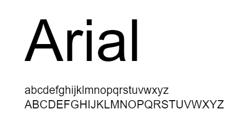
In recent years, fonts.com has reported that Arial is among the most used typefaces. With its distinctly contemporary design, Arial is more in sync with the last decade of the twentieth century than many of its predecessors.
There is no horizontal line at the bottom of the edges of Arial letters. They are angled instead. It helps give the face a more organic appearance by cutting the terminals on a diagonal.
The Arial family of typefaces is incredibly robust. Suitable for setting text for reports, articles, publications, and for use in display media, newspapers, and promotional materials.
Whether you’re writing small or large chunks of text, Arial makes reading easy. Figures should be formatted in Arial or Helvetica as per Nature’s instructions.
Labels and legends in particular benefit from this typeface. As a rule of thumb, keep font sizes small *8 points when using Arial for figure legends.
2. Baskerville
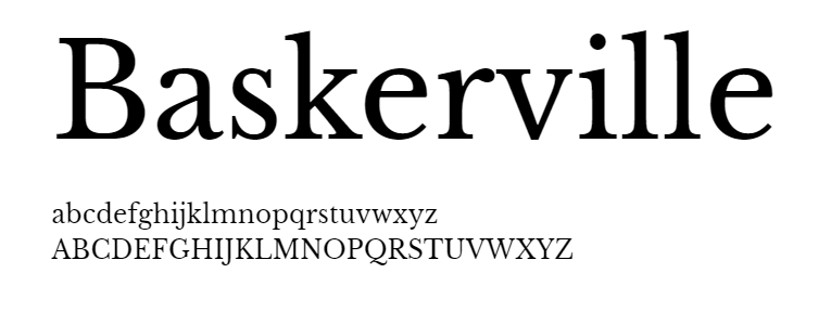
Designed by John Baskerville in 1757, Baskerville is a typeface that can be read easily and looks good in print. The letters were straightforward and elegant according to Baskerville.
Here and there, Baskerville font was found to increase reliability of text in comparison to other fonts. The readers’ behavior on the same study was most negatively influenced by Comic Sans.
The Baskerville family of fonts are known as the first transitional roman. These fonts distinguish between thin and thick strokes. The large size of Baskerville looks good because of this feature.
Based on its serif style, Baskerville has “tails” on the edges of its letters. This font is best suited for printing. For long text blocks, it is most suitable.
For best results, try to keep the font size between 8 and 14 points. Then your text will look more professional.
3. Helvetica
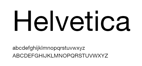
The most commonly used font is Helvetica. Max Miedinger, a Swiss designer, initially created Helvetica in 1957.
Designed to be simple to read, the font immediately gained popularity. It is named after the Latin term for Switzerland, Helvetia. Neue Helvetica is the name of the newer version of the font, which was introduced in 1983.
Even a movie has been made about Helvetica. Helvetica is not only a Hollywood (Indie) font, it looks fantastic on screen and print.
Science, Nature, and Cell ask for the figure captions to be in Helvetica. Even though it looks good when printed in small formats, it looks even better when printed in large formats.
It’s hard for authors to keep track of how many figures they’ve labelled with Helvetica now, since that’s what publishers use.
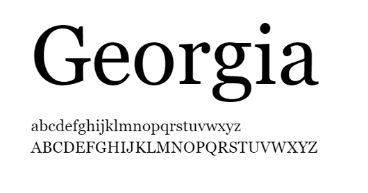
In spite of Georgia’s role in providing clarity at low resolutions on the screen, it is imbued with a typographic aesthetic that strikes a chord with readers.
This friendly face is evident even at small sizes. A stunning, smooth italic accompanies Georgia’s design; the artwork minimizes the complexity of making a screen-friendly italic.
As opposed to many contemporary typefaces, it has authentic italics, including the slender lowercase letters a and g.
The bold weight is also carefully tailored, with a heavier weight than the regular; this is particularly useful at small screen sizes where the two weights must be distinguished(phone screens).
5. Garamond
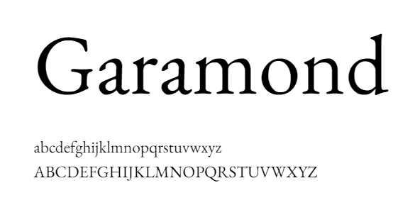
The history of this font also dates back a long way. French King Francis I of France (1515-1547) commissioned Claude Garamond to design a typeface for use in a series of books.
It was revived by Robert Slimbach in 1989 as an electric typeface. Garamond comes in many different variations because there are different sources available. The most commonly used version is Adobe Garamond.
French publishers continue to use Garamond extensively. Size 9 is also a must for Garamond in France. The history of France’s publishing industry is published in Garamond, as is Histoire de l’édition française .
This font was chosen due to its elegance, opulence, and legibility as well as a simple layout highlighting the detailed writing and offer an enlightened insight on the contemporary aspect of the content.
In long documents such as thesis papers, dissertations, and academic books, Garamond is a reliable font to use. Garamond is the font that many master’s thesis writers use.
Among the long-established fonts is Caslon. The typeface was designed in the early 1700s by William Caslon. English typefaces began with this one. It was a common font used in colonial America, and even the US Declaration of Independence was written with this font.
Because there is no enforceable trademark on the name “Caslon”, there are many typefaces called “Caslon”, some of which are exact copies of the originals, while others are not.
It is best used in blocks of text since it is a serif font (with tails). If you want best results, keep the font size between 8 and 14 points, as you would with Baskerville. The best place to make use of this would be in an application or a report.
7. Times New Roman
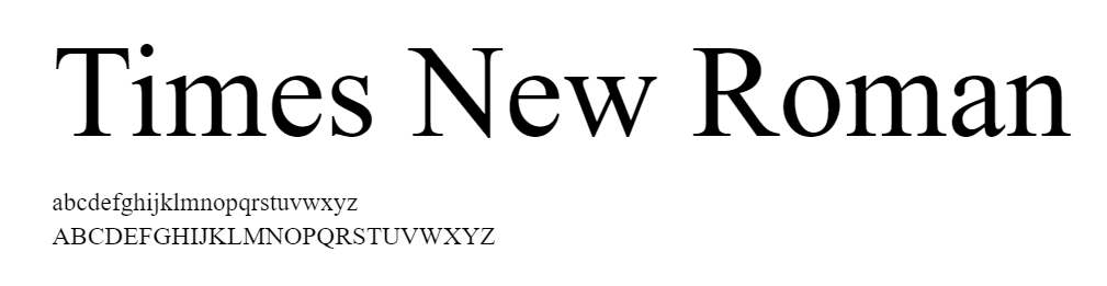
First published by The Times of London newspaper in 1932, this typeface was designed for the publication.
In the years since, it has evolved into one of the most popular typefaces in the world. Victor Lardent at The Times created the original designs under the direction of Stanley Morison.
Monotype’s Type Drawing Office then further refined it in an extensive step-by-step process. Many of its characteristics were taken from Morison’s experiments with Perpetua and Plantin, but it was adapted so that it was highly readable and also very efficient.
There are vast uses for it in books and journals, in reports, in presentations, and in advertising.
Is there anything else you need to think about when selecting the right font?
When choosing a font, there are a number of things to keep in mind besides these categories. For example, does it have all the features you are looking for?
You may be able to get away with just using the letters of the alphabet for the first piece, but what if you have to write a quick article for the public?
Are there symbols such as a currency symbol or exclamation point in the text? Especially when you are submitting a funding proposal. (Read our guide to everything you need to know about Research Proposals .)
Every once in a while, we find ourselves trying to add a price but the symbol we need isn’t there.
As well as the font size, there are other considerations, such as does it come in many sizes and styles or are only light, regular and bold available?
If you don’t have a lot of specifics, that’s alright, but you should take into account a broader perspective and what you intend to accomplish.
When it comes to communicating your message, different font sizes can be really helpful. Despite the fact that it’s good to have different typefaces, there is a rule that suggests only using a maximum of three typefaces in one contribution.
If you use any more than that, you risk-taking away the emphasis of what is being said. Complementary fonts are important, but they shouldn’t be too similar as this could result in a cluttered look that could be confusing.
Lastly, when picking a font, we should consider the print aspects to ensure it will be easy to read. These factors include colour, size, and style. The most decorative script fonts may look good, but they aren’t always a good option.
Hence, make sure to put into consideration every possible aspect of the information that may be published around the world through various mediums.
How to use Scientific fonts?
A reader’s primary objective should be to understand the facts about your project clearly. An easy-to-read document will help you achieve that goal.
The editors of newspapers, as well as publishers of journals, have developed many guidelines to make text more readable. These guidelines are now available for scientific purposes.
- Keep the main body text font size at least 16 points . Any smaller would make the text difficult to read.
- A project title should have a minimum height of 2 inches.
- It is recommended that headlines have at least one inch tall letters .
- If you want to stay with the norm, use Arial , Times New Roman , or another typeface similar to these.
- If you intend to draw attention to anything, use italics or boldface .
- Place your text below your picture ; that makes it easier to read.
- Please refrain from using ALL CAPS ; they can be difficult to perceive.
- You should not use reverse typeface (light text on dark background).
- If you type in a script font, avoid using artistic fonts , since they are harder to follow.
- You can choose between Serif or Sans Serif depending on the medium or the audience you will be addressing to.
- Your poster or paper should not contain more than two or three contrasting fonts .
- For body copy and headings, Time New Roman and Arial combine nicely.
Please note that every journal or publication house has different guidelines based on how they handle submissions, so make sure you check them.
It is also important to consider the medium on which the text will appear when choosing a font. Posters will need to have better fonts that appear decent when printed.
Selecting the wrong font can negatively affect future decision-making. It is important to remember that the typeface that you select to present your research or information will have a major impact on its effectiveness.
Make sure you make the right choice because it will leave a meaningful impression on the reader. (You can learn how to create an outstanding presentation that will leave the audience impressed, here )
Fonts for scientific illustrations and infographics
Infographics, or informational graphics, are a growing trend in data presentation. This style of presentation allows you to convey your message quickly and easily.
In order to make complex topics understandable, illustrations are extremely useful. A good font is essential no matter what.(See our guide to scientific illustrations )
Your choice of font is as important as the research itself when it comes to presenting it. (In most cases.) Generally, book, journal, and newspaper fonts are serif fonts, which are characterized by small lines at the end of each stroke.
The vast majority of online content uses sans serif fonts. Serif fonts make it easier for readers to follow lines of text, which is certainly useful when designing illustrations or use the infographic maker.
The best typeface for graphic design is sans serif. Arial, Calibri, Helvetica, Verdana, and open sans, which are readily available, improve content legibility significantly.
If you understand how certain font choices affect the composition of your content, deciding on a family of fonts and a typography scheme becomes much more straightforward.
As you become more familiar with the values, tone, and vision of the work, you will begin to can identify what works. It is possible to convey your ideas in a non-verbal and yet powerful way, using fonts.
Now that we have reached our final section, you should also know where to find all the fonts in one place.
You can find all the best science fonts for graphic design at one place
We at mind the graph understand the importance of typography and how it plays an integral part in representation of scientific ideas. Mind the graph, the most user-friendly tool.
Scientists and academicians from over 100 top academic, educational, and industrial institutions trust Mind the Graph. This is why everything is up-to-date and scientifically sound.
You will find all the A to Z fonts you need for all things scientific here. Besides that, we also suggest fonts that are appropriate for your content type. You can choose from the list we have.
Furthermore, we have many templates to assist in the creation of posters and graphics. Additionally, they can be customized according to your needs. However, guess what is even better than that? We offer a FREE trial, so you can decide what plan fits you best.
When you join, you join us in our mission to increase easy access to the best science tool for as many people as possible. Our blog section has a variety of information about everything from making Science posters to a list of the best science podcasts of 2022, definitely worth checking out.

Subscribe to our newsletter
Exclusive high quality content about effective visual communication in science.
Unlock Your Creativity
Create infographics, presentations and other scientifically-accurate designs without hassle — absolutely free for 7 days!
About Fabricio Pamplona
Fabricio Pamplona is the founder of Mind the Graph - a tool used by over 400K users in 60 countries. He has a Ph.D. and solid scientific background in Psychopharmacology and experience as a Guest Researcher at the Max Planck Institute of Psychiatry (Germany) and Researcher in D'Or Institute for Research and Education (IDOR, Brazil). Fabricio holds over 2500 citations in Google Scholar. He has 10 years of experience in small innovative businesses, with relevant experience in product design and innovation management. Connect with him on LinkedIn - Fabricio Pamplona .
Content tags
Browser does not support script.
King's College London - Homepage
- Undergraduate
- Postgraduate
- International Students
- Study abroad
- Professional Education
- Short courses
- International Foundation
- Accommodation
- Visit King's
- Learning & teaching
- Language Centre
- Student Services Online
- Libraries & Collections
- Student news
- Careers & Employability
- Students' Union
- Academic calendar
- King's Sport
- Research at King's
- King's Health Partners
- Arts & Humanities
- Dentistry, Oral & Craniofacial Sciences
- Life Sciences & Medicine
- Natural, Mathematical & Engineering Sciences
- Nursing, Midwifery & Palliative Care
- Psychiatry, Psychology & Neuroscience
- Social Science & Public Policy
- Alumni Community
- Alumni benefits
- Events & reunions
- News & features
- Mission & strategy
- Internationalisation
- Governance & Legal
- Organisational structure
- Work at King's
- Diversity & Inclusion
- Financial information
- Thesis Format
Format of thesis and Binding
- Title page – including the thesis title, the student's full name and the degree for which it is submitted
- Abstract - of up to 5,000 words
- Table of contents – including any material not bound in the book, and a list of tables, photographs and any other materials
Word limits
- PhD - not to exceed 100,000 words
- MPhil - not to exceed 60,000 words
- MD(Res) - not to exceed 50,000 words
- MPhilStud - not to exceed 30,000 words
- Professional Doctorates - at least 25,000 words and not to exceed 55,000 words
Thesis word limit inclusions and exclusions The thesis word count includes everything from the start of chapter 1 up to the end of the last chapter. This means: Including all words included within:
- Footnotes/Endnotes
- Table/figure legends
- Tables of contents/of figures/of tables/ of acronyms
- Acknowledgements/dedications
- References/Bibliography
- 'Editions of texts (except where the edition or editions themselves constitute the thesis under examination)'
- Students are only required to submit an electronic thesis for their examiners, in PDF format, this should be emailed to [email protected] no later than your deadline
- If examiners have requested a printed copy a member of the Research Degrees Examinations team will get in touch with you
- Margins - as we no longer require printed copies of the thesis, the margin edge is at the student's discretion, however bear in mind if examiners prefer a printed copy then it may need to be spiral bound
- Spacing - Double or 1.5 spacing (except for indented quotations or footnotes which can be single spaced)
- Font size - It is recommended to use font size 12 to ensure examiners are able to read it
- Page numbering - All pages must be numbered in one continuous sequence, i.e. from the title page of the first volume to the last page of type, from 1 onwards. This sequence must include everything in the volume, including maps, diagrams, blank pages, etc.
Illustrative materials - May include: audio recordings and photographic slides, these can be emailed to [email protected]
- Additional material - Any material which cannot be included in the PDF thesis maybe emailed separately to the [email protected]
Some examiners may prefer to work from a printed version of the student's thesis rather than the PDF, if this is the case:
- The Research Degrees Examinations team will in the first instance check with the examiner if they would be happy to print the thesis themselves. If the examiner is happy to do this and is able to, they can claim back the expenses following the examination
- If the examiner is unable to print the thesis, the Research Degrees Examinations team will contact the student to make arrangements for a print version to be posted directly to the examiner(s) or via a binders
- It is the students' responsibility to get their thesis printed and bound if examiners require a copy. Students may only claim back postage costs.
PRINT COPIES MUST NOT BE POSTED PRIOR TO OFFICIAL DISPATCH BY THE RESEARCH DEGREES EXAMINATION TEAM
- Research Degrees
- Supervisors
- Oral Examinations
- Re-examination
- Coronavirus

© 2024 King's College London | Strand | London WC2R 2LS | England | United Kingdom | Tel +44 (0)20 7836 5454
Get Instant Help From 5000+ Experts For
11 ideal fonts for dissertation writing |helpwithassignment.com.
- Dissertation
Times New Roman, Georgia, Garamond, Arial, Verdana, Cambria, Century Gothic, Constantia, and Arial Narrow are some of the ideal fonts for dissertation writing.
What is Dissertation Writing ?
In the term – Dissertation writing, the word “Dissertation” has originated from the Latin language where ‘ dissertare’ means ‘to debate’. This word was first used in the English language in around 1651 which gave us a definition to write extensively on a certain subject. It is also defined as a long piece of writing on any particular topic which you have studied.

In a dissertation writing, the writer should always choose to write with the help of using a clear font like Arial, Times New Roman, etc. They should also set perfect font sizes such are 10 to 12 also the line spacing should be done of 1.15 or 1.5 which is generally accepted as it makes the document appear more neat and tidy and allows the reader to put comments in between.
Mistakes that should be avoided while choosing the Font for dissertation writing:
- Do not choose fonts on the basis of your personal likes and dislikes. Always the writer should keep in mind that they should choose the font on the basis of the reader’s perspective as it is not easy to go through a 20 pages dissertation with a complex font.
- Always avoid using too many fonts as the write-ups become too much complicated and is also not considered well organized.
- All fonts for dissertation do not match or work together, therefore, a student should make sure that they should choose fonts which go along their write up
- Try separating the fonts of your subtitles and the paragraphs as the same fonts used might make your writing monotonous and boring for the reader.
11 Best Font for Dissertation Writing
Times new roman: most common fonts for dissertation.
This font was originally designed for Times Newspaper of London. This font has a separate and different aesthetician a formal style that is prescribed or assigned by many universities and colleges. It is also quite easy to read.
This is a serif type font designed by Matthew Carter and was founded by Microsoft Corporation. It was created and released in 1993 and 1996 respectively.
This another font which has a pleasant-looking appearance on dissertation writing and is also considered as an old-style serif typeface which was named for 16th-century Parisian engraver Claude Garamond. This font is very much popular and is used for printing books etc.
This is also a Serif style typeface commissioned by Microsoft which was designed by Steve Matteson, Robin Nicholas and Jelle Bosma in 2004. It is distributed by windows and office.
Century Gothic:
This is also designed in a sans serif typeface style and a geometric style that was released in 1991 by Monotype Imaging.
Palatino Linotype:
This font was first released in 1949 by Stempel foundry. This serif typeface style font was designed by Hermann Zapf. It has bee also classified as old style font.
This font style is one of the commonly used font styles which is also displayed sometimes as Arial MT. It has been classified as neo-grotesque sans-serif which was released in 1982 and was designed by Robin Nicholas and Patricia Saunders.
This font style is widely used for writing dissertations or any other academic papers as they provide a very cleaned and very simple – smooth look to the paper and also to the eyes of the reader. This was designed by Matthew Carter for Microsoft Corporation.
Constantia:
This was designed by John Hudson, a serif style design that was commissioned by Microsoft. The developmental work for this writing began in 2003 and was finally released in 2006
Century schoolbook: Fonts for dissertation
It is again a serif style typeface that was designed by Linn Boyd and Morris F Benton. This belongs to the century writing font family which was released in between 1894-1923.
Arial Narrow:
This is a high style font that is available for free download for personal and commercial use. However, the free version provides all upper case and lower case with some special character and features.
Therefore above are some of the most popularly used ideal fonts for dissertation writing. Times Roman is the most chosen font styles for thesis and dissertation writing but still, it has some common drawbacks as this font was created mostly to create spaces in between the words and letters but according to some professionals, the usage of this font causes overuse of view.
Similarly, Verdana and Arial fonts for dissertation might provide a simple and clear look on the screen but on the paper, it appears a little congested and a little less formal. But still, all of these fonts discussed above are some of the most appropriate fonts which are ideally used in writing a thesis, dissertation, essays or any writing assignment given to a student in college.
HelpwithAssignment.com provides the best quality dissertation help to the students. We have a team of skilled and experienced dissertation writers who have undergone double specialization in related fields. They are capable of writing any kind of dissertation from scratch within no time.
Best features of HelpWithAssignment.com ‘s Dissertation Help
Full-time experts: All the experts at HelpwithAssignment are full time assignment help experts and are dedicated experienced professionals who devote their full time in service of the students.
Best Quality Work: We never compromise with the quality of work. That is the reason why students always prefer our assignment services. Even if the deadline is very near, we only provide the best quality papers.
Talk to Subject Experts: You can talk to subject experts regarding the update of your assignment. If you want to make some changes to the solution, then you can convey some message to the expert.
Plagiarism-free: We know how plagiarism affects the grades of the student. We follow strict rules on plagiarism and use Turnitin to check the originality of the papers. Papers provided by our experts are 100% genuine and plagiarism-free.
Delivery before Deadline: We understand your stress related to the submission. Our experts complete assignments before the deadline and even give enough time to make last-minute changes.
Reasonable Cost: The cost of hiring a tutor for assignment help or homework help is very reasonable. We know the financial constraints of college or university going students. Hence, our pricing has been designed keeping in view an average student’s budget in mind.
Get Instant Dissertation Writing Help

Fill up the assignment help request form on the right or drop us an email at [email protected] . Feel free to contact our customer support on the company 24/7 Live chat or call us on 312-224-1615.
Book Your Assignment
Recent Posts

Top 5 Things to Focus on When Writing Your Thesis
11 simple ways to stay motivated while writing your thesis, 51 top topics for masters thesis in biomedical engineering, 200+ exclusive legal thesis topics for 2024, how to write methodology in thesis, popular categories, get assignment help from subject matter experts.
4.7/5 rating | 10,000+ happy students | Great tutors 24/7
ONLINE TO HELP YOU 24X7
OR GET MONEY BACK!
OUT OF 38983 REVIEWS
University of South Florida
Office of Graduate Studies
Main navigation, font options.
Choose one single font, color and size to use throughout the manuscript (front matter, headings, and body), acceptable exceptions for footnotes, tables, table captions, figures and figure captions are noted below.
Font Typeface
Choose a single font (typeface) for use throughout the thesis/dissertation, with the exception of figures. You may have a different font style within figures you create or use with permission to reprint.
Choose a common True-Type font generally found on most computers (this prevents conversion issues when converted to a PDF for publishing). Recommended choices are:
Students using LaTeX may use Computer Modern Roman.
For the primary font size, you may choose to use 10 pt., 11 pt., or 12 pt. , and must use this one chosen size throughout; with the exception of tables, figures, table captions, figure captions, and footnotes, which may (optional) be reduced to 8 pt .
In tables and figures, as well as their captions, you may go as small as 8 pt., as long as it is legible, to ensure everything fits on one page. If it is not legible, you will be asked to adjust the size.
Footnotes should be smaller than the body text, but no smaller than 8 pt.
Font Styles
Manuscripts may contain all common font styles, such as boldface, italics, and underline. The use of the style must be consistent throughout the text. Including color. We typically reserve special formats for Titles/Headings.
IMAGES
VIDEO
COMMENTS
Times New Roman is the standard choice for academic documents, and the thesis preparation guidelines of some universities stipulate its use. For many years, it was the default body text for Microsoft Word. With the release of Office 2007, the default became a sans serif typeface called Calibri. Lacking the little projecting bits (serifs) at the ...
Georgia. Georgia font was designed in 1883, especially for Microsoft Corporation. This is the best font for the students who want to submit the document online. It is preferred for the elegant and small appearance for low-resolution screens. Serif. Serif is originated from Roman from a font written on a stone.
Serif fonts that offer all characters necessary for a PhD thesis. These fonts are heavily based on fonts that have been in use since the invention of the mechanical printing press in the 15th century. Hence, these types of fonts have been tried and tested for more than 500 years.
Serif fonts, like Times New Roman and Garamond, bring a formal, traditional vibe. They're often easier on the eyes for long reads. Sans Serif fonts, like Arial and Helvetica, offer a cleaner, more modern look. Perfect for shorter texts or digital platforms. Contextual appropriateness for academic documents. Context is king. A thesis?
Fonts must be 10, 11, or 12 points in size. Superscripts and subscripts (e.g., formulas, or footnote or endnote numbers) should be no more than 2 points smaller than the font size used for the body of the text. Spacing and Indentation. Space and indent your thesis or dissertation following these guidelines:
All text material must be in the same font/typeface; all headings and figure/table titles/captions must be in a consistent typeface. Please select a font and size that is highly legible and will reproduce clearly. Ornate or decorative fonts such as script, calligraphy, gothic, italics, or specialized art fonts are not acceptable.
Some examples include Verdana, Times New Roman, and Calibri (which is the default font in Microsoft Word). Font size is best set to 10 or 11. In scientific articles and theses, a line spacing of 1.15 or 1.5 is generally preferred, as it makes the document more readable and enables your supervisor to post comments between the lines of text.
If you use mathematical or other scientific notation in your dissertation or thesis using a font other than Symbol, you must embed the font into the PDF that is submitted to the university. Margins Inner margins (left edge if single-sided; right edge for even-numbered pages, and left edge for odd-numbered pages if double-sided) must be 1.5 inches.
Fonts. Students should use the same font size (11- or 12-point) and style (typically Times New Roman) through the thesis, including labels and references. Tables, captions, and footnotes should use the same font style but may be smaller in size (usually 10-point).
University formatting guidelines apply to the font type and size, page margins, page numbering, page order, line spacing for the entire document and the content and formatting for the front pages. ETD Style Guides for the front pages are available by school or college on the ETD website. For the body of the document, please use the style guide ...
A variety of fonts are permitted in APA Style papers. Font options include the following: sans serif fonts such as 11-point Calibri, 11-point Arial, or 10-point Lucida Sans Unicode; serif fonts such as 12-point Times New Roman, 11-point Georgia, or normal (10-point) Computer Modern (the default font for LaTeX); We recommend these fonts because they are legible and widely available and because ...
Use A Serif Font. Serifs are the tiny strokes at the end of a letter's main strokes. Serif fonts have these extra strokes; sans serif fonts do not. ( Sans is French for "without.") Serif fonts also vary the thickness of the letter strokes more than sans serifs, which have more uniform lines.
Fonts and Point Size. Use 10-12 point size. Fonts must be embedded in the PDF file to ensure all characters display correctly. ... If you are converting to PDF using Acrobat Professional (instructions courtesy of the Graduate Thesis Office at Iowa State University): Open your document in Microsoft Word. Click on the Adobe PDF tab at the top ...
1. Language. The dissertation or thesis must be written in English. 2. Page Size and Specifications. Page size must be 8.5 x 11 inches (or 216 x 279 millimeters), also known as "letter" size in U.S. standards. (ISO standard paper sizes, such as A4, are not allowed.) The inclusion of oversized pages or sheets of paper larger than 8.5 x 11 ...
Colour. Font colour should normally be black throughout, except for web links which should be blue. Fonts Choice of Font For most theses, the font should be one that is appropriate for an academic paper. Generally, the same font should be used throughout the thesis (dedication page and scholarship-appropriate alterations excepted).
So far this is the formatting I used: main title "Thesis of ...": Arial 16pt. Abstract subtitle: Times New Roman 12pt. Abstract content: Times New Roman 11pt, justified. Heading 1 (main sections of the paper): Arial 14 bold. Heading 2 (sections of the paper, corresponding to Headings 1): Arial 12 bold. Content of each sections (Headings 2 ...
20. If there's no template, then the choice is yours. However, you should make sure to pick a font that's easy to read. The usual standards in academia tend to be the Times, Helvetica/Arial, and Computer Modern families. This doesn't restrict you from using fonts like Book Antiqua, Myriad Pro, Goudy Old Style, or Garamond, but they're ...
In long documents such as thesis papers, dissertations, and academic books, Garamond is a reliable font to use. Garamond is the font that many master's thesis writers use. 6. Caslon. Among the long-established fonts is Caslon. The typeface was designed in the early 1700s by William Caslon. English typefaces began with this one.
Font size - It is recommended to use font size 12 to ensure examiners are able to read it; Page numbering - All pages must be numbered in one continuous sequence, i.e. from the title page of the first volume to the last page of type, from 1 onwards. This sequence must include everything in the volume, including maps, diagrams, blank pages, etc.
Century schoolbook: Fonts for dissertation. It is again a serif style typeface that was designed by Linn Boyd and Morris F Benton. This belongs to the century writing font family which was released in between 1894-1923. Arial Narrow: This is a high style font that is available for free download for personal and commercial use.
Font Options. Choose one single font, color and size to use throughout the manuscript (front matter, headings, and body), acceptable exceptions for footnotes, tables, table captions, figures and figure captions are noted below.. Font Typeface. Choose a single font (typeface) for use throughout the thesis/dissertation, with the exception of figures.
APA Style papers should be written in a font that is legible and widely accessible. For example: Times New Roman (12pt.) Arial (11pt.) Calibri (11pt.) Georgia (11pt.) The same font and font size is used throughout the document, including the running head, page numbers, headings, and the reference page. Text in footnotes and figure images may be ...
I am writing my thesis in Mathematics but I am not happy with the default fonts of the template that I am using. So kindly inform me what are the common fonts used in thesis along with the latex commands for those fonts. I like Charter with Utopia math, and with Bera mono font. \usepackage{utopia}\usepackage{XCharter}\usepackage{beramono} with ...