
Presentation vs Report Writing: What’s the Difference?
By: Author Shrot Katewa

I was sitting at my desk today while I stumbled upon a question by one of our patrons. It got me thinking if there was ever a difference between a Presentation and Report Writing? So, I did some research, and here’s what I found out!
The main difference between a Presentation and Report Writing is that a report is usually fairly extensive and gives a detailed account of the information on a particular topic. Whereas, a presentation is mostly a synopsis which highlights the key points that are important for the audience.
Since one of the key objectives of both – a presentation and a report is to give information to its intended audience, people often tend to confuse between the two. So, let’s understand the nuances in further detail.
Key Differences between Presentation and Report Writing
In order to make sure that we don’t end up creating an incorrect document the next we are tasked with an assignment, it is important for us to understand the differences between a presentation and report writing.
As I mentioned earlier, one of the purposes of both a presentation and a report is typically to provide insights or useful information about a certain topic.
However, the purpose of creating a presentation is to share information in a short period of time; usually not more than 15-20 minutes. Thus, it ends up being a synopsis of a topic rather than giving a detailed account on a particular topic.
Report Writing on the other hand goes into the intricacies involved within a particular topic.
For a research oriented report writing, the purpose of the report is often to capture the detailed account for the research conducted including (but not limited to) purpose of the research, methodology adopted for conducting research, observations and findings, discrepancies (if any), and the conclusion.
Writing a report often scientific approach and requires a technical understand of the subject.
2. Depth of Information
Another difference between a report and a presentation is the depth of information that is shared in the two types of documents.
As mentioned in the previous point, a report goes in great depth capturing the thought behind almost every single action taken by the researcher; thereby giving an in-depth understanding on the topic.
A presentation on the other hand picks up key pieces of information and aims to provide very specific details usually in the interest of the available time of the audience.
A typical example of a report would be a corporate annual report which explains the details of actions taken by the organisation and how it performed. This information is shared across multiple paragraphs usually accompanied by a table giving the performance details. Whereas, a presentation of the annual report only summarizes the key points on the performance of the company throughout the year.
3. Information Delivery

Another major difference between a presentation and report writing is the mode of information delivery.
Since a presentation is a piece of summarized information, it requires a person to share additional information while delivering the presentation. A presentation mostly contains visual cues along with a few points on each slide, which is accompanied with a talk given by an individual giving the presentation.
A presentation can be given in-person to a small group of people or even to a few hundred individuals in a large auditorium. Alternatively, a presentation can also be delivered online to several thousands of people across the globe using different softwares.
A report on the other hand doesn’t necessarily require to be presented. Since it contains detailed information, it can be independently read by people at their comfort.
Reading a report can take time as it is often spread across several hundreds of pages.
4. Method of Engaging the Audience
Yet another difference between a presentation and report writing is the manner in which it engages its audience.
A presentation depends upon the skill of the presenter to engage the audience. A person giving a presentation not only needs to make the presentation visually appealing, it also requires the presenter to entertain the audience by means of story-telling and humor (as deemed necessary) while delivering the presentation.
A report on the other hand depends on the capability of an individual to command a language to engage its readers. It needs the person writing a report to have a good grasp of the language in order to describe the information accurately and as briefly as possible while holding the interest of the audience.
In a research study done in order to compare the understanding capability of science students based information consumed in the two formats – Presentation versus Report format , it was observed that students understood the topic better when it was explained through a presentation rather than a report.
Perhaps, one can conclude that presentation is usually more engaging than a detailed report.
5. Skills Needed

Lastly, another difference between a presentation and report writing is the skills needed for each of the two activities.
Creating an effective presentation requires not only design skills, but also mastering the art of giving presentations! While the task of designing a presentation can often be outsourced, the knack of picking the correct topics to be covered in the presentation can’t be outsourced and is dependent on the presenter.
As a presenter, you don’t necessarily need to have great writing skills, but you surely need to know the art of story-telling, and leverage this for giving a presentation.
On the other hand, report writing requires creative (sometimes technical) writing skills. One also needs to be analytical.
How to Choose between a Presentation and a Report? Which is Better?
Choosing between creating a presentation or writing a report can be a difficult task for some. But, not being able to do so correctly can often lead to drastic (sometimes even embarrassing) circumstances.
Here are a few questions that you should ask yourself before starting creating a presentation or writing a report –
- How much time do I have with my audience? If you have only about 20 to 30 minutes with you audience to share the required information, it is perhaps better to give a presentation than to write a report. A report (unless written in less than 10 pages), will usually take more than this much time to be completely understood.
- Does your intended audience prefer to read or to hear/watch? People have their own preferences when it comes to consuming information. Some people like to read, while others prefer hearing or visual comprehension to gain knowledge. Be sure to ask them their preference, and make your decision accordingly.
- What are you good at – Presentation or Report Writing? If the above two questions are not important or if your audience doesn’t have a preference, a good way to start would be to focus on your strengths. Ask yourself – what are you more comfortable with? Is a creating and delivering a presentation? Or, is it writing a report? Make a decision based on your capability. A little introspection can definitely go a long way in helping you choose the right direction.
How to Create an Attractive Presentation?
If you end up deciding to go down the presentation route, then we’ve got you covered.
The main objective of this site is to help you create better presentations!
Thus, be sure to check out a few other posts on this website that provide little ninja tips on how you can make your presentations attractive in a few easy steps!
A good place to start would be by reading this post –
7 EASY tips that ALWAYS make your PPT presentation attractive (even for beginners)
Don’t hesitate to reach out to us if you have any specific questions. We would love to help you create better presentations!
Final Thoughts
As we understood in this article, even though delivering a presentation and report writing have a similar objective of sharing interesting information, they both have their differences.
Knowing what mode of information sharing to choose can often be critical. Thus, I hope this post has helped you understand some of the key differences between the two and how to choose whether to create a presentation or write a report.

What is the Difference Between a Presentation and a Report?
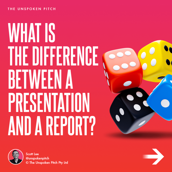
Both have their place in corporate communications but it is important to know the difference and where and when to use each
A report is extensive and provides a detailed account of a subject. Facts, features and benefits are hallmarks of a report
A presentation is a story, a journey from one place to another with the intention to inform, educate or excite, highlighting key points to the audience.
???? Follow The Unspoken Pitch on the journey into selling with visual storytelling
#arrangement #design #suggestions

© 2019 The Unspoken Pitch | Privacy Policy | Terms
Home Blog Design Understanding Data Presentations (Guide + Examples)
Understanding Data Presentations (Guide + Examples)

In this age of overwhelming information, the skill to effectively convey data has become extremely valuable. Initiating a discussion on data presentation types involves thoughtful consideration of the nature of your data and the message you aim to convey. Different types of visualizations serve distinct purposes. Whether you’re dealing with how to develop a report or simply trying to communicate complex information, how you present data influences how well your audience understands and engages with it. This extensive guide leads you through the different ways of data presentation.
Table of Contents
What is a Data Presentation?
What should a data presentation include, line graphs, treemap chart, scatter plot, how to choose a data presentation type, recommended data presentation templates, common mistakes done in data presentation.
A data presentation is a slide deck that aims to disclose quantitative information to an audience through the use of visual formats and narrative techniques derived from data analysis, making complex data understandable and actionable. This process requires a series of tools, such as charts, graphs, tables, infographics, dashboards, and so on, supported by concise textual explanations to improve understanding and boost retention rate.
Data presentations require us to cull data in a format that allows the presenter to highlight trends, patterns, and insights so that the audience can act upon the shared information. In a few words, the goal of data presentations is to enable viewers to grasp complicated concepts or trends quickly, facilitating informed decision-making or deeper analysis.
Data presentations go beyond the mere usage of graphical elements. Seasoned presenters encompass visuals with the art of data storytelling , so the speech skillfully connects the points through a narrative that resonates with the audience. Depending on the purpose – inspire, persuade, inform, support decision-making processes, etc. – is the data presentation format that is better suited to help us in this journey.
To nail your upcoming data presentation, ensure to count with the following elements:
- Clear Objectives: Understand the intent of your presentation before selecting the graphical layout and metaphors to make content easier to grasp.
- Engaging introduction: Use a powerful hook from the get-go. For instance, you can ask a big question or present a problem that your data will answer. Take a look at our guide on how to start a presentation for tips & insights.
- Structured Narrative: Your data presentation must tell a coherent story. This means a beginning where you present the context, a middle section in which you present the data, and an ending that uses a call-to-action. Check our guide on presentation structure for further information.
- Visual Elements: These are the charts, graphs, and other elements of visual communication we ought to use to present data. This article will cover one by one the different types of data representation methods we can use, and provide further guidance on choosing between them.
- Insights and Analysis: This is not just showcasing a graph and letting people get an idea about it. A proper data presentation includes the interpretation of that data, the reason why it’s included, and why it matters to your research.
- Conclusion & CTA: Ending your presentation with a call to action is necessary. Whether you intend to wow your audience into acquiring your services, inspire them to change the world, or whatever the purpose of your presentation, there must be a stage in which you convey all that you shared and show the path to staying in touch. Plan ahead whether you want to use a thank-you slide, a video presentation, or which method is apt and tailored to the kind of presentation you deliver.
- Q&A Session: After your speech is concluded, allocate 3-5 minutes for the audience to raise any questions about the information you disclosed. This is an extra chance to establish your authority on the topic. Check our guide on questions and answer sessions in presentations here.
Bar charts are a graphical representation of data using rectangular bars to show quantities or frequencies in an established category. They make it easy for readers to spot patterns or trends. Bar charts can be horizontal or vertical, although the vertical format is commonly known as a column chart. They display categorical, discrete, or continuous variables grouped in class intervals [1] . They include an axis and a set of labeled bars horizontally or vertically. These bars represent the frequencies of variable values or the values themselves. Numbers on the y-axis of a vertical bar chart or the x-axis of a horizontal bar chart are called the scale.

Real-Life Application of Bar Charts
Let’s say a sales manager is presenting sales to their audience. Using a bar chart, he follows these steps.
Step 1: Selecting Data
The first step is to identify the specific data you will present to your audience.
The sales manager has highlighted these products for the presentation.
- Product A: Men’s Shoes
- Product B: Women’s Apparel
- Product C: Electronics
- Product D: Home Decor
Step 2: Choosing Orientation
Opt for a vertical layout for simplicity. Vertical bar charts help compare different categories in case there are not too many categories [1] . They can also help show different trends. A vertical bar chart is used where each bar represents one of the four chosen products. After plotting the data, it is seen that the height of each bar directly represents the sales performance of the respective product.
It is visible that the tallest bar (Electronics – Product C) is showing the highest sales. However, the shorter bars (Women’s Apparel – Product B and Home Decor – Product D) need attention. It indicates areas that require further analysis or strategies for improvement.
Step 3: Colorful Insights
Different colors are used to differentiate each product. It is essential to show a color-coded chart where the audience can distinguish between products.
- Men’s Shoes (Product A): Yellow
- Women’s Apparel (Product B): Orange
- Electronics (Product C): Violet
- Home Decor (Product D): Blue

Bar charts are straightforward and easily understandable for presenting data. They are versatile when comparing products or any categorical data [2] . Bar charts adapt seamlessly to retail scenarios. Despite that, bar charts have a few shortcomings. They cannot illustrate data trends over time. Besides, overloading the chart with numerous products can lead to visual clutter, diminishing its effectiveness.
For more information, check our collection of bar chart templates for PowerPoint .
Line graphs help illustrate data trends, progressions, or fluctuations by connecting a series of data points called ‘markers’ with straight line segments. This provides a straightforward representation of how values change [5] . Their versatility makes them invaluable for scenarios requiring a visual understanding of continuous data. In addition, line graphs are also useful for comparing multiple datasets over the same timeline. Using multiple line graphs allows us to compare more than one data set. They simplify complex information so the audience can quickly grasp the ups and downs of values. From tracking stock prices to analyzing experimental results, you can use line graphs to show how data changes over a continuous timeline. They show trends with simplicity and clarity.
Real-life Application of Line Graphs
To understand line graphs thoroughly, we will use a real case. Imagine you’re a financial analyst presenting a tech company’s monthly sales for a licensed product over the past year. Investors want insights into sales behavior by month, how market trends may have influenced sales performance and reception to the new pricing strategy. To present data via a line graph, you will complete these steps.
First, you need to gather the data. In this case, your data will be the sales numbers. For example:
- January: $45,000
- February: $55,000
- March: $45,000
- April: $60,000
- May: $ 70,000
- June: $65,000
- July: $62,000
- August: $68,000
- September: $81,000
- October: $76,000
- November: $87,000
- December: $91,000
After choosing the data, the next step is to select the orientation. Like bar charts, you can use vertical or horizontal line graphs. However, we want to keep this simple, so we will keep the timeline (x-axis) horizontal while the sales numbers (y-axis) vertical.
Step 3: Connecting Trends
After adding the data to your preferred software, you will plot a line graph. In the graph, each month’s sales are represented by data points connected by a line.

Step 4: Adding Clarity with Color
If there are multiple lines, you can also add colors to highlight each one, making it easier to follow.
Line graphs excel at visually presenting trends over time. These presentation aids identify patterns, like upward or downward trends. However, too many data points can clutter the graph, making it harder to interpret. Line graphs work best with continuous data but are not suitable for categories.
For more information, check our collection of line chart templates for PowerPoint and our article about how to make a presentation graph .
A data dashboard is a visual tool for analyzing information. Different graphs, charts, and tables are consolidated in a layout to showcase the information required to achieve one or more objectives. Dashboards help quickly see Key Performance Indicators (KPIs). You don’t make new visuals in the dashboard; instead, you use it to display visuals you’ve already made in worksheets [3] .
Keeping the number of visuals on a dashboard to three or four is recommended. Adding too many can make it hard to see the main points [4]. Dashboards can be used for business analytics to analyze sales, revenue, and marketing metrics at a time. They are also used in the manufacturing industry, as they allow users to grasp the entire production scenario at the moment while tracking the core KPIs for each line.
Real-Life Application of a Dashboard
Consider a project manager presenting a software development project’s progress to a tech company’s leadership team. He follows the following steps.
Step 1: Defining Key Metrics
To effectively communicate the project’s status, identify key metrics such as completion status, budget, and bug resolution rates. Then, choose measurable metrics aligned with project objectives.
Step 2: Choosing Visualization Widgets
After finalizing the data, presentation aids that align with each metric are selected. For this project, the project manager chooses a progress bar for the completion status and uses bar charts for budget allocation. Likewise, he implements line charts for bug resolution rates.

Step 3: Dashboard Layout
Key metrics are prominently placed in the dashboard for easy visibility, and the manager ensures that it appears clean and organized.
Dashboards provide a comprehensive view of key project metrics. Users can interact with data, customize views, and drill down for detailed analysis. However, creating an effective dashboard requires careful planning to avoid clutter. Besides, dashboards rely on the availability and accuracy of underlying data sources.
For more information, check our article on how to design a dashboard presentation , and discover our collection of dashboard PowerPoint templates .
Treemap charts represent hierarchical data structured in a series of nested rectangles [6] . As each branch of the ‘tree’ is given a rectangle, smaller tiles can be seen representing sub-branches, meaning elements on a lower hierarchical level than the parent rectangle. Each one of those rectangular nodes is built by representing an area proportional to the specified data dimension.
Treemaps are useful for visualizing large datasets in compact space. It is easy to identify patterns, such as which categories are dominant. Common applications of the treemap chart are seen in the IT industry, such as resource allocation, disk space management, website analytics, etc. Also, they can be used in multiple industries like healthcare data analysis, market share across different product categories, or even in finance to visualize portfolios.
Real-Life Application of a Treemap Chart
Let’s consider a financial scenario where a financial team wants to represent the budget allocation of a company. There is a hierarchy in the process, so it is helpful to use a treemap chart. In the chart, the top-level rectangle could represent the total budget, and it would be subdivided into smaller rectangles, each denoting a specific department. Further subdivisions within these smaller rectangles might represent individual projects or cost categories.
Step 1: Define Your Data Hierarchy
While presenting data on the budget allocation, start by outlining the hierarchical structure. The sequence will be like the overall budget at the top, followed by departments, projects within each department, and finally, individual cost categories for each project.
- Top-level rectangle: Total Budget
- Second-level rectangles: Departments (Engineering, Marketing, Sales)
- Third-level rectangles: Projects within each department
- Fourth-level rectangles: Cost categories for each project (Personnel, Marketing Expenses, Equipment)
Step 2: Choose a Suitable Tool
It’s time to select a data visualization tool supporting Treemaps. Popular choices include Tableau, Microsoft Power BI, PowerPoint, or even coding with libraries like D3.js. It is vital to ensure that the chosen tool provides customization options for colors, labels, and hierarchical structures.
Here, the team uses PowerPoint for this guide because of its user-friendly interface and robust Treemap capabilities.
Step 3: Make a Treemap Chart with PowerPoint
After opening the PowerPoint presentation, they chose “SmartArt” to form the chart. The SmartArt Graphic window has a “Hierarchy” category on the left. Here, you will see multiple options. You can choose any layout that resembles a Treemap. The “Table Hierarchy” or “Organization Chart” options can be adapted. The team selects the Table Hierarchy as it looks close to a Treemap.
Step 5: Input Your Data
After that, a new window will open with a basic structure. They add the data one by one by clicking on the text boxes. They start with the top-level rectangle, representing the total budget.

Step 6: Customize the Treemap
By clicking on each shape, they customize its color, size, and label. At the same time, they can adjust the font size, style, and color of labels by using the options in the “Format” tab in PowerPoint. Using different colors for each level enhances the visual difference.
Treemaps excel at illustrating hierarchical structures. These charts make it easy to understand relationships and dependencies. They efficiently use space, compactly displaying a large amount of data, reducing the need for excessive scrolling or navigation. Additionally, using colors enhances the understanding of data by representing different variables or categories.
In some cases, treemaps might become complex, especially with deep hierarchies. It becomes challenging for some users to interpret the chart. At the same time, displaying detailed information within each rectangle might be constrained by space. It potentially limits the amount of data that can be shown clearly. Without proper labeling and color coding, there’s a risk of misinterpretation.
A heatmap is a data visualization tool that uses color coding to represent values across a two-dimensional surface. In these, colors replace numbers to indicate the magnitude of each cell. This color-shaded matrix display is valuable for summarizing and understanding data sets with a glance [7] . The intensity of the color corresponds to the value it represents, making it easy to identify patterns, trends, and variations in the data.
As a tool, heatmaps help businesses analyze website interactions, revealing user behavior patterns and preferences to enhance overall user experience. In addition, companies use heatmaps to assess content engagement, identifying popular sections and areas of improvement for more effective communication. They excel at highlighting patterns and trends in large datasets, making it easy to identify areas of interest.
We can implement heatmaps to express multiple data types, such as numerical values, percentages, or even categorical data. Heatmaps help us easily spot areas with lots of activity, making them helpful in figuring out clusters [8] . When making these maps, it is important to pick colors carefully. The colors need to show the differences between groups or levels of something. And it is good to use colors that people with colorblindness can easily see.
Check our detailed guide on how to create a heatmap here. Also discover our collection of heatmap PowerPoint templates .
Pie charts are circular statistical graphics divided into slices to illustrate numerical proportions. Each slice represents a proportionate part of the whole, making it easy to visualize the contribution of each component to the total.
The size of the pie charts is influenced by the value of data points within each pie. The total of all data points in a pie determines its size. The pie with the highest data points appears as the largest, whereas the others are proportionally smaller. However, you can present all pies of the same size if proportional representation is not required [9] . Sometimes, pie charts are difficult to read, or additional information is required. A variation of this tool can be used instead, known as the donut chart , which has the same structure but a blank center, creating a ring shape. Presenters can add extra information, and the ring shape helps to declutter the graph.
Pie charts are used in business to show percentage distribution, compare relative sizes of categories, or present straightforward data sets where visualizing ratios is essential.
Real-Life Application of Pie Charts
Consider a scenario where you want to represent the distribution of the data. Each slice of the pie chart would represent a different category, and the size of each slice would indicate the percentage of the total portion allocated to that category.
Step 1: Define Your Data Structure
Imagine you are presenting the distribution of a project budget among different expense categories.
- Column A: Expense Categories (Personnel, Equipment, Marketing, Miscellaneous)
- Column B: Budget Amounts ($40,000, $30,000, $20,000, $10,000) Column B represents the values of your categories in Column A.
Step 2: Insert a Pie Chart
Using any of the accessible tools, you can create a pie chart. The most convenient tools for forming a pie chart in a presentation are presentation tools such as PowerPoint or Google Slides. You will notice that the pie chart assigns each expense category a percentage of the total budget by dividing it by the total budget.
For instance:
- Personnel: $40,000 / ($40,000 + $30,000 + $20,000 + $10,000) = 40%
- Equipment: $30,000 / ($40,000 + $30,000 + $20,000 + $10,000) = 30%
- Marketing: $20,000 / ($40,000 + $30,000 + $20,000 + $10,000) = 20%
- Miscellaneous: $10,000 / ($40,000 + $30,000 + $20,000 + $10,000) = 10%
You can make a chart out of this or just pull out the pie chart from the data.

3D pie charts and 3D donut charts are quite popular among the audience. They stand out as visual elements in any presentation slide, so let’s take a look at how our pie chart example would look in 3D pie chart format.

Step 03: Results Interpretation
The pie chart visually illustrates the distribution of the project budget among different expense categories. Personnel constitutes the largest portion at 40%, followed by equipment at 30%, marketing at 20%, and miscellaneous at 10%. This breakdown provides a clear overview of where the project funds are allocated, which helps in informed decision-making and resource management. It is evident that personnel are a significant investment, emphasizing their importance in the overall project budget.
Pie charts provide a straightforward way to represent proportions and percentages. They are easy to understand, even for individuals with limited data analysis experience. These charts work well for small datasets with a limited number of categories.
However, a pie chart can become cluttered and less effective in situations with many categories. Accurate interpretation may be challenging, especially when dealing with slight differences in slice sizes. In addition, these charts are static and do not effectively convey trends over time.
For more information, check our collection of pie chart templates for PowerPoint .
Histograms present the distribution of numerical variables. Unlike a bar chart that records each unique response separately, histograms organize numeric responses into bins and show the frequency of reactions within each bin [10] . The x-axis of a histogram shows the range of values for a numeric variable. At the same time, the y-axis indicates the relative frequencies (percentage of the total counts) for that range of values.
Whenever you want to understand the distribution of your data, check which values are more common, or identify outliers, histograms are your go-to. Think of them as a spotlight on the story your data is telling. A histogram can provide a quick and insightful overview if you’re curious about exam scores, sales figures, or any numerical data distribution.
Real-Life Application of a Histogram
In the histogram data analysis presentation example, imagine an instructor analyzing a class’s grades to identify the most common score range. A histogram could effectively display the distribution. It will show whether most students scored in the average range or if there are significant outliers.
Step 1: Gather Data
He begins by gathering the data. The scores of each student in class are gathered to analyze exam scores.
After arranging the scores in ascending order, bin ranges are set.
Step 2: Define Bins
Bins are like categories that group similar values. Think of them as buckets that organize your data. The presenter decides how wide each bin should be based on the range of the values. For instance, the instructor sets the bin ranges based on score intervals: 60-69, 70-79, 80-89, and 90-100.
Step 3: Count Frequency
Now, he counts how many data points fall into each bin. This step is crucial because it tells you how often specific ranges of values occur. The result is the frequency distribution, showing the occurrences of each group.
Here, the instructor counts the number of students in each category.
- 60-69: 1 student (Kate)
- 70-79: 4 students (David, Emma, Grace, Jack)
- 80-89: 7 students (Alice, Bob, Frank, Isabel, Liam, Mia, Noah)
- 90-100: 3 students (Clara, Henry, Olivia)
Step 4: Create the Histogram
It’s time to turn the data into a visual representation. Draw a bar for each bin on a graph. The width of the bar should correspond to the range of the bin, and the height should correspond to the frequency. To make your histogram understandable, label the X and Y axes.
In this case, the X-axis should represent the bins (e.g., test score ranges), and the Y-axis represents the frequency.

The histogram of the class grades reveals insightful patterns in the distribution. Most students, with seven students, fall within the 80-89 score range. The histogram provides a clear visualization of the class’s performance. It showcases a concentration of grades in the upper-middle range with few outliers at both ends. This analysis helps in understanding the overall academic standing of the class. It also identifies the areas for potential improvement or recognition.
Thus, histograms provide a clear visual representation of data distribution. They are easy to interpret, even for those without a statistical background. They apply to various types of data, including continuous and discrete variables. One weak point is that histograms do not capture detailed patterns in students’ data, with seven compared to other visualization methods.
A scatter plot is a graphical representation of the relationship between two variables. It consists of individual data points on a two-dimensional plane. This plane plots one variable on the x-axis and the other on the y-axis. Each point represents a unique observation. It visualizes patterns, trends, or correlations between the two variables.
Scatter plots are also effective in revealing the strength and direction of relationships. They identify outliers and assess the overall distribution of data points. The points’ dispersion and clustering reflect the relationship’s nature, whether it is positive, negative, or lacks a discernible pattern. In business, scatter plots assess relationships between variables such as marketing cost and sales revenue. They help present data correlations and decision-making.
Real-Life Application of Scatter Plot
A group of scientists is conducting a study on the relationship between daily hours of screen time and sleep quality. After reviewing the data, they managed to create this table to help them build a scatter plot graph:
In the provided example, the x-axis represents Daily Hours of Screen Time, and the y-axis represents the Sleep Quality Rating.

The scientists observe a negative correlation between the amount of screen time and the quality of sleep. This is consistent with their hypothesis that blue light, especially before bedtime, has a significant impact on sleep quality and metabolic processes.
There are a few things to remember when using a scatter plot. Even when a scatter diagram indicates a relationship, it doesn’t mean one variable affects the other. A third factor can influence both variables. The more the plot resembles a straight line, the stronger the relationship is perceived [11] . If it suggests no ties, the observed pattern might be due to random fluctuations in data. When the scatter diagram depicts no correlation, whether the data might be stratified is worth considering.
Choosing the appropriate data presentation type is crucial when making a presentation . Understanding the nature of your data and the message you intend to convey will guide this selection process. For instance, when showcasing quantitative relationships, scatter plots become instrumental in revealing correlations between variables. If the focus is on emphasizing parts of a whole, pie charts offer a concise display of proportions. Histograms, on the other hand, prove valuable for illustrating distributions and frequency patterns.
Bar charts provide a clear visual comparison of different categories. Likewise, line charts excel in showcasing trends over time, while tables are ideal for detailed data examination. Starting a presentation on data presentation types involves evaluating the specific information you want to communicate and selecting the format that aligns with your message. This ensures clarity and resonance with your audience from the beginning of your presentation.
1. Fact Sheet Dashboard for Data Presentation

Convey all the data you need to present in this one-pager format, an ideal solution tailored for users looking for presentation aids. Global maps, donut chats, column graphs, and text neatly arranged in a clean layout presented in light and dark themes.
Use This Template
2. 3D Column Chart Infographic PPT Template

Represent column charts in a highly visual 3D format with this PPT template. A creative way to present data, this template is entirely editable, and we can craft either a one-page infographic or a series of slides explaining what we intend to disclose point by point.
3. Data Circles Infographic PowerPoint Template

An alternative to the pie chart and donut chart diagrams, this template features a series of curved shapes with bubble callouts as ways of presenting data. Expand the information for each arch in the text placeholder areas.
4. Colorful Metrics Dashboard for Data Presentation

This versatile dashboard template helps us in the presentation of the data by offering several graphs and methods to convert numbers into graphics. Implement it for e-commerce projects, financial projections, project development, and more.
5. Animated Data Presentation Tools for PowerPoint & Google Slides

A slide deck filled with most of the tools mentioned in this article, from bar charts, column charts, treemap graphs, pie charts, histogram, etc. Animated effects make each slide look dynamic when sharing data with stakeholders.
6. Statistics Waffle Charts PPT Template for Data Presentations

This PPT template helps us how to present data beyond the typical pie chart representation. It is widely used for demographics, so it’s a great fit for marketing teams, data science professionals, HR personnel, and more.
7. Data Presentation Dashboard Template for Google Slides

A compendium of tools in dashboard format featuring line graphs, bar charts, column charts, and neatly arranged placeholder text areas.
8. Weather Dashboard for Data Presentation

Share weather data for agricultural presentation topics, environmental studies, or any kind of presentation that requires a highly visual layout for weather forecasting on a single day. Two color themes are available.
9. Social Media Marketing Dashboard Data Presentation Template

Intended for marketing professionals, this dashboard template for data presentation is a tool for presenting data analytics from social media channels. Two slide layouts featuring line graphs and column charts.
10. Project Management Summary Dashboard Template

A tool crafted for project managers to deliver highly visual reports on a project’s completion, the profits it delivered for the company, and expenses/time required to execute it. 4 different color layouts are available.
11. Profit & Loss Dashboard for PowerPoint and Google Slides

A must-have for finance professionals. This typical profit & loss dashboard includes progress bars, donut charts, column charts, line graphs, and everything that’s required to deliver a comprehensive report about a company’s financial situation.
Overwhelming visuals
One of the mistakes related to using data-presenting methods is including too much data or using overly complex visualizations. They can confuse the audience and dilute the key message.
Inappropriate chart types
Choosing the wrong type of chart for the data at hand can lead to misinterpretation. For example, using a pie chart for data that doesn’t represent parts of a whole is not right.
Lack of context
Failing to provide context or sufficient labeling can make it challenging for the audience to understand the significance of the presented data.
Inconsistency in design
Using inconsistent design elements and color schemes across different visualizations can create confusion and visual disarray.
Failure to provide details
Simply presenting raw data without offering clear insights or takeaways can leave the audience without a meaningful conclusion.
Lack of focus
Not having a clear focus on the key message or main takeaway can result in a presentation that lacks a central theme.
Visual accessibility issues
Overlooking the visual accessibility of charts and graphs can exclude certain audience members who may have difficulty interpreting visual information.
In order to avoid these mistakes in data presentation, presenters can benefit from using presentation templates . These templates provide a structured framework. They ensure consistency, clarity, and an aesthetically pleasing design, enhancing data communication’s overall impact.
Understanding and choosing data presentation types are pivotal in effective communication. Each method serves a unique purpose, so selecting the appropriate one depends on the nature of the data and the message to be conveyed. The diverse array of presentation types offers versatility in visually representing information, from bar charts showing values to pie charts illustrating proportions.
Using the proper method enhances clarity, engages the audience, and ensures that data sets are not just presented but comprehensively understood. By appreciating the strengths and limitations of different presentation types, communicators can tailor their approach to convey information accurately, developing a deeper connection between data and audience understanding.
[1] Government of Canada, S.C. (2021) 5 Data Visualization 5.2 Bar Chart , 5.2 Bar chart . https://www150.statcan.gc.ca/n1/edu/power-pouvoir/ch9/bargraph-diagrammeabarres/5214818-eng.htm
[2] Kosslyn, S.M., 1989. Understanding charts and graphs. Applied cognitive psychology, 3(3), pp.185-225. https://apps.dtic.mil/sti/pdfs/ADA183409.pdf
[3] Creating a Dashboard . https://it.tufts.edu/book/export/html/1870
[4] https://www.goldenwestcollege.edu/research/data-and-more/data-dashboards/index.html
[5] https://www.mit.edu/course/21/21.guide/grf-line.htm
[6] Jadeja, M. and Shah, K., 2015, January. Tree-Map: A Visualization Tool for Large Data. In GSB@ SIGIR (pp. 9-13). https://ceur-ws.org/Vol-1393/gsb15proceedings.pdf#page=15
[7] Heat Maps and Quilt Plots. https://www.publichealth.columbia.edu/research/population-health-methods/heat-maps-and-quilt-plots
[8] EIU QGIS WORKSHOP. https://www.eiu.edu/qgisworkshop/heatmaps.php
[9] About Pie Charts. https://www.mit.edu/~mbarker/formula1/f1help/11-ch-c8.htm
[10] Histograms. https://sites.utexas.edu/sos/guided/descriptive/numericaldd/descriptiven2/histogram/ [11] https://asq.org/quality-resources/scatter-diagram

Like this article? Please share
Data Analysis, Data Science, Data Visualization Filed under Design
Related Articles

Filed under Design • March 27th, 2024
How to Make a Presentation Graph
Detailed step-by-step instructions to master the art of how to make a presentation graph in PowerPoint and Google Slides. Check it out!

Filed under Presentation Ideas • January 6th, 2024
All About Using Harvey Balls
Among the many tools in the arsenal of the modern presenter, Harvey Balls have a special place. In this article we will tell you all about using Harvey Balls.

Filed under Business • December 8th, 2023
How to Design a Dashboard Presentation: A Step-by-Step Guide
Take a step further in your professional presentation skills by learning what a dashboard presentation is and how to properly design one in PowerPoint. A detailed step-by-step guide is here!
Leave a Reply
How to Create an Outstanding Report Presentation!
A report presentation is a daily necessity for most companies. Employees are constantly working on compiling data and facts about their company and department and presenting them in PowerPoint presentations. But often, the presentation design fails to impress.
In this article, you’ll learn how to visualize hard data into an appealing and engaging report presentation for your audience.
What exactly is a report?
A business report is a formal document that communicates corporate information clearly and concisely .
In a report presentation, a company presents data, facts and information, quarterly balance sheets, turnover, HR developments , and so on.
Why report presentations are so important
Report presentations are essential to the success of your business . Why? It’s simple.
Report presentations provide a coherent overview of your company’s performance : What is the current status quo? Which strategic decisions need to be made in the future? How are resources being allocated?
This clear presentation forms the basis for future fact-based decisions . This means it must present facts transparently and answer any business-related questions .
What does a good report presentation look like?
A report presentation has to be clear and concise – after all, you want your audience to understand what you’re saying.
Reporting on data is often very dry. You need to present it in the most visually interesting way possible . An attractive report design will help your audience understand your key messages immediately, without having to delve into specific corporate figures . Keep reading for tips on how to do this.
How to create an engaging report presentation: 5 tips
Report presentations are usually time-limited, so focus on the essential information . The key is to communicate facts clearly and concisely .
Give your information visual interest. Microsoft PowerPoint offers numerous possibilities for enhancing the look of your presentation. Below we have compiled 5 tips for you on how to create an appealing report.
Tip 1: Prepare properly

Preparation lays the foundation for a successful report presentation. Think carefully about how you want to present specific facts and data. Know what you want to say and what your goals are – that’s key for a great report presentation layout. Each slide must have a specific purpose . Only include data that is essential to convey your message .
Give your slides variety but don’t overload them with information or graphics. Less is often more. Try out the unique features of PowerPoint and see which option best suits your presentation.
Focus on the most important key figures and avoid unnecessary details . A good report presentation should make your key statements understandable without your audience having to delve deeper into the company’s key figures.
For 11 helpful tips on preparing your presentations, check out our post, Preparing a PowerPoint Presentation .
Tip 2: Chose the right charts and diagrams
Charts and diagrams are the best way to visualize figures and data. Not only are they visually appealing, but they also summarize your statements in a way that is easy to understand .
PowerPoint offers a wide range of charts and diagrams . You can choose from pie charts, bar charts and area charts, as well as other customizable diagram options. We’ve summarized an overview of the best diagram styles and when to use them in our article, 10 Chart Types: Which One Is Right for My Data?
Some chart types are more suited to specific data . For example, a pie chart is a terrific way to show gender distribution in your company. Bar or column charts can be used to visualize sales, balance sheets and profits.
If you want to illustrate aspects that have happened over a longer period of time, area charts, line charts and of course timelines are ideal.
Feel free to combine several chart types . Let your creativity run free. You can also add icons to your diagrams. The possibilities are endless! Just keep it simple and don’t overload your slides. You can find professionally designed icons in our shop . Take a look at these:
Once you’ve found the right type of chart or diagram, it’s time to highlight the most vital information in it . This helps your audience understand your key messages and quickly identify the most important aspects of your report presentation. If you need to, you can further explain these aspects as you go along.
You’ll find professionally designed slide templates for various charts in our shop . For example, this template:

Tip 3: Reuse layouts
Certain topics often reappear in report presentations. A good example of this is quarterly figures or annual financial statements. With these kinds of topics, it makes sense to the invest time in creating an optimal layout that you can reuse .
If you want to compare quarterly figures or annual financial statements, using the same layout makes any differences clear and obvious to your audience.
You can find out how to create your own layouts and other tips & tricks here .
Tip 4: Other design elements
You can also use additional design elements to enhance your report presentation . There are unlimited, creative options to choose from. Think carefully about which elements will visually support your statements.
Try to include transparent images . These are more attractive than normal images and set visual accents when combined with text or graphics. Transparent images are also effective as customized backgrounds, like on title slides. We’ve put together more information on transparent images for you here .
Another design idea is icons . These small images help to break up blocks of text and reduce presentation content to a bare minimum. The simple messages behind icons are universally understood and save space on slides. More information can be found here .
Tip 5: Practice, practice, practice
Ideally, a report presentation should need little accompanying information – your slides should speak for themselves . But that doesn’t mean you don’t need to practice. Especially with diagrams, extra information can further support the infographics. Put particular focus on getting your key messages across.
Think about any questions that your audience may have. Even when your report presentation covers only key content, it’s still important to know and convey more in-depth background information on data, facts and figures in case of follow-up questions .
Of course, there’s so much more that goes into a convincing presentation. Here are some articles with helpful tips:
- 16 Ways to Kick-Start Your Presentation
- Body Language in PPT Presentations: 8 Tips & Tricks
- Rhetoric Skills: How to Speak and Present Effectively
- Presentation Hack: Always Focus on Your Audience’s Needs
- Because First Impressions Aren’t Everything: 20 Tips and Ideas to End Your Presentation in Style
You can find more helpful articles in our blog. ► To the blog
Create expert report presentations
Report presentations are a common part of day-to-day business. With their clear graphic elements, reports communicate unambiguous information that is essential for a company’s success.
No doubt your next report presentation is already in your business calendar. Take our tips to heart and try them in your next report.
Do you have questions about report presentations or general questions about PowerPoint? Feel free to contact us at [email protected] . We’re here to help!
Are you looking for professionally designed slide templates for your report presentation? Take a look around our shop. We have a wide variety of slide templates on numerous (business) topics. You’re sure to find the right slide set for your needs. For example, here’s one for your financial report:

You can find more templates here ► To the shop
These articles might also interest you:
- The Right Way to Use Pie Charts in PowerPoint
- PowerPoint Layout: Tips & Tricks Plus 6 Modern Ideas for Your Slide Layout!
- Make a PowerPoint Image Transparent: The Pro Guide
- Icons: An Amazing Way to Improve Your Content
- Preparing a PowerPoint Presentation: 11 Tips for Guaranteed Success!
- 10 Chart Types: Which One Is Right for My Data?
Share this post
- share
- save

Design Thinking: Problem Solving with a Difference

Why Corporate Mission Statements Are So Important

7 Tips & Learnings from the Apple Keynote
University of Missouri
- Faculty Directory
- Staff Directory
- Calendar & Events
Mizzou Engineering
Presentations and posters.
Presentations and posters are a key part of any profession. They are a way to share information to clients, colleagues, or the public in a simple visual format. Learn how to organize, format, and present your presentation or poster.
Presenting vs. Writing
Presentations are meant to convey much of the same information as a written report – but that does not mean you slap some figures and quotes on some slides and it makes a good presentation. You need to think carefully about the content and what you will say versus what is in writing on the slide.
Some of the key differences in presenting vs. writing are:
- Brevity – a presentation is generally shorter than a written report. You cannot get all the information in your report to fit into a presentation – so don’t try to. What you need to do is to select only the most valuable and important information. What are you trying the communicate and what does the audience really need to know in order to make the right decisions? It’s not easy cutting out what you feel are some really cool things about your work, but if it is not something the audience needs to know then leave it out. You can always refer them to the written report (or to yourself) if there are questions.
- Display – Screen space is different than paper space. While paper tends to be black and white, on the screen you can make use of colors and even animations to make your presentation pop. But don’t get too carried away and make a wild color scheme a distraction. Also, make sure that the font is readable for the people in the back of the room (yes, people really do want to be able to read the axis of a graph). So, in general, make sure no font size less than 12pt anywhere. For text in the presentation use at least 18 pt.
- Balance of Text and Graphics – Don’t use a lot of text on your slides and don’t read your slides to the audience! If you use too much text you might as well make it a written report and then what is the point of you presenting. The text on the slides should be the most important summary information (you don’t even have to use complete sentences). Graphics are also a great way to convey information. In general, you want at least one graphic on every slide.
- Delivery – It’s not just the words you say but also how you say them. The nonverbal communication in your presentation can make a large impression on the overall quality of the presentation. Try to be calm, confident, and engaging with the audience. Make sure that your presentation helps the audience follow your train of thought and grasp the key concepts.
- Engagement – In a presentation you want to engage with the audience. This means interacting with the audience (eye contact) and providing a presentation that entices them. Often you can begin a presentation with a short “hook” that grab’s the audience’s attention (anecdote, story, questions, applicable joke, etc.). This helps to engage the audience but also can be used to express the significance of the presentation.
Organization of the Presentation
Most presentations follow a fairly standard organization listed here. However, there are cases where different organizations need to be used so be sure to know what your audience needs. In making your slides you need to make sure that each slide conveys one main point usually described by the slide title.
Title Slide
The first slide is usually the title slide. It does much the same job as the cover page in a written report. You should give the title of your presentation, who is presenting (and who worked on the project), and affiliations (such as the company you work for or who is sponsoring the project). While presenting the title slide (or adding another after it) you may include your “hook” to help engage the audience and grab their attention.

Outline/Overview
The next slide generally gives an outline. It does much the same job as an abstract or a table of contents in a written report. You should let the audience know where you are going. Outline the project and the results that will be presented. Don’t use a generic outline, but tailor it to your presentation.

Motivation and Objectives
The third slide generally sets the stage for the audience. Why do they want to know about what you are presenting? What are the objectives of the project? What are the questions you are going to answer? This is probably your most important slide. Make sure the information on this slide ties the rest of your presentation together (every slide should be supporting the motivation and objectives and the conclusions should answer the questions raised here).

Experimental Setup or Design Requirements
If you are reporting on the results of an experiment you can describe the apparatus and procedures as well as any standards followed. If you are presenting a design report you can describe the requirements/constraints of the design problem and design goals.

The results section simply states the results of the design or laboratory experiments. In an experimental or laboratory research presentation the results will typically consist of the results of the calculations and/or experimental data. This is where you can put in your most important tables and figures that answer your research questions/objectives. Use limited text that highlights what the audience should take away from the graphic. You can explain in your speech the details. You should also give the audience an understanding of the methods used in analyzing your experiment. In a design presentation the results typically consist of calculation work done in interpreting the design. You don’t have to show all the calculations in a presentation, but you should give the audience an understanding of how you arrived at your design.

This is the heart of your presentation. You should present what you determined in the design or learned from the experiment. In an experimental or laboratory research presentation, you should analyze your results by discussing the data and interpreting your results. State the significance of your results clearly, and compare your results with theory or other work. Be sure to use quantitative comparisons in your discussion. Indicate if the results support the underlying theory or contradict it. In a design presentation, you should highlight the main recommendations of the design or compare the design with other alternatives. This may be where you evaluate the value vs. cost of the proposed design. The audience should have a clear understanding of why this design was chosen.
Conclusions and Recommendations
Based on the data you presented to the audience tell them what they should have learned or should do with that information. These conclusions should answer the motivations presented on the third slide. Conclusions are usually presented with a bulleted list on one slide (if you can’t fit it on one slide – then you need to work on focusing your presentation and weeding out extraneous information). Recommendations can be on the same or a separate slide.

Text Density
Don’t put a lot of words on your slide. Generally, slides will have fewer than 100 words (and that is only for a conclusion slide that can be more word heavy). Most slides will have only 10 to 30 words, some slides may have no words on them. Don’t use complete sentences. Rather used bulleted lists or short phrases. Do not read your slide to the audience. The point of a presentation is that you are talking to the audience, so say something they cannot read.
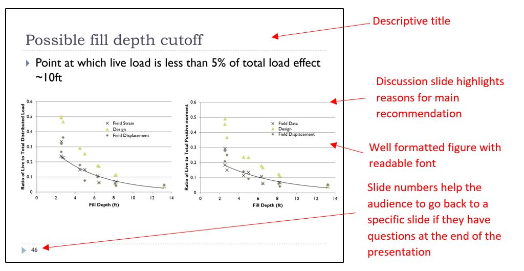
Follow the format suggestions for Figures, Tables, and Equations that you would use in a written report. You don’t have to number the graphics, but you do need to make sure they look good. If you did not produce the graphic be should to include a citation. Make sure all graphics appear clear and sharp. Don’t use too many graphics to too complicated of a slide. Too much will overwhelm the audience.
Consistency
You may think using lots of different fonts and other visual makers makes the presentation more interesting, but the key here is to keep things simple. Use visual markers (such as bold or italic font, different colors, or arrows and stars) to highlight key information on a slide, but don’t use so many that it becomes a distraction to the audience. Also, be consistent in your use. If you use one type of arrow to highlight something, use the same arrow throughout in the same way.
One of the benefits of a presentation is that they are in color, but you want to be careful with the use of color. PowerPoint has a wide array of colorful backgrounds that seem interesting, but don’t be tempted by these. In general, the background should be light, uniform, and dull. Dark text on light simple backgrounds are easier for the audience to read. Use colors sparingly to highlight important information, such as some text in red. Be careful, some colors (like yellow) show up well on a computer monitor but do not project as well. If possible do a trial run and try projecting your slide in the room you will be presenting in to check colors and make sure font is readable.
Slides give you a good amount of space and you want to make sure that you fill it without being overly crowded. Work with your presentation to make sure each slide is visually balanced and appealing. Also try to keep the same format through many slides.
Transitions and Animations
In PowerPoint, slide transitions and other animations (flying in text) can be used. These help the visual appeal of the presentation, but like colors, they should be used sparingly and consistently. For example, if you choose one method for a slide transition keep the same method throughout the presentation. If you want to animate the text (flying it in) then use the same method throughout. Try not to use too many animations (You don’t need a new fly in for every bullet. Its ok to put them all up at once and talk through them one by one).
Slide Titles
Slide titles are good to use. They help the audience know what the slide is about. But don’t use a lot of repetitive generic titles like “results.” Instead, use a title that describes the content on each slide. Each slide should convey only one main point.
Slide sizes are either 4:3 or 16:9. The squarer 4:3 size used to be the standard, but now more and more projectors use the 16:9 format. Know the room you will be presenting in and choose the correct size. If you use a 16:9 slide size and the projector is a 4:3 size, then your slides will not be projected as large.
- One of the main differences between a presentation and a written report is that you will be speaking directly to the audience. A good presentation has a speaker that is effective, engaging, and confidant. Practice is the best way to improve your speaking. Practice in your home. Get friends and family to be an audience. Practice in the room you are to present to feel more familiar with it. Beyond practice, below are some suggestions for improving your speaking.
- The presentation should be formal, specific, and complete. You need to use professional technical language. In some cases, the presentation may be less formal and more interactive. Know your audience.
- Engage your audience. Make eye contact with them, don’t stare at your screen. Try walking around the room (if possible).
- Vary your pace and tone in the presentation. You don’t want your presentation to be one long monotone monologue. Make appropriate pauses to let the audience think about a particular point. Ask questions and get the audience to engage if possible.
- Use spoken transitions between slides so that the audience can follow your train of thought and logic of your presentation.
- Speak loud enough to be heard at the back of the room. If the room is too large consider using a microphone. There is nothing more disengaging to an audience than not being able to understand the speaker. If your language skills are poor, slow down and speak as loudly (but don’t shout at them) and clearly as possible.
- Avoid distractions and filler words. Try not to use “um” and “like”. If you are having trouble remembering what to say, a pause is ok. Pay attention to your body language. You should appear to be calm and confidant in your presentation. Portraying confidence is the best way to get the audience to trust in your conclusions or design recommendation. Don’t fidget. Keep your hands to your side or use them for gesturing occasionally.
- Laser points are good for getting the audience to focus on a particular item in the slide, but don’t use them all the time.
- Know what you are going to say ahead of time, but don’t memorize a speech. You want your presentation to feel natural and flowing. You need to make slight modifications to what you are saying based on the audience reactions.
- Watch the audience. If it is clear they are disengaging or looking confused try to adjust your talk to address them. You can try asking questions or telling a joke.
- Speaking in public can make even the most seasoned speakers feel a bit nervous. The key is to find the tips and trick that allow you to calm your nerves and deliver a confidant presentation. Practice is one of the best ways to become more confidant, but also mental preparations and tricks can help distract your mind from your fears and focus back on the presentation. A quick Google search will provide many websites with suggestions for improving confidence in public speaking.
PowerPoint can be used to create a poster. You simply need to adjust the size of the slide to the required (or allowed) size of the poster. Below are some general rules on a poster.
- Be brief in the information. Like in a presentation only include that which is needed to inform the audience on what they need to know to make a decision or understand a conclusion. Unlike a presentation you may not be there to explain everything, so make sure there is some details.
- Use color in the poster, but be sparing with it. Keep to only a few complimentary colors and make sure the text is a different color (i.e. light text on a dark background or dark text on a light background)
- Section your poster into different areas (like the different sections of a presentation). The most important information (motivation and objectives) should go in the upper right corner.
- If you use any graphics that you did not produce make sure they are cited
- Be sure to include your name and affiliation (also perhaps contact information) in case the audience wants more information. You may also provide references to associated written reports.
- Like in a presentation you want to keep text short. Use key words and phrases and bulleted lists. However, unlike a presentation you may need to use more text in the poster as you may not be there to explain everything.
- Make sure all font is readable when the poster is printed.
- If you are presenting your poster be ready with a 30-45 second “elevator” speech to convey the main point of your poster. If the audience member is interested, you can go through more details.

- Undergraduate Studies
- Presentations
- Table of Contents
- Styles (Why Slides?)
- Differences with Reports
- Differences with Lectures and Marketing
- Introduction
- Enthusiasm and Expertise
- Organization
- Visual Aids
- Presentation Skills
- Answering Questions
1.2 Differences with Technical Reports
Two formal means of communication available to engineers when passing information onto a general audience include written reports and the oral presentations. Each has its own characteristics and when an engineer gives a technical presentation, he or she should focus on those aspects unique to presentations. Table 1 gives a summary of some of the differences.
As a technical presentation is meant primarily to inform or to persuade, a plethora of text is not required: the presentation should give a summary of the details and any audience member interested in delving further may ask the speaker further questions, or—even better—read the report. The audience is only exposed to each slide for at most one minute, and consequently, a detailed discussion which requires specific knowledge of previous slides may loose the audience. Certain presenters are capable of using dueling projectors , though this requires significant skill and set-up time. Each additional difference should be considered when preparing a presentation.
Want to create or adapt books like this? Learn more about how Pressbooks supports open publishing practices.
Unit 33: Informative and Persuasive Presentations
Learning objectives.

- describe the functions of the speech to inform
- provide examples of four main types of speeches to inform
- understand how to structure and develop a speech to inform
- identify and demonstrate how to use six principles of persuasion
- describe similarities and differences between persuasion and motivation
- identify and demonstrate the effective use of five functions of speaking to persuade
Introduction
Regardless of the type of presentation, you must prepare carefully. Are you trying to sell life insurance to a group of new clients, or presenting a proposal to secure financing to expand your business operation? Are you presenting the monthly update on the different sales divisions in your company, or providing customers with information on how to upgrade their latest computer purchase. Your future career will require you to present both to inform or to persuade. Knowing the difference between these two types of presentations and knowing how to construct each type of presentation will be beneficial to your future careers.
Presenting to Inform
At some point in your business career, you will be called upon to teach someone something. It may be a customer, coworker, or supervisor, and in each case, you are performing an informative speech. It is distinct from a sales speech, or persuasive speech, in that your goal is to communicate the information so that your listener understands. The informative speech is one performance you’ll give many times across your career, whether your audience is one person, a small group, or a large auditorium full of listeners. Once you master the art of the informative speech, you may mix and match it with other styles and techniques.
Informative presentations focus on helping the audience to understand a topic, issue, or technique more clearly. There are distinct functions inherent in a speech to inform, and you may choose to use one or more of these functions in your speech. Let’s take a look at the functions and see how they relate to the central objective of facilitating audience understanding.
Share: The basic definition of communication highlights the process of understanding and sharing meaning. An informative speech follows this definition when a speaker shares content and information with an audience. As part of a speech, you wouldn’t typically be asking the audience to respond or solve a problem. Instead, you’d be offering to share with the audience some of the information you have gathered related to a topic.
Increasing Understanding: How well does your audience grasp the information? This should be a guiding question to you on two levels. The first involves what they already know—or don’t know—about your topic, and what key terms or ideas might be necessary for someone completely unfamiliar with your topic to grasp the ideas you are presenting. The second involves your presentation and the illustration of ideas. The audience will respond to your attention statement and hopefully maintain interest, but how will you take your speech beyond superficial coverage of content and effectively communicate key relationships that increase understanding? These questions should serve as a challenge for your informative speech, and by looking at your speech from an audience-oriented perspective, you will increase your ability to increase the audience’s understanding.
Change Perceptions: How you perceive something has everything to do with a range of factors that are unique to you. We all want to make sense of our world, share our experiences, and learn that many people face the same challenges we do. For instance, many people perceive the process of speaking in public as a significant challenge, and in this text, we have broken down the process into several manageable steps. In so doing, we have to some degree changed your perception of public speaking.
When you present your speech to inform, you may want to change the audience member’s perceptions of your topic. You may present an informative speech on air pollution and want to change common perceptions such as the idea that most of North America’s air pollution comes from private cars. You won’t be asking people to go out and vote, or change their choice of automobiles, but you will help your audience change their perceptions of your topic.
Gain Skills: Just as you want to increase the audience’s understanding, you may want to help the audience members gain skills. If you are presenting a speech on how to make a meal from fresh ingredients, your audience may thank you for not only the knowledge of the key ingredients and their preparation but also the product available at the conclusion. If your audience members have never made their own meal, they may gain a new skill from your speech.
Exposition versus Interpretation: When you share information informally, you often provide your own perspective and attitude for your own reasons. The speech to inform the audience on a topic, idea, or area of content is not intended to be a display of attitude and opinion.
The speech to inform is like the classroom setting in that the goal is to inform, not to persuade, entertain, display attitude, or create comedy. If you have analyzed your audience, you’ll be better prepared to develop appropriate ways to gain their attention and inform them on your topic. You want to communicate thoughts, ideas, and relationships and allow each listener specifically, and the audience generally, to draw their own conclusions. The speech to inform is all about sharing information to meet the audience’s needs, not your own.
Exposition: Exposition means a public exhibition or display, often expressing a complex topic in a way that makes the relationships and content clear. The goal is to communicate the topic and content to your audience in ways that illustrate, explain, and reinforce the overall content to make your topic more accessible to the audience. The audience wants to learn about your topic and may have some knowledge of it as you do. It is your responsibility to consider ways to display the information effectively.
Interpretation and Bias: Interpretation involves adapting the information to communicate a message, perspective, or agenda. Your insights and attitudes will guide your selection of material, what you focus on, and what you delete (choosing what not to present to the audience). Your interpretation will involve personal bias.
Bias is an unreasoned or not-well-thought-out judgment. Bias involves beliefs or ideas held on the basis of conviction rather than current evidence. Beliefs are often called “habits of the mind” because we come to rely on them to make decisions. Which is the better, cheapest, most expensive, or the middle-priced product? People often choose the middle-priced product and use the belief “if it costs more it must be better” (and the opposite: “if it is cheap it must not be very good”). The middle-priced item, regardless of the actual price, is often perceived as “good enough.” All these perceptions are based on beliefs, and they may not apply to the given decision or even be based on any evidence or rational thinking.
We take mental shortcuts all day long, but in our speech to inform, we have to be careful not to reinforce bias.
Point of View: Clearly no one can be completely objective and remove themselves from their own perceptual process. People express themselves and naturally relate what is happening now to what has happened to them in the past. You are your own artist, but you also control your creations.
Objectivity involves expressions and perceptions of facts that are free from distortion by your prejudices, bias, feelings or interpretations. For example, is the post office box blue? An objective response would be yes or no, but a subjective response might sound like “Well, it’s not really blue as much as it is navy, even a bit of purple.” Subjectivity involves expressions or perceptions that are modified, altered, or impacted by your personal bias, experiences, and background. In an informative speech, your audience will expect you to present the information in a relatively objective form. The speech should meet the audience’s needs as they learn about the content, not your feelings, attitudes, or commentary on the content.
Knowledge Check
Types of Informative Presentations
Speaking to inform may fall into one of several categories. The presentation to inform may be an explanation, a report, a description, or a demonstration . E ach type of informative speech is described below.
Explanation: Have you ever listened to a lecture or speech where you just didn’t get it? It wasn’t that you weren’t interested, at least not at first. Perhaps the presenter used language you didn’t understand or gave a confusing example. Soon you probably lost interest and sat there, attending the speech in body but certainly not in mind. An effective speech to inform will take a complex topic or issue and explain it to the audience in ways that increase audience understanding.
No one likes to feel left out. As the speaker, it’s your responsibility to ensure that this doesn’t happen. Also, know that to teach someone something new—perhaps a skill that they did not possess or a perspective that allows them to see new connections—is a real gift, both to you and the audience members. You will feel rewarded because you made a difference and they will perceive the gain in their own understanding.
Report: As a business communicator, you may be called upon to give an informative report where you communicate status, trends, or relationships that pertain to a specific topic. The informative report is a speech where you organize your information around key events, discoveries, or technical data and provide context and illustration for your audience. They may naturally wonder, “Why are sales up (or down)?” or “What is the product leader in your lineup?” and you need to anticipate their perspective and present the key information that relates to your topic.
Description: Have you ever listened to a friend tell you about their recent trip somewhere and found the details fascinating, making you want to travel there or visit a similar place? Describing information requires an emphasis on language that is vivid, captures attention, and excites the imagination. Your audience will be drawn to your effective use of color, descriptive language, and visual aids. An informative speech that focuses on the description will be visual in many ways. Use your imagination to place yourself in their perspective: how would you like to have someone describe the topic to you?
Demonstration: You want to teach the audience how to program the applications on a new smartphone. A demonstrative speech focuses on clearly showing a process and telling the audience important details about each step so that they can imitate, repeat, or do the action themselves. Consider the visual aids or supplies you will need.
By considering each step and focusing on how to simplify it, you can understand how the audience might grasp the new information and how you can best help them. Also, consider the desired outcome; for example, will your listeners be able to actually do the task themselves? Regardless of the sequence or pattern you will illustrate or demonstrate, consider how people from your anticipated audience will respond, and budget additional time for repetition and clarification.
Creating an Informative Presentation
An informational presentation is a common request in business and industry. It’s the verbal and visual equivalent of a written report. Informative presentations serve to present specific information for specific audiences for specific goals or functions. Table 33.1 below describes five main parts of a presentation to inform.
Table 33.1. Presentation Components and Their Functions. Lists the five main parts or components of any presentation (McLean, S., 2003).
Sample Speech Guidelines: Imagine that you have been assigned to give an informative presentation lasting five to seven minutes. Follow the guidelines in Table 33.2 below and apply them to your presentation.
Table 33.2 Sample speech guidelines. Seven key items.
Informative presentations illustrate, explain, describe, and instruct the audience on topics and processes. Now let’s watch an example of an informative speech.
The Persuasive Presentation
No doubt there has been a time when you wanted to achieve a goal or convince someone about a need and you thought about how you were going to present your request. Consider how often people want something from you? When you watch television, advertisements reach out for your attention, whether you watch them or not. When you use the internet, pop-up advertisements often appear. Most people are surrounded, even inundated by persuasive messages. Mass and social media in the 21st century have had a significant effect on persuasive communication that you will certainly recognize.
Persuasion is an act or process of presenting arguments to move, motivate, or change the mind of your audience. Persuasion can be implicit or explicit and can have both positive and negative effects. Motivation is different from persuasion in that it involves the force, stimulus, or influence to bring about change. Persuasion is the process, and motivation is the compelling stimulus that encourages your audience to change their beliefs or behaviour, to adopt your position, or to consider your arguments. Let’s view the video below for an overview of the principles of a persuasive presentation.
Principles of Persuasion
What is the best way to succeed in persuading your listeners? There is no one “correct” answer, but many experts have studied persuasion and observed what works and what doesn’t. Social psychologist Robert Cialdini (2006) offers us six principles of persuasion that are powerful and effective: Reciprocity , Scarcity , Authority , Commitment and consistency , Consensus , and Liking . These six principles are covered in more detail in Unit 27 .
Developing a Persuasive Presentation
Persuasive presentations have the following features, they:
When you focus on stimulation as the goal of your speech, you want to reinforce existing beliefs, intensify them, and bring them to the forefront. By presenting facts, you will reinforce existing beliefs, intensify them, and bring the issue to the surface. You might consider the foundation of common ground and commonly held beliefs, and then introduce information that a mainstream audience may not be aware of that supports that common ground as a strategy to stimulate.
In a persuasive speech, the goal is to change the attitudes, beliefs, values, or judgments of your audience. Audience members are likely to hold their own beliefs and are likely to have their own personal bias. Your goal is to get them to agree with your position, so you will need to plan a range of points and examples to get audience members to consider your topic. H ere is a five-step checklist to motivate your audience into some form of action:
1. Get their attention 2. Identify the need 3. Satisfy the need 4. Present a vision or solution 5. Take action
This simple organizational pattern can help you focus on the basic elements of a persuasive message that will motivate your audience to take action…
Include a Call to Action
When you call an audience to action with a speech, you are indicating that your purpose is not to stimulate interest, reinforce and accentuate beliefs, or convince them of a viewpoint. Instead, you want your listeners to do something, to change their behaviour in some way. The persuasive speech that focuses on action often generates curiosity, clarifies a problem, and as we have seen, proposes a range of solutions. The key difference here is there is a clear link to action associated with the solutions.
Solutions lead us to consider the goals of action. These goals address the question, “What do I want the audience to do as a result of being engaged by my speech?” The goals of action include adoption, discontinuance, deterrence, and continuance.
Adoption means the speaker wants to persuade the audience to take on a new way of thinking, or adopt a new idea. Examples could include buying a new product, or deciding to donate blood. The key is that the audience member adopts, or takes on, a new view, action, or habit.
Discontinuance involves the speaker persuading the audience to stop doing something that they have been doing. Rather than take on a new habit or action, the speaker is asking the audience member to stop an existing behaviour or idea.
Deterrence is a call to action that focuses on persuading the audience not to start something if they haven’t already started. The goal of action would be to deter, or encourage the audience members to refrain from starting or initiating the behavior.
Finally, with C ontinuance , the speaker aims to persuade the audience to continue doing what they have been doing, such as keep buying a product, or staying in school to get an education.
A speaker may choose to address more than one of these goals of action, depending on the audience analysis. If the audience is largely agreeable and supportive, you may find continuance to be one goal, while adoption is secondary.
Goals in call to action speeches serve to guide you in the development of solution steps. Solution steps involve suggestions or ways the audience can take action after your speech. Audience members appreciate a clear discussion of the problem in a persuasive speech, but they also appreciate solutions.
Increase Consideration
In a speech designed to increase consideration, you want to entice your audience to consider alternate viewpoints on the topic you have chosen. Audience members may hold views that are hostile in relation to yours, or perhaps they are neutral and simply curious about your topic. You won’t be asking for action in this presentation, simply to consider an alternative perspective.
Develop Tolerance of Alternate Perspectives
Finally, you may want to help your audience develop tolerance for alternate perspectives and viewpoints. Your goal is to help your audience develop tolerance, but not necessarily acceptance, of alternate perspectives. By starting from common ground, and introducing a related idea, you are persuading your audience to consider an alternate perspective.
A persuasive speech may stimulate thought, convince, call to action, increase consideration, or develop tolerance of alternate perspectives. Watch the following video of a persuasive speech with annotation to see the concepts above in action.
Persuasive Strategies
When you make an argument in a persuasive speech, you will want to present your position logically by supporting each point with appropriate sources. You will want to give your audience every reason to perceive you as an ethical and trustworthy speaker. Your audience will expect you to treat them with respect, and to present your argument in a way that does not make them defensive. Contribute to your credibility by building sound arguments and using strategic arguments with skill and planning.
Stephen Toulmin’s (1958) rhetorical strategy focuses on three main elements, shown in Table 33.3 as a claim, data, and warrant.
Table 33.3 Rhetorical strategy.
This three-part rhetorical strategy is useful in that it makes the claim explicit, clearly illustrating the relationship between the claim and the data, and allows the listener to follow the speaker’s reasoning. You may have a good idea or point, but your audience will be curious and want to know how you arrived at that claim or viewpoint. The warrant often addresses the inherent and often unspoken question, “Why is this data so important to your topic?” and helps you illustrate relationships between information for your audience. This model can help you clearly articulate it for your audience.
Appealing to Emotions
Emotions are psychological and physical reactions, such as fear or anger, to stimuli that we experience as a feeling. Our feelings or emotions directly impact our own point of view and readiness to communicate, but also influence how, why, and when we say things. Emotions influence not only how you say what you say, but also how you hear and what you hear. At times, emotions can be challenging to control. Emotions will move your audience, and possibly even move you, to change or act in certain ways.
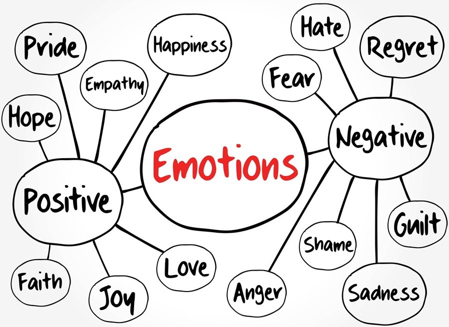
Be wary of overusing emotional appeals, or misusing emotional manipulation in presentations and communication. You may encounter emotional resistance from your audience. Emotional resistance involves getting tired, often to the point of rejection, of hearing messages that attempt to elicit an emotional response. Emotional appeals can wear out the audience’s capacity to receive the message.
The use of an emotional appeal may also impair your ability to write persuasively or effectively. Never use a personal story, or even a story of someone you do not know if the inclusion of that story causes you to lose control. While it’s important to discuss relevant and sometimes emotionally difficult topics, you need to assess your own relationship to the message. Your documents should not be an exercise in therapy and you will sacrifice ethos and credibility, even your effectiveness, if you become angry or distraught because you are really not ready to discuss an issue you’ve selected.
Now that you’ve considered emotions and their role in a speech in general and a speech to persuade specifically, it’s important to recognize the principles about emotions in communication that serve you well when speaking in public. The video below reviews how to effectively integrate emotion, logic and credibility into your presentation.
DeVito (2003) offers five key principles to acknowledge the role emotions play in communication and offer guidelines for there expression.
Emotions Are Universal: Emotions are a part of every conversation or interaction that you have. Whether or not you consciously experience them while communicating with yourself or others, they influence how you communicate. By recognizing that emotions are a component in all communication interactions, you can place emphasis on understanding both the content of the message and the emotions that influence how, why, and when the content is communicated.
Expression of emotions is important, but requires the three Ts: tact, timing, and trust . If you find you are upset and at risk of being less than diplomatic, or the timing is not right, or you are unsure about the level of trust, then consider whether you can effectively communicate your emotions. By considering these three Ts, you can help yourself express your emotions more effectively.
Emotions Are Communicated Verbally and Nonverbally: You communicate emotions not only through your choice of words but also through the manner in which you say those words. The words themselves communicate part of your message, but the nonverbal cues, including inflection, timing, space, and paralanguage can modify or contradict your spoken message. Be aware that emotions are expressed in both ways and pay attention to how verbal and nonverbal messages reinforce and complement each other.
Emotional Expression Can Be Good and Bad: Expressing emotions can be a healthy activity for a relationship and build trust. It can also break down trust if expression is not combined with judgment. We’re all different, and we all experience emotions, but how we express our emotions to ourselves and others can have a significant impact on our relationships. Expressing frustrations may help the audience realize your point of view and see things as they have never seen them before. However, expressing frustrations combined with blaming can generate defensiveness and decrease effective listening. When you’re expressing yourself, consider the audience’s point of view, be specific about your concerns, and emphasize that your relationship with your listeners is important to you.
Emotions Are Often Contagious: It is important to recognize that we influence each other with our emotions, positively and negatively. Your emotions as the speaker can be contagious, so use your enthusiasm to raise the level of interest in your topic. Conversely, you may be subject to “catching” emotions from your audience.
In summary, everyone experiences emotions, and as a persuasive speaker, you can choose how to express emotion and appeal to the audience’s emotions.
Presenting Ethically
What comes to mind when you think of speaking to persuade? Perhaps the idea of persuasion may bring to mind propaganda and issues of manipulation , deception , intentional bias , bribery , and even coercion . Each element relates to persuasion, but in distinct ways. We can recognize that each of these elements in some ways has a negative connotation associated with it. Why do you think that deceiving your audience, bribing a judge, or coercing people to do something against their wishes is wrong? These tactics violate our sense of fairness, freedom, and ethics.
Figure 33.4 offers eleven points from the book Ethics in Human Communication (Johannesen, 1996). These points should be kept in mind as you prepare and present your persuasive message.
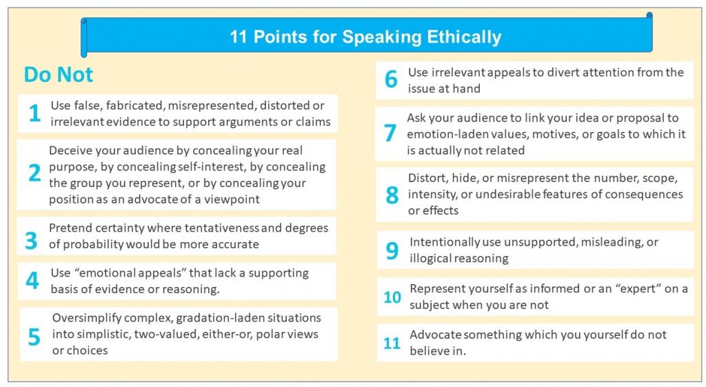
In your speech to persuade, consider honesty and integrity as you assemble your arguments. Your audience will appreciate your thoughtful consideration of more than one view, your understanding of the complexity, and you will build your ethos, or credibility, as you present your document. Be careful not to stretch the facts, or assemble them only to prove yourself, and instead prove the argument on its own merits. Deception, coercion, intentional bias, manipulation and bribery should have no place in your speech to persuade.
Key Takeaway

- Understand the function of your informative presentation in order to communicate the right message to the right audience.
- Organize your information presentation using the five main parts of an informative presentation
- Use the six principles of persuasion to develop your persuasive presentation
- Use the Rhetorical Strategy to construct will developed arguments
- Integrate emotional appeal to effectively engage your audience

- An elevator speech is to oral communication what a Twitter message (limited to 140 characters) is to written communication. An elevator speech is a presentation that persuades the listener in less than thirty seconds, or around a hundred words.
Creating an Elevator Speech
An elevator speech does not have to be a formal event, though it can be. An elevator speech is not a full sales pitch and should not get bloated with too much information. The idea is not to rattle off as much information as possible in a short time, nor to present a memorized thirty-second advertising message, but rather to give a relaxed and genuine “nutshell” summary of one main idea. The emphasis is on brevity, but a good elevator speech will address several key questions:
What is the topic, product or service? 2. Who are you? 3. Who is the target market? (if applicable) 4. What is the revenue model? (if applicable) 5. What or who is the competition and what are your advantages?
The following are the five key parts of your message:
- Attention Statement – Hook + information about you
- Introduction – What you offer
- Body – Benefits; what’s in it for the listener
- Conclusion – Example that sums it up
- Residual Message – Call for action
Task: Write an elevator speech for your next networking event to introduce yourself to prospective employers.
Comm Studies. (2019). Informative speech example [Video file]. Retrieved from https://www.youtube.com/watch?v=StPSgqwCnVk&t=60s
eCampusOntario. (2020). Chapter 7: Presentation to inform . Communication for business professionals. Retrieved from https://ecampusontario.pressbooks.pub/commbusprofcdn/chapter/introduction-5/
eCampusOntario. (2020). Chapter 8: Presentation to persuade . Communication for business professionals. Retrieved from https://ecampusontario.pressbooks.pub/commbusprofcdn/chapter/introduction-6/
Guffey, M., Loewry, D., & Griffin, E. (2019). Business communication: Process and product (6th ed.). Toronto, ON: Nelson Education. Retrieved from http://www.cengage.com/cgi-wadsworth/course_products_wp.pl?fid=M20b&product_isbn_issn=9780176531393&template=NELSON
Littleleague.org. (2020). “Calm” emotions & “positive” feelings: Two keys to stay healthy during self-Isolation. Resources for parents . Retrieved from https://www.littleleague.org/news/calm-emotions-positive-feelings-two-keys-to-stay-healthy-during-self-isolation/
Lyon, A. (2017). Ethos Pathos Logos [Video file]. Retrieved from https://www.youtube.com/watch?v=2ey232I5nUk
Lyon, A. (2017). How to Organize a Persuasive Speech or Presentation [Video file]. Retrieved from https://www.youtube.com/watch?v=jnfoFN7TBhw
Lyon, A. (2019). Informative vs persuasive [Video file]. Retrieved from https://www.youtube.com/watch?time_continue=1&v=85gg_pgij4I
Reciprocity is the mutual expectation for exchange of value or service.
You want what you can’t have, and it’s universal. People are often attracted to the exclusive, the rare, the unusual, and the unique
Trust is central to the purchase decision
People like to have consistency in what is said to them or in writing. Therefore, it is important that all commitments made are honored at all times.
People often look to each other when making a purchase decision, and the herd mentality is a powerful force across humanity
We tend to be attracted to people who communicate to us that they like us, and who make us feel good about ourselves. This principle involves the perception of safety and belonging in communication.
management of facts, ideas or points of view to play upon inherent insecurities or emotional appeals to one’s own advantage
use of lies, partial truths, or the omission of relevant information to deceive your audience
the selection of information to support your position while framing negatively any information that might challenge your belief
giving of something in return for an expected favour, consideration, or privilege
use of power to compel action
Communication@Work Copyright © 2019 by Jordan Smith is licensed under a Creative Commons Attribution 4.0 International License , except where otherwise noted.
Share This Book
Different Types of Research Presentations

There are many different types of research presentations, but the different types of presentations can be divided into two general categories: written presentations and oral presentations. Written research presentations include dissertations and theses, posters, grant and project proposals, blogs, websites, PowerPoint slides, etc. Oral research presentations include lectures, conference presentations, job talks, etc. Often, oral and written methods of presentation are combined to effectively convey information about research. For example, posters or PowerPoint slides may be used to support oral presentations of research, or information on posters may be supplemented with oral explanations. Whichever type of research presentation you choose for your research, you should remember the following about the similarities and differences between oral and written presentations.
Similarities Between Oral and Written Presentations
The fundamental elements of successfully presenting research apply to both oral and written presentations. Whether you choose to present your research orally or in written form, you should know and actively engage your audience in the presentation of your research to effectively deliver your ideas. Organization is also important in both written and oral presentations. You can create outlines of your research that you can use to help you organize information for both oral and written presentations.
Differences Between Oral and Written Presentations
The most important difference between oral and written presentations is the time that is available for your audience to process what you have presented about your research. In written presentations, your audience has an unlimited amount of time to read, re-read, and analyze your research; if your audience does not understand particularly dense elements of your research, your audience has plenty of time to mull over your research until it becomes more understandable. In oral presentations, however, you generally have a limited amount of time to present your research, and your audience has even less time to understand what you have said. In both oral and written presentations (but particularly in oral presentations), you can help your audience understand your research by defining important key terms. After you have defined the key terms for your written or oral presentation, you must use them and any other jargon consistently throughout your entire presentation to help your audience avoid confusion.
Click here to cancel reply.
You must be logged in to post a comment.
Copyright © 2024 PhDStudent.com. All rights reserved. Designed by Divergent Web Solutions, LLC .
Want to create or adapt books like this? Learn more about how Pressbooks supports open publishing practices.
13.1 Functions of the Presentation to Inform
Learning objectives.
- Describe the functions of the speech to inform.
- Explain the difference between exposition and interpretation.
Informative presentations focus on helping the audience to understand a topic, issue, or technique more clearly. You might say, “Is that all?” and the answer is both yes and no. An affirmative response underscores the idea that informative speeches do not seek to motivate the audience to change their minds, adopt a new idea, start a new habit, or get out there and vote. They may, however, inform audiences on issues that may be under consideration in an election or referendum. On the other hand, a negative response reaffirms the idea that to communicate a topic, issue, or subject clearly is a challenge in itself and shouldn’t be viewed as a simplistic process. There are distinct functions inherent in a speech to inform, and you may choose to use one or more of these functions in your speech. Let’s take a look at the functions and see how they relate to the central objective of facilitating audience understanding.
The basic definition of communication highlights the process of understanding and sharing meaning. An informative speech follows this definition in the aspect of sharing content and information with an audience. You won’t be asking the audience to actually do anything in terms of offering a response or solving a problem. Instead you’ll be offering to share with the audience some of the information you have gathered relating to a topic. This act of sharing will reduce ignorance, increase learning, and facilitate understanding of your chosen topic.
Increase Understanding
How well does your audience grasp the information? This should be a guiding question to you on two levels. The first involves what they already know—or don’t know—about your topic, and what key terms or ideas might be necessary for someone completely unfamiliar with your topic to grasp the ideas you are presenting. The second involves your presentation and the illustration of ideas. A bar chart, a pie graph, and a video clip may all serve you and the audience well, but how will each ingredient in your speech contribute to their understanding? The audience will respond to your attention statement and hopefully maintain interest, but how will you take your speech beyond superficial coverage of content and effectively communicate key relationships that increase understanding? These questions should serve as a challenge for your informative speech, and by looking at your speech from an audience-oriented perspective, you will increase your ability to increase the audience’s understanding.
Change Perceptions
How you perceive stimuli has everything to do with a range of factors that are unique to you. We all want to make sense of our world, share our experiences, and learn that many people face the same challenges we do. Many people perceive the process of speaking in public as a significant challenge, and in this text, we have broken down the process into several manageable steps. In so doing, we have to some degree changed your perception of public speaking. When you present your speech to inform, you may want to change the audience member’s perceptions of your topic. You may present an informative speech on air pollution and want to change common perceptions such as the idea that most of North America’s air pollution comes from private cars, or that nuclear power plants are a major source of air pollution. You won’t be asking people to go out and vote, or change their choice of automobiles, but you will help your audience change their perceptions of your topic.
Gain Skills
Just as you want to increase the audience’s understanding, you may want to help the audience members gain skills. If you are presenting a speech on how to make salsa from fresh ingredients, your audience may thank you for not only the knowledge of the key ingredients and their preparation but also the product available at the conclusion. If your audience members have never made their own salsa, they may gain a new skill from your speech. In the same way, perhaps you decide to inform your audience about eBay, a person-to-person marketplace much like a garage sale in which items are auctioned or available for purchase over the Internet. You may project onto a screen in class the main Web site and take the audience through a step-by-step process on how to sell an item. The audience may learn an important skill, clean out the old items in their garage, and buy new things for the house with their newfound skills. Your intentions, of course, are not to argue that salsa is better than ketchup or that eBay is better than Amazon, but to inform the audience, increasing their understanding of the subject, and in this case, gaining new skills.
Exposition versus Interpretation
When we share information informally, we often provide our own perspective and attitude for our own reasons. But when we set out to inform an audience, taking sides or using sarcasm to communicate attitude may divide the audience into groups that agree or disagree with the speaker. The speech to inform the audience on a topic, idea, or area of content is not intended to be a display of attitude and opinion. Consider the expectations of people who attend a formal dinner. Will they use whatever fork or spoon they want, or are there expectations of protocol and decorum? In any given communication context there are expectations, both implicit and explicit. If you attend a rally on campus for health care reform, you may expect the speaker to motivate you to urge the university to stop investing in pharmaceutical companies, for example. On the other hand, if you enroll in a biochemistry course, you expect a teacher to inform you about the discipline of biochemistry—not to convince you that pharmaceutical companies are a good or bad influence on our health care system.
The speech to inform is like the classroom setting in that the goal is to inform, not to persuade, entertain, display attitude, or create comedy. If you have analyzed your audience, you’ll be better prepared to develop appropriate ways to gain their attention and inform them on your topic. You want to communicate thoughts, ideas, and relationships and allow each listener specifically, and the audience generally, to draw their own conclusions. The speech to inform is all about sharing information to meet the audience’s needs, not your own. While you might want to inform them about your views on politics in the Middle East, you’ll need to consider what they are here to learn from you and let your audience-oriented perspective guide you as you prepare.
This relationship between informing as opposed to persuading your audience is often expressed in terms of exposition versus interpretation. Exposition means a public exhibition or display, often expressing a complex topic in a way that makes the relationships and content clear. Expository prose is writing to inform; you may have been asked to write an expository essay in an English course or an expository report in a journalism course. The goal is to communicate the topic and content to your audience in ways that illustrate, explain, and reinforce the overall content to make your topic more accessible to the audience. The audience wants to learn about your topic and may have some knowledge on it as you do. It is your responsibility to consider ways to display the information effectively.
Interpretation and Bias
Interpretation involves adapting the information to communicate a message, perspective, or agenda. Your insights and attitudes will guide your selection of material, what you focus on, and what you delete (choosing what not to present to the audience). Your interpretation will involve personal bias. Bias is an unreasoned or not-well-thought-out judgment. Bias involves beliefs or ideas held on the basis of conviction rather than current evidence. Beliefs are often called “habits of the mind” because we come to rely on them to make decisions. Which is the better, cheapest, most expensive, or the middle-priced product? People often choose the middle-priced product and use the belief “if it costs more it must be better” (and the opposite: “if it is cheap it must not be very good”). The middle-priced item, regardless of actual price, is often perceived as “good enough.” All these perceptions are based on beliefs, and they may not apply to the given decision or even be based on any evidence or rational thinking.
By extension, marketing students learn to facilitate the customer “relationship” with the brand. If you come to believe a brand stands for excellence, and a new product comes out under that brand label, you are more likely to choose it over an unknown or lesser-known competitor. Again, your choice of the new product is based on a belief rather than evidence or rational thinking. We take mental shortcuts all day long, but in our speech to inform, we have to be careful not to reinforce bias.
Bias is like a filter on your perceptions, thoughts, and ideas. Bias encourages you to accept positive evidence that supports your existing beliefs (regardless of whether they are true) and reject negative evidence that does not support your beliefs. Furthermore, bias makes you likely to reject positive support for opposing beliefs and accept negative evidence (again, regardless of whether the evidence is true). So what is positive and what is negative? In a biased frame of mind, that which supports your existing beliefs is positive and likely to be accepted, while that which challenges your beliefs is likely to be viewed as negative and rejected. There is the clear danger in bias. You are inclined to tune out or ignore information, regardless of how valuable, useful, or relevant it may be, simply because it doesn’t agree with or support what you already believe.
Point of View
Let’s say you are going to present an informative speech on a controversial topic like same-sex marriage. Without advocating or condemning same-sex marriage, you could inform your audience about current laws in various states, recent and proposed changes in laws, the number of same-sex couples who have gotten married in various places, the implications of being married or not being able to marry, and so on. But as you prepare and research your topic, do you only read or examine information that supports your existing view? If you only choose to present information that agrees with your prior view, you’ve incorporated bias into your speech. Now let’s say the audience members have different points of view, even biased ones, and as you present your information you see many people start to fidget in their seats. You can probably anticipate that if they were to speak, the first word they would say is “but” and then present their question or assertion. In effect, they will be having a debate with themselves and hardly listening to you.
You can anticipate the effects of bias and mitigate them to some degree. First, know the difference between your point of view or perspective and your bias. Your point of view is your perception of an idea or concept from your previous experience and understanding. It is unique to you and is influenced by your experiences and also factors like gender, race, ethnicity, physical characteristics, and social class. Everyone has a point of view, as hard as they may try to be open-minded. But bias, as we’ve discussed previously, involves actively selecting information that supports or agrees with your current belief and takes away from any competing belief. To make sure you are not presenting a biased speech, frame your discussion to inform from a neutral stance and consider alternative points of view to present, compare and contrast, and diversify your speech. The goal of the speech to inform is to present an expository speech that reduces or tries to be free from overt interpretation.
This relates to our previous discussion on changing perceptions. Clearly no one can be completely objective and remove themselves from their own perceptual process. People are not modern works of minimalist art, where form and function are paramount and the artist is completely removed from the expression. People express themselves and naturally relate what is happening now to what has happened to them in the past. You are your own artist, but you also control your creations.
Objectivity involves expressions and perceptions of facts that are free from distortion by your prejudices, bias, feelings or interpretations. For example, is the post office box blue? An objective response would be yes or no, but a subjective response might sound like “Well, it’s not really blue as much as it is navy, even a bit of purple, kind of like the color of my ex-boyfriend’s car, remember? I don’t care for the color myself.” Subjectivity involves expressions or perceptions that are modified, altered, or impacted by your personal bias, experiences, and background. In an informative speech, your audience will expect you to present the information in a relatively objective form. The speech should meet the audience’s need as they learn about the content, not your feelings, attitudes, or commentary on the content.
Here are five suggestions to help you present a neutral speech:
- Keep your language neutral and not very positive for some issues while very negative for others.
- Keep your sources credible and not from biased organizations. The National Rifle Association (NRA) will have a biased view of the Second Amendment, for example, as will the American Civil Liberties Union (ACLU) on civil rights.
- Keep your presentation balanced. If you use a source that supports one clear side of an issue, include an alternative source and view. Give each equal time and respectful consideration.
- Keep your audience in mind. Not everyone will agree with every point or source of evidence, but diversity in your speech will have more to offer everyone.
- Keep who you represent in mind: Your business and yourself.
Key Takeaways
- The purpose of an informative speech is to share ideas with the audience, increase their understanding, change their perceptions, or help them gain new skills.
- An informative speech incorporates the speaker’s point of view but not attitude or interpretation.
- Consider the courses you have taken in the past year or two, and the extent to which each class session involved an informative presentation or one that was more persuasive. Do some disciplines lend themselves more to informing rather than interpretation and attitude? Discuss your findings with your classmates.
- Visit a major network news Web site and view a video of a commentator such as Rachel Maddow or Keith Olbermann (MSNBC) or Glenn Beck or Bill O’Reilly (Fox News). Identify the commentator’s point of view. If you were giving a presentation to inform, would you express your point of view in a similar style?
- On the same network news Web site you used for Exercise no. 2, view a video reporting a news event (as opposed to a commentator’s commentary). Do you feel that the reporter’s approach conveys a point of view, or is it neutral? Explain your feelings and discuss with your classmates.
- What is the difference between an informative presentation and a persuasive one? Provide an example in your response.
- Consider a sample speech to inform on a topic where you have a strong opinion. In what ways would you adjust your key points so as not to persuade your listeners? Discuss your ideas with a classmate.
Business Communication for Success Copyright © 2015 by University of Minnesota is licensed under a Creative Commons Attribution-NonCommercial-ShareAlike 4.0 International License , except where otherwise noted.

Learning Objectives
- Describe the functions of the speech to inform.
- Explain the difference between exposition and interpretation.
Informative presentations focus on helping the audience to understand a topic, issue, or technique more clearly. You might say, “Is that all?” and the answer is both yes and no. An affirmative response underscores the idea that informative speeches do not seek to motivate the audience to change their minds, adopt a new idea, start a new habit, or get out there and vote. They may, however, inform audiences on issues that may be under consideration in an election or referendum. On the other hand, a negative response reaffirms the idea that to communicate a topic, issue, or subject clearly is a challenge in itself and shouldn’t be viewed as a simplistic process. There are distinct functions inherent in a speech to inform, and you may choose to use one or more of these functions in your speech. Let’s take a look at the functions and see how they relate to the central objective of facilitating audience understanding.
The basic definition of communication highlights the process of understanding and sharing meaning. An informative speech follows this definition in the aspect of sharing content and information with an audience. You won’t be asking the audience to actually do anything in terms of offering a response or solving a problem. Instead you’ll be offering to share with the audience some of the information you have gathered relating to a topic. This act of sharing will reduce ignorance, increase learning, and facilitate understanding of your chosen topic.
Increase Understanding
How well does your audience grasp the information? This should be a guiding question to you on two levels. The first involves what they already know—or don’t know—about your topic, and what key terms or ideas might be necessary for someone completely unfamiliar with your topic to grasp the ideas you are presenting. The second involves your presentation and the illustration of ideas. A bar chart, a pie graph, and a video clip may all serve you and the audience well, but how will each ingredient in your speech contribute to their understanding? The audience will respond to your attention statement and hopefully maintain interest, but how will you take your speech beyond superficial coverage of content and effectively communicate key relationships that increase understanding? These questions should serve as a challenge for your informative speech, and by looking at your speech from an audience-oriented perspective, you will increase your ability to increase the audience’s understanding.
Change Perceptions
How you perceive stimuli has everything to do with a range of factors that are unique to you. We all want to make sense of our world, share our experiences, and learn that many people face the same challenges we do. Many people perceive the process of speaking in public as a significant challenge, and in this text, we have broken down the process into several manageable steps. In so doing, we have to some degree changed your perception of public speaking. When you present your speech to inform, you may want to change the audience member’s perceptions of your topic. You may present an informative speech on air pollution and want to change common perceptions such as the idea that most of North America’s air pollution comes from private cars, or that nuclear power plants are a major source of air pollution. You won’t be asking people to go out and vote, or change their choice of automobiles, but you will help your audience change their perceptions of your topic.
Gain Skills
Just as you want to increase the audience’s understanding, you may want to help the audience members gain skills. If you are presenting a speech on how to make salsa from fresh ingredients, your audience may thank you for not only the knowledge of the key ingredients and their preparation but also the product available at the conclusion. If your audience members have never made their own salsa, they may gain a new skill from your speech. In the same way, perhaps you decide to inform your audience about eBay, a person-to-person marketplace much like a garage sale in which items are auctioned or available for purchase over the Internet. You may project onto a screen in class the main Web site and take the audience through a step-by-step process on how to sell an item. The audience may learn an important skill, clean out the old items in their garage, and buy new things for the house with their newfound skills. Your intentions, of course, are not to argue that salsa is better than ketchup or that eBay is better than Amazon, but to inform the audience, increasing their understanding of the subject, and in this case, gaining new skills.
Exposition versus Interpretation
When we share information informally, we often provide our own perspective and attitude for our own reasons. But when we set out to inform an audience, taking sides or using sarcasm to communicate attitude may divide the audience into groups that agree or disagree with the speaker. The speech to inform the audience on a topic, idea, or area of content is not intended to be a display of attitude and opinion. Consider the expectations of people who attend a formal dinner. Will they use whatever fork or spoon they want, or are there expectations of protocol and decorum? In any given communication context there are expectations, both implicit and explicit. If you attend a rally on campus for health care reform, you may expect the speaker to motivate you to urge the university to stop investing in pharmaceutical companies, for example. On the other hand, if you enroll in a biochemistry course, you expect a teacher to inform you about the discipline of biochemistry—not to convince you that pharmaceutical companies are a good or bad influence on our health care system.
The speech to inform is like the classroom setting in that the goal is to inform, not to persuade, entertain, display attitude, or create comedy. If you have analyzed your audience, you’ll be better prepared to develop appropriate ways to gain their attention and inform them on your topic. You want to communicate thoughts, ideas, and relationships and allow each listener specifically, and the audience generally, to draw their own conclusions. The speech to inform is all about sharing information to meet the audience’s needs, not your own. While you might want to inform them about your views on politics in the Middle East, you’ll need to consider what they are here to learn from you and let your audience-oriented perspective guide you as you prepare.
This relationship between informing as opposed to persuading your audience is often expressed in terms of exposition versus interpretation. Exposition means a public exhibition or display, often expressing a complex topic in a way that makes the relationships and content clear. Expository prose is writing to inform; you may have been asked to write an expository essay in an English course or an expository report in a journalism course. The goal is to communicate the topic and content to your audience in ways that illustrate, explain, and reinforce the overall content to make your topic more accessible to the audience. The audience wants to learn about your topic and may have some knowledge on it as you do. It is your responsibility to consider ways to display the information effectively.
Interpretation and Bias
Interpretation involves adapting the information to communicate a message, perspective, or agenda. Your insights and attitudes will guide your selection of material, what you focus on, and what you delete (choosing what not to present to the audience). Your interpretation will involve personal bias. Bias is an unreasoned or not-well-thought-out judgment. Bias involves beliefs or ideas held on the basis of conviction rather than current evidence. Beliefs are often called “habits of the mind” because we come to rely on them to make decisions. Which is the better, cheapest, most expensive, or the middle-priced product? People often choose the middle-priced product and use the belief “if it costs more it must be better” (and the opposite: “if it is cheap it must not be very good”). The middle-priced item, regardless of actual price, is often perceived as “good enough.” All these perceptions are based on beliefs, and they may not apply to the given decision or even be based on any evidence or rational thinking.
By extension, marketing students learn to facilitate the customer “relationship” with the brand. If you come to believe a brand stands for excellence, and a new product comes out under that brand label, you are more likely to choose it over an unknown or lesser-known competitor. Again, your choice of the new product is based on a belief rather than evidence or rational thinking. We take mental shortcuts all day long, but in our speech to inform, we have to be careful not to reinforce bias.
Bias is like a filter on your perceptions, thoughts, and ideas. Bias encourages you to accept positive evidence that supports your existing beliefs (regardless of whether they are true) and reject negative evidence that does not support your beliefs. Furthermore, bias makes you likely to reject positive support for opposing beliefs and accept negative evidence (again, regardless of whether the evidence is true). So what is positive and what is negative? In a biased frame of mind, that which supports your existing beliefs is positive and likely to be accepted, while that which challenges your beliefs is likely to be viewed as negative and rejected. There is the clear danger in bias. You are inclined to tune out or ignore information, regardless of how valuable, useful, or relevant it may be, simply because it doesn’t agree with or support what you already believe.
Point of View
Let’s say you are going to present an informative speech on a controversial topic like same-sex marriage. Without advocating or condemning same-sex marriage, you could inform your audience about current laws in various states, recent and proposed changes in laws, the number of same-sex couples who have gotten married in various places, the implications of being married or not being able to marry, and so on. But as you prepare and research your topic, do you only read or examine information that supports your existing view? If you only choose to present information that agrees with your prior view, you’ve incorporated bias into your speech. Now let’s say the audience members have different points of view, even biased ones, and as you present your information you see many people start to fidget in their seats. You can probably anticipate that if they were to speak, the first word they would say is “but” and then present their question or assertion. In effect, they will be having a debate with themselves and hardly listening to you.
You can anticipate the effects of bias and mitigate them to some degree. First, know the difference between your point of view or perspective and your bias. Your point of view is your perception of an idea or concept from your previous experience and understanding. It is unique to you and is influenced by your experiences and also factors like gender, race, ethnicity, physical characteristics, and social class. Everyone has a point of view, as hard as they may try to be open-minded. But bias, as we’ve discussed previously, involves actively selecting information that supports or agrees with your current belief and takes away from any competing belief. To make sure you are not presenting a biased speech, frame your discussion to inform from a neutral stance and consider alternative points of view to present, compare and contrast, and diversify your speech. The goal of the speech to inform is to present an expository speech that reduces or tries to be free from overt interpretation.
This relates to our previous discussion on changing perceptions. Clearly no one can be completely objective and remove themselves from their own perceptual process. People are not modern works of minimalist art, where form and function are paramount and the artist is completely removed from the expression. People express themselves and naturally relate what is happening now to what has happened to them in the past. You are your own artist, but you also control your creations.
Objectivity involves expressions and perceptions of facts that are free from distortion by your prejudices, bias, feelings or interpretations. For example, is the post office box blue? An objective response would be yes or no, but a subjective response might sound like “Well, it’s not really blue as much as it is navy, even a bit of purple, kind of like the color of my ex-boyfriend’s car, remember? I don’t care for the color myself.” Subjectivity involves expressions or perceptions that are modified, altered, or impacted by your personal bias, experiences, and background. In an informative speech, your audience will expect you to present the information in a relatively objective form. The speech should meet the audience’s need as they learn about the content, not your feelings, attitudes, or commentary on the content.
Here are five suggestions to help you present a neutral speech:
- Keep your language neutral and not very positive for some issues while very negative for others.
- Keep your sources credible and not from biased organizations. The National Rifle Association (NRA) will have a biased view of the Second Amendment, for example, as will the American Civil Liberties Union (ACLU) on civil rights.
- Keep your presentation balanced. If you use a source that supports one clear side of an issue, include an alternative source and view. Give each equal time and respectful consideration.
- Keep your audience in mind. Not everyone will agree with every point or source of evidence, but diversity in your speech will have more to offer everyone.
- Keep who you represent in mind: Your business and yourself.
Key Takeaways
- The purpose of an informative speech is to share ideas with the audience, increase their understanding, change their perceptions, or help them gain new skills.
- An informative speech incorporates the speaker’s point of view but not attitude or interpretation.
- Consider the courses you have taken in the past year or two, and the extent to which each class session involved an informative presentation or one that was more persuasive. Do some disciplines lend themselves more to informing rather than interpretation and attitude? Discuss your findings with your classmates.
- Visit a major network news Web site and view a video of a commentator such as Rachel Maddow or Keith Olbermann (MSNBC) or Glenn Beck or Bill O’Reilly (Fox News). Identify the commentator’s point of view. If you were giving a presentation to inform, would you express your point of view in a similar style?
- On the same network news Web site you used for Exercise no. 2, view a video reporting a news event (as opposed to a commentator’s commentary). Do you feel that the reporter’s approach conveys a point of view, or is it neutral? Explain your feelings and discuss with your classmates.
- What is the difference between an informative presentation and a persuasive one? Provide an example in your response.
- Consider a sample speech to inform on a topic where you have a strong opinion. In what ways would you adjust your key points so as not to persuade your listeners? Discuss your ideas with a classmate.
Business Communication for Success: Public Speaking Edition Copyright © 2015 by University of Minnesota is licensed under a Creative Commons Attribution-NonCommercial-ShareAlike 4.0 International License , except where otherwise noted.
- Report vs Dashboard
Report vs. Dashboard: which one do you need? (+ dashboard templates)
Businesses thrive on results and data analytics. Whether you’re a marketer, small business owner, or freelancer, it’s essential to monitor the changes in your business and your clients’ businesses. Most reporting tools allow you to present business metrics either as a dashboard or a report. Which one is best for you?
In this article, we’ll show you the differences between a report and a dashboard and when to use each one.
- What is a report
What is a dashboard?
What are the differences between a report and a dashboard, dashboard vs reports: which one should you choose, bonus dashboard examples and templates.
- - Small business report template
- - Sales report template
- - Digital marketing report template
- - SEO report template
Choose a reporting tool that’s right for you
What is a report.
A report is a comprehensive document with in-depth data about a company’s operations as a whole or on a particular segment. For example, a marketing report would detail the results of marketing campaigns, how many sales the strategy is driving, and which channels are most effective.
Reports typically contain text, charts, graphs, and tables that drill down on the organization’s growth and progress. They can span several pages and typically include information from a past period, such as the month before, for example.
You can share reports with clients, stakeholders, supervisors, or your team. If you’re a small business owner, you can even use them on your own to monitor your business data and key performance metrics (KPI).
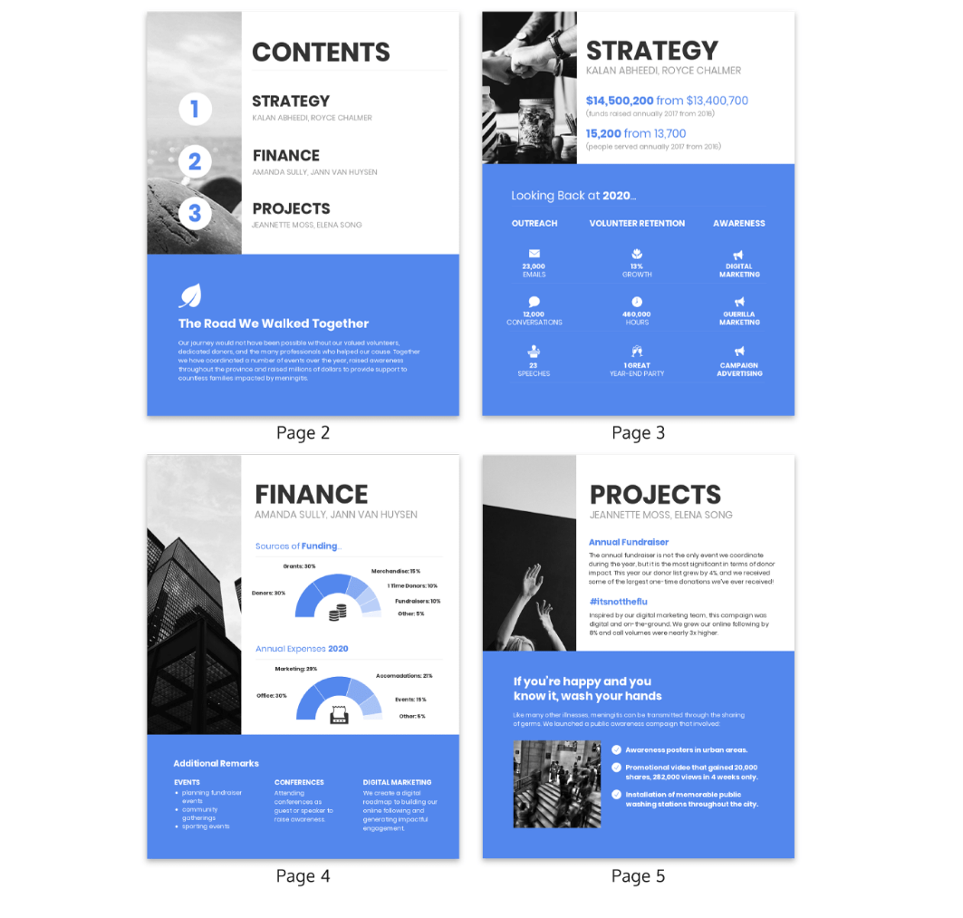
Besides digital marketing reports, you can create sales reports, SEO reports, and reports for your small business. If you need to make several reports regularly, it may be worth looking into using report templates . These come with preset metrics and lighten the tedious task of filling in the same parameters for every report.
A dashboard allows you to view current data, specific metrics, and KPIs at a glance. This data visualization tool provides a high-level view. It highlights the key data, updating you about the performance of your business without needing to scroll through several pages.
Much like a car’s dashboard, they work well for quick, focused data analysis and you can see what’s working without needing to pore over pages of a report.
You can also customize dashboards templates to suit your business. Simply replace the template metrics with yours, connect your marketing channels, and get live updates on the dashboards.
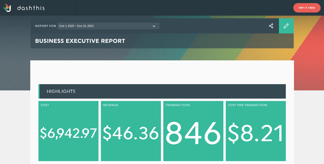
Grab this executive dashboard | Try it with your data
While both dashboards and reports present data for evaluating your business, they’re not the same. Here are some of the key differences between a report and a dashboard:
Level of understanding
Dashboards provide a high-level view of the key performance indicators. Right off the bat, you can see the main metrics as soon as you load the dashboard. With dashboards, it’s easy to tell which numbers have risen or plummeted since the last review, and checking on progress only takes a few minutes!
Reports on the other hand delve into detail and require time to comb through and extract actionable information.
Visual presentation
Typically, reports are designed to be packed with detailed data. As such, they’re more granular, highlighting specific information. However, reports can also feature infographics, charts, and tables. They tend to include additional information and summaries explaining the generated data.
Dashboards are more visual and tend to fit on a single screen or single page. They contain minimal explanatory text, focusing more on interactive charts and tables. As a result, they’re easier to read for specialists but may require additional explanation for stakeholders who may not fully understand the displayed metrics.
Static vs. dynamic
Reports are a static representation of the state of affairs. They’re generally presented at the end of a specific period. They inform your clients, manager, or stakeholders of any progress or losses made within the past period.
In contrast, dashboards are more dynamic. They’re often regularly updated — up to the minute! — and keep everyone on the team abreast of changes as they happen. A dashboard is also more interactive, so end-users can click on charts and tables to gain more information about the metrics.
Versatility
With reports, what you see is what you get. They usually include data sets from a set period — often monthly — and can be inflexible when it comes to being interactive or providing data about operations in the present or during shorter timeframes.
With dashboards, you have more versatility. You can see changes as they happen. Dashboards can be updated as regularly as necessary, whether you prefer daily, weekly, monthly, quarterly or annual updates. Unlike reports, dashboards can also be set to alert users to new updates or when a certain metric reaches a stipulated threshold.
Both reports and dashboards are essential business intelligence tools. They are crucial for making sense of analytics and adjusting strategies to propel your business forward.
Reports excel at presenting detailed information for review at specific periodic intervals . Dashboards , on the other hand, deliver data on demand in a highly visual, interactive, and compact interface . But which format is best for you?
It depends on the person to whom you’re presenting the information as well as the purpose of the data presented.
Higher-level executives, CEOs, and stakeholders who are unfamiliar with the nitty-gritty of operations may do better with a monthly or quarterly report. It presents a broader scope of data and includes necessary explanations to show them the impact of marketing strategies over a period of time.
Team members and other C-suite members such as a CFO or COO may benefit more from the at-a-glance nature of dashboards. Since they understand the key performance metrics and their significance, a quick view that brings them up-to-speed in minutes is a life-saver for their busy schedules. They can also get more frequent daily or weekly updates using a dashboard.
Before you decide how to present your data, think about your viewer’s level of understanding. Also consider how much time they have to review the data (reports can be time-consuming!), and how frequently they need to be updated.
DashThis makes it easy to create visually appealing dashboards in minutes. Once you’ve created an account, it’s as simple as connecting your integrations, choosing your preferred dashboard, and customizing your dashboard design as necessary.
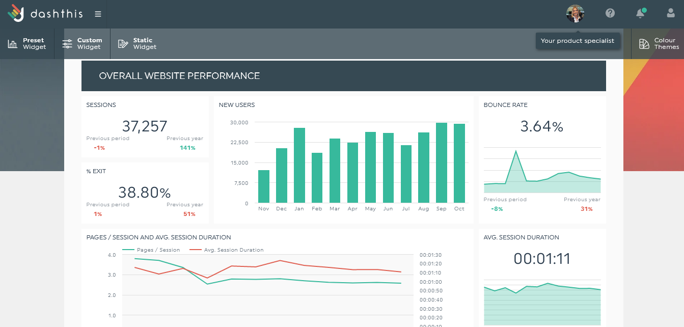
It doesn’t matter which marketing reports you need. With connections to over 34 popular platforms including Google Analytics, Ahrefs, Facebook, and more, you can see all your KPIs in one place. Gain insight into your website’s performance, use drag-and-drop widgets to customize your template, set viewing permissions for team members, and receive daily updates as DashThis imports new data every day.
Don’t need a certain metric? Delete it. Wish some metrics were on the board, add them! DashThis also includes dashboard templates that help you set up yours with minimal effort. Here are some dashboard template examples to get you started.
Small business report template
This dashboard template is geared towards helping small business owners scale their digital marketing efforts and drive sales. You can monitor everything from site traffic to ad campaigns and social media growth over time. It also lets you generate periodic reports if you need to keep the business owner updated about marketing progresses.
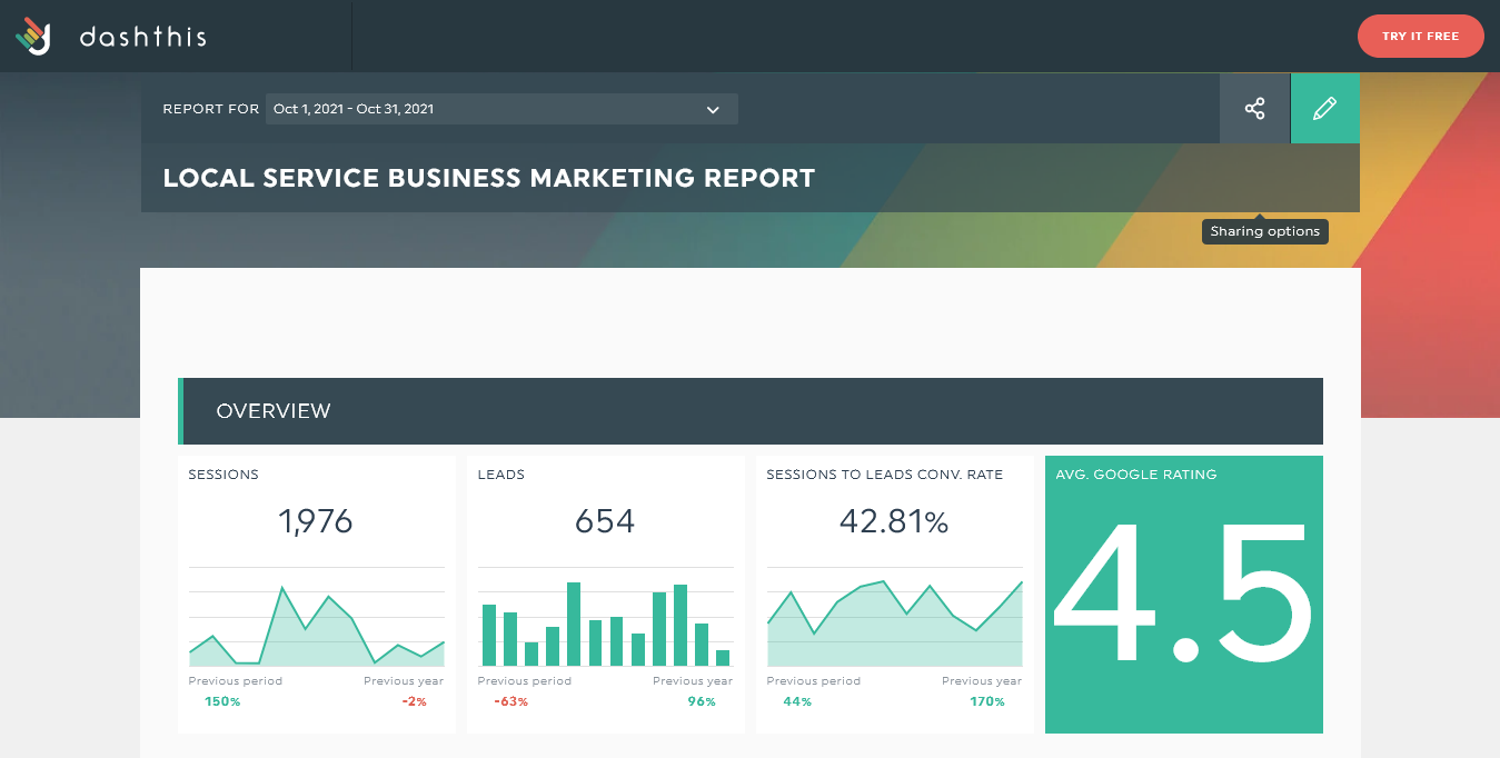
Grab this dashboard with your own data !
Sales report template
Looking for a less stressful way to monitor your sales transactions and track your conversion rate in one go? Try DashThis sales report template. Since DashThis integrates with Shopify, Google Sheets, Formstack, and more, this template lets you import information from a wide range of data sources so you can skip manual data entry.
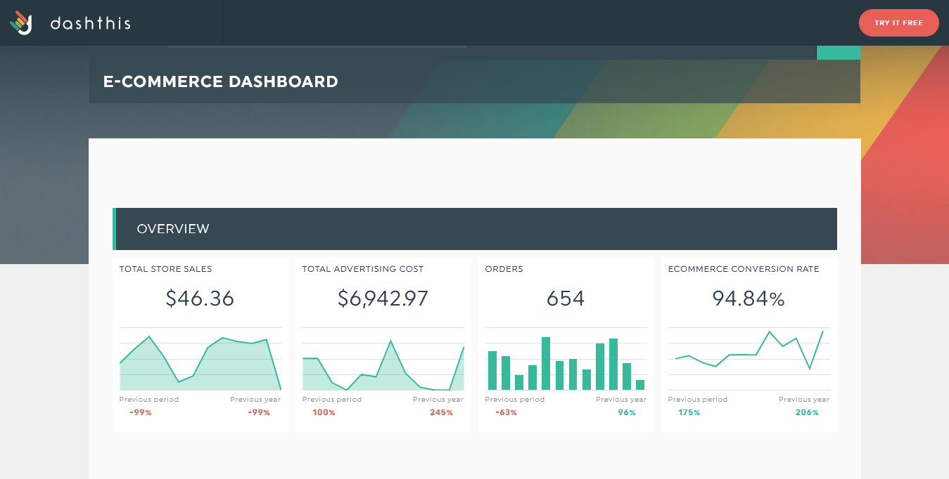
Grab this dashboard with your own data!
Digital marketing report template
Track the efficacy of your marketing strategies with this preset template. Check on KPIs like bounce rate, conversion rate, and channel and campaign performance over time. You never have to wonder how any of your marketing channels are performing.
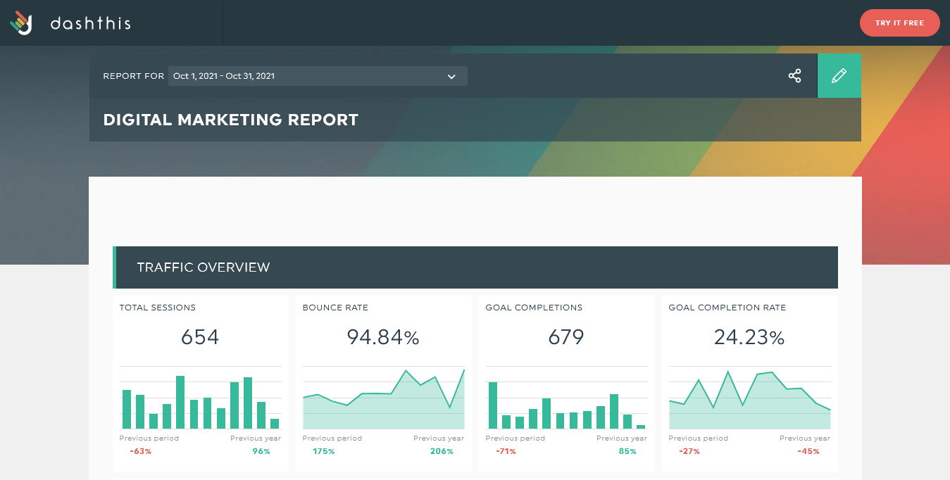
SEO report template
Tired of switching between multiple platforms to track all your SEO metrics? Try this SEO report template that highlights all the major KPIs you need to keep up with SEO performance. Click-through rate, page load time, organic search traffic, new and returning visitors, and so much more.
Successful businesses often have one thing in common: they monitor their KPIs . Metrics show you what’s working and when to pivot or try new strategies. You can keep track of your KPIs using reports or dashboards.
Dashboards provide at-a-glance, dynamic, high-level information. Reports are often the longer, more in-depth summaries about how the business has performed in a specific past period.
Save reports for higher-level stakeholders interested in learning about periodic growth, but who may need more explanation. C-suite executives, specialists, and team members who need real-time updates and can grasp technical terms without explanation will benefit from dashboards.
Need an effective marketing reporting tool that provides both dashboards and reports? Try DashThis today !

DashThis is the power behind thousands of reporting dashboards created by and delivered for agencies and digital marketers every month.
Ready to automate your reporting?
Metrics Reporting: How to Use it to Level Up Your Marketing
Don’t miss out!
Follow us on social media to stay tuned!
Automate your reports!
Bring all your marketing data into one automated report.
Get Started Today!
Made in Canada
DashThis is a brand owned by Moment Zero inc
Copyright © 2011-2024
Data Exploration Vs. Data Presentation – Learn More About The 5 Key Differences

The verdict is in: Data is big and business intelligence (BI) and data visualization tools are here to stay. Organizations of all sizes are now able to easily connect to their various data sources, interact and make sense of their data, and share their analyses. As the BI marketplace matures, organizations are realizing they need robust tools that can handle a wide range of analysis types. Just as there are various dashboard types and different data visualization types tell different data stories, there are multiple intentions for data reporting and analysis. There are two overarching business intelligence buckets that can help determine what type of data report to build: data exploration reports and data presentation reports. Let’s dig deeper into each one and showcase the different data visualization techniques between the two.
Data Exploration And Data Discovery
Data exploration, or data discovery, is the bread and butter of business intelligence software . These exploration tools help ensure users are bringing quality real-time data into their analytics. The software then blends these various data sources. This ease of access to business data allows a wide range of users to perform analyses and gain insights that were previously difficult to acquire, even for data scientists. It is key to the success of these tools and analytics.
Data discovery is the first step in data analysis. Before businesses can make data-driven decisions, they need to understand the data. As Martin Wattenberg, co-leader of Google's Big Picture visualization research group, recently tweeted, “Visualization doesn't add insight, it multiplies. If you know nothing about your data to start with, visualization won't help.”
The first step to understanding data is ensuring the data is properly prepped for exploration . Luckily, business intelligence can do a lot of this heavy lifting. Data discovery typically involves summarizing the main characteristics of a dataset. This is key to accurate data analysis. Before a formal data analysis can be conducted, data explorers must know how many cases are in the dataset, what variables are included, how many missing observations there are and what general hypotheses the data is likely to support. Without this initial exploration of the database, analysts and data viz tool users are unable to direct their analyses. Even worse, they may end up presenting misleading data and insights.
Data visualization software is powerful for exploratory data analysis (EDA) because it allows users to quickly and simply view most of the relevant features of their dataset. Data exploration techniques enable users to easily identify variables that are likely to have interesting observations. By displaying data visually/graphically, users can quickly visualize if two or more variables correlate and determine if they are good candidates for further in-depth analysis. A cloud-based BI software allows various users to collaborate and interact with the same data, bringing various subject matter experts (SME) to the same table. These acting analysts can then continue to build off the unearthed insights, using data exploration techniques for formal data analysis.
Data Presentation and Data Storytelling

Data presentation is in a different class, due to its distinct use cases, goals and audience needs. Data presentation is the data storytelling side of business intelligence. This is where analysts get to be data journalists. Exploration is a key step in business analytics. However, as digital marketing evangelist, Avinash Kaushik, put it in his 7 Data Presentation Tips , “The actual output that is almost singularly responsible for driving the change we want in our organizations. The thing that is the difference between an organization that data pukes and the one that influences actions based on understandable insights.” Without the right data presentation, the results of data discovery and analysis lose significance.
While data visualization techniques are significant for the exploration, they are just as crucial for the presentation. A well-visualized, formatted, designed and simple data presentation is extremely powerful. The intended audience for a data presentation often was not part of the exploration and analysis stage. Data presentation techniques need to focus on giving the appropriate amount of background and calling out the actionable insights. To further differentiate between exploration and presentation, let’s delve into the key differences!
5 Key Differences Between Data Exploration and Data Presentation
1. Intended Audience For the exploration, the primary audience is usually the data analyst(s) - even though with new BI tools, anyone can act as an analyst. These BI tool users are both manipulating the data and visualizing the results. The analysts work with tight feedback cycles of defining hypotheses, analyzing data and visualizing results.
For data presentation, the audience is a separate group of end users, usually not the initial data explorers or analysts. These end users are often less analytical and are often on the frontlines of business decision making. Without direction, they have difficulty connecting the dots between an analysis and the implications for their job.
Make sure to keep your intended audience and purpose in mind when directing your analyses and how they are presented.

2. Analysis Message Data discovery is about the journey to find a message in your data. The explorer (analyst) is trying to put together the pieces of a puzzle. It is often about the journey through the data and should be treated as a treasure hunt.
Data presentation is about sharing the treasures unearthed through the data discovery process. These messages are then presented to the intended audience who can take action on the insights. Authors of data presentations need to guide an audience through the content with a purpose and point of view.
3. Depth of Explanation I think you are starting to get the message here, but data exploration and presentation should be dealt with differently. The depth of explanation provided in both is no different.
With data discovery, the meaning of the analysis can be self-evident to the analyst. A big change in an important business key performance indicator (KPI) will require action. The important mission for the analysts is to answer the question of why this is happening.
Data presenters need to explain the results of analysis and deliver possible solutions. When presenting data to an audience, explaining the underlying data gives the audience confidence in the findings. While visualizing data is still key for data presentations, the increased depth of explanation often means there will be more text provided in a data presentation than with the exploration.
4. Best Visualizations, Formats and Interactivity Capabilities As we just mentioned, data visualization is key to data discovery and data presentation. That said, the data visualization techniques are often different between the two.
For data discovery, the visualizations need to be easy to create and may often show multiple dimensions to unearth complex patterns. Because of this, data discovery is best done through real-time business analytics reporting and dashboard software . These dashboards allow for easier collaboration and tracking of trends and outliers. Interactive capabilities of these dashboards allow for continuous discovery. Design should be focused on the best visualizations and keeping it simple, with minimal text whenever possible.
For data presentation, it is important that the visualizations be simple and intuitive. The audience often doesn’t have the time or need to decipher the meaning of a chart. Data presentation is guided storytelling complete with compelling visuals and thoughtful text descriptions. These presentations should be easily exported to PDF files for easy dissemination. Since these presentations are often shared outside of organizations, design plans should include appropriate branding: logo, colors, font, etc. Make sure you guide the audience through a focused data story. With new BI software, it is easy to be tempted to throw in every data visualization possible. Simple is better. Make sure you choose the best fit for your message.
5. End Goal The goal of data exploration is often to ask a better question. It is an iterative process of finding better questions to continually gain new insights and a better understanding of how your organization works. Real-time data is extra beneficial because it is an ongoing process. Cloud-based and easily shared business dashboards are also key to exploration, for the same reasons.
Data presentations are about guiding decision makers to make smarter choices. The goal is to communicate the insights found through the exploration phase and the business actions that should result. These presentations are often made on more set schedules: monthly, quarterly, bi-annually, annually, etc. They are also dispersed to a wider audience on various platforms, making design and the ability for the presentations to stand alone more imperative.
Explore and Present Your Data With Ease
With the right online BI tool , organizations can easily explore and effectively present their data. Now a wide range of business users can act as analysts and data storytellers. It is an exciting time for business intelligence. However, as with anything, having a plan and focus leads to the best results. Just use this list to help determine the purpose of your analysis before you start!
- SUGGESTED TOPICS
- The Magazine
- Newsletters
- Managing Yourself
- Managing Teams
- Work-life Balance
- The Big Idea
- Data & Visuals
- Reading Lists
- Case Selections
- HBR Learning
- Topic Feeds
- Account Settings
- Email Preferences
How to Present to an Audience That Knows More Than You
- Deborah Grayson Riegel

Lean into being a facilitator — not an expert.
What happens when you have to give a presentation to an audience that might have some professionals who have more expertise on the topic than you do? While it can be intimidating, it can also be an opportunity to leverage their deep and diverse expertise in service of the group’s learning. And it’s an opportunity to exercise some intellectual humility, which includes having respect for other viewpoints, not being intellectually overconfident, separating your ego from your intellect, and being willing to revise your own viewpoint — especially in the face of new information. This article offers several tips for how you might approach a roomful of experts, including how to invite them into the discussion without allowing them to completely take over, as well as how to pivot on the proposed topic when necessary.
I was five years into my executive coaching practice when I was invited to lead a workshop on “Coaching Skills for Human Resource Leaders” at a global conference. As the room filled up with participants, I identified a few colleagues who had already been coaching professionally for more than a decade. I felt self-doubt start to kick in: Why were they even here? What did they come to learn? Why do they want to hear from me?
- Deborah Grayson Riegel is a professional speaker and facilitator, as well as a communication and presentation skills coach. She teaches leadership communication at Duke University’s Fuqua School of Business and has taught for Wharton Business School, Columbia Business School’s Women in Leadership Program, and Peking University’s International MBA Program. She is the author of Overcoming Overthinking: 36 Ways to Tame Anxiety for Work, School, and Life and the best-selling Go To Help: 31 Strategies to Offer, Ask for, and Accept Help .
Partner Center
- Key Differences
Know the Differences & Comparisons
Difference Between Essay and Report

On the other hand, an essay can be understood as a piece of writing, on a specific topic or subject, which expresses the author’s own ideas and knowledge about the subject.
The basic difference between essay and report is that while an essay is argumentative and idea-based, reports are informative and fact-based. Now, let us move further to understand some more points of differences.
Content: Essay Vs Report
Comparison chart, definition of essay.
An essay can be understood as a comprehensive literary composition, written in a narrative style and presents a particular topic, supports an argument and highlights the writer’s view or ideology. An essay is used to check a person’s outlook and understanding on specific matters and also his/her ability to describe and argue in a way which convinces the reader or informs him/her about a specific topic.
One can make use of learned materials, along with his/her own research, to write an essay effectively. It includes both narrative and subjective thoughts. Further, an essay supports a single idea at a time, for which several components need to be covered in it so as to appear logical and chronological.
It can be a learned argument, observation of day to day life, literary criticism, political manifestos, recollections, and reflections of the writer. It starts with a question and attempts to answer or give suggestions to the problem, on the basis of the existing theories or the writer’s personal opinion and assessment.
While writing an essay, it must be kept in mind that the approach used by the writer should be positive, even if the topic of argument is negative.
Definition of Report
The report implies a well structured factual document which is created and presented after conducting an independent enquiry, research or investigation on a specific subject. It serves as a basis for problem-solving and decision making.
Reports are prepared for a definite purpose and contain relevant information in a proper format, for a particular audience. It is used to identify, observe and analyse the issues, events, findings, that occurred practically, i.e. in real life.
A report is designed with the aim of informing the reader about the event, situation or issue, in a very simple and objective manner, while enabling them to get the desired information quickly and easily. It provides recommendations for future actions. Information collected from research, or from carrying out a project work is presented in a clear and concise manner, under a set of headings and subheadings, that helps the reader to get the desired information quickly and easily.
Characteristics of an Ideal Report
- It must be clear and concise.
- It is written in easy language which the readers can understand easily.
- It has to be appropriate and accurate.
- It should be well drafted and organised, with specific sections, headings and sub-headings.
A report summary can be provided orally, however detailed reports are usually in the form of written documents. It contains – Title Page, Acknowledgement, Authorization Letter, Table of Contents, Executive Summary, Introduction, Discussion, Results, Conclusion, Recommendations and References.
Moreover, Cover letter, Copyright notice, Bibliography, Glossary and Appendices may also form part of a report.
Key Differences Between Essay and Report
The difference Between report and essay is discussed here in detail:
- An essay is a brief literary composition, which is used to describe, present, argue, and analyse the idea or topic. Conversely, a report is a formal and concise document consisting of findings from the practical research. It aims at investigating and exploring the problem under study.
- An essay is written on the basis of subjective analysis of theories and past research, by other people and own ideas, on the concerned subject. As against, a report is objective and factual, which is based on past research, as well as present data and findings.
- An essay talks about general facts and events along with the writer’s personal ideas and views, on the topic in a non-fictional manner. On the contrary, a report contains information which the reader can use to identify the facts or support in decision making or solving issues if any.
- When it comes to sections, a report usually contains different sections, with catchy headings which may attract the attention of the audience. As against, an essay does not have any section, its flow is continuous. However, it is divided into cohesive paragraphs.
- A report uses tables, charts, graphs, diagrams, statistics and many more for a clear and better presentation of the information. But, in the case of essays, they are not used.
- The conclusion in an essay is based on the writer’s personal opinion and views on the topic itself which must be optimistic, and it does not provide any recommendations for future actions. On the other hand, a report gives an independent conclusion, but it may contain the opinion of the experts or previous researchers and recommendations are included, about how the research can be improved and extended.
In a nutshell, Essays are descriptive, subjective and evaluative, whereas, a report is descriptive, objective and analytical. Essays are mainly used in an academic context, whereas reports are preferred in the field of research.
The report is used to present the researched information in a written format, to the audience. Conversely, essays are used to identify what the writer knows about the topic and how well the writer understand the question.
You Might Also Like:

Anna H. Smith says
November 26, 2020 at 3:22 pm
Thank you for explaining this so eloquently. Excellent post, I will keep this handy and refer to it often from now on, the information is so clear and so insightful, thanks for giving a clear difference. It’s a very educative article.!
Presley Dube says
November 20, 2021 at 3:43 pm
very useful to me thank you.
Leonard says
August 8, 2022 at 2:52 pm
Thanks for sharing such nice information about this topic.
Ignatius Phiri says
March 20, 2023 at 10:39 pm
Leave a Reply Cancel reply
Your email address will not be published. Required fields are marked *
Save my name, email, and website in this browser for the next time I comment.
IMAGES
VIDEO
COMMENTS
The main difference between a Presentation and Report Writing is that a report is usually fairly extensive and gives a detailed account of the information on a particular topic. Whereas, a presentation is mostly a synopsis which highlights the key points that are important for the audience. Since one of the key objectives of both - a ...
What is the Difference Between a Presentation and a Report? Both have their place in corporate communications but it is important to know the difference and where and when to use each. A report is extensive and provides a detailed account of a subject. Facts, features and benefits are hallmarks of a report
Here are three ways a well designed data product moves information beyond a report and to a data presentation: Guidance - Direct an audience where to start and the sequence they should consume the information. Presentations always start somewhere. Context - Give an audience what they need to understand and buy in to the challenge and solution ...
To nail your upcoming data presentation, ensure to count with the following elements: Clear Objectives: Understand the intent of your presentation before selecting the graphical layout and metaphors to make content easier to grasp. Engaging introduction: Use a powerful hook from the get-go. For instance, you can ask a big question or present a ...
Difference Between Presentation and Report. A presentation is a kind of communication that combines oral explanation with visual assistance to create an engaging experience for the audience. It can be delivered face-to-face or online, intended to educate, persuade, or motivate its audience. On the other hand, a report is a formal, written ...
Tip 1: Prepare properly. Preparation lays the foundation for a successful report presentation. Think carefully about how you want to present specific facts and data. Know what you want to say and what your goals are - that's key for a great report presentation layout. Each slide must have a specific purpose.
One of the main differences between a presentation and a written report is that you will be speaking directly to the audience. A good presentation has a speaker that is effective, engaging, and confidant. Practice is the best way to improve your speaking. Practice in your home. Get friends and family to be an audience.
As nouns the difference between report and presentation is that report is report (all senses) while presentation is the act of presenting. report . English (wikipedia report) Verb *{{quote-magazine, date=2013-01-01, author=Paul Bartel, Ashli Moore
Guidelines for the report writing in the seminar of big data management Jiaheng Lu 1. Difference between presentations and reports First, please note that the goals of presentations and reports in this seminar are different: § Presentations: Present to the audiences and let them understand your topic.
Differences between reports and presentations. Presentations Reports; Primary Transfer: Voice: Text: Secondary Transfer: Slides, Figures: Figures, Tables, Appendices: Audience: Restricted: Unlimited: Time: Limited: ... As a technical presentation is meant primarily to inform or to persuade, a plethora of text is not required: the presentation ...
Knowing the difference between these two types of presentations and knowing how to construct each type of presentation will be beneficial to your future careers. ... The presentation to inform may be an explanation, a report, a description, or a ... Lyon, A. (2017). How to Organize a Persuasive Speech or Presentation [Video file]. Retrieved ...
There are many different types of research presentations, but the different types of presentations can be divided into two general categories: written presentations and oral presentations. Written research presentations include dissertations and theses, posters, grant and project proposals, blogs, websites, PowerPoint slides, etc. Oral research ...
In this video, learn about the differences between a presentation and a speech. Speeches and presentations are not technically the same, though the words are often used interchangeably.
Let's define what we mean by "report" and "speech.". A report is a written or spoken account of something that has been observed or investigated. It can be formal or informal and is often used to convey information to a specific audience. On the other hand, a speech is a formal address or discourse delivered to an audience.
Expository prose is writing to inform; you may have been asked to write an expository essay in an English course or an expository report in a journalism course. The goal is to communicate the topic and content to your audience in ways that illustrate, explain, and reinforce the overall content to make your topic more accessible to the audience.
yes, the difference is that the world should stop writing presentations and start writing documents. In case a 'presentation' is needed, one should write a summary, a specific kind of document. Like
Expository prose is writing to inform; you may have been asked to write an expository essay in an English course or an expository report in a journalism course. The goal is to communicate the topic and content to your audience in ways that illustrate, explain, and reinforce the overall content to make your topic more accessible to the audience.
Conclusions. Effective research posters should be designed around two or three key findings with accompanying handouts and narrative description to supply additional technical detail and encourage dialog with poster viewers. Keywords: Communication, poster, conference presentation. An assortment of posters is a common way to present research ...
In this article, we'll show you the differences between a report and a dashboard and when to use each one. ... Visual presentation Typically, reports are designed to be packed with detailed data. As such, they're more granular, highlighting specific information. However, reports can also feature infographics, charts, and tables.
Data presentation is in a different class, due to its distinct use cases, goals and audience needs. Data presentation is the data storytelling side of business intelligence. This is where analysts get to be data journalists. Exploration is a key step in business analytics.
All of that is true, of course. But there is one thing I often see missing from what I feel differentiates a good presentation (one that is simple, clear, and confidently delivered) and a great ...
Share Cite. Simply put, an essay is typed or written onto paper, while a presentation is given verbally. A presentation can be about an essay that was written, and it can also contain a written ...
Summary. What happens when you have to give a presentation to an audience that might have some professionals who have more expertise on the topic than you do? While it can be intimidating, it can ...
The basic difference between essay and report is that, while an essay is argumentative and idea-based, reports are informative and fact-based. Now, let us move further to understand some more points of differences. ... It is the written presentation and analysis of the data, findings and results thereof that the researcher obtained during the ...
Refugees and asylum seekers who identify as sexual minorities and/or who have been persecuted for same-sex acts maneuver through multiple oppressive systems at all stages of migration. Sexual minority refugees and asylum seekers (SM RAS) report experiencing a greater number of persecutory experiences and worse mental health symptoms than refugees and asylum seekers persecuted for reasons other ...